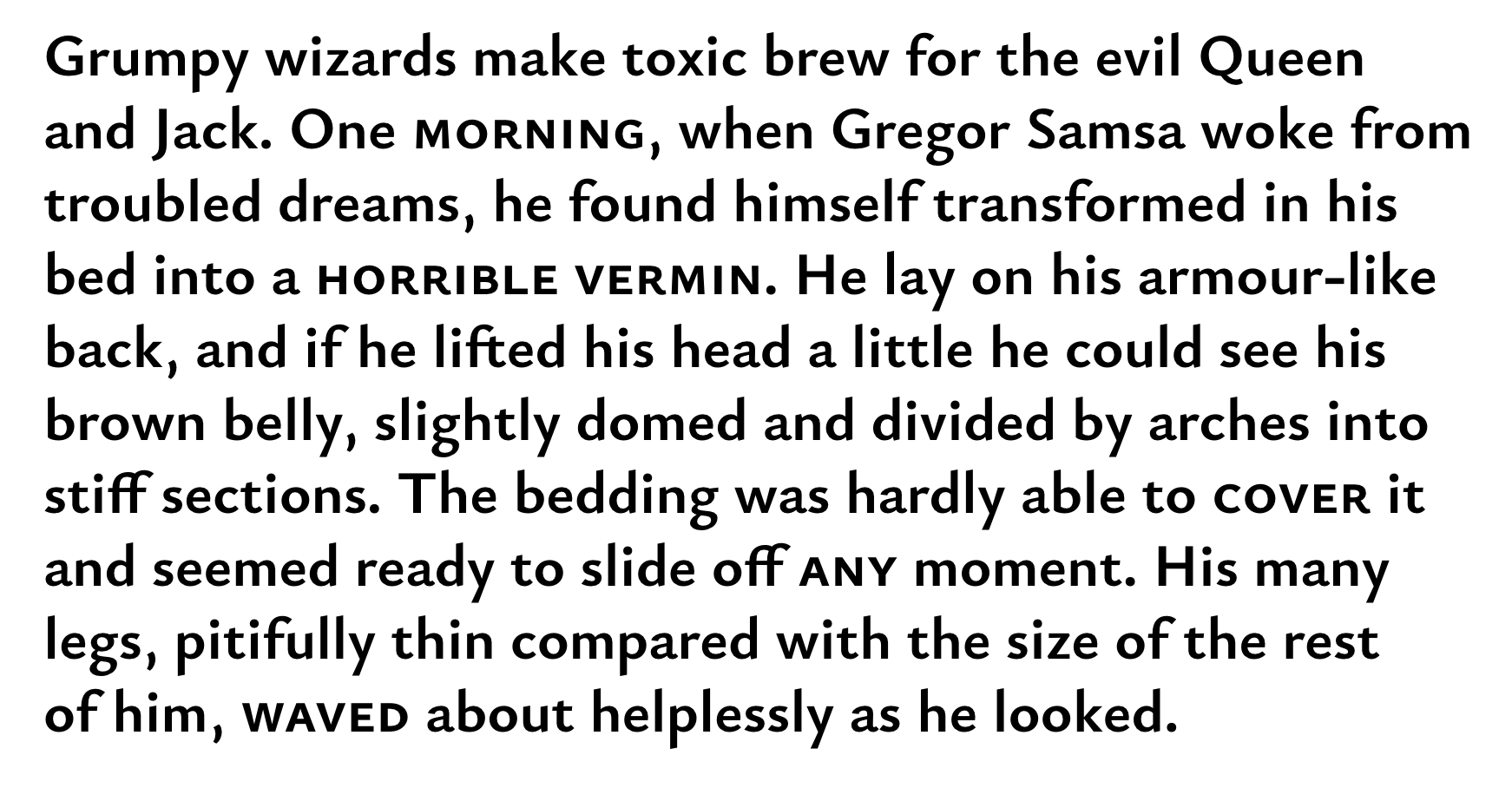
Eau de Garamond — a sans distilled from the essence of Garamond
Comments
-
Jasper, I've tried to address most of your comments. I didn't expect to like the opened /s better than before, but I do.
")
However, I haven't raised the /t. I'm allowing myself to indulge in some Carolingian decadence there.
Also, I've tried flat feet for /p/q, but I find them somewhat less attractive than the slanted ones. I perceive the descenders as hanging rather than standing, so the slanted cuts matching the ascenders feel more natural to me.
EDIT: Alright, I've raised the /t's by 10 units. I guess the apex shouldn't look flatter than the spur (though it kinda does in Garamond).
Flanker: Thanks! I have lightened the terminals on /f and related glyphs, but left the /G unchanged for now. I find it needs a bit of strengthening at the end of the arch, since it's a strong diagonal.
BTW, this forum has a real-name policy, so you'll probably be asked to change your user name to your full name soon...
0 -
Alright, I'm almost done with a first draft of the character set. What's mainly still missing now is the unicase alternates for the smallcaps, which I'm not sure I'll implement here (though I liked them in Cormorant).
The project is now on GitHub:
https://github.com/CatharsisFonts/EauDeGaramond
I guess I can still change the name later.
0 -
I canot install it on my Kubuntu Linux while your cormorant does fine.
0 -
Strange. The TTFs behave normally on my Mac. What's the error message?
0 -
"Impossible de lire la police" It doesn't show any preview icon.
0 -
Now I realize that I installed Cormorant OTF. Cormorant Truetypes also cannot install on Kubuntu.
0 -
Must be a Kubuntu problem, then.
I've added an OpenType export now, though I'm probably not going to update it quite as often as the TrueType.
0 -
Thanks for the Open Type ! That's the first time I have problems with TrueTypes in Kubuntu however.
0 -
Strange problem too with Eau Sans OTF. It cannot install and here is the message I get when I try to open it in FontForge

0 -
Sorry, I have no idea what's going wrong there. The OTFs from GitHub work on my machine. Maybe you could ask around in a Kubuntu forum?
0 -
Ok ! It seems this is a problem between Github and Mozilla at the moment. When I download a TTF or an OTF that only downloads the link as an html file. However if I download the whole directory the fonts work !
0 -
Did you download the individual file using the 'raw' link?ivan louette said:Ok ! It seems this is a problem between Github and Mozilla at the moment. When I download a TTF or an OTF that only downloads the link as an html file. However if I download the whole directory the fonts work !0 -
I used save the links target.
0 -
Christian, I had a look at the files.
I love the display version, but feel disappointed by the text version.
A text version should be much more than simply swapping the /a and /e glyphs (that feels like cheating).
You are loosing the opportunity to make a great body text face for the web.
There are many other things you can optimize for text... looser spacing, bigger x-heigth, etc, etc... currently it renders very small when set, for example, at 16px... you can also tweak the scale of the lowercase so it renders bigger.
But you will need separate masters for that, it wont be as easy as simply swapping a few glyphs. It will be more work... but the result may worth the effort.
Otherwise, my recommendation is to release only the display version now. And work on a real text version later...
0 -
Hi Pablo,
I'm glad you like the display version.
As we've discussed above, aiming for optimal screen performance would imply quite a different set of design goals from the ones I'm currently pursuing, so I'm not worrying about that right now.PabloImpallari said:You are loosing the opportunity to make a great body text face for the web.
The alternate /a/e/g are meant to make the display version work as a text font, and I believe that goal can be achieved even with the current proportions. After all, they're modeled after Garamond, which has been proven to work exceedingly well for running text. To me, the spacing already feels quite loose for a sans. As for the x-height...currently it renders very small when set, for example, at 16pxThen maybe it should be set at 18 pt. As far as I can tell, one of the reasons why Garamond is so legible is exactly that it doesn't try to cram as much information into a given space as possible, but that it allows its letters to grow out to their «natural» shape.
Actually, Eau looks larger to me at 16 pt than EB Garamond does:

Or Minion:
Otherwise, my recommendation is to release only the display version now. And work on a real text version later...
That sounds like a plan.
In fact, given your expertise in adapting typefaces for the screen, you might even be able to convice Google to fund you to do it.
0 -
Neither EB Garamond nor Minion are optimized for the web.
Compare Eau to Merriweather Sans, Libre Baskerville, Libre Caslon Text, Webtype RE fonts & Hoefler SmartScreen Fonts.
0 -
We agree on that. Eau is also not optimized for the web.PabloImpallari said:Neither EB Garamond nor Minion are optimized for the web.
My point, though, was that EB Garamond and Minion are great text faces for print and high-res screen use. The «text» cut of my current Eau is intended to be able to fill that same role. The fact that there exists a market for fonts optimized for low-res environments does not invalidate the former role. In fact, as Nick pointed out earlier, high-res screens are becoming more and more ubiquitious each year.
I like the idea of making a low-res optimized version of Eau eventually, but it's low on my priority list at the moment.
0 -
First draft of Cyrillic capitals.

Note the toe-stubbed version of /Kje-cy before /El-cy. Similar alternates exist for all /Ka-cy and /Zhe-cy derivates.
0 -
I'm no expert but are ЦШЩЏ (esp. the middle two) too wide?1
-
I use the Impallari testing site every day. It is a great help!!! Bravo, Pablo!3
-
ЦШЩЏ look fine to me.
Д's left descender should begin closer to the curved stroke than the right does to the vertical one. They are supposed to be asymmetric to look balanced.
I prefer /shha that is a stylistic cousin of the soft sign, but someone who actually uses one in their daily life in Kazakhstan should comment on it.
Is there a reason why Я won't join the club of ЖКЛ and their curved legs? I am still not the biggest fan of curved legs and straight arms, though.
Could you show your З next to a lining 3, please? You might have to make it a bit wider.
3 -
Thanks for your insights, Samuil!
I've changed /Д, /Һ, /Я as you suggested. I had tried a round-tailed /Я originally, but it looked bad. I rather like the new version, though.
I originally also make the arm of /К curvy to match the leg, but then the whole glyph starts to look a bit clownish. I prefer the straight-armed version.
The /З is wider and opener than /three.lf — enough so?
0 -
The new /Ka is too opinionated, it will work in a modern display font, but it's not Garamondish enough. But if you flip it vertically it might work after a few fixes...
What if /Ze was more closed than /three.lf?
The /Shha is something I need to research more before I comment on the shape further.
0 -
Just curious: did you ever try curly *arm* and straight *leg* on the Ka etc.?0
-
I haven't, mostly because the curly leg is already established in the Garamond /R, whereas the «elephant trunk» of modern-style /Ka-cy strikes me as rather alien to the Garamond æsthetic... But I suppose I can give it a try.Craig Eliason said:Just curious: did you ever try curly *arm* and straight *leg* on the Ka etc.?
The «curved leg, straight arm» approach seemed to work well for Cormorant, in any case!
Wouldn't it look grotesque then? The EB Garamond has a quite open /Ze-cy, in analogy to the open /S.Samuil Simonov said:
What if /Ze was more closed than /three.lf?
0 -
I checked Garamonds and other humanist serifs designed by ParaType, and they all have more closed /Ze than /three.lf. Or you could have a voiced palato-alveolar sibilant fricative-shaped /three.lf as a stylistic alternative for Cyrillic texts. It's not very garamondy, but distinctive.Christian Thalmann said:
Wouldn't it look grotesque then? The EB Garamond has a quite open /Ze-cy, in analogy to the open /S.
0 -
I've been working on the /Ka-cy a bit more. Here's a line-up starting with the Latin /K and growing more and more wiggly toward the right.

I can't make a curved-arm /Ka-cy that doesn't look exaggerated among my otherwise lean capitals. I think I'm going to go with the second one in the row. At least its two appendages share the same basic design philosophy (straight, in this case), and it still lets more air with /Zhe-cy in mind.
In fact, Leksandra's post on how to recognize a good Cyrillic says that there's no reason for a humanist typeface to have a curly /Ka-cy, and she has a few good examples of typefaces with straight /Ka-cy.
EDIT: I also made the /Ze-cy wider and more closed:
1 -
-
Uh, what has happened to that /zhje? Has it mugged another letter to get a second descender?

Light /be feels too wide, black /be is unusual, but I won't judge it until I see it in a block of text.
/dje is missing from the list
I am not sure the slanted end of the descender of /er will work, but once again, I want to see a block of text.
I think /tse is a tiny bit too wide.
The legs of /ya and /el and /lje feel a bit flamboyant in the light cut.
0 -
Җ needs to have a tooth removed?
б flag has too much contrast in bold.
у looks very tapered next to other descenders in bold.
ү looks bottom-heavy in bold.
ю may be wide in light?
ї might need to be built with /dieresiscomb.i
0


Categories
- All Categories
- 47 Introductions
- 4K Typeface Design
- 495 Type Design Critiques
- 577 Type Design Software
- 1.1K Type Design Technique & Theory
- 671 Type Business
- 885 Font Technology
- 29 Punchcutting
- 539 Typography
- 125 Type Education
- 333 Type History
- 81 Type Resources
- 113 Lettering and Calligraphy
- 33 Lettering Critiques
- 80 Lettering Technique & Theory
- 569 Announcements
- 100 Events
- 116 Job Postings
- 170 Type Releases
- 182 Miscellaneous News
- 270 About TypeDrawers
- 54 TypeDrawers Announcements
- 114 Suggestions and Bug Reports