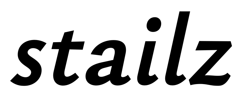
A few years ago, I was first hit by the creative urge to make a faithful sans companion to Garamond — not just another humanist sans tipping its hat to the old master, but a sans that really
was Garamond. I was going to distill the pure essence of Garamond. Unfortunately, my skills weren't up to the task back then (Typophile veterans might remember).
Now, after completing a display Garamond (Cormorant) and a sans (Quinoa), I feel confident enough to try again.


My current plan is to start with a low-contrast family that starts with the monolinear «essence» for large display sizes on the light end of the spectrum grows into a robust text-capable workhorse at heavier weights. I'm working with these two masters —
Hairline and
Bold — and adding a third, intermediate master via the brace trick in Glyphs wherever necessary (for instance, to restrict the strong thinning of shoulders to the heavy weights).
Beyond that, my stretch goals are:
- An Italic.
- A high-contrast family branching off the same Hairline master, but with a new Bold master. First experiments (see below) seem promising.
- Adobe Latin 4 and Cyrillic coverage.
- If I can pull it off, a third master (Black) for heavy weights beyond Bold. Not sure if the æsthetics of the essence would survive that ordeal, though.

Now, since I will base this project off the existing chassis of Cormorant, I am bound by contract to release this typeface under the Open Font License as well. Unfortunately, Google Fonts has apparently spent all its budget for commissioning new typefaces this year, so I can't get funding through that channel anytime soon.

Dave has suggested getting some crowdfunding from
Kickstarter, though. Do you think that could work? It has worked for other typefaces in the past... (Though from what I can see, the successful projects are significantly smaller in financial scope than what Google pays...) Do you have any experiences with Kickstarter yourself? Can you recommend it?
Comments
I worked on the production of <redacted>, and as an insider I can tell you that its Kickstarter didn't work as well as appearances... And frankly this is less rousing for the public.
Hrant: It might not have the meme cred of Comic Sans or the socio-historic appeal of the Einstein and Freud typefaces, but I do think there's a good story in it. Everybody owns books printed in Garamond; it's the most timeless typeface of the modern age. Distilling its essence might be seen as a sort of community-serving research.
I think my treatment of the /a is already quite distinctive from all previous attempts, and I like to think it's the most Garamond of them all.
https://www.myfonts.com/fonts/linotype/syntax/
http://www.myfonts.com/fonts/thefoundry/foundry-sans/
You can also try your own hand at it, even if other people attempted the same thing.
Pablo: I wasn't aware of Foundry Sans. It's better than Syntax in many respects, though its goofy /e still smacks of it. It strikes me as cold and mechanical, though.
Anyway, I really like where this is going. Maybe I'll just pursue it speculatively and hope Google will adopt it next year.
**
Christian, why not get a bank loan, and retail the typeface?
You could make a lot more than Google pays, in the long run.
Why? Christian is making it work, and I think it would be useful to have a sans companion to a classic like Garamond. Honestly, all the typefaces mentioned so far have little relation to Garamond.
As for going retail: The contract with Google specifically precludes me from selling derivatives of my OFL products. And like Khaled, I do like the idea of releasing a font to the world. Cormorant Garamond alone is already served by Google Fonts 100,000 times a week on more than 500 websites, and the numbers are steadily rising. It feels rewarding.
As for making money: Google paid me about three times as much money for Cormorant as I've made with my other seven typefaces on MyFonts since I started out in 2013. Now, it could well be that Cormorant and Eau are just much more widely usable than my previous designs and would do better on MyFonts... but even then, giving up a fraction of my potential earnings to expand my user base to the whole world isn't such a bad deal, given that I'm in this primarily for the creative expression rather than for the money. (Although I like to get paid for my work as much as anyone.)
Haters gonna hate.
That way we can download and have a deeper look at it. For example, I would like to drop it into the testing page to have a better look at it, at different sizes, in different contexts, etc...
(Those last two are an /o and a /zero for comparison.)
First readability tests don't look bad:
@Jasper de Waard: You were right about /6 and /9, I tweaked them. The other two are leaning left by design... here's EB Garamond for comparison. (Though /3 was overdoing it; I tweaked that too.)
BTW, should I reduce the space around /1? I feel it needs a bit more space to stand on its own...