Eau de Garamond — a sans distilled from the essence of Garamond
Comments
-
I spent about two minutes trying to figure out what you meant by the Verdana ell-treatment.
 I don't think it would fit into my approach, though, which seems to be reductionist when in doubt. For instance, I dropped the spur on /b because I figured it would look serify.
On the other hand, that angled top seems out of place among those other numerals. I guess a flat top would also be more in line with the Garamond /1:
1 -
The descender space is –severely– under-rated (in Latin). But the place to act on that is the lowercase. For the numerals in a typeface that plays by the rules, making sinkholes is bad.
0 -
I like the 2 and 3 lean.1
-
Not sure what this is about ascending Garamond figures. Attaching Pica
 Garamond 1552, from the Vervliet.
4 -
Just that he was French... (Really, any excuse to promote readability.)
-1 -
Just for the record: this is "Garamond Sans" an experiment by Emiliano Frías in the class of Ruben Fontana (Argentina) around 1993.

6 -
That's pretty good! The spurs on /b/q feel out of place to me, and /g feels too fussy compared to the other letters. Anyone who gimps their /f for the sake of avoiding collisions is forsaking the Garamond spirit, though.
 And /a is just stolen from Meta.
0 -
I think you could stand to make the x-height slightly greater in the bold. It would look closer to the same, right now visually it looks smaller at the same size (compared to the light).2
-
The x-height already is larger in the Bold:

I've started to worry about whether the ascender height was too large, though. I noticed the difference is much smaller in Garamond. Perhaps that's why Eau has a bit of an unruly feel to it in text settings?
1 -
I lowered the ascenders by 50 units, and I think that improves the readability. Now my (ascender – descender) totals to 950, and I think I'm going to risk leaving it there... If I use the «Scale to UPM 1000» command, I'm afraid the fragile 10-unit monolinear master is going to get messed up.
I also added an intermediate weight between my previous Regular and Medium. I called the new one Regular (since I think it makes the best text weight, see below) and the previous Regular Semilight (for lack of a better term).
0 -
For display it's Ok. For body text, it needs ample spacing (and bigger /a /e counters)
2 -
The main problem with bolder Garamonds (and not only in your version) is that often the /a does small blots on the page. Thats mainly visible at small sizes of course but this is not only a question of hinting i think. Perhaps is that because in all Garamonds it's eye is inclinated and slightly smaller than /e eye.
Otherwise very nice and interesting !
I have the idea to draw a sans for my Geranium, but my eyes are turned on Palatino sans for that kind of details (not for the general drawing of course).
0 -
I thought the spacing was pretty generous already; it strikes me as a tad ampler than Garamond itself.PabloImpallari said:For display it's Ok. For body text, it needs ample spacing (and bigger /a /e counters)
I did notice that /e tends to fill up rather quickly even at moderate sizes, though. I guess I will make a Text cut of the typeface with larger counters in /a/e, as I did with the «Garamond» series of Cormorant.
EDIT: Alright, I made some alternates for /a/e (bottom is new), although it pains me to look at that Baskervillesque /a up close. . I'll take them for a ride on the test site as soon as I've written some instances that implement these by default.
1 -
Unruliness is the catalyst of readability.
For a design with such a small x-height a talus of 50 is too much.
0 -
I wouldn't add the 50 as a talus, I'd just leave it at 950 units/em.0
-
Deviating from 1000 is –still– problematic; if you're that close to it, make the effort to snap to it (probably by increasing the x-height instead of decreasing ascenders).
A small talus above is useful, to accommodate some of the cap accent extension.
1 -
If you are going to create size-specific versions, maybe you may want to have a look at Libre Caslon Display and Text . This are both highly optimized for each role. Not only wideness, contrast, spacing, weight, etc... but also a full BBox optimization.

https://github.com/impallari/Libre-Caslon-Display
https://github.com/impallari/Libre-Caslon-Text
(A deck version is planned, in the middle of both, at some point in the future).
2 -
I can't really raise the x-height much without also raising the cap height to preserve proportions. At that point, the whole thing is equivalent to rescaling my current 950-unit design. Problem is, my delicate 10-unit monoline degrades under rescaling. The /a takes it relatively bravely, but the /Q's tail is an example where it looks bad (the right /a and left tail are new):Hrant H. Papazian said:Deviating from 1000 is –still– problematic; if you're that close to it, make the effort to snap to it (probably by increasing the x-height instead of decreasing ascenders).
A small talus above is useful, to accommodate some of the cap accent extension.

So I guess it would mean going through my rescaled monoline with a fine-toothed comb. This had better be worth it.
Is it possible to apply scaling from the baseline to a batch of glyphs with RMX Tools? I know they're good at things like «make the glyph wider by +20 units», but this is a different job...
0 -
Measure twice, cut once.3
-
Comparison of the 950 unit text font with 50 units of talus and the scaled-up 1000 unit text font. The talus looks irrelevant inside of Glyphs, but it makes a noticeable difference in a text block:


0 -
Stop it here! Actually Foundry Sans is a good take (don’t know why you hate Syntax). Also Legacy Sans, as James Montalbano mentioned, maybe even Charlotte Sans.
Your take is lacking someting substantial. It is too constructed. Looking at the row of your alphabet, it is falling apart at least from the letter ›s‹ on. Especially this one is like from a geometric typeface (reminds me very much of Futura). The bow of ›t‹ is too round. I like your take on the ›a‹, but even ›b, d, p and q‹ are way too constructed.
I advise to have a look at the above mentioned typefaces, and especially at the work of Chris Brand, whose Sans never was executed as a working font, unfortunately.
http://luc.devroye.org/fonts-32509.html
My two cents,
Jürgen
0 -
Jack: You're right, of course... except that for a typeface, one needs to «cut» a number of letters before one can «measure» whether they look right. Admittedly, I should have done that after hamburgefonstiv rather than after making all letters and ligatures, though.
 Anyway, I've already cleaned the scaled-up capitals and am now moving on to the lowercase. The work is not as difficult as I feared, it's mostly a matter of identifying the strokes in which the effective weight was rounded up by one unit.
Jürgen: We'll have to disagree on that. I like where Eau is going, and it does not feel geometric or constructed to me. This verdict seems all the stranger to me given the fact that you like Syntax, The Typeface Made From Elbows.

The /bdpq in Syntax are essentially a clone army, the /bdqpmn would feel right at home in a grotesque, and the /eag are just really ungainly. The Eau letters, on the other hand, I find more humanist, more harmonious, and more beautiful.
Yes, my /kvwxyz are very geometric and constructed, but that's the very nature of those letters (they are pretty unimaginative in Garamond as well). At least mine have the decency of lining up with the baseline and x-height rather than elbowing this way and that like Syntax.
The round foot of /t is, admittedly, a bit of indulgence on my side. I'm in love with the brazenly low and wide /t of the Carolingian minuscule, and I strive after that idea with all of my typefaces. The Garamond /t is beautifully low, but a bit too timid for my taste, so I made it wider and gave it a proper foot.
And what's supposed to be particularly geometric about this /s?
1 -
Syntax, Legacy Sans, and Today Sans were pioneers, but they aren’t the dead end of this idea. They approach the concept in very different ways, and I think Christian’s take has merit in its own right.
BTW, he may be a little harsh in his criticisms, but Syntax is by no means perfect. Sometimes pioneers or classics are thought of as religious icons. They hold an important place in history and some deserve a certain respect, but people are too often afraid to call out their faults.2 -
I do worry, Christian, that you're focusing a bit too much on the individual glyphs and not enough on the performance as a whole, particularly in text. That ‘Q’, for instance, just won’t work as a default.1
-
BTW, I think DTL Haarlemmer Sans and DTL Documenta Sans are underappreciated examples of low contrast sans serifs based on traditional serif models.0
-
Stephen: That's an omission I am likely quite vulnerable to, having only made fonts primarily (or exclusively) meant for display rather than for text so far. I also trusted the Garamond heritage to retain its supreme readability in the translation. Perhaps this is also one of the area where my lack of classical training in type design is most noticeable.
What aspects of global «performance» would you recommend me to test and improve?
EDIT: I see you added /Q as an example. It's a guilty pleasure, I admit, but one that EB Garamond also indulges in, so I figured I'd be in good company. Should I deactivate the contextual alternates in the text cut?
0 -
I'll leave it to the real type designers to suggest how you can improve the text, but it may require more advice than anyone is willing to give for free.
Jürgen’s objection to your ‘s’ may have something to do with your decision to close the apertures. You could treat your ‘s’ like Blokland did in his two faces above: by interpreting the Garamond endings as serifs, not part of the main stroke. Consider outward facing terminals, rather than curved terminals. Maybe that will stray too far from Garamond, I dunno.3 -
Christian, one way to improve your text font development skills is very simple:
Start testing your glyphs in texts having many paragraphs. Don't study the letters alone, but in the context of their neighbors.
Basically, so far you have been working at the "Letter" level (one by one), or at the "Sentence" level (a few words in a short sentence).
Next move is to start working at the Paragraph level (testing in long texts).
Glyphs is a bit slow to work when you have lot of text on the edit view.
So I use the Tools section of the testing page for at
http://www.impallari.com/testing/tools.php
It's similar to Adhesion text, but you can drop the font right there, so you work faster by avoiding the hassle of typing, copying, pasting, etc. It's really fast.
There are also some extra tips: Try seting the size to something like 18px, then try 200px, and 300px. You will get different cascade views.
Also, for seeing the letters in the context of their neighbors, try the "Spacing Grid" and "Connections Grid" tabs in the same page. I use them all the time.
If you like to print, you can print directly from the browser.
Using those tools alone, will allow you for great and very fast progress, since the design or spacing errors become self-evident, and you will be able to notice then on your own, much faster, as long as you keep a critic look.
Also, the Latin-2 page includes a lot if "In Context" content. It's really useful.
I like very much the "Newspaper Headlines" tab, where I collect real world headlines from multiple newspapers.
http://www.impallari.com/testing/index-latin-02.php
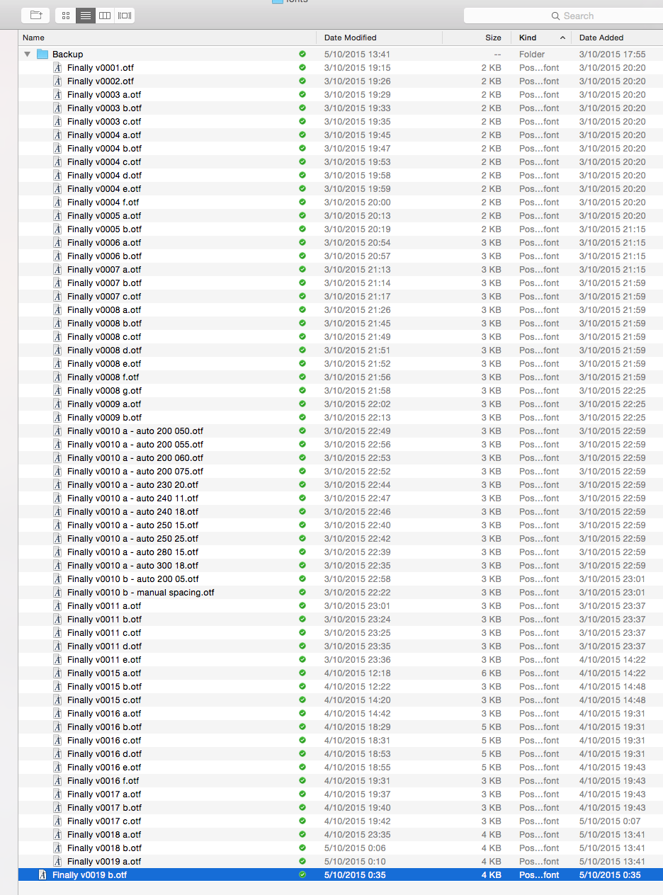
I export my working fonts basically after any small change, and drop it on the tools section to confirm if the change was good or bad. I rename the fonts, adding and ending suffix, like "-v0001a" "-v0001b" "-v0001c" "-v0001d" etc... once the change or the letter is good to go, and I move to another letter, I keep renaming as "-v0002a" "-v0002b" "-v0002c" and so on.
By renaming, it enables me drop both, the before and after version on the Testing page, and switch quickly between the 2 or 3 options I'm reviewing each time.
This is how the folder where I generate my testing fonts usually looks like:
7 -
I've lost count of how many times I've had to redraw scaled/transformed glyphs or newly interpolated and adjusted instances, or masters, including delicate hairline styles.“Behind every beautiful thing, there's some kind of pain.” ― Bob Dylan3
-
Honestly, all the typefaces mentioned so far have little relation to Garamond.
It depends what one considers “essence”.
“Eau” is focused on skeletal form, but stress, contrast and serif style are equally significant markers of “Garamond”. I designed the monoline Bodoni Egyptian as an alternative to the notion that fundamentally Bodoni = High Contrast, because I felt that Giambattista’s letter shapes were also quite distinctive in their own right, but I don’t see the traditional equation being replaced any time soon! Same for “Garamond”, which is similarly tied to a particular kind of pen nib that profoundly informs its character. This is apparent in the /a, which, as has been pointed out, clutters up in a monoline weight of any substantial heft—this letter shape, as originally conceived, is quite dependent on the thin aspect of the broad nib.At any rate, I think Legacy captures a lot of the essence of “Garamond”, in a way that a more reductive sans does not—even with angled terminals on the extenders. Which is not to say that a skeletally reductive version isn’t worthwhile, but it’s no Holy Grail.1
Categories
- All Categories
- 46 Introductions
- 3.9K Typeface Design
- 489 Type Design Critiques
- 572 Type Design Software
- 1.1K Type Design Technique & Theory
- 664 Type Business
- 877 Font Technology
- 29 Punchcutting
- 530 Typography
- 121 Type Education
- 328 Type History
- 81 Type Resources
- 111 Lettering and Calligraphy
- 32 Lettering Critiques
- 79 Lettering Technique & Theory
- 562 Announcements
- 97 Events
- 116 Job Postings
- 169 Type Releases
- 179 Miscellaneous News
- 269 About TypeDrawers
- 53 TypeDrawers Announcements
- 114 Suggestions and Bug Reports


