Eau de Garamond — a sans distilled from the essence of Garamond
Comments
-
Thanks for the feedback, Samuil and Craig!
Yeah, the /җ was beleaguered by a rogue /__descender-cy.tail. I've made a radical change to /б; better? Also tweaked /tse, /ү, /ю, /ї slightly.
Samuil: Here's the /dje-cy. Are you sure about the flamboyant tails? They strike me as rather gentle in the Light. See below for a context setting.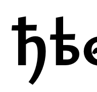
Craig: It would feel weird to make the /y's tail lighter than the other descenders, and likewise I don't want to fatten its waist any more than necessary (especially not the weak diagonal!). I don't mind the tapered shape that much, since it echoes the ball terminal of the Garamond /y.

0 -
Note that ії is a very common ending in Ukrainian. One should design the /yi accordingly.
0 -
The new /be doesn't look bad, but try setting бббб6б6б6бб66б6б6бб6б6б666б6б6б in Eau. Otherwise the text looks fine, or maybe I should put my glasses on.
0 -
Samuil: I seriously hope this is an artificial exercise and not some common usage.


Kent: Does this work? I'm loathe to make the /dieresis.narrow narrower than that, or it will become unreadable at text sizes. I did make a ligature for /ïï, though, which I'm told is a common pronoun in Ukrainian.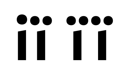
I don't suppose a vertically stacked /ï would be legible?
0 -
I couldn’t say with any authority, as I am not a Ukrainian speaker. I was thinking less about the width of the dieresis and more about the vertical placement.
Personally, I have taken to placing the dieresis in line with the dotaccent (and thus the tittle) in my own work.
0 -
Wouldn't that make it even harder to reconcile in such colliding pairs, though? Maybe the vertical offset actually helps legibility.Kent Lew said:Personally, I have taken to placing the dieresis in line with the dotaccent (and thus the tittle) in my own work.
0 -
@Christian Thalmann I don't think there's a single word that contains їі other than їі itself.
0 -
Samuil: We've been talking about /iï and /ïï, not /ïi...

BTW, upon request from typografie.info, I've added a footed ell to the Infant cut. I didn't expect to like it, but I do.
0 -
You can fudge the roundness of /dieresis.narrow's dots a bit without it being noticeable.0
-
Maybe the vertical offset actually helps legibility.That would be a reasonable question.
But in Finnish, for instance, I do know that native readers prefer dieresis aligned with tittle (or so a Finnish magazine art director has told me). Whether it is a matter of legibility or aesthetics, I couldn’t say.
Personally I prefer this (Ukrainian and Kashubian examples):
over this:
But now I fear I’ve inadvertently derailed your thread. I only wanted to call your attention to the combination for your full consideration, however you choose to resolve it. Carry on.
2 -
I'll have to think more about the dieresis issue... maybe a stylistic set would be in order.
Meanwhile, here's the Bulgarian and Macedonian/Serbian extrawurst. I do rather like the slant-cut tops of the Bulgarian, but I don't suppose I can import them into the default Cyrillic...

0 -
цшщ don't look Bulgarian to me. I would expect more of u/ɯ-like loopiness from them.
0 -
D'oh, you're right! I haven't been paying attention.
I also found that the previous Bulgarian з was too wide.
Corrected:
BTW, do I need to have Bulgarian-style glyphs for non-Bulgarian characters, like џ?
0 -
Depends upon whether you think that a) a Bulgarian user with text tagged as BGR would be likely to be using loan words from Macedonian, Serbian, et al., and b) whether that user would expect those loan words to have any non-Bulgarian letters appear in a Bulgarian-style Cyrillic. In which case, you would probably want to ask yourself the same questions regarding, for instance, Љ љ.
0 -
I now think that both versions of ы have their two parts spaced a bit too wide. I am also not sure about that Serbian б, its tail doesn't feel right, but I can't say why.0
-
Kent: Yeah, I guess it would open up a whole can of worms... I suppose I could ask my Bulgarian co-worker tomorrow, though.
Samuil: New ы below. Yes, I'm also rather unsatisfied with that Serbian б. It's a monstrous construction any way you slice it. The main problem might be that the arm starts out along the strong diagonal but has to be rather light in order to support the stressed horizontal and to play along with the crowded mess below... there's also not much space to do the elbow some proper justice. Do you have any suggestions on how to fix it...?
1 -
Um, I might already have found the solution for Serbian б thanks to a sneak peek at Candara Bold's solution:

0 -
When I see the dots on the /i and /ї which are at different heights, it looks so strange to me in lowercase.
Old Theard
0 -
The old thread sounds rather undecided.
I tried raising the dieresis to /i-level, but it looked really weird for letters like /ä in the Light cut. As a compromise, I've made an exception for the dieresis in /yi-cy: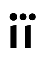
0 -
Cyrillic smallcaps finished — and that should conclude the character set for the time being.
 It's up on GitHub.
I certainly need to spend more time polishing the Roman, but for now I feel like starting with the Italics. Maybe the outstanding polishing work will make for a good incentive for Google to fund me to complete the family next year.
0 -
Hmmm, EB Garamond has a whopping 17° of slant in the caps (and more like 21° in the x-high lowercase). If I do the same in Eau, it looks almost comically extreme. I've taken a look at Proza Libre and Alegreya Sans, and they both only have 7° of slant in the Italics.
Below are two test examples from Eau with 16°, 12°, and 8° slants. I'm currently leaning toward 12°. The 16° is just goofy, and 8° strikes me as too upright to look like an italic Garamond.
0 -
I'm with you, 12° looks just right.
BTW, I really like this font!2 -
I'd be tempted to push it towards the eccentric extreme, if only to distinguish this from existing fonts. But I'd imagine that monoline structure plus extreme slope might equal some difficult situations with acute angles. Maybe distinction might come from a Garamondian lively variety of slopes instead.3
-
Yeah; I'm a bit worried that the Italic might look too busy with all those on- and offstrokes if they're folded too tightly on each other.Craig Eliason said:I'd be tempted to push it towards the eccentric extreme, if only to distinguish this from existing fonts. But I'd imagine that monoline structure plus extreme slope might equal some difficult situations with acute angles.Maybe distinction might come from a Garamondian lively variety of slopes instead.
I'm not quite sure how closely I'll follow that particular aspect... it's certainly very Garamondian, but I also find it a bit messy to behold. Maybe if I tone it down a bit to match the reduced slant...?
BTW, what has that Garamond Italic /A been smoking?! Does it look like that in all Garamonds...?
I'm thinking of using that super-slanted /A for mixed case and setting it more upright when preceded by a capital.
0 -
Alright, here's my progress on the Italic caps so far. The only ones that deviate significantly from the Romans are the super-slanted /A (with a more upright all-caps alternate) and the /Q, which I find rather freakish-looking (but which is modeled after EB Garamond's /Q). I'll have to offer a saner /Q as an alternate, or perhaps even as the default cut.

Garamond also has a rather weird Italic /M, but I ignored that for the time being.
0 -
@Christian Thalmann
Any update?0 -
Sorry, no. With the start of the new school semester, my free time has dwindled dramatically. Expect progress to be much slower until next year. What little time I've had for type design recently has gone into the completion and improvement of the Cyrillic coverage of Cormorant under Alexei Vanyashin's guidance as per Google's request, which is still ongoing.
I'm still hoping next year @Dave Crossland might help ensure I have more time to work on Eau. 2 -
@Christian Thalmann, have you done anything beyond expanding the glyph set and adding a teardrop-terminated /U-cy? I want to see your take on the famous Abkhaz Ҩҩ, the
 of expanded Cyrillic.
2 -
Hi Samuil,
the Ҩҩ is part of «expanding the glyph set». Here's my take in Cormorant:
0 -
Please, give it a try! The Garamond Italics are so peculiar, especially the /M.Christian Thalmann said:Garamond also has a rather weird Italic /M, but I ignored that for the time being.
0


Categories
- All Categories
- 47 Introductions
- 4K Typeface Design
- 493 Type Design Critiques
- 575 Type Design Software
- 1.1K Type Design Technique & Theory
- 669 Type Business
- 884 Font Technology
- 29 Punchcutting
- 537 Typography
- 124 Type Education
- 332 Type History
- 81 Type Resources
- 113 Lettering and Calligraphy
- 33 Lettering Critiques
- 80 Lettering Technique & Theory
- 569 Announcements
- 100 Events
- 116 Job Postings
- 170 Type Releases
- 182 Miscellaneous News
- 270 About TypeDrawers
- 54 TypeDrawers Announcements
- 114 Suggestions and Bug Reports