Eau de Garamond — a sans distilled from the essence of Garamond
Comments
-
Since I'm on vacation at the moment, I found some time to look at Eau Italics again. I've made some first steps with the lowercase, which I find very tricky to get right. How does this look for starters? Too scripty?


0 -
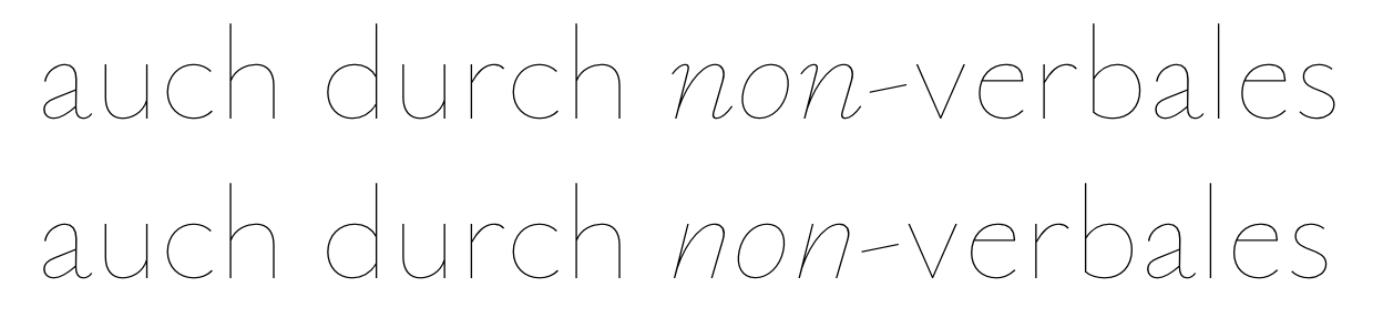
Those /n/'s ain't sans /n/'s!1
-
Do on- and offstrokes count as serifs...? I'm having trouble visualizing a Garamond Italic without those...
Meanwhile, I've reduced the contrast following feedback from Typografie.info:

0 -
Maybe like this, then...? Not sure I like it.


0 -
The curve of /n feels off when its on- and off-strokes are missing, its upper right bend feels forced.
0 -
Try just an out-stroke, without the in-stroke.
1 -
Random question did Typografie.info ever have an english forum?Christian Thalmann said:
Meanwhile, I've reduced the contrast following feedback from Typografie.info:
0 -
@Samuil Simonov: I see what you mean. I also prefer the visuals of the version with on-/offstrokes, but then again I'm worried that those might clash with the clean simplicity of the upright. Do you know of any true sans that has on-/offstrokes in the italics?
@Kent Lew: Tried that, hated it.
@Kayley Hill: Yes, it's called typography.guru .
0 -
Comparison of both approaches in the context of the upright. I find the scripty version rather jarring, much as I would prefer to prefer it.

2 -
I think you could reduce the slant a little.0
-
Jasper: It's already significantly less slanted than Garamond... I figure a certain impression of «wow, that's a lot of slant» is necessary to preserve the Garamond Italics feeling.
I made a few more letters to get a better feeling for the tailless Italics. Think I can get away with the inward-curled /h of Garamond...?


BTW, Typografie.info seems to prefer the scripty version with on- and offstrokes. I'm starting to think I'll have to offer both...
0 -
I think monoline makes that /h/ structure really hard to read as an h. In the modulated original the little flick at the end is clearly just a little flick, but with your modulated letter it appears to be a more meaningful bend of the stroke.
If it's going to work I think it might have to be more subtle.
I wonder if having it dip a little below the baseline would make the flick seem less integral to the letter.2 -
Craig, I see what you mean. I tried to make the bend a bit more localized now. Dipping below the baseline looked unnatural, though. I figure I'll offer an /n-shaped /h in SS02 at any rate.
I've made some «sans squiggle», «semi squiggle» and «squiggle» versions of a few italic letters for comparison in context:
Unlike my first attempt (that I didn't show), this version of «semi squiggle» (as @Kent Lew suggested) seems to work rather well. The «sans squiggle» feels a bit harsh to my eyes, which the outstrokes of the semi alleviate. The full squiggle, then, feels a bit messy compared to the semi, but it doesn't work half bad either, IMHO.
The same goes for small sizes, though perhaps I find the full squiggle more harmonious here than at large sizes:
0 -
Semi squiggle is the way to go, IMO.
(That in itself helps make the /h/ work (in addition to your helpful tweaking).)1 -
Christian Thalmann said:@Kayley Hill: Yes, it's called typography.guru .
For some reason I thought there was another site. Was Typografie.info the type forum that was down for ages?
EDIT: I just realised I was thinking of Typophile... My mind was muddled.
0 -
-
Tittle looks too big to me, but I think you're on a great path.
0 -
Agreed. And shouldn't the tittle be slanted? c and o could use a little more slant, and r seems too thick at the end.0
-
And shouldn't the tittle be slanted?
Dunno, should it? I rather like symmetric tittles in a typeface that aims at a monolinear feel.
Lightened /r and tittle; added more slant to /c and a bit less so to /o. There's also the new /h with a more pronounced vertical trend in the right stem, as was suggested on T.info. Less pretty than the previous curl, but I guess more legible.
 0
0 -
Going that way it feels like the /h/ terminal should bear more relation to the outstrokes of /i/ etc. (in terms of amount of contrast at least).1
-
Maybe you could have the terminal in h end in south-west direction (instead of horizontal), and make it thin like the terminal of n?0
-
I'm a bit wary to thin the terminal too much, since the stroke direction is taking it past the thin diagonal and back into thickening territory (which is why it gets a drop terminal in Garamond). But I guess I could give it a try.
Jasper, I tried a diagonal curl before and didn't like it; it broke the consistency of the baseline...
I'm not too fond of that current /h, though, it's awfully boxy. Maybe thinning the terminal would help against that.
0 -
Alright, after more prodding, I've finally worked on a diagonal terminal for /h long enough to make it sort of work. Looking back at the hook-footed /h I had before, it looks rather weird to me, so I guess it's the right direction forward.


0 -
What are your proportions based off? The x-height looks quite short compared to the caps. Re: Syntax: I definitely prefer your version of this experiment, particularly the lowercase a.1
-
New h looks better to me, but could be a tiny bit more 'horizontal' I think.0
-
Elizabeth: Glad you like it! As for proportions, I believe I started with those of Cormorant (which in turn strives for the Garamond essence as well) and then toned down the ascender height a bit. The x-height looks small compared to typical sans expectations, yes, but it is an essential part of the Garamond look. (I consider ITC Garamond a travesty...)
Jasper: I'll give it a try, thanks.
Meanwhile, more letters, including the /h.ss02:
0 -
This is looking great! They reminded me of Lion, the old Peugeot custom font http://www.zecraft.com/fonts/lion-peugeot/ I always loved that one. Witch in turn reminded me of https://www.myfonts.com/fonts/berthold/avantis-bq/
2 -
/g/ ear may be a bit too skinny. I still think tittles are too big and round. Bowl shapes are all excellent. Some tougher letters coming up, looking forward to seeing them!2
-
First full lowercase. I tried out a slanted tittle this time, but I'm not sure I prefer it over the circle.


1 -
I like the tittles. /k/ could be wider. /x/ looks stiff.0


Categories
- All Categories
- 47 Introductions
- 4K Typeface Design
- 495 Type Design Critiques
- 577 Type Design Software
- 1.1K Type Design Technique & Theory
- 670 Type Business
- 885 Font Technology
- 29 Punchcutting
- 539 Typography
- 125 Type Education
- 333 Type History
- 81 Type Resources
- 113 Lettering and Calligraphy
- 33 Lettering Critiques
- 80 Lettering Technique & Theory
- 569 Announcements
- 100 Events
- 116 Job Postings
- 170 Type Releases
- 182 Miscellaneous News
- 270 About TypeDrawers
- 54 TypeDrawers Announcements
- 114 Suggestions and Bug Reports