Paramond — an extreme display serif
Comments
-
@ Craig: I find the small apertures and overlong extenders in line with the «stainless steel murderspider» style of the typeface (so named by Orthoxerox), I'd rather keep them that way. There's always lining figures (or the small caps figures!) for people with more conservative tastes. ;o)
I tried putting a right serif on /four, but I don't like the result much. The serif clashes with the unserifed vestigial descender, and putting a serif on that too would presumably be too many serifs... the /four is probably the least Roman figure of all, what with its hovering base and uncategorizable semi-extenders. I feel like those stroke ends are almost serifs in and of themselves (a bit like the spikes of Д?) rather than stems and crossbars.
Is this /eight.lf better? And I lowered the bowl on /five.lf, which was long overdue.
@ Frode: I agree that the two kinds of numerals have very different requirements in terms of stability and leg room. Lining figures are more like pillars or bricks holding up a common roof, whereas oldstyle figures are like birds on a power line. I can see how serifs can help with the former, though the figures in question (2, 3) would never have horizontal serifs. I actually had trouble making the serifs as they were heavy enough to work in the Bold without breaking the top curve. Now that the serif is gone, I just made the curve itself heavier, which I think does a good job at holding up the roof.
The /nine is actually already different from a flipped /six. I found just flipping the /six turned its smile into a frown. I've now also reduced the size of its counter a little bit (it didn't need much).

0 -
Hmm, would the previous unbalanced counters be more in keeping with the typeface concept? (Compare letters like /A/R/G/)Christian Thalmann said:And I lowered the bowl on /five.lf, which was long overdue.
That eight.lf is better but there's still something wonky especially about that lower left part. Maybe its extrema need to be raised, and/or it should hit the join at a slightly flatter angle?0 -
Hmm, would the previous unbalanced counters be more in keeping with the typeface concept? (Compare letters like /A/R/G/)
The unbalanced counters are a tricky beast, and I found much fewer places to apply the concept than I had intended originally, simply because it's so easy to break the glyph's credibility that way. I'd rather have a /five.lf that I can take seriously than another opportunity to apply that principle. (Also, the principle is to tend toward undersized counters; in the case of the /five.lf, the bowl is what I perceive as the «counter», and it was oversized.)
I have been tempted every now and then to start a spin-off typeface that exaggerates these disproportions in the style of FF Oneleigh, but that would be a different beast entirely.
I'll have another look at the /eight.lf.
0 -
Hmmm, made some tiny adjustments, but I can't figure out a way to go from here without making it look worse...

0 -
I've been surprised how many things I still found to correct and improve in this week alone. I wonder what the typeface will look like in ten years.Frode Bo Helland said:It will come with experience, but it takes time to develop sensibility for the details in type. Magically being able to solve problems just from reading a comment on a web forum is the rare occurence. More often than not, one will start noticing new issues with those “solved” shape when looking closer. (Although this weekend's release will probably stay on Google Fonts for a long time; I hear it's hard to get an update through...)
BTW, deadline has been extended to Monday.
0 -
Everyone complains about /S/ but an eight is even harder to get right!Christian Thalmann said:Hmmm, made some tiny adjustments, but I can't figure out a way to go from here without making it look worse...
An issue I see here is that the spine seems to thicken as it just starts to bend coming down at the lower right. (and maybe, but to a lesser extent, as it starts to bend going up at the upper left). The stroke should be (optically) thickest in the diagonal center part.
I don't think you're that far off here though.2 -
I see what you mean... better?

BTW, Orthoxerox on GitHub has convinced me to change my cursive /de-cy so as to make the ascender an integral part of the right side of the bowl and to start downward rather than upward:
Looks sensible to me. @Alexander Stetsiuk?
1 -
I agree with you.0
-
Congratulations on the release of Cormorant, Christian. It was nice of Google to redesign their font presentation to show off the beauty of this family.
") 3
3 -
Congrats, Christian! Cormorant Garamond looks splendid on Google Fonts. But it looks like I should've tested the Unicase cut for you as well: /em and /te are /m and /t, respectively. Not that anyone would use Unicase for Cyrillic, of course, but still...
0 -
It's based on a known problem of Glyph (that Georg won't acknowledge as a problem...). But yes, the Unicase font is not meant for Cyrillic.
https://forum.glyphsapp.com/t/exporting-spin-off-instances-sc-ss01-etc/2793/42
0 -
Georg fixed the problem now, but I guess the Google version will remain frozen like that for a long while...
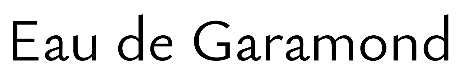
BTW, now that I've gained some more experience, perhaps it's time to revisit my old Eau de Garamond project...?
0 -
Tried out a few more weights... I was going to keep this optically monolinear, but it just wouldn't look right in the heavier weights. On the other hand, maybe I'm stepping too much on Proza's toes like this...?

LOL, even the extrapolation into Black territory looks like it could be salvageable with just a few tweaks...
0 -
Making a sans Garalde is nobody's personal property. But you might still want to emulate Farey...
0 -
Only the thin looks interesting to me. The value of the structure of those letters is in their elegance, which is enhanced by the thin weight and compromised by both heavy weight and monolinearity.1
-
Craig, I think I see what you mean. I do like the Hairline best as well. I still rather like the Regular, though. The Semibold starts to fall apart a bit (the /a in particular; I'm almost getting a bit of a Stone Sans vibe there...), and the Black is of course nowhere near finished.
My original plan for Eau de Garamond (several years ago) was to stick to monolinear weights and restrict the spectrum to Hairline—Light. However, I'm wondering whether there's any market for such a family; it would be extremely limited in scope.«...compromised by both heavy weight and monolinearity.»
The Hairline is monolinear, though... do you mean the enforced monolinearity of the heavier weights? I already gave them some contrast since it looked extremely crude in optical monoline. Do you think the heavies might be salvageable with more contrast...?
0 -
Yes, I meant the monolinearity in heavier weights.
Yes, the heavies might be made workable with more contrast, but my opinion is that they will necessarily be much less interesting than the skinnies.
But don't let me deter you from further working through the idea!0 -
Trying out some high-contrast heavies for comparison. I rather like the look, but it has very little to do with what the Hairline is trying to achieve...


And a rough extrapolation of what the Black might look like...
1 -
And please don't fall for that emerging trend that says each weight should just do its own thing.
0 -
Craig: Even if I stick to the superlight end of the spectrum, I still need a weight spread to accommodate different optical sizes, right...? And even then, the uses would be restricted to some extremely narrow cases.
Hrant: I think there can certainly be a transition between a mono hairline and a highly contrasted Bold that makes conceptual sense. Frode's Vinter is a great example (although the Thin is not perfectly monolinear).
In fact, this is what I get when I sample my interpolation close to the monolinear. It reminds me a lot of Vinter, and I like it.
3 -
Chris, maybe you can make a math version, simply call it Cormorant Math.
However you have to add Greeks first...0 -
You mean like for LaTeX or the MS equation editor? I don't think that fits the display flavor of the family, and I wouldn't even know how to do it.
Greek, on the other hand, might be worth a try, if only as a learning experience... I wonder if Google might be interested to support the expansion? ;o)
Now that I've made my first Armenian typeface, I wonder whether I should add that to Cormorant... It would actually be easier to accommodate than Greek, since it doesn't require a total rethinking of the stroke philosophy...0 -
I don't think you need to worry about stepping on Proza's toes
")
I like the text-version (with some contrast), but I think a Black would need more contrast. The high-contrast variant for me becomes problematic the darker it gets, because the ends of thin strokes lack serifs to beef them up. In Proza Display, I added serif-like structures, but Sowersby did something similar to what your doing in Domaine Sans Display. personally, I think you shouldn't go too dark in a high-contrast variant like that, but that's just me.0 -
Hi Jasper,
I don't think you need to worry about stepping on Proza's toes
Hah, yeah, I should rather worry about being accidentally crushed beneath Proza's toes.
Don't take the Blacks seriously yet, they're extrapolated from the Medium master I've drawn, so they're really just rough sketches rather than anything else. I would certainly introduce a third master (Heavy) and open up those apertures and thin the joins if I were to pursue that parameter space. I agree that the thins in /E become very weak in comparison with the strong stems; I would probably add flaring in the Heavy master to compensate for that.
I'm now torn between different strategies:- Stick to the monolinears and just produce a range of different stroke widths, from Thin to I-Can't-Believe-It's-Not-White, sort of like what the Line family is doing.
- Expand into Medium weights (perhaps up to Heavy with a third master on the long run) with a moderate-contrast philosophy. This would yield intermediate weights comparable in style with Proza, Gill Sans etc. and remain relatively faithful to the Hairline. Judging from the experiments above, though, those would run the danger of ending up rather uninspired.
- Expand into Medium weights (perhaps up to Heavy with a third master on the long run) with a high-contrast philosophy. I think the experiments above look more interesting here, potentially even glamorous, but the problem is that the Hairline will feel rather isolated whereas the majority of the weights will do something else entirely...
- Mix (2.) and (3.) by keeping the range from Hairline to Medium rather low-contrast and then moving to high contrast for the heavier weights? That might make the family feel very disjoint, though, and I'd miss out on the Vinter-style high-contrast Thin that I really like.
- Do both (2.) and (3.) by adding a contrast axis to the family. I'd need one Hairline Master and two Medium masters, and perhaps also two Heavy masters (though perhaps one Heavy master might be enough, since a contrastless Heavy would look really crude). Downside: Preposterous amount of work. Did I mention I'd want proper Garamond-style Italics as well...?
0 -
Just note that the more texty a font, the more the Armenian needs to snap away from the Latin's vertical proportions. Then there's italics...
0 -
"Mix (2.) and (3.)" When I started out with Proza, I was overambitious and actually wanted to do something like that, creating a superfamily of different weights and 5 different degrees of contrast. I'm glad I didn't go through with it. Better to focus on one of the two, and keep the other as a possibility for later. If I were you, I'd focus on either the moderate or zero contrast design. A high-contrast sans-serif can teach you a lot, but is extremely hard to get right.1
-
Jasper, I agree that starting out with a superfamily in mind is probably a recipe for disaster (or at least an early forfeit).
I'll try out a moderate-contrast design between the two previous takes to see what it would look like. I think a zero-contrast design will never work, unless I stick to weights of 20 units or less...
I can see that a high-contrast sans comes with its share of challenges, but I'm not seeing any showstoppers at this point... in fact, among the quick demo samples I showed earlier, the high-contrast ones felt quite compelling to me out of the box, whereas the low-contrast ones strike me as crude and uninspired. (Come to think of it, most of my previous typefaces are high-contrast designs, so maybe I'm predisposed.)
I also agree with you that the visual quality drops with increasing weight, and that it's probably a good idea to drop the Black weight (unless it came with some drastic reshaping, as with Bély Display...?). Even in Proza, I find the lightest weights have a distinguished rhythm and elegance that diminishes somewhat in the heavies (presumably by sheer inevitability).
0 -
This might relate to something potentially big that hit me recently:Christian Thalmann said:Even in Proza, I find the lightest weights have a distinguished rhythm and elegance that diminishes somewhat in the heavies (presumably by sheer inevitability).
0 -
Experimenting with contrast grades. For some reason, the highest and lowest contrasts feel the most coherent to me in this view. However, when I see the lowest-contrast sample in isolation, it looks crude to me.
I don't actually mind the white color of the high-contrast /E much. Tabac Glam pulls it off successfully, too. I tried flaring the horizontals a little in the heavy weights, but then the whole /E starts to look sad. 0
0 -
She's your baby. If the high-contrast version looks better to you, just go with it.0


Categories
- All Categories
- 47 Introductions
- 4K Typeface Design
- 495 Type Design Critiques
- 577 Type Design Software
- 1.1K Type Design Technique & Theory
- 672 Type Business
- 885 Font Technology
- 29 Punchcutting
- 540 Typography
- 125 Type Education
- 333 Type History
- 82 Type Resources
- 113 Lettering and Calligraphy
- 33 Lettering Critiques
- 80 Lettering Technique & Theory
- 569 Announcements
- 100 Events
- 116 Job Postings
- 170 Type Releases
- 182 Miscellaneous News
- 270 About TypeDrawers
- 54 TypeDrawers Announcements
- 114 Suggestions and Bug Reports