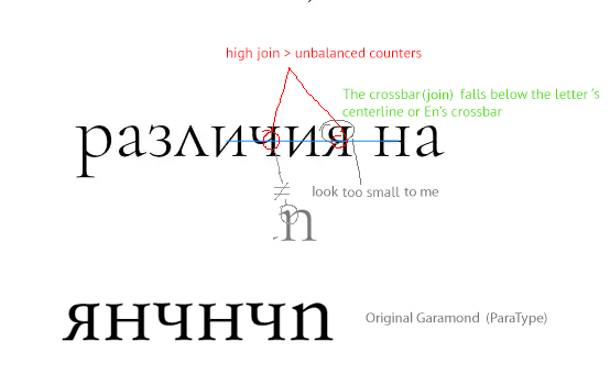
Paramond — an extreme display serif
Comments
-
That new /a.ss02 could be a touch wider I think.1
-
True. I thought Garamond /a's were very narrow as a rule, but apparently not more so than my default /a. Alright, then:

Any ideas on making tiny-eyed /g work?
0 -
Your post on 10/8 that starts "Actually, looking at it again..." had a promising, smaller-eyed /g/ IMO.
I wonder if making the loop an open counter would afford you some flexibility to get the proportions working. Just a thought.1 -
Yeah, I liked that one, too. It combines the functionality of the horizontal foot with some of the intended elegance of the original designs. I'll consider basing the default /g off of that, and keeping the Garamondy one for SS02. Let's see where it's going.
I'm also wondering whether it might be worthwhile to export SS02 as a pre-composed font. I already have too many fonts as-is, though... then again, maybe I should offer a basic pack with, like, 15 fonts (Roman, Italic, SC), and an expert pack with all of them.
0 -
This would be the status quo of the default and SS02 styles, then:
Default:
SS02:
As for an open-tailed design, I just tried out this here, and I like it more than I should. Though I can't imagine it as part of the default style. Maybe I can combine it with the connection-less /Q design and expand it into a style with several other «opened» glyphs...?
And while we're at it: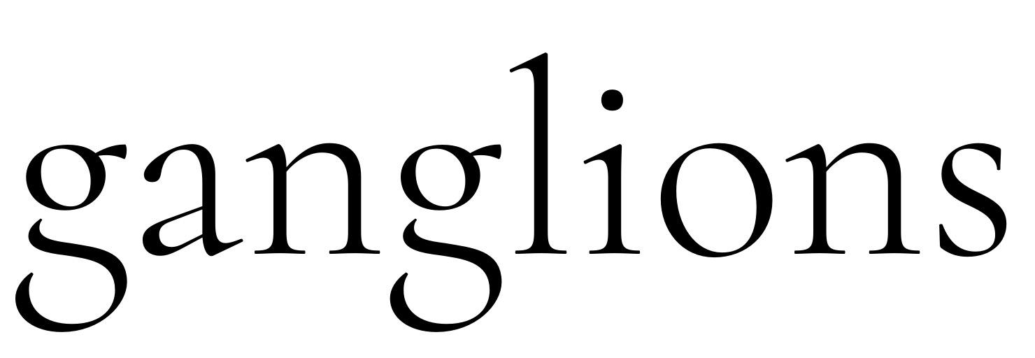
1 -
U+9D41(鵁, simpl. 䴔 U+4D14) is used in the ancient name of Ardeola bacchus, a kind of bird.Christian Thalmann said:Incidentally, the typeface now supports one Han character: uni9D41 "Fishing Cormorant". I'm not sure how legible it is, though — any Chinese experts here to comment? ;o)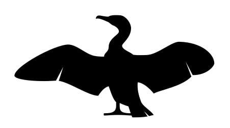 0
0 -
Given that the glyph's name is «The Fishing Cormorant», I figured it used to refer to either the practice of cormorant fishing, or to one of the species used for this purpose. Judging from Wikipedia, neither of these terms use the glyph 鵁... In any case, cormorant fishing looks pretty painful for the birds involved, so maybe it's better if I don't advertise it.
In any case, I have been dissuaded from using the unicode point of 鵁 for a glyph that is not actually a legible 鵁. I have now made the cormorant icon a stylistic alternate of the floral heart, ❦, whose purpose is presumably just to be black and pretty, so that should work just fine. The cormorant is also the default shape for the floral heart in the Cormorant Infant series.
1 -
By the way, I'm thinking of adding a «Cormorant Garamond» series of spin-off fonts that has SS02 activated by default. It would bloat my font package from 35 to 45 fonts, but I guess I could offer an «essentials» distribution with only the default cuts for people who don't need all those options.
EDIT: Yep, Cormorant Garamond is now available as part of release v0.8.
1 -
Alright, I've just released the first official full version of Cormorant! Thanks for all the help and feedback!

https://github.com/CatharsisFonts/Cormorant/releases/tag/v2.0
This is not to say that I wouldn't welcome more help and feedback from now on. I certainly intend to keep honing Cormorant in the future!
1 -
I got some more feedback from Orthoxerox on the Cyrillic via the issues tracker on GitHub. In response, I've now made a number of alternates that are available in SS02 and in the «Garamond» cuts. They use triangular bodies for /Д/Л and a serifless apex design for /И. This should make the whole Cyrillic set look more Garamond-esque.
I also changed the Cyrillic breves to have vertical stress and to distringuish case.
2 -
By the way, it looks like Google Fonts is finally ready to ingest the Cormorant family. I have until the coming Friday to roll out a final issue. Last chance for bug reports and requests!
2 -
I saw you added anchors to some letters, why don't you add them to other Latin ones?
ps. How about Greek?1 -
Hm, I suppose I could Cmd-U the whole font to add the missing anchors, if that's useful.
As I've argued on GitHub, Greek has such a different design philosophy that I don't think I can reconcile it with Cormorant's laser-cut stiletto serifs. If you want to propose a design, I'd be happy to take a look...
0 -
Wow.. very nice process, btw, I really like the idea of tiny counters, even this are untraditional details on garamond face, may be some people don't see this project as display and judge it as traditional 'reading' at book sizes typeface, many times some issues with a specific glyphs (e.g your controvertial 'g' which I really like the early innovative version) can solved with specific 'calt' arrangements.
I also agree with the idea to offer a "traditional version" and "your own version" as separate options.
Sometimes, design solution could be viewed from a more global perspective or an openmind mood.. some troubles and solutions are not always in just one glyph but in the group.
0 -
-
-
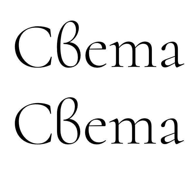
Trying to wrap my head around Bulgarian /ve. Is the bottom version better? It certainly looks more «Roman» to me. I'm keeping the Italic version round.
0 -
The bottom version is better yes0
-
I'm not Bulgarian expert, I aesthetically prefer the first 've', but native Bulgarian people have more authority on this matter than anyone else.1
-
The straight back merging into two curves looked weird. I made a version with a continuously curved back that looks straighter than the previous one. This no longer feels that much out of place among the Roman letters.

1 -
I gave the infant /a and related shapes a much-needed overhaul (bottom line is new):

2 -
I like your Bulgarian 've' even more now...0
-
Even more overhauling of the teardrop characters. I've made /q different from /a/g again (but analogous to /b) and made both /b/q smoother. Only /p still has a broken joint, since the stem continues in both directions.
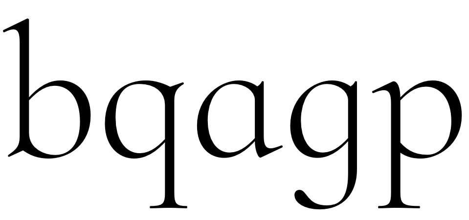
I can't believe I'm only now getting around to fixing these things...
1 -
Fixed another thing that's been bothering me for a while: those ungainly serifed heads of the lining figures. I'm tempted to keep the serifs on the oldstyle figures, though... whaddya think?

0 -
Think I like the serifed version better in both instances.0
-
-
I'd probably expect LFs to be more "serify" than OSFs, actually, rather than the other way around.1
-
Make a ss is betterChristian Thalmann said:Fixed another thing that's been bothering me for a while: those ungainly serifed heads of the lining figures. I'm tempted to keep the serifs on the oldstyle figures, though... whaddya think? 0
0 -
I can see the theoretical appeal of making lining figures «serify». In practice, though, I can't help but prefer my unserify ones. That also fits well with their use in Cormorant Infant, where the figure shapes should be as clean as possible. For the OSFs, serifs make sense to me because they occupy the same habitat as all the serifed lowercase letters.
My main beef with those figures was that they had something haphazard and impractical about them, as if they'd been designed in that phase where Latin typography was still experimenting with how to draw these newfangled Arabic numbers. I think that was due to the double bend in the /2 and the unnecessarily whimsical central join in /3. I've also made the beak of /1 larger (upon input from Typografie.info) and gave it yet more space — somehow that figure seems to soak up any sidebearing increase I throw at it and remain thirsty.

Overall, I feel the issue is finally taken care of.
0 -
Your old-style eight, while it has that character-full "offset" where the thins meet the thick, retains its balance well, I think because the white outside corners at those joins appear to be at the same height. The lining version is clunkier because it's higher on the left side.
This three juncture is definitely better. Revised two also.
Old-style three/five/six/nine extenders may be a bit too exaggerated in length?
Any thought of a serif on the right side of old-style four?0
Categories
- All Categories
- 46 Introductions
- 3.9K Typeface Design
- 489 Type Design Critiques
- 572 Type Design Software
- 1.1K Type Design Technique & Theory
- 664 Type Business
- 877 Font Technology
- 29 Punchcutting
- 530 Typography
- 121 Type Education
- 328 Type History
- 81 Type Resources
- 111 Lettering and Calligraphy
- 32 Lettering Critiques
- 79 Lettering Technique & Theory
- 562 Announcements
- 97 Events
- 116 Job Postings
- 169 Type Releases
- 179 Miscellaneous News
- 269 About TypeDrawers
- 53 TypeDrawers Announcements
- 114 Suggestions and Bug Reports


