Paramond — an extreme display serif
Comments
-
Attributes to consider while naming:
phase one: Sharp but slightly dulled (sharp display version of a dull typeface)
phase two: Flowing (calligraphy)
phase three: Old but a little modern (typeface and variant)
phase four: Memorable (well duh, you get more sales, because they will say "I like ___", not "I like that font where it is kinda like Garamond")
0 -
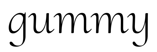
Alright, I've filled up Adobe Latin 4 for both weights and both styles. Actually, I've added the Upright Cursive as a third style... it's just a de-slanted and horizontally relaxed version of the Italic, but I think it has a nice voice of its own:

Let the finishing begin!
0 -
Very nice. You might consider a different structure on the upright cursive /y/ (one based on the /u/?)--I feel like that structure is an outcome of working with the slope that's no longer there. Maybe relax the descender of /f/ a little too?2
-
Thanks Craig!
I do have a script-style design for /g and /y, which are currently stowed away in .ss01. I figure I could promote them to the main style, though, allowing the Upright to differentiate itself more from the Roman.
What do you mean by relaxing the descender of /f? Allowing it to extend further backwards?
2 -
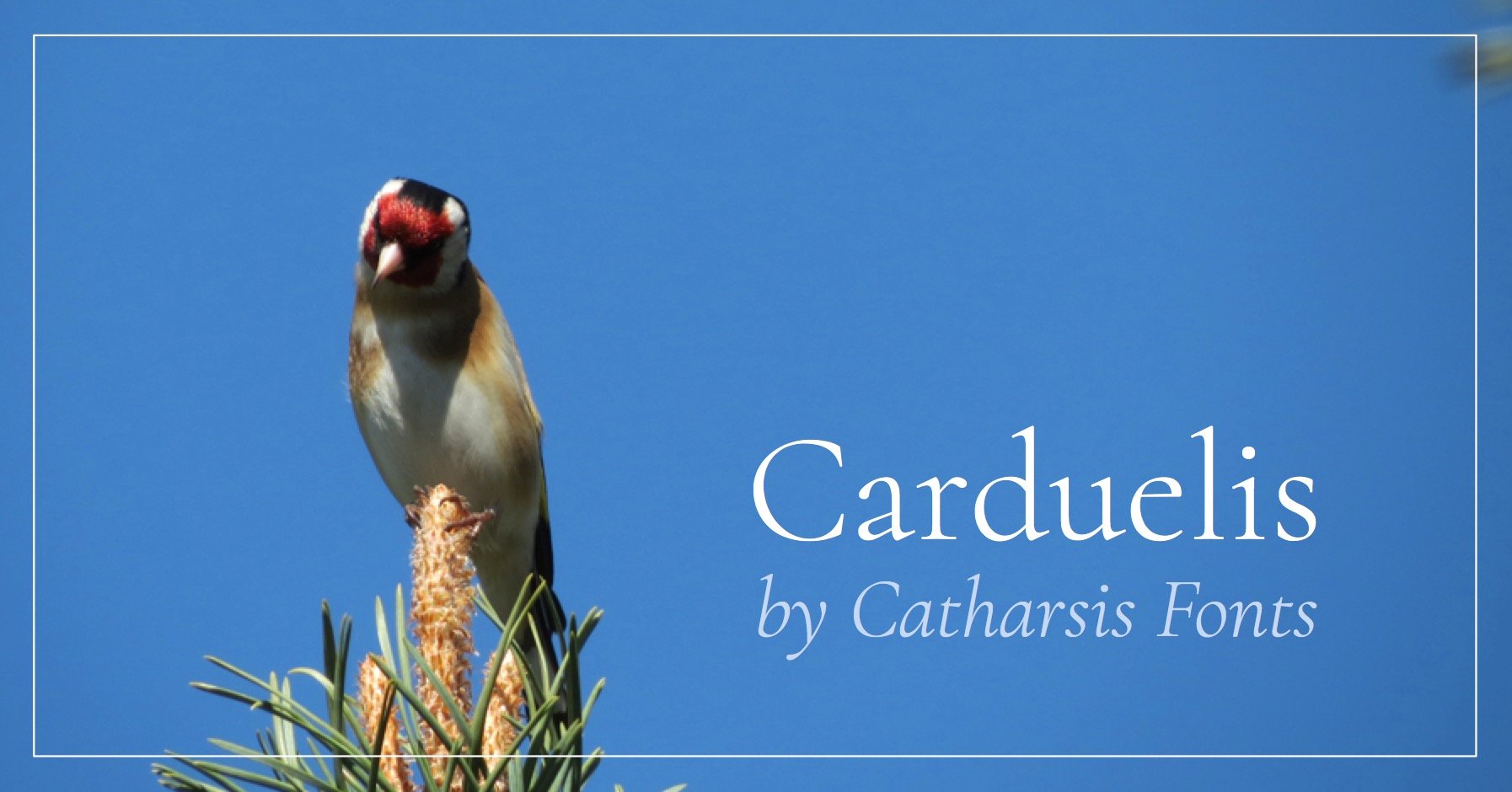
As for the name — do Alcedo (kingfisher) and Carduelis (goldfinch) sound too academic? I do like their appearance and their meaning. Both birds are strikingly beautiful, bear sharp high-contrast features, and are fraught with historical significance.
(I also happen to have some photos of them lying around. ;o)

0 -
Yes, on the /f/ I just meant not so tightly curled. But I could be wrong about that.
Alcedo is a nice name. Carduelis seems kind of easy to forget to me.0 -
I love bird names for typeface names, but consider common ones, not Latin. The drawback for both Alcedo and Carduelius is that many people will struggle to pronounce them, and the second one is tough to spell on the first try. Not good.0
-
I can see the problem with Carduelis (you misspelled it...), but surely Alcedo is not harder than other typical font names like Clavo, Richler, Neue Haas Grotesk etc...? ;o)
Would it help if I included a pronunciation guide on the minipage? I'm thinking of [æl'si:doʊ] for English usage, and the Classical Latin [al'ke:do:] for German...
I find the problem with common bird names is that they often don't sound name-like but rather very explicitly descriptive (like Kingfisher and Goldfinch). That, or they just sound plain stupid (like Tit or Chiffchaff). Any suggestions?
Heron, unfortunately, is taken. Its Latin form would be Ardea, how bad would that be...?
0 -
Craig: I wouldn't want to uncurl the bottom of the /f too much so as not to bump into previous descenders. I already have a ton of ligatures to take care of the ascender problem, that's quite enough... ;o)
0 -
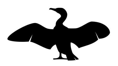
How about Cormorant?

Photo by JJ Harrison: https://de.wikipedia.org/wiki/Kormoran_(Art)#/media/File:Phalacrocorax_carbo_Vic.jpg
2 -
I dig it. Fits the slenderness and quality of curves, too.0
-
Yeah! Cormorant’s nice. Good word, good bird.0
-
Yep, go sea birds. Lots of them, all full of character!0
-
Incidentally, the typeface now supports one Han character: uni9D41 "Fishing Cormorant". I'm not sure how legible it is, though — any Chinese experts here to comment? ;o)

0 -
Alright, big news: Cormorant is now officially Open Source! Thanks to Dave Crossland for the incentive. ;o)
I put together a quick Bēhance page for publicity, and there's a GitHub page for the nitty-gritty stuff:
https://www.behance.net/gallery/28579883/Cormorant-an-open-source-display-font-family
https://github.com/CatharsisFonts/Cormorant
I mean to finalize the first official version of the family by mid-November at the latest. If you download it in the meantime, I'd be very grateful for your feedback. Please report any flaws or bugs you see. In particular, I've only tested the fonts on a Mac so far; I'd be interested to hear how it works on other platforms.
Cheers!
2 -
FYI "Spright" has been used! http://coopertype2012.com/spright0
-
Would anyone on a Windows machine be willing to spare a minute or two to help me test Cormorant? In particular, I need to check whether the automatic TrueType hinting works, which I believe is important for rendering on Windows but superseded by the system's own rendering philosophy on a Mac. (Is that correct?)
If you feel like it, please (1) download one of the TrueType font files from GitHub, ideally Cormorant Regular and/or Cormorant Upright Regular; (2) drag it onto Pablo Impallari's font testing page; and (3) post a screenshot of the bottom of the page Latin 1 > Hinting.
I figure the Regular is probably going to be the most used cut, whereas the Upright Regular has some not-quite-vertical stems and cursive-style terminals that I imagine are more difficult to autohint than the Regular.
This is what it looks like on my Retina Mac:
Cheers!
0 -
Christian, you can use Windows in your Mac, for free.
Get VirtualBox from https://www.virtualbox.org/ and any Windows version you want to test from http://dev.modern.ie/tools/vms/mac/ (I use IE11 Win 7)
3 -
A more easy solution for you would be to use browserstack's screenshot functionality. I use it all the time, and it works great! And, they sometimes give free accounts to opensource projects.
https://www.browserstack.com/screenshots
2 -
Thanks for the suggestions!
Jasper, that looks like a neat service. To see my font in Pablo's font testing page, though, I'd need to be able to drag it onto the interactive field at the top of the page. I don't think that can be done as part of the URL — or can it...?
Otherwise I suppose I'd need to set up a test website that links to my most recent TTF on GitHub...
0 -
Ahh well, yes that's true. I use a testpage myself and upload the new font files with dreamweaver, but I'm sure there are easier ways...
The advantage, though, is that you get to see your font in many different settings, as opposed to just a single browser on a single operating machine.0 -
Otherwise I suppose I'd need to set up a test website that links to my most recent TTF on GitHub...
I recommend branching from master to gh-pages and setting up an index.html that links to the TTFs in a stable way; such that the page always shows what is current.0 -
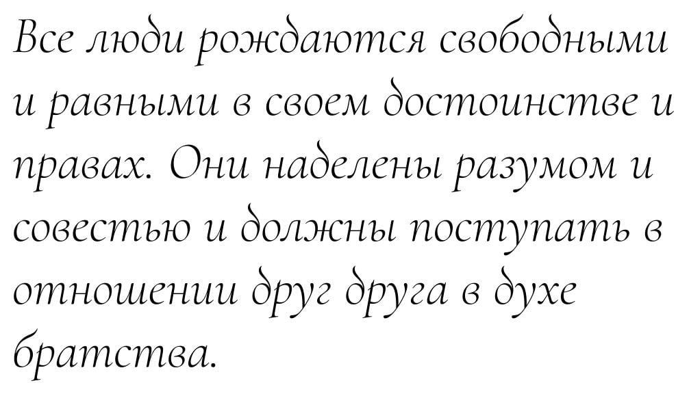
Meanwhile, I've done some brainstorming on a possible Cyrillic expansion. Does that look workable as a starting point? I'm sure the glyph widths and detailing will need some special attention, given that I'm not a native reader.

0 -
Completed a first version of a Cyrillic inventory, including italics, Serbian/Macedonian alts, and Bulgarian alts.

1 -
Damn, that's beautiful... and somehow it fits the fluid sound of Russian better than the Cyrillic shapes one usually sees. Not that I know much about Cyrillic, or Russian -- just the usual stuff you get from a graduate degree in literature. Maybe I've only heard highly cultured speakers? At any rate, this suits such language perfectly, being agile yet full of tensile strength. Just gorgeous.
In fact, that's my overall impression of Cormorant as a whole. Perfectly balanced and spaced, curves, err, perfectly harmonized. I especially appreciate how you've changed the usual balances between roman and italic: the roman is pointy and angular and the italic round; the roman feels more static (or at least dynamically normalizing -- push on the shapes and they'll spring back into place), and the italic fluid and dynamic (push on the shapes and they'll bounce forward). Just bloody beautiful, man. Mixing the two in a line of text gives a texture that feels like a Victorian garden: pointy spikes to keep out the riff-raff, with exuberant wildflowers of deceptive simplicity. Even some quaint and curious flowers (the upright italics) to add another layer.
1 -
I’m not sure you can get away with that return flare on the ascender of italic д (as pretty as it may seem). The я seems a little narrow to me. There may be a few other width/balance issues.
But I’ll leave it to native designers to comment more authoritatively.
0 -
Thanks Michael! ;o)
Kent: Do you mean because it might be confused with Serbian-style /be? I figured the diagonal motion was clear enough to make it unambiguous... or would there need to be an inward curl? I'll look into the /ia. Thanks!
0 -
My comment is based mostly on what I learned as the normative form for italic /de from Alexandra Korokolva. She specifically advises against this treatment.
See this post: http://leksandra.livejournal.com/115861.html
and in particular this image: http://ic.pics.livejournal.com/leksandra/2767058/49087/49087_original.jpg
Hers may not be the last word on the matter. Other native speakers will have to weigh in if they have different perspectives.
0 -
Good point. I had been looking at that site but had apparently overlooked that part... I suppose I'll change it, then.

0 -
Alright, I made a new version of cursive /de. I like it less, but I suppose legibility beats æsthetics.

0
Categories
- All Categories
- 46 Introductions
- 3.9K Typeface Design
- 489 Type Design Critiques
- 572 Type Design Software
- 1.1K Type Design Technique & Theory
- 663 Type Business
- 876 Font Technology
- 29 Punchcutting
- 530 Typography
- 121 Type Education
- 328 Type History
- 81 Type Resources
- 111 Lettering and Calligraphy
- 32 Lettering Critiques
- 79 Lettering Technique & Theory
- 561 Announcements
- 96 Events
- 116 Job Postings
- 169 Type Releases
- 179 Miscellaneous News
- 269 About TypeDrawers
- 53 TypeDrawers Announcements
- 114 Suggestions and Bug Reports


