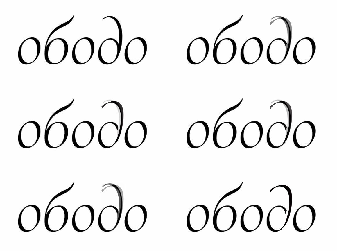
Paramond — an extreme display serif
Comments
-
-
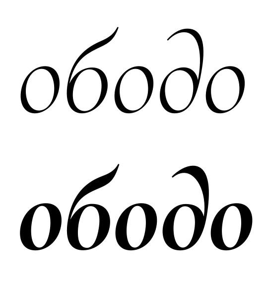
Thanks Alexander, that's very helpful indeed! Is is better now?
Edit: I added a contextual alternate to avoid collision in "Gde".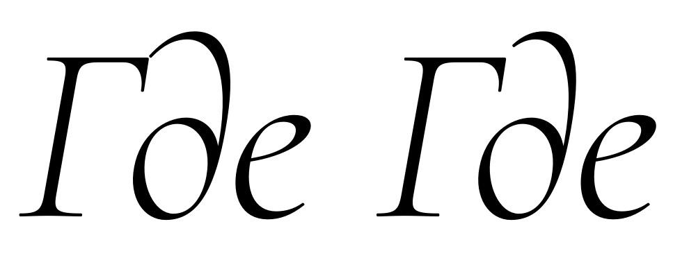
2 -
Very nice! I like how the /de stroke flares out.
Warning: I don't have enough experience of type design.
0 -
Awesome work! I really like this font. You made huge improvement.
0 -
Thanks! Andreas; an improvement over what?
Meanwhile, I've added small caps for the Cyrillic:
0 -
I finally revisited that ever-problematic /g. I can't believe I tolerated it for so long. I like the new one much better, although it no longer adheres to the «tiny counters» theme. In the end, though, I'd rather have a /g that works and that harmonizes with the other letters than one that looks original.

I also got rid of a slew of /g_y and /g_g_y ligatures (with various accents) just by decoupling the /y from the /v kerning class and adding some positive kerning between /g/y.
1 -
Similarly, I've finally promoted the deep, ball-footed /J to the primary style and rotated the humbler version to SS01. The dedicated all-caps version with its reduced tail is now implemented in CALT whenever /J follows or precedes a capital, even when the CASE environment is not triggered.

Although the default /J now strikes me as very deep indeed. It's currently the same descender depth as /g, but I suppose I could make it less deep?
0 -
Yes it could be less deep. It could also curl less (maybe something between what you have, and a teardrop added onto the SS01 version).0
-
Good idea! Is that better?

Now I'm starting to wonder whether I made the /g's eye too big this time...
1 -
Yes, I think that /J/ is working.
And yes, I feel like the eye of /g/ is somehow too round or big.1 -
I've finally freed myself from that downward diagonal and symmetrical bottom bowl and adopted a more Garamondesque design for /g. It looks a bit less relaxed than the previous design, but it fills the x-space more evenly and even behaves well in gemination.

1 -
I like the old g better. The top part could be a tiny bit bigger but the triangular loop fits better.1
-
Argh, you guys are not making this easy. ;o) At least if you're divided on the issue, it can't be blatantly wrong anymore.
I've made some corrections to the Garamondy /g, does that help sway you, Georg...? In the meantime, I'll see if I can make the triangular loop work better. That large void at the baseline on the right has just been bothering me for a while, though, and I do think the almost-horizontal plateau of the current version is amending that. Most serif fonts that I've seen recently do the same thing.

0 -
Relaxed the neck of /g just a bit; I think that was responsible for the slightly cramped feeling of the new design.

1 -
I like the top of the three versions. Only move the top bowl a bit to the right. All of the g’s seem to lean to the left.2
-
Looks like we'll just have to disagree on the designs, Georg... I feel the upward diagonal of the new design fits the theme of the face's on- and outstrokes much better, not to mention the superior use of x-space. I'll put the top version in a SS, though, either in the calligraphic SS01 or maybe a dedicated one.
I'll see about nudging the bowls for better centering. I don't see them as unbalanced at the moment, but maybe I can do better anyway.
0 -
Strange; there seems to be a majority building in favor of the old /g... whatever happened to this logic?
http://typedrawers.com/discussion/comment/10781/#Comment_10781
0 -
I vote for the old /g, maybe do a few variants with Georg's suggestions to see if addressing the left leaning balances better.0
-
-
Hi Frode,
I am bound by contract to release Cormorant soon (ideally mid-November), so waiting a year is currently not an option. However, as an open-source project, Cormorant is expected to continue evolving after its first release, so there's no reason not to revisit it in one or two years. If my future changes should affect the «identity-bearing» letters so much as to warrant a new identity, I could release the new version as Cormorant Pro.
Interesting point about small and large interior spaces. I've had a look at a few Garamonds for reference:
Garamond Premier Pro:
Sabon Next:
Adobe Garamond Pro: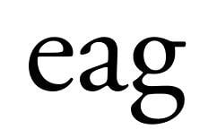
In all of these cases, the /a and especially the /e strike me as more open than the /g, but that might be partly due to the fully enclosed nature of /g's counters. It's true that the sizes of /a's bowl and /g's eye are more or less comparable.
I'm not sure how that would translate to Cormorant's design philosophy. I certainly don't want to increase the closed counters in /e and /a, since that's an identity-building part of the typeface. Then again, I don't know whether I can pull off a similarly tiny counter in /g without turning the letter into a parody of itself. A binocular /g is hard enough to pull off convincingly without such constraints. I have tried a tiny-eyed design (cf. early posts in this thread), but with very bad results. Making the «neck space» tiny would probably result in a cramped-looking glyph with bloated closed counters, out of place between the airy build of the other characters. And making the tail loop tiny would probably tear large holes into the x-space above it; a problem I've encountered before.
Do you have a suggestion on how such a design could be built? Maybe by exaggerating the tail with respect to the eye, Bodoni-style? That might look out of place in a Garalde.
EDIT: As for not confusing personal tastes with serious critique, yes, that's bound to be a problem at my level of expertise. At least my recent motion to change the /g is the result of a longer-term discontent I've been fermenting for months, so I'm pretty sure the motion is going in the right direction as far as my own design intentions go. I might still find a radically different solution that I like even better, of course.
0 -
Alexander: That's an interesting approach; I've seen such design work exceedingly well for modern serifs, even with a horizontal spike as the neck. I feel it's too experimental for a Garalde, though.
0 -
Huh, this looks kinda interesting, though... let's see where it leads.

0 -
Top half of that last one looks promising with regard to proportions fitting the typeface, but to me its bottom loop curves look too casual and contemporary.0
-
Hi Craig,
I'm also not happy with the new bottom; it's far from final. At least it tells me there is hope for making a tiny-eyed design work. My previous designs look bloated to me now in comparison.1 -
Actually, looking at it again after a few hours of diversion, I find the tiny-headed version comically absurd (Riesling, anyone?), whereas the previous version still works for me. I think I'll have to make the eyes somewhat larger than the /a/e counters at least. The Garamonds get away with it too, after all.
Here's a version with the previous tail design and an eye somewhere between the two extremes:
2 -
Just for comparison, I've tried a more faithful representation of the Garamond /g. Doesn't look too bad, although the harsh downward motion of the neck is perhaps a bit jarring. (EDIT: Softened that.)

0 -
You are on the right track there, I think! As far as I’m concerned, you’ve gotta keep the top part of the bottom half of that /g straight. Making that stroke diagonal was never going to work. I think that Frode is onto something about your /a. I’d say that it is too tight for the /e you have. You could open it the /a up a little, and the /a and the /e would still match. Also, it would allow you to make the /a a little more Garamond-y.0
-
If you're willing to open up that /a/ counter as Frode and Dan are suggesting, I think you could also make its hood droop down a little less, which would help preserve the openness of aperture that connects to the /e/.
But this is a display face after all, so if that /a/ is exactly as you want it, maybe the latest /g/ is too generic.0 -
I am indeed not too fond of the idea of toning down the /a, which has been the seminal letter for this typeface (as so often). I suppose I could make a vanilla /a for the Garamondesque SS02, though. If I end up making a more eclectic /g, I could also put the current /g into SS02 to match it.
To be honest, though, I don't feel the current /a and /g clash with each other. Sure, they have different proportions of interior and exterior spaces, but so do /e and /g in the Garamonds I've compared above, and so do /a and /o in any (two-storey) typeface I've ever seen. I'm getting a pretty harmonic impression from the typeface as it currently is. Of course, I'm willing to see whether this changes if I sleep over it a few times, and I can continue to experiment with tiny-eyed /g's. Maybe I can offer one as a dedicated SS even if I don't like it enough to be the default /g.But this is a display face after all, so if that /a/ is exactly as you want it, maybe the latest /g/ is too generic.
It is a display face alright, but it's no FF Oneleigh. I'm not going for a distorted, eclectic, or freaky look. I'm allowing the /a and /e to be extreme because I think I can get away with them and still look classy; so far I haven't succeeded at doing that with /g. Whenever I make one space tiny, another one opens up irresponsibly, whether it's the descender loop or the neck room in the middle.
I'm curious—do you have a concrete suggestion on how a /g could be built to have a tiny counter and still fit the rhythm and style of a Garamond?
0 -
Categories
- All Categories
- 46 Introductions
- 3.9K Typeface Design
- 489 Type Design Critiques
- 572 Type Design Software
- 1.1K Type Design Technique & Theory
- 664 Type Business
- 877 Font Technology
- 29 Punchcutting
- 530 Typography
- 121 Type Education
- 328 Type History
- 81 Type Resources
- 111 Lettering and Calligraphy
- 32 Lettering Critiques
- 79 Lettering Technique & Theory
- 562 Announcements
- 97 Events
- 116 Job Postings
- 169 Type Releases
- 179 Miscellaneous News
- 269 About TypeDrawers
- 53 TypeDrawers Announcements
- 114 Suggestions and Bug Reports
