Paramond — an extreme display serif
Comments
-
If only it were that simple.
 My perceptions shift to and fro. For instance, I like the fact that the low-contrast versions look very convincing at small sizes:

Maybe I should just bite the sour apple and make one high-contrast and one low-contrast version. If they share the Hairline master and forego heavy weights, I could get away with «only» three masters... plus the Italics... and the high/low masters can build on each other, so they don't take twice as much work as sticking to only one of the two... then again, this sound dangerously like compromising for the sake of convenience.
Dammit, it seems I'm past the blissful days of single-weight projects.
0 -
I'm also not sure whether chipping away at the shoulders and heels is an improvement or not... sure, it helps the poor /d, but doesn't it also reduce the overall solidity a bit...?

(BTW, I widened the /a a bit more. Although the super-narrow /a is a trademark feature of the lighter weights of Garamond, I think it can't really get away with it in the heavier weights.)
0 -
Testing different grades & widths & weights & contrast & all that stuff is always super cool, but you must do so with a target size-range in mind, or a target use-case.
What looks best for body text (14 or 16px) will look like a horse at huge sizes (180px), and what looks super nice at huge sizes will look all jammed and pressed at text sizes.
Of your previous 5 options, they all look good, but each for a different purpose.
Basically if you add a little bit of spacing and width to the mix, you end up having multiple masters families like Adobe's display, deck, text & caption series.
1 -
I should probably also stop using a Bold weight to make these decisions — after all, Garamond itself shines in Regular, and suffers a Bold only by neccessity.

As a test, I've adopted the low-contrast Bold as my second master, kept the clipped-off heels, and added some bracket-trick intermediates to keep the contrast from growing too quickly at low weights. It doesn't look as crude as I had feared.
Pablo: Since the Hairline is my starting point, I guess my primary goal is something that looks good at display sizes. However, if the small-print test above is any indication, this low-contrast approach could make for a decent text face (especially for the modern-day text use, i.e. 15+ pt on a retina screen). If I end up making a high-contrast version as well, that would almost certainly be for display sizes only. I will probably never make anything optimized for small sizes and bad resolution because that sounds like a lot of work and compromises.
0 -
OK, I'm starting to have fun with this.


1 -
Time for a new thread, no?2
-
-
Congrats on the new release, Christian! That italic /de-cy is always a royal pain to get right.1
-
Yep! Cyrillic is harder than it looks...
BTW, here's a little «stealth change» I made to the Garamond style of Cormorant along with the flashier stuff... the counters of /A and /R are now more relaxed to match the more relaxed counters in /a and /e. That /R has been bugging me for a while in Garamond settings. Oh, and I got rid of that inexplicably odious foot on the lining /seven. What was I thinking...?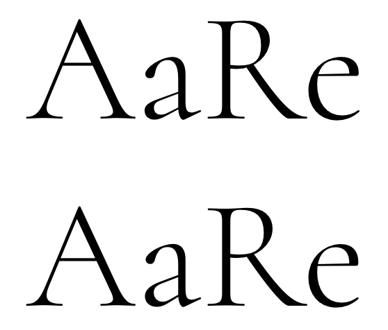

1 -
Christian Thalmann said:Yep! Cyrillic is harder than it looks...
BTW, here's a little «stealth change» I made to the Garamond style of Cormorant along with the flashier stuff... the counters of /A and /R are now more relaxed to match the more relaxed counters in /a and /e. That /R has been bugging me for a while in Garamond settings. Oh, and I got rid of that inexplicably odious foot on the lining /seven. What was I thinking...?
I really wish that you can do a “Text” version alongside the current Garamond. I’m currently typesetting my paper using a modified version of it.0 -
Well, Cormorant was intended as a display companion to traditional Garamonds (like EB Garamond), so it seems unnecessarily cyclical to make a text companion to Cormorant now. Then again, Cormorant does have its individual character now, and I do admit the thought has crossed my mind.
Making Eau de Garamond as a sans companion to the Garamonds (including Cormorant) is my first priority right now. I'm getting the impression that Eau will be surprisingly capable as a text font, so you could always use that for your paper.
(Perhaps if enough people were interested in a Cormorant Text typeface, though, Google Fonts might be convinced to fund it...? )
)
0 -
Cormorant has been sighted in print! That's super awesome. I had to order the book immediately.
2 -
:D Thanks for posting the pictures, it's available on amazon but the previews are so blurry you can't even see what font it is. Found at my local bookstore (Vermont) btw.0
-
Christian Thalmann said:Actually, how about this /g for the more sober default face? It's certainly more Garamond than the previous ones, and it even geminates well.
 And how about that /R?

This is a beautiful font, to my eye there is only one thing which I noticed which looks incongruous. But this is only my own opinion.
The forward junction between the upper bowl and the lower bowl of the capital B and the forward junction between the upper bowl and the leg of the upper case R seem disjointed to my eye, they need to curve in more to flow into the junction rather than have a sudden change of direction.
Apart from this one thing it seems very good.
0 -
Paul, the images you are quoting are very much out of date. Both the /B and the /R have changed a while ago. I'm also shocked to see what incredibly malformed /g I was willing to consider back then...
You can always find the newest version on GitHub:
https://github.com/CatharsisFonts/Cormorant
0 -
That book cover shows something that's been nagging me for a while, though. The thins in the Bold cut look vanishingly thin compared to the stems. I'm wondering whether I shouldn't strengthen them a little.
0 -
Sorry I didn't realise how long the thread was, sorry.Christian Thalmann said:Paul, the images you are quoting are very much out of date. Both the /B and the /R have changed a while ago. I'm also shocked to see what incredibly malformed /g I was willing to consider back then...
You can always find the newest version on GitHub:
https://github.com/CatharsisFonts/Cormorant
I see that the issue with the B and R has been addressed already.
The g is not malformed, it's just a little idiosyncratic. It has character!
0 -
I found this flyer lying around at school today.

(That's two flyers, front and back.)
1 -
That's not the /g/ I remember, have you updated it? It looks great, anyway.
How's Eau de Garamond progressing, by the way?0 -
Ori: That's the default /g of the default Cormorant fonts. Were you thinking of the «good nagging» /g a few posts up? That has been dumped for the current saner version a long time ago. Or maybe you were thinking of the /g in the Cormorant Garamond fonts, which has a horizontal loop top and larger eye.
I haven't worked on Eau for a long while, and I haven't received any funding to work on it this year. As a result, what little time I have for type design currently goes into the Black master for Quinoa. There's a dedicated thread for Eau, btw.
0 -
Oh yeah, I was thinking of the good nagging /g/, I had missed that post.
Sad news about Eau, it's become one of my favorites 0
0 -
Well, the Roman is already pretty complete, and you can use the Italics to highlight words as long as you don't need anything fancy (like figures...). The project is on hiatus, it's not dead or anything. Anyway, as an Open Source project, I suppose it can't die by definition. ;o)Ori Ben-Dor said:Oh yeah, I was thinking of the good nagging /g/, I had missed that post.
Sad news about Eau, it's become one of my favorites
0 -
No idea can ever die.0
-
Well, I'm not a graphic designer, so I don't need fonts at all. It's just that seeing this project completed would make me metaphysically content.Christian Thalmann said:Well, the Roman is already pretty complete, and you can use the Italics to highlight words as long as you don't need anything fancy (like figures...). The project is on hiatus, it's not dead or anything. Anyway, as an Open Source project, I suppose it can't die by definition. ;o)
0 -
He he, today I thought about you! I found this advertisement in the Rome metro

0 -
Hey, nice catch, thanks!
Now if only they hadn't used a dozen different typefaces...
0 -
0
-
While my original uppercase accents were flat like in Garamond, I've been offering steeper uppercase accents to match the steep lowercase accents in SS13 for a while now... but the flat ones look so bad in comparison that I've been tempted to replace them by the steep ones for good. I'm just a bit worried that I might break some existing designs that depend on the accents being flat.Do you think that's a real possibility, or is everyone going to prefer the steep accents?
 0
0 -
Nice ! At this size I prefer the steep ones, but how does it work on text blocks ?0


Categories
- All Categories
- 47 Introductions
- 4K Typeface Design
- 495 Type Design Critiques
- 577 Type Design Software
- 1.1K Type Design Technique & Theory
- 670 Type Business
- 885 Font Technology
- 29 Punchcutting
- 539 Typography
- 125 Type Education
- 333 Type History
- 81 Type Resources
- 113 Lettering and Calligraphy
- 33 Lettering Critiques
- 80 Lettering Technique & Theory
- 569 Announcements
- 100 Events
- 116 Job Postings
- 170 Type Releases
- 182 Miscellaneous News
- 270 About TypeDrawers
- 54 TypeDrawers Announcements
- 114 Suggestions and Bug Reports