Paramond — an extreme display serif
Comments
-
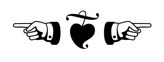
I've never drawn a manicule or a fleuron before. Do these work?
0 -
-
I've never drawn a manicule
The index finger looks a bit wooden to me … when I look at mine, the curve is at the top, the straight line bottom; it sits higher than the thumb. Check yours?1 -
Hi Jan — good point, I've changed the finger's outline a bit so that it rises towards the hand, ever so slightly bracketed its lower joint with the hand, and hinted at the continuation of the middle finger beyond its forward-pointing joint. I also fixed the inconsistent curvatures of the sleeve. Better?

Actually, when I make a pointing hand, I press my thumb down on my fingers, which brings the thumb's joint downward below the index finger's knuckle, as you say. However, I can also relax my thumb a bit, in which case I can reproduce the above pose quite accurately.
0 -
Looks a little like the cuff link is piercing the wrist! Perhaps make the shirt sleeve hang a bit lower.0
-
-
The three fingers below the thumb look too large when compared to the thumb and index finger.0
-
-
Love this! Can’t wait to see the final results.
The bowl of the /a stands out to me.
In many letters there is some really nice calligraphic flair. Like in /B, where the nib angle changes quite nicely, and in /g, with its full and flowing strokes.
The bowl of the /a looks a bit sharp to me. Down at an angle, around, and then back up.
Have you tried rounding it more at the bottom? Or played with the angle of the thick stroke in the bowl?
0 -
Martin: Good point; I've reduced and staggered the size of the fist fingers and extended the palm, thumb, and index.

Henric: The /a is the glyph around which the whole font was conceived, so I am reluctant to change it back to a more conventional architecture... I wanted to make the bowl as small as I could get away with while preserving the overall structure of the Garamond /a and the decisive white wedge between its bowl and foot. In any case, the current architecture doesn't strike me as particularly un-calligraphic, given that similar narrow bowls are used in uncial scripts etc.
0 -
Taking first steps towards the Italic!
 I just noticed I know very little about the peculiarities of Garamond italics, given that Traction Italic stuck rather close to its roman.
How does this /n work, for a start?
0 -
The left foot seems to be a bit higher than the right.1
-
Thanks Georg!
Meanwhile, here's my first shot at the lowercase. Work in progress, obviously... Oops, I forgot the /k... well, it's gotta wait for tomorrow!
1 -
I was having a bit of trouble wrapping my head around the archetypical Garamond Italic /y, so I explored some alternatives:
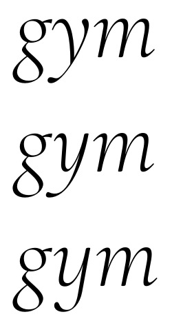
I like the second one, but it gets very tight around the low point of the body. The third one meshes perfectly with the other lowercase letters but doesn't look Garamondy at all. I think I'll use either 1 or 2 as default and keep 3 as an alternate (together with a monocular /g).
EDIT: Actually, version 2 fits into the cursive rhythm reasonably well after all:
0 -
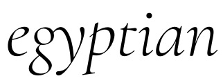
Upon further consideration, I decided the new /y, while pretty, was not legible enough at smaller sizes and sometimes parsed as a dirty /u. I'm going to stick it in another stylistic set, then, and go with the Garamond /y. I made a /g_y ligature to sweeten the deal:
1 -
-
The middle one for me …0
-
Jan: I'll give it some more thought. They're all so different!
First draft of the caps:
0 -
Hi Christian - I'm a big fan of the roman and really like the way the italic is shaping up.
A couple of thoughts about the italic:- I agree with Jan about the middle /Q/
- I think the /ct/ ligature looks a bit tight
- Looking at the image above, the /o/ really jumps out at me: it looks as though it's either leaning at a shallower angle or has a different stress (compare the bowls of the /o/ and /eth/), or maybe it's a touch too wide?
- The way the stem of the /p/ terminates at the top seems a little out of character to me when compared to the /a/ and /t/ (both regular and extended version used in the ligature). I also think the top of the /p/ bowl is a little 'flat'.
0 -
Steve's spot-on about the /o/ I think.
I too like the middle /Q/, though the way the tail attaches seems a little clunky to me. I might try having the thin tail link swoop more tangentially into the thin southeast part of the bowl.
I'm still bothered by the crossbars of /f/ and /t/ in both roman and italic. I don't much like the blobby shape, but even if that's retained, I think the angle of the whole shouldn't sag like it does (appearing to drop as it goes left to right).
The /g/ looks odd when doubled up in "Nugget," though I think the single one in "Yoghurt" looks credible. I think you'll want to include a single story alternate, but I'm sure that was already in your plans!
0 -
Thanks for the feedback! Much food for thought. I'll address the /Q first.
I've tried moving the tail attachment to the bottom right of the bowl, but I'm not so sure it looks natural. I feel the urge to open the bowl and connect the neck to the bowl's curve (see below), but then that looks very swashy indeed and doesn't sit well among the more austere italic caps. Maybe I'll have to make a full set of swash caps eventually...
Meanwhile, I've also made a nicer version of the former Nr. 3 solution. Any better?
0 -
On the /o: I actually changed it recently since the way it came out from Cursifying the roman /o looked unnatural. I feel this version is more in line with the font's pen logic. But you might certainly be right about the counter being too large and/or too upright. Lemme try to fix that.
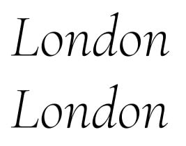
Better?
0 -
Better?
0 -
It would be good to see the new /o/ in your earlier 'Alpha - Zanderfilet' image to see it in a wider range of contexts, but it looks much better to me.1
-
(Sorry for the double "Better" up there.)
Alright, I've added one more degree of skew to /o and changed the crossbars of /t, /f, and related glyphs, and decompressed the discretionary ligatures a bit.
I actually had a point-topped /p originally, but rejected it because it looked noisy at medium sizes. However, I've given it another try now, taking care not to leave too much of a concavity, and it seems to work reasonably well. As for the bowl, the Garamond /p's seem to be rather flat-topped as a rule, but I did make it just a tad rounder.
Craig, I'm not quite sure what you disliked about the /gg, but I made a /g_g ligature for good measure. I'm cheating to nudge the two heads a bit closer together than they normally would be. Does that help?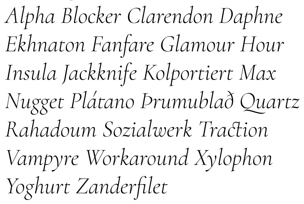
BTW, did anybody notice the contextual alternates for /f and /t before /a? ;o)
0 -
The gg issue for me wasn't really spacing, just that the unconventional proportions and droopy link become showier when doubled, but maybe that's okay. That said, the fit is better with the alternate.
I like those crossbars better. They may be a touch heavy?
I wonder if the little piece of /p/ coming out of the left side of the stem is too timid. My eye kind of catches on it. But I've had all sorts of difficulty trying to get that structure of /p/ to look right and space right, so I'm probably not the best advisor on that one.
I think the /o/ could still be narrower.
With these tall ascenders, should the top of /t/ be a little higher too?
Forgot to mention before, your /y/ solution is really great.0 -
Thanks Craig, I'll give those a look. Meanwhile, I've completed the Italic character set and l'm looking forward to starting on the bolds, but I guess I should finalize the lights first.
Incidentally, I noticed the cap-sized currency signs looked weird next to the old-style figures, so I made some x-high currency signs instead. I'm not sure they look right either, though. What do you think?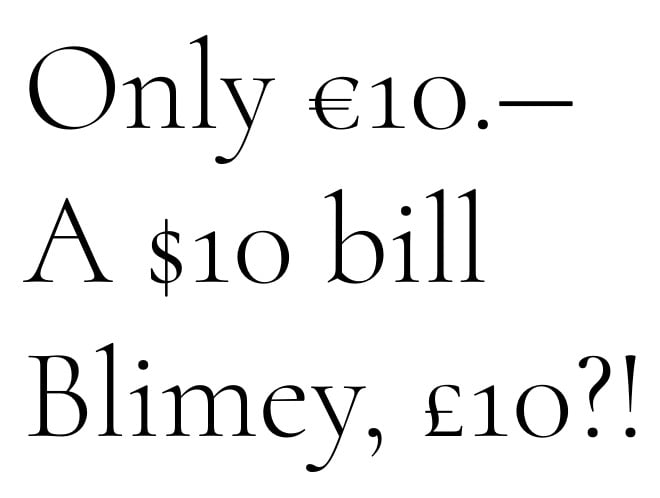
0 -
Experimenting with the Bold, just to see where it's going...
 1
1 -
"The gg issue for me wasn't really spacing, just that the unconventional proportions and droopy link become showier when doubled, but maybe that's okay. "
Me too, but just a single g brought it on for me. I'm guessing there is some threshold beyond the expected angular range, where g's mostly horizontal stroke creeps into the reader's head as vertical. The Light Roman of this face started off in a tough place for that, so I've been wondering, very slowly, what the bold g might look like. It looks like we're really close. But meanwhile the italic has, I think, crossed the threshold mentioned above.
I'd release that broad-bottomed g, the widest of all lowercase structures, from the other, narrower-bottomed descenders, (maybe y too), (not far), stopping the rise of its descent, when the connection stroke is relaxed enough for the reader to not notice, but before the connection stroke's wonderful weirdness is lost. I know that is possible from experience, and also from the same well, I'd quickly at least consider a 6 pt. design now for the same g things, if you're planning that axis any time soon.
0 -
David, I'm not quite sure I follow... are you suggesting to raise the descender of /g away from the descender line? Isn't that going to look weird?
(For the record, I don't find the current italic /g weird at all...)
0
Categories
- All Categories
- 46 Introductions
- 3.9K Typeface Design
- 489 Type Design Critiques
- 572 Type Design Software
- 1.1K Type Design Technique & Theory
- 665 Type Business
- 877 Font Technology
- 29 Punchcutting
- 530 Typography
- 121 Type Education
- 328 Type History
- 81 Type Resources
- 111 Lettering and Calligraphy
- 32 Lettering Critiques
- 79 Lettering Technique & Theory
- 562 Announcements
- 97 Events
- 116 Job Postings
- 169 Type Releases
- 179 Miscellaneous News
- 269 About TypeDrawers
- 53 TypeDrawers Announcements
- 114 Suggestions and Bug Reports


