Paramond — an extreme display serif

Christian Thalmann
Posts: 2,074
As I posted on Typophile, this Monday I had a sudden impulse to doodle an exaggerated light, contrasted, space-taking Garalde with impossibly tiny counters, long extenders and no respect for long amounts of text or small sizes.
I've started implementing it in Glyphs, and I'm having way too much fun doing it.

I'm toying with the name "Paramond", hinting to its Garalde genome and its delusions of grandeur. Where other fonts may be touted as workhorses, this one would be the unicorn.
I'm not using any one form of Garamond, whether historical or recent, as a reference. I drew most characters from scratch, based on my mental image of what garaldes look like, and tweaked them until I liked them. When I run into trouble (for instance, that /f was a tough cookie, and I'm still not too satisfied with it), I open a page of garaldes on MyFonts and skim over them to get a general impression of the existing solutions without getting too attached to a single one.
What do you think so far?
I've started implementing it in Glyphs, and I'm having way too much fun doing it.
I'm toying with the name "Paramond", hinting to its Garalde genome and its delusions of grandeur. Where other fonts may be touted as workhorses, this one would be the unicorn.
I'm not using any one form of Garamond, whether historical or recent, as a reference. I drew most characters from scratch, based on my mental image of what garaldes look like, and tweaked them until I liked them. When I run into trouble (for instance, that /f was a tough cookie, and I'm still not too satisfied with it), I open a page of garaldes on MyFonts and skim over them to get a general impression of the existing solutions without getting too attached to a single one.
What do you think so far?
1
Comments
-
Love it! Especially the /g and accents. Nicely balanced and poised, full of energy... a Garamond for the athletic. That /A has real potential.
Maybe pointy terminals on /f/c etc... you'd lose the Garamond tear, but it'd harmonize better with the flags of /i/n etc. and the terminal of /s. Maybe. The beak of /r certainly needs to be tweaked, though.
A Garamond typically has an /f that extends quite a bit further, but I think this is fine. Or maybe it could extend as far as the top of the /c. Still, it extends further than the bottom of /j, so it's in balance.
/v to /z could be more exuberant; but then again, their relative restraint could counterbalance the other letters... it'd depend on contest (like everything else).0 -
As for names, "Paramond" is fine, but not really exciting, ya know? Maybe something more fanciful, even sprightly. Heck, "Spright" (rather than the trademarked "Sprite") would be appropriate, given its agile grace and lightness. (Not to mention being a nod towards Centaur and Satyr.)0
-
Thanks for the feedback, Michael!
I'm not sure about "pointy", but at least a more cut-like rather than rounded flag terminal on the /f might work better. I agree that the beautifully round and irresponsibly far-reaching /f is one of the most defining features of Garamond. Unfortunately, all my previous attempts at saving it into this font ended up looking like dew drops hanging from some gooey antenna. I'm wondering if the high ascenders and low stroke weight even make it possible to have a good-looking Garamondesque /f here... I'll give it another try, though.
What's wrong with the /r's beak? Too long...?
I'm not sure how /v–/z could be more exuberant; they're pretty banal in construction and show very little variation among the Garamonds of the world. The /y appears to have the most variation, but then I dislike most of the variants... I drew the one I like.
Birdseeding on Typophile suggested the /s needed improvement, and I agree. It's too wide and too dark for a Garamond.
As for the name: Paramond is only a working title, but I do like the ring of it. I'll probably go for something entirely different in the end. Maybe I'll even steal the name "Eau de Garamond" from a previous stalled project of mine to make a sans that embodies the Garamond spirit as much as possible.0 -
Progress on /s, /z, /f, and exploring proportions for the caps:

 0
0 -
The head serifs are a little too long and/or too droopy for my taste, for what that's worth.
The structure of /g/ makes the top bowl look too high. I like the concept of playing with the proportions but it's not there yet.
Any way to give the tittles (& dieresis) more character?
Do the crossbars of /f/ and /t/ get too pinched at the join? (That's a comment I was thinking about saying about Traction Display too.)0 -
Hi Craig, thanks for your comments.
By head serifs, do you mean upper left serifs in general? At the /n- and /l-level? Personally, I like their current shape a lot — I took the liberty to depart from the cramped upright /n stem head with its blotty triangular serif that Garamonds typically have. I'm getting an energetic rather than droopy vibe from them. Or did you mean the /u in particular? I must say I found that weird and unbalanced too now, looking at it. I made the upper serifs on the /u much shorter now, and narrowed the whole thing by a hair. I think that helped.
Spot-on with the /g. I loved the shape but it felt just a bit out of place. I lowered the bowl now — problem solved? I know I'm opening up a lot of whitespace with that radical downward slope, but I'd rather not make the bottom counter any larger so as to keep the small-counters theme of the face intact.
Tittles: They already strike me as noticeable by their sheer smallness (although Frank informs me that used to be the norm)... I can't see a diamond tittle working here, and the circle feels right for the face's clean-cut class. What did you have in mind?
Crossbars: I thickened them, and will have a look at them in Attraction too. Good point. 0
0 -
Yes, I meant serifs at the meanline, and yes, it was the /u/ more than others that was bothersome, so that's an improvement.
On the tittles, stay with round, but roughen it up a bit? Right now the baseline serifs, for example, look like they could have been carved on a punch, but the tittles look like they were produced by click-and-dragging a mouse with the shift key pressed, know what I mean?0 -
Hmmm... alright, I made the curvature of the tittle's segments a bit larger than necessary, and raised the bottom vertex by one tick. Not sure that's visible, though...?
Also, I chickened out and made a more normal /A. I like it better, but I'll keep the weird one as an alternate. 0
0 -
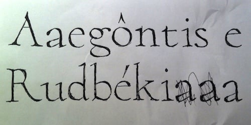
Some more capitals. Is the /B too special? Is the stress in /C/O/G too diagonal?
 0
0 -
I absolutely love the design. The light weight and relatively long serifs provide a very nice texture, and I like how you're playing with direction of stress and form, making this typeface a lot more vivid. The skewed G works very well for me.
I'm really not sure if I would go for a B like that though. I like what I perceive to be mechanical elements, like the simple /A. Perhaps normalize the middle horizontal of B a bit, like in Trajan.
The terminal of /f is perhaps on the heavy side, but I'm not sure if that's an issue. I recently saw some of Didot's (if I'm not mistaken) older typefaces which featured an /f with a very heavy terminal compared to the other terminals but I actually liked it a lot. I believe the idea was that the heavy terminal would distinguish the letter more from other ascenders.
The /r looks a lot better but I think it's still not quite there yet. What about starting the join at a lower point?
As for A, I really liked the one in your sketch. Did you design one already or do you have yet to design it? In any case, the right side seems too diagonal. I would bring the stem a bit more to the left, effectively also condensing the letter slightly.
Could we see larger text samples? I would love to see some detail in the serifs and terminals.0 -
By the way, the stress of /o might be a bit severe, but C/G look great to me. Perhaps bring the anchor points in the vertical center a little bit to the right as there seems to be a bump there. Also, is the counter of /d not a tiny bit too big compared to b/c/o?
And I forgot to mention the shape of /g. I like it a lot, however it makes the reader stop for a moment; it disturbs the rhythm. Again I'm not sure if this is an issue necessarily. You might want to try making the top of the loop a bit more horizontal though, so it aligns with the baseline a bit more.0 -
Hi Martin, thanks for your feedback!
Incidentally, I have since switched to /C/G designs with vertical stress so as to accomodate the bottom serif of /C that seems to be a fixture in Garamonds. I also made those two glyphs considerably wider — I still had the tighter rhythm of Traction in the back of my head. Do you still like the new designs...?
I tried a steeper /r, but I find it meshes less well with the arches and serifs of existing letters, which imply a relatively shallow pen angle.
As for the /A, I was planning on keeping the more calligraphic design as a stylistic alternate (along with other more calligraphic alternates, such as a "kicking K") and keep the more rational design as the default. While I like the flavor of that /A, I felt its top looked fiddly and unclean at medium sizes, almost like a mistake.
As for the /g, would it help if I made the ear straight, as it typically is in Garamond?
Text sample: Good idea, I'll make a PDF. Meanwhile, here are some more caps. Obviously, the /Q is going to need a long-tailed variant. 0
0 -
I think perhaps the terminals of C should stick out more so they're less vertical. I really liked the unconventional G before, though the letters are much better balanced now. There's nothing to dislike about them. I just wonder to what extent this typeface should be normalized. If I were designing this typeface I would keep the previous letters as alternates because they go well with some other unconventional shapes, like the /g and provide an interesting texture.
I tried a steeper /r, but I find it meshes less well with the arches and serifs of existing letters, which imply a relatively shallow pen angle.
I should have communicated better what I meant. I think the part of the shoulder on the left of the terminal could be a bit more rounded so it slopes into the stem more, rather than a sudden join like in h/m/n. I forgot the term for this. It's just something I would try. I don't know if it works necessarily, but I find the /r tends to deviate a bit in the join compared to h/m/n in some typefaces.While I like the flavor of that /A, I felt its top looked fiddly and unclean at medium sizes, almost like a mistake.
I can understand that. It works very well at display size though. I think the alternate A and K will work well with the unconventional C/G you had before as well. Like I said, these letters create an interesting texture. Since this typeface is not being designed for extended reading I think it's interesting to try some different things.As for the /g, would it help if I made the ear straight, as it typically is in Garamond?
Perhaps, though I prefer the upwards ear. It doesn't fix what I objected to though. I think I would keep the current /g as an alternate and make another one with a bit more horizontal loop. I would love to see it in text though.
Is it by design that p/q have bigger counters than /o? Right now I feel they're too big, but I would have to see it in text.
The N looks good, but perhaps you could check out what happens if you extend the point at the lower right; make it sharper and a bit below baseline. I think it may work well with the sharp serifs of m/n/r.
The bowl of P could also be bigger as I see it now, though it may work very well in text.0 -
Hi Martin,
thanks for your comments!
I'll definitely keep the more calligraphic forms as alternates.
As for that /g... I've tried making the bowl more horizontal, but didn't like the result much (middle). Did I misinterpret your idea? Meanwhile, I've kept the small round bowl (which I find pretty) and instead made the lower body narrower (right). It still doesn't look good in the combination /gg, but I guess I'll need a ligature or a contextual alt for that.
The bowls of /b/d/o/p/q look the same size to me (by design — I tweaked them until I got that impression). Apparently that's subjective...?
I'm not sure if I want to make the /r's stem more left-leaning; I'm afraid it might make the left side more noticeable than the right like in some fonts (such as TheSerif). I can still try, of course.
Serifs on /C/G: Actually, I originally had strong vertical top serifs like in Traction, but they looked too un-Garamond. It took some convincing myself to adopt those non-vertical ones. I just tried making them stick out of the aperture more and can't say I liked the result. I definitely want to avoid Bookman-style serifs.
Made the /P bigger, the /N pointier, and the /B calmer. Again, the calligraphic /B is now a stylistic alternate. 0
0 -
Actually, how about this /g for the more sober default face? It's certainly more Garamond than the previous ones, and it even geminates well.

And how about that /R? 1
1 -
I'm curious to see Th, and how it looks with the considerable difference in heights between caps and ascenders.
Latest g looks like it's really recoiling from the ensuing letter!0 -
I'm probably going to make a /T_h ligature... but here's the first draft of just /T/h.
I'm not so sure I understood the sentiment about the /g, but I tried to address it anyway... head reaches a bit less to the left, ear has an upward tilt and rises to the same level as the /t crossbar. 0
0 -
I like those changes in /g/.
Is your /e/ a little too tall? I know you've lowered the upper bowl of /g/, but the top of /e/ looks higher than /n/ and /h/ too. Or maybe it's that those /n/h/ shoulders are too low, since they also look lower than /o/.
Or maybe it's just my eyes, or the rasterization. Or you've intentionally built in some unevenness?0 -
The new /g works very well!0
-
Craig: I'm having trouble seeing that unevenness, except maybe for the /e, which is significantly heavier on its apex than for instance the /o. Anyway, I've tweaked the top of /o/e/a/n ever so slightly to try and match the x-height better. Does it work?
 0
0 -
Overshoot still looks too great on all of those to me, actually. But get some additional opinions.0
-
It actually looks (to me) like /o and /e and /a are sitting too high.1
-
Hmmm. Rather than pushing down all the rounded letters, I just raised the top of the /x (it was apparently 10 units below the x-height — that explains it...) and did some more nanotweaking.
Is this better? Things look pretty even to me now, though /o is a bit on the smallish side for my eye. 0
0 -
Well, that is better for the xoxaxe, but now the /n in xn looks too short?
Also btw, I liked the diagonal stress in /G and /C (more dynamic, more in keeping with your original premise). You do not want to end up with another real Garamond?0 -
Hrrrrm. I'm having an unreasonable amount of trouble seeing these things. Better?

I'll think about the /G and other non-Garamondisms (I'm gravitating towards a Perpetua /U). My original concept was "sharp Garamond with tiny counters", but there are not that many counters one can make that tiny, unfortunately.0 -
Alright, I'm now maintaining two sets of stylistic alternates: .ss01 for calligraphic finials...

...and .ss02 for "pure Garamond" forms (/C/G/U):
That allows me to keep the more interesting diagonally-stressed forms as the default and still allow the font to function as a "true Garamond" if desired.2 -
Alright, I have a first version of the full upper- and lowercase:
 0
0 -
The difference in the terminal sizes between the /a/ and /c/ (and /f/) looks a little odd to me but, aside from this, I think it looks great.0
-
Hi Steve, good point. Which terminal size would you consider more appropriate to be propagated through the font?0
-
Beautiful, Christian!
PS: Now /q (in oqu) and /p in puma look too high to my eyes … but all this could be just me.0


Categories
- All Categories
- 47 Introductions
- 4K Typeface Design
- 495 Type Design Critiques
- 577 Type Design Software
- 1.1K Type Design Technique & Theory
- 671 Type Business
- 885 Font Technology
- 29 Punchcutting
- 539 Typography
- 125 Type Education
- 333 Type History
- 81 Type Resources
- 113 Lettering and Calligraphy
- 33 Lettering Critiques
- 80 Lettering Technique & Theory
- 569 Announcements
- 100 Events
- 116 Job Postings
- 170 Type Releases
- 182 Miscellaneous News
- 270 About TypeDrawers
- 54 TypeDrawers Announcements
- 114 Suggestions and Bug Reports