AlphabetMagic. My first AI experiment
Comments
-
No no.. it was about the world cup. If France had won the final match, Alphabet Magic would not exist!
0 -
😂😂😂😂0
-
@PabloImpallari I may be wrong but it would not have been a healthier and more honest attitude to learn how to sketch and design original fonts to become a true type designer? I think you could have produced better alphabets than the ones you show in your examples, preserving your sanity. All this without taking into account the fact that artificial intelligence platforms are being trained on artwork that is often copyrighted.
1 -
@Die in-dryfoun If you had done a little research, you would have found that Pablo in fact designed many fonts, some of which you have probably seen many times, which he also writes about in this thread.
Your point about copyright is an interesting one. That discussion is being held also regarding other AIs. The main ethical argument for AI, I think, is that true originality is a fantasy. Nothing is every created out of nothing. Humans reference other works in much the same way that AI does, and that has never been a problem.* Many of the examples Pablo has shown here are much more 'original' than most human-made designs.
*Of course, there is a big grey zone here. When is a reference too strong? What if you told the AI to create a 'Serif for long-form text in the style of Gerard Unger'?2 -
@Jasper de Waard It is likely that we have different tastes when it comes to type design. When I look at Pablo's designs I don't find anything that doesn't feel bland or fundamentally derivative to me. His Lobster font is nothing more than a substandard copy of Donald Young's Home Run. Its popularity is only due to the fact that it is free.
0 -
@Die in-dryfoun Pablo's work is rock solid.2
-
Probably the most important skill to learn in type design is not trashing other people's work.7
-
I'm afraid I don't share your view. I think that in type design it is much more important to do your best to design typefaces as beautiful, functional and original as possible. It's also important to be able to distinguish between mediocre designers who hate drawing to the point that they need to resort to illegal stimulants, and those who know their trade and can sketch, draw, and create new alphabets without suffering.Simon Cozens said:Probably the most important skill to learn in type design is not trashing other people's work.
1 -
Well.... Yes and No.Die in-dryfoun said:His Lobster font is nothing more than a substandard copy of Donald Young's Home Run.
It is substandard, of course. But, it was my very first font ever with no prior experience. Not too bad for a first try.
Yo may be surprised to learn that Doyald was the very first person to know that I was developing lobster, long before releasing it into the public. Doyald was tremendously generous with me, and actually helped me to develop Lobster.
I got in touch with Doyald over the phone as I wanted to buy his 3 books. Hearing his voice was like talking to god. Since I was in Argentina, very far away from the US.. he told me that he will make a trip to the post office and get back to me about the shipping costs. The next day, since the shipping cost where as expensive as the books, he offered me to split the shipping cost.
His red book was all about how he combined features from two or more alphabet designs into a new one to use for Logotypes. Some times he grabs the weight distribution of one alphabet and applied the proportions of another one, and the swashes from a third one.. and things like that.. Doyald had this ability of putting many alphabet into the blender and come up with something new. (The blue book is ore about the tiny little details in alphabets, and the White book is more about creativity and the process of exploring options until arriving to the final solution)
Thats what I wanted to experiment with Lobster, what I have learned from the Red Book.
I wanted to do a new typeface that I can use in <h1> headers on websites, and Home Run was very condensed for that use, I didn't really worked well at that specific task. Eclat on the other hand was very expanded, also didn't worked for <h1>. So I wanted to make a new font, in the same style, but having intermediate proportions, in between Home Run and Eclat. Also, Home Run has much of a Baseball feel to it... I wanted to tone-down that feeling a little bit, So I made it a little more like Bodoni Bold Italic and a little less like Home Run, even decreasing the angle of the letters. I also wanted the Uppercase to have sort of mini-swashes, for that I studied many many other fonts.
I explained all this to Doyald. He knew that I was passionate about it and that I wanted to learn, and since he loves teaching he told me this: "If you are really serious about suggestions for it, I’ve a few comments."
Of course I wanted to learn more, so I send him the first version of lobster, and I did wanted to look serious, so I did my best effort, trying to please him.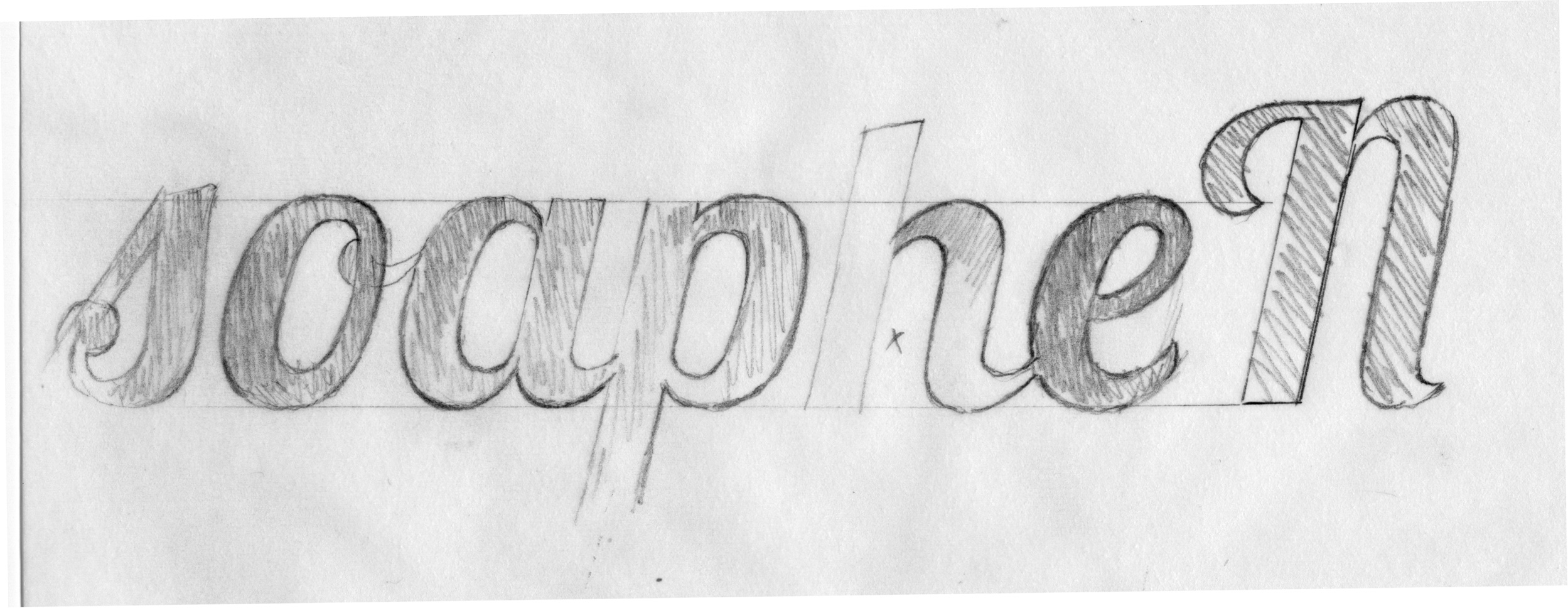
This image is a lobster review that Doyald sent to me after reviewing my initial version of the Lobster. This is what he told me:- Make all of your bowls (curve stems) the same thickness, which should be a bit heavier than your straights because they are losing mass top and bottom.
- Your overshoot aqt the baseline and x-height should be a bit more to appear optically to align with with your horizontals.
- Now, your l.c. “e” is a bit squarish almost like a Eurostile. I think its curve should relate to the “a”. Or, make the other bowl forms match it.
- Note that I’ve drawn three different types: a squarish one, then a bit rounder and then the roundest.
- Thin the straight stem of the a as the bowl joins so that it doesn’t mass. Invert the “a” to get a “p”
- Perhaps the right-hand side of the “b” should be like the “o”.
- Your “s” should have a centerline that matches the rest, use less curve too.
- Note how I’ve drawn the branch of the “h”
- Also, your cap N seems out of character.
Of course neither Doyald or myself could have anticipated that Lobster would get so popular the next year... that was total surprise to both of us.Its popularity is only due to the fact that it is free.
Again, Yes and No.
If I had Lobster released as commercial font, probably very few people would have bought it. Or many a lot of people during the 1st month only, as it happen with many commercial fonts.
So, making it free was good for lobster popularity... When we meet with Laurence and Adam in Nancy, France for a type conference, we spotted lobster like 5 times on shop signs in the same block, it was everywhere. But also for that very same reason it was bad for lobster too... We got tired of seeing it everywhere and this kind of popularity also killed it too.. Thanks God!!!!
But also, I can't attribute all the popularity only to the "free" aspect of it. That would be oversimplifying things. There are gazillion of other "free" fonts out there and only very few get so popular.
I think another reason for Lobster popularity, besides being free, is that it was nice -not perfect- but nice for lots of people. Part of it because it was born from Doyald designs, but also because my modifications (the intermediate proportions, the Bodoni italic influence, the little swashes) made it perfect for H1 and for Logos. I have also included some not-perfect but cool ligatures to it, and also added automatic open type features to remove the connecting stroke in the last letter of each word, since the last letters did not need to connect with any other, that improved the it very very much.
I think that for that reasons it went so popular...
Also, it got included into the initial Google Fonts release among other fonts. Lobster was n1 in popularity. I think it got so popular because It was eye catching and usable in his proportions.. Most other fonts in the initial 15 fonts only release of Google fonts just looked so similar to Arial or Times new roman that regular people can not notice the difference. They only other eye-catching font was Tangerine by Toshi -a true masterpiece- but because of his extreme proportions (small x, long ascenders/descender) it wasn't very usable for <h1> headers and logos.
Both where free, both where included on GF, Tangerine was better, but the people chosen Lobster.
Despite all the "substandard" things about the lobster.. his proportions where just perfect.
I nailed it down regarding proportions.
In Quantum Physics they have this concept of "The Observer". Matter behaves in different ways depending of the observer.. like a particle or like a wave.. etc. Applied to fonts it will be something like this:
If the observer is not looking at your font.. your font doesn't exist.
If the observer look at your font and don't like it.. it wont be used.
If the observer looks at your fonts and like it.. it will be used.
As simple as that... Some people will just ignore it, other will hate it, and other will love it.. it's totally ok.Die in-dryfoun said:It's also important to be able to distinguish between mediocre designers who hate drawing to the point that they need to resort to illegal stimulants, and those who know their trade and can sketch, draw, and create new alphabets without suffering.
This time is not Yes and No... this time is a big NO. You got all that wrong!
I LOVE to draw.. in 2010 I couldn't draw, I didn't know how. After 13 years now I can.
I can draw with difern't pencil from hard ones to soft ones, I can draw with carpenters pencils, I can draw with sharpies, I can draw with pointed sable brush or flat brush, I can draw with both flexible or flat nibs, I can draw with different kind of inks ranging from cheap commercial inks all the way up to top notch Sumy ink, I can mix inks and other liquids to control ink elasticity... Im pretty good at Rulling Pen too!. I can also draw with potatoes, with node-dragging, and I can even draw in my mind without the need to put what I draw in material objects like ink and paper... and finally now I can also draw with sardines too.
Again... I love drawing, drawing is not the source of suffering... What I hate is the slow process of dragging nodes around to convert those loved drawings into font software... it a BIG difference.
I know the trade -as much or as little- as any other after 13 years on it.
I'm no longer the Pablo I was in 2010. I also don't claim to be a great designer, probably I never will... But i'm still enjoying my journey as much as the destination. The only thing I can say about me is that I'm passionate about alphabets.
I hope you understand now.
Thanks for reading, and sorry for the long post format.8 -
One of the paradoxes I see at play here:
1 Looking skills are necessary to prompt and especially to assess AI productions.
2 I think nothing develops looking skills like drawing.
3 AI potentially makes drawing obsolete.
6 -
Yo may be surprised to learn that Doyald was the very first person to know that I was developing lobster, long before releasing it into the public. Doyald was tremendously generous with me, and actually helped me to develop Lobster…

6 -
It occurred to me that a great set of images to train the AI on would be the contents of Rian Hughes’ Custom Lettering of the… books.1
-
Die etc:All this without taking into account the fact that artificial intelligence platforms are being trained on artwork that is often copyrighted.
If the AI is training on scans of typography, then it is no different than type designers scanning old printed foundry specimen books, by eye or with a photographic device.
However, if the AI is training on actual digital fonts, then the notion of “AI point piracy“ may have to be pre-empted in EULAs, if the foundries that publish fonts don‘t want that to happen.3 -
Here is a typical EULA stipulation, which would appear to already prohibit AI from “training” on actual digital font files:
Licensed Users are prohibited from … creating derivative Fonts [i.e. Font Software] without prior written consent from Licensor or the Font’s copyright holder…
And how about Open Source fonts?
I’m not familiar with all the details of such font licences, but is it allowable to “train” on Google font software, and then publish the result as a commercial product?0 -
I don’t know how Pablo’s stuff works as he hasn’t shared the details. But do read up on how Stable Diffusion works. You can think it is infringing or not, but something that did vectors, but used an approach like Stable Diffusion… definitely would not be copying point placement. Stable Diffusion is WAY more abstracted than that.
4 -
That's a very interesting question, given that Google Fonts use a copyleft license, the Open Font License (OFL). A rare few are Apache2. The OFL requires all derivative work to carry the same license. Training on Google Fonts to make another OFL font would be permissible (and I believe has been done by NaN)... but to make a proprietary font? I don't know. Matthew Butterick's lawsuit against GitHub CoPilot is essentially about the same thing.Nick Shinn said:
And how about Open Source fonts?
I’m not familiar with all the details of such font licences, but is it allowable to “train” on Google font software, and then publish the result as a commercial product?
With proprietary fonts, I could see an argument that training on vectors would be tantamount to reverse engineering software, whereas we know that the design itself cant be copyrighted, so a visual approach like Stable Diffusion, as Thomas notes, is less risky... we'll get more clarity when the lawsuits start to settle I guess!
1 -
Eltra Corp vs Ringer (1978) suggests to me that processing bitmap typefaces with ML Transformers is not subject to copyright in the USA: neither inputs nor outputs. Just personal speculation.
And then making bezier outlines from the output bitmaps, would to me, suggest the copyright adheres the same as normal.
Buckle up. https://google-research.github.io/seanet/musiclm/examples/3 -
The lawsuit against Stable Diffusion will be interesting to watch. In general, I agree with @Craig Eliason : There's so many examples of tech enthusiasts pointing out how good AI art is... and it's an anatomical nightmare. I'm sure with proper curation it would look fantastic, but in the wrong hands it's nothing more than a shiny gimmick. AI can be a great tool for artists, but I have to be convinced this will be more than a modernized TypeCooker.
0 -
Wooowww!!Dave Crossland said:
I wonder what will be the sound of alphabets as songs!
Also the other way around: songs as alphabets!0 -
Sound like a pile of mellotrons run through a sequencer. This makes me very sad.Dave Crossland said:0 -
Thomas:
an approach like Stable Diffusion… definitely would not be copying point placement.
I wasn’t referring to copying particular point placement. As Jeremy says, training on vectors would be tantamount to reverse engineering. Font EULAs say “you can open the hood and look but you can’t touch”, i.e. no data copying of font outlines, even for the purpose of running a group of them through an algorithm to create a composite outline.
If blending two fonts to create a ’tween is not allowed, why would blending thousands be any different, even if the level of abstraction is more complex? Where to draw the line?
0 -
Nick, you are still suggesting “data copying of font outlines” would happen. I would argue that this is not what is happening now with Stable Diffusion, nor is it what I am suggesting as far as a font-oriented equivalent would work.
What is happening now with Stable Diffusion may be infringing, but if so, it is not because it is copying pixels.
“If blending two fonts to create a ’tween is not allowed, why would blending thousands be any different, even if the level of abstraction is more complex?”
First, who says blending two fonts is not allowed? But for the sake of argument, let’s grant that. Blending thousands would be different precisely because it is thousands. One of the key deciding factors in copyright infringement under US law (and most other countries seem to have similar principles) is whether the infringing work is “substantially similar” to the specific copyrighted work it is accused of infringing. You aren’t going to be substantially similar to any one work if you have blended thousands. You are also probably not going to be much hurting the value or potential market of any one of those thousands of works.
I won’t be shocked if new laws get created to deal with all this. That would be a reasonable response to the new realities, and copyright laws and principles that never imagined the situation we are now facing.
I am not a lawyer, but the few lawyers I have seen weigh in on this who seemed to understand the tech, and were not working for one side, had no expectation for which way(s) the courts will decide, based on existing copyright law. So, I would not be even a tiny bit surprised if we got conflicting court decisions, whether between different lower courts in the USA, or between the USA and other countries.
It could be a wild ride! We should buckle up!2 -
Thomas, my understanding of “data copying” is that glyph descriptions are extracted from a font file in electronic digital form. Whatever happens to it next is of no consequence, in respect to a EULA which is a contract that says you’re not allowed to do that.
However, if a third party not involved in the contract were to extract fonts from web sites, and the fonts are not software protected by encryption from being opened, then I assume EULAs are irrelevant and general copyright laws would apply.
0 -
OK, so it is still not at all clear to me that the kind of process I have in mind (analogous to Stable Diffusion, but for vector fonts instead of bitmapped images) matches your description of data copying. I imagine that could depend very much on the details of the particular EULA, and quite possibly on the kind and degree of abstraction from the algorithm.
And of course at no point did I or anybody else in the discussion mention EULAs; I assume that this will be web based and/or programmed by people not party to any relevant EULAs, so that part won’t matter. At least, not if the people involved are at all smart about it.
Another consideration is, I expect releasing fonts generated this way might very well trigger threats of legal action and likely actual legal action, from at least some of the major players, if they believed their fonts were part of the training corpus for the font-generating engine.
Anyhow, apologies to @PabloImpallari for hijacking his thread! I don’t need to go on further.
0 -
Thomas, Nick & all: fell free to discuss here whatever you want related to AI.. I have no problem with it.
Quick update on the "Testing Page" experiment:
Training the network for "top quality" contours as I would like it too, would have taken 40 hours.. to much for an experiment. I reduced it to a more acceptable time of 4 hours. It was about to finish training (96%) when I got kicked out of Collab since Im on the free plan and they give preferences to paid users.
I will try again tonight when everyone is sleeping and there is more time available for free users
0 -
Great Question.Nick Shinn said:Where to draw the line?
When I started making fonts 13 years ago, most fonts where single style, or RIBI.
The Univers table was a rare thing... nowadays multiaxis fonts are the standard, released everyday.
That was possible thanks to the progress in tools like Fontlab Multiple Master, Superpolator, RMX Tools, GlypphsApp, etc. AFAIK, nobody asked "Where to draw the line" at that tine.. maybe we should have asked... I don't know...maybe it was a good thing we didn't asked... who knows? Even 1st timers are doing families from day 1.. Is it a good or bad thing? I don't know.. maybe is good.
Now with AI we are able do more than axis expansions. For example for the mayans and the monster experiment I played with dingbats. For the "seashore inspired number2" I played with this one
Maybe we should ask, as you did, where to draw the line... or maybe we can keep using the same line as today, releasing new fonts that wont hurt the value of our colleagues fonts as much as possible.... However that has happened many many times in the industry since the beginning of metal type, without computers or AI involved.
My initial guess is that AI will mostly expand the range of display alphabets, as Multiple Masters and interpolation did with multi-axis families. Text fonts are already very similar to each other, hence really hurting the value to each other.. even if drawn by hand or node dragging whit no AI involved.
Also, I don't see many font descriptions telling "we have used interpolation and rmx harmonizer to develop our families" or any other tool, whatever it may be... for example: iKern is used a lot, but only a few are telling it while others keep it private. AI is just another tool. There is nothing in any particular released font that can tell if you have used rmx tools, or fonttools or whatever any other tool, or not... I guess the same will apply to AI fonts: they will be AI fonts as long as you say so in the font description... or not2 -
I agree with everything about the present, and yet… there is every reason to assume that the tech will improve. We have seen it many, many times with software and computers doing new tasks.Evie S. said:… In general, I agree with @Craig Eliason : There's so many examples of tech enthusiasts pointing out how good AI art is... and it's an anatomical nightmare. I'm sure with proper curation it would look fantastic, but in the wrong hands it's nothing more than a shiny gimmick. AI can be a great tool for artists, but I have to be convinced this will be more than a modernized TypeCooker.
So yeah, we are at the version 1.0 stage right now and there are things about it that are laughable. But I would eat my hat if human anatomy (at least in common positions) was not mostly solved in another year or three.
Maybe horses and dogs will still suck for a while longer after humans are solved, because they are going to be a lower priority. But even for that I think… give it time.0 -
It's funny that you chose Univers as an example. I was thinking about how AI can free fonts from the tyranny of interpolation and the Bézier curve. The condensed styles of the original Univers had flat sides and the newest version has rounded sides, presumably because it was easier to interpolate. While if possible to smoothly blend from rounded to flat sides, it's not easy, so most type designers decide not to do it. The limitations of our tools have pushed us away from making certain styles.If a new version of Monotype Grotesque were commissioned today, it would likely be turned into interpolated masters and most of the charm would be removed. I think the inconsistency is its best quality—it doesn't make a lick of sense, and that's what I love about it. It's possible to build an interpolated typeface with those inconsistencies, but it's unlikely that it would even happen. But you can prompt an AI to build a typeface with deliberate continuity errors throughout all styles, and it would take no extra effort.5
-
Ray Larabie said:If a new version of Monotype Grotesque were commissioned today, it would likely be turned into interpolated masters and most of the charm would be removed. I think the inconsistency is its best quality—it doesn't make a lick of sense, and that's what I love about it. It's possible to build an interpolated typeface with those inconsistencies, but it's unlikely that it would even happen.Not to get too far off topic, but Community Gothic from Frere-Jones is an example of a type family that (IMO) rather successfully achieves what you're describing. I do think you're right about the effort involved, I can only imagine that the family was particularly painful to produce4
-
“breed of talentless, self-perceived font makers”I think it's worse than that. Even those won't be needed. Why would the end user bother buying or downloading a font when they could simply type in a prompt? Even if Pablo doesn't succeed with this, someone will. I can't envision a scenario where a third party is required. User requests a font, AI generates it, transaction over. It's fascinating, and it sucks.4


Categories
- All Categories
- 47 Introductions
- 4K Typeface Design
- 493 Type Design Critiques
- 575 Type Design Software
- 1.1K Type Design Technique & Theory
- 669 Type Business
- 884 Font Technology
- 29 Punchcutting
- 537 Typography
- 124 Type Education
- 332 Type History
- 81 Type Resources
- 113 Lettering and Calligraphy
- 33 Lettering Critiques
- 80 Lettering Technique & Theory
- 569 Announcements
- 100 Events
- 116 Job Postings
- 170 Type Releases
- 182 Miscellaneous News
- 270 About TypeDrawers
- 54 TypeDrawers Announcements
- 114 Suggestions and Bug Reports