AlphabetMagic. My first AI experiment
Comments
-
Exactly. And it’s you who started getting personal by claiming we have some kind of history.PabloImpallari said:Also when things got personal.. they don't end up well
1 -
Ok, I was wrong about you. Would you accept my apologies to you so we can end it?0
-
Apologies accepted. And sorry for getting personal to you.
I still think you need to work on your language though. But it is up to the moderators how to deal with that.
1 -
Yes I do! its not the fist time it got me into trouble.
I will improve it. Thanks for the friendly feedback Paul.
Maybe Moderators are enabled to edit my post in a non-offensive manner to avoid offending new readers? Maybe replacing my wording by "cool Morisawa guys" and "Retarded " by "stupid" or things like that? It will make it less offensive but also it wont be truly expressing how much I was hating myself in that moment... it will be like removing the blood in Tarantino movies to make it less violent. It's for moderators to decide. In any case, sorry for the inconvenience and thanks in advance!
I really want to get back to discussing what to do with the damned AI since the implications are huge. Do you have any thoughts about it?
0 -
Just use extra adjectives! You can do it!
Instead of “stupid” make it “mind-blowingly stupid.” Or something like that.
You can communicate the general sentiment you are actually trying to get across without offending people, AND without completely losing the strength of feeling!2 -
Thanks Thomas! I will do that from now0
-
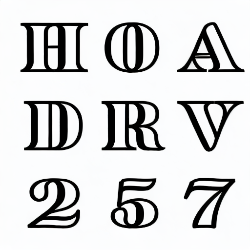
Experiment 7:
I wanted to explore what Alphabet Magic can do for Non-Latin.
In the past, while I was working in the traditional node clicking moving and dragging way, I has had experience in Cyrillic and Devanagary. This time I wanna try some even more difficult.
Result 7:
AlphabetMagic Mayans!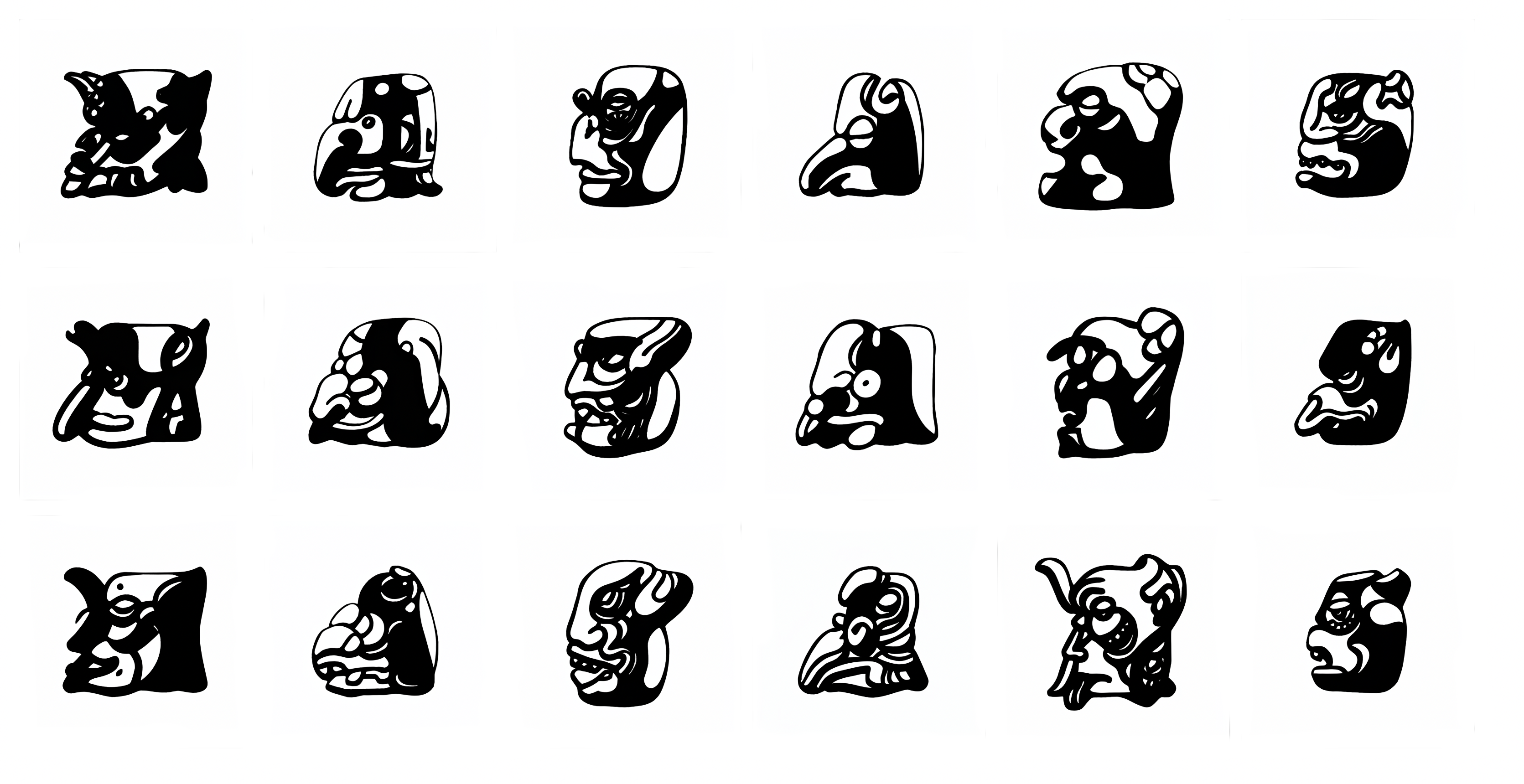
This experiment what not as easy as the previous ones. It took me the entire day.
It was a true exercise on letter shapes and weight distribution.
Real mayan glyphs are mostly square in shape, and they are not filled with big zones of black mass. On the other hand, Latin letters each one has a peculiar share, and are mostly black with very few counters.
What you see in the picture above are some of the best results, but whole process was really interesting. I used mostly Human faces for it in order to simplify the experiment, but can also be used to created whatever other shape one needs, for example Birds or Turtles, or whatever your can dream on.
AlphabeMagic created more than 200 variations of each letters, and they are all impressive.
Let me know If I you want to see more of it and I will post more images in a separate thread
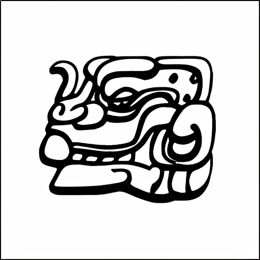
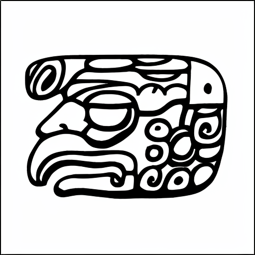
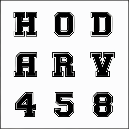
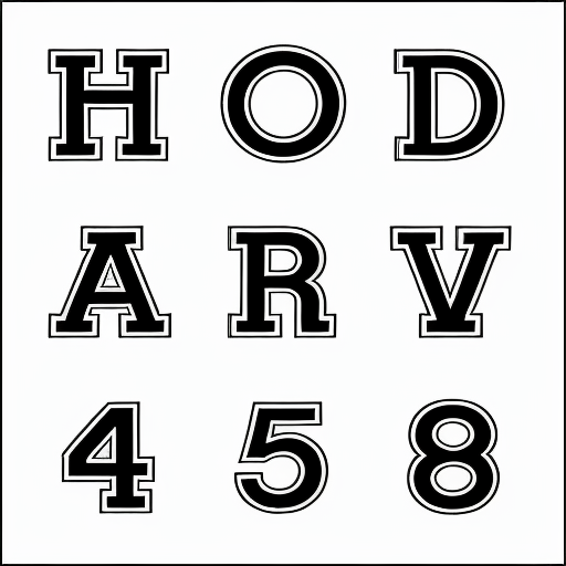
Experiment 7b: Fake Mayan
I also used AlphabetMagic to create more than 500 real-looking but fake mayan glyphs.
They looked so real that in fact I had to double-check they were truly new inventions.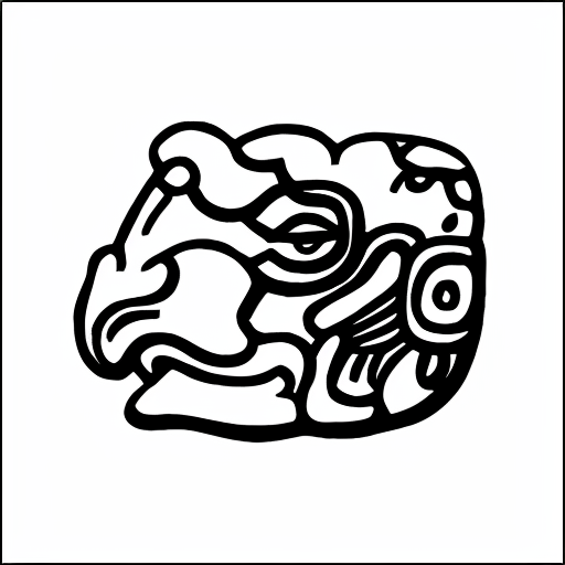
I'm wondering that, since I was able to create new Mayan glyphs, maybe in my next experiment I can create fake latin letters too!!! Remember the Euro and the Rupee sign where created? Well, something like that.
if we add 10 non-existent, newly created glyphs to Latin Alphabet:
Can you imagine how they will look like?
Also, I can't help but wonder myself about the Pseudo-Arabic custom typeface used by the FIFA for the Qatar World Cup identity that I hated so much.. What it would have looked like if created using AlphabetMagic? Pretty much in all WorldCup editions, the fonts suck bit time. The one for Rio2026 was mind blowing, that wave looking one, can you remember it? it was awesome, flowing so nicely in a script like fashion. Pretty much the only exception0 -
Backstage: Failed but Hilarious!
Big Mustache
The Batman
Luke, I'm your Father
Despite the failed but fun result: Experiment 7 has confirmed to me that whatever the brief for a new typeface design, no matter how difficult, AlphabetMagic can do it!
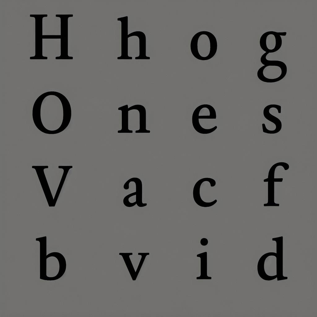
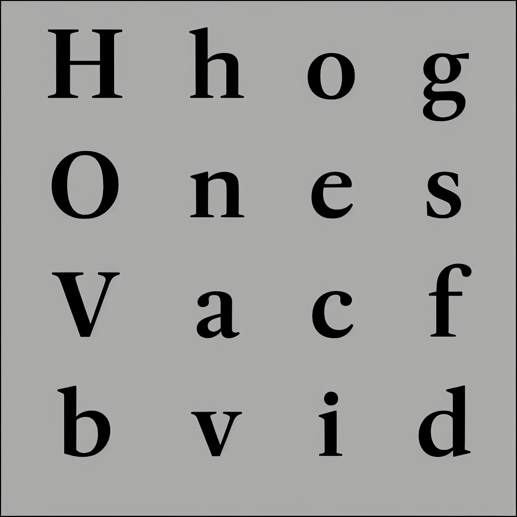
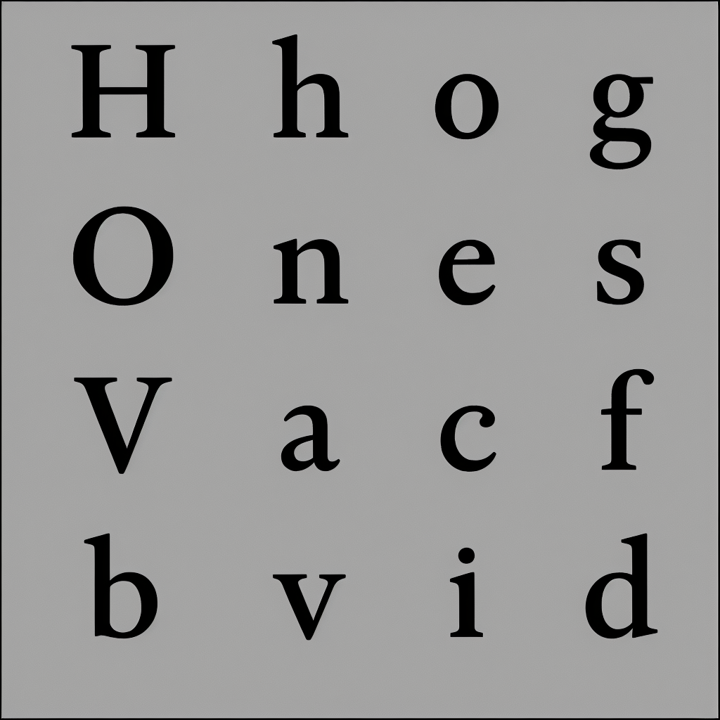
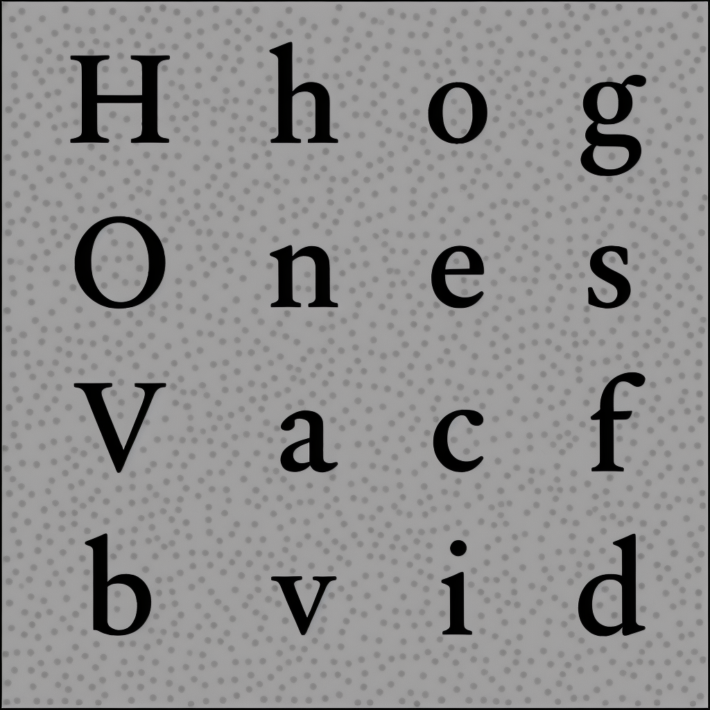
AlphabetMagic found that for a basic A-Z a-z 9 alphabet: There are around 30.000 parameters. In current AlphabetMagic state of the art, it's mostly trained. The parameter count will increase as soon as I expand the character coverage.
The nice thing about that is:
I don't even need to train they all, since most of them are dependent from each others
For example:
if manually trained Parameter A = 1
And manually trained Parameter B = 2
Automatically Trained Parameter C = 3.
I will make it even easier to understand in a non-technical way:
If /b ascenders = 700, then /h ascender will be 700 too. No need to train this one, since its deducted deducted.
At this point, there is no doubt in my mind.
If it was able to do the mayans with such a high degree of success, there is nothing it can't do; Grades, Size Specific Cut form Display-to-Agate... you name it, AlphabetMagic can do it.
Whatever you can throw at it will be far easier than the mayans.
The only task I can think off, that will be more difficult than the mayans task, will me something like creating an entirely new alphabet for the aliens from outer space civilizations.. or maybe finding the sweet spot between an alien alphabet an ours. I think it will be also possible to achieve. But for the moment, AFAIF, we don't need that soon... or maybe we already have it but we civilians don't know it... who knows...
It also got me into thinking that we, the human race type designers community:
We haven't done our job really well... I'm sorry to say so, but it's true.
What I mean for that, is not about the typefaces we have designed, they are all great.. also is not about our skillset... Im not talking about that.. please don't get me wrong this time.
What I mean, is that we have not taken very seriously the issue of developing a detailed language corpus specific to our craft, as other communities have done.
If you have ever been in a medical emergency situation, in an operating room or places like that (I have since my dad is a breast cancer surgeon) you may have noticed that doctors communicate to each other in very specific terms with the shortest possible sentences, each term having a very specific meaning. They have developed that corpus out of their need to be used in emergency situations where fast and error free communication is a must, since there is no room for errors or debates in such situations. Also, everything ordered by the chief surgeon must be executed by a subordinate exactly as directed by the superior, the subordinate cannot simply carry out the order at will (unless the superior specifically allows him to). Communications is community is perfectly flawless, since patients can die out of communication errors.
Until now, we have not had that need to create such a specific corpus about type design.
So far we do not need it, because we are in this prehistoric node-dragging era.
Since I'm on a crusade to advance type design tools to the next era of "If you have it in your head and you cont describe it to me using words: Give the brief, I give you the font", in order to make that happen.. Now I am truly in the need of such and specific corpus for the first time ever in the typeface design history.
I know.. I'm 100% sure that Alphabet Magic can do it all... I can feel it deep inside me.
The problem is no longer if Alphabet Magic can do it. It can!
The problem now is "Can we ask for it?"
No! We cant.. because we don't yet have the words we need to do it.
Think it like that:
If you have to ask for a custom typeface design, tailored to your very own specific requirements.. OVER THE FONE... Can you do it?
We have some vague terms like "blackletters" or "sans serif".. but they are not enough.
The type designer on the other side of the phone (Alphabet Magic in this case) will only be able to deliver a typeface that will look as you wanted to a certain extend, to the extend you where able to describe it... but not exactly as you wanted it to be in your mind.
That's the situation I'm facing!
I know for sure that Alphabet Magic can do whatever I want it to do.. I just don't know how to ask for it using simple words.
Because of that situation: I will switch myself from the experiments mode to a new mode that will be all about "Type designers specific language corpus creation".
I have been doing it already in an informal way, since as you already know, I have been thinking deeply about this subject, non-stop since the 2016 Warsaw Atypi conference.
Some of that corpus creation impetu have resulted in a very detailed type classification system... here is a small example of it, that by chance I discussed in another thread.1 -
I think you have to wonder whether it will ever be possible to create a language that is precise enough to describe all the different typographic variations, and still be comprehensible. Even if it would be possible, it could take forever to write out the description.
I would suggest that it is usually more efficient to communicate a design idea visually than verbally, and so I would see more potential in designing a few letters or even abstract shapes (e.g. a wavy form), submitting that to AI and getting it to fill out the font (e.g. something like that amazing Rio Olympics type).
Then, to be truly powerful, I would want to make some changes to the AI output and tell it to implement those changes throughout the font. Of course you could iterate this process to come closer and closer to the desired output.
ps. That amazing typeface for the Olympics in Rio was made by Dalton Maag: https://www.daltonmaag.com/work/rio-20160 -
I totally agree with you Jasper.
Or workflow so far is much more visual and less verbal, thats why I said the we have been lazy. Other communities can do both visual and verbal, and I think we as trained professionals should be able to do both ways too.
Of course, it should be able to work in a visual way too. as you suggested. Both workflows should be at our disposal. The mayan experiment was carried on in a visual way somewhat similar to what you have suggested.
But still, the fact that we don't have a precise language corpus strikes to me as a limitation, and I think that we shouldn't be limited.
I will try to develop such a corpus. Maybe I end up with a result not successful enough to cover every single aspect of type design, but Im sure I can end up with a better corpus that the very limited one we currently have. I think it's something worth a try to advance our profession state of arts.
We have a few books about type designers language corpus.
For example Stephen's Type Anatomy. Thats pretty much our entire corpus.
It's a good corpus? Yes it is!
It is precise enough as the one the surgeons have developed for their craft? No, we are not even close to such a corpus. We as professionals are currently doing baby steps in everything corpus related. It's time to group up, We wont be leaving our parents home, but maybe we can make it into the teenagers stage.0 -
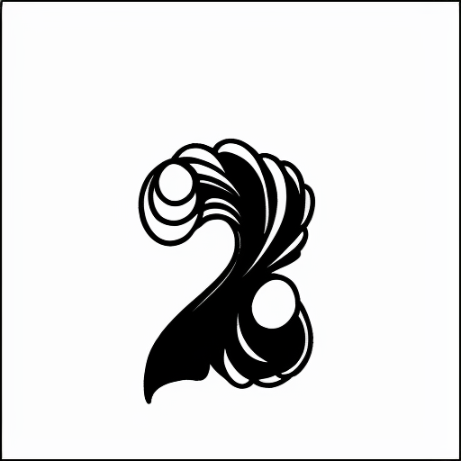
Seashore inspired Number 2 experiments


1 -
Can you do some experiments with neon and marquee light styles? Like ITC Neon and Budmo? I'm curious about how it handles stripes and dot patterns.
2 -
Hi Ray,
I didn't had enough samples in the Neon an Marquee genre to train the network.
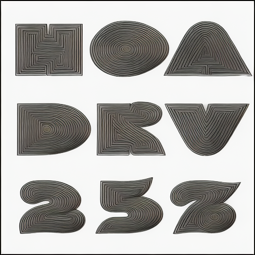
Instead I put together a bunch of (1) Shadows, (2) Incised, (3) Inline and (4) beveled fonts.
Since all the samples for the 4 genres for training went all together in a single mix, the results i'm getting looks confused") All in all, I think it may inform your curiosity about stripes
All in all, I think it may inform your curiosity about stripes
For a first try about inline decoration: I'm not entirely happy, but not entirely sad too.
My dreamed goal for the future would be to be able to produce something like the the Zannerarian alphabets... we are not even close yet, but maybe in the future
0 -
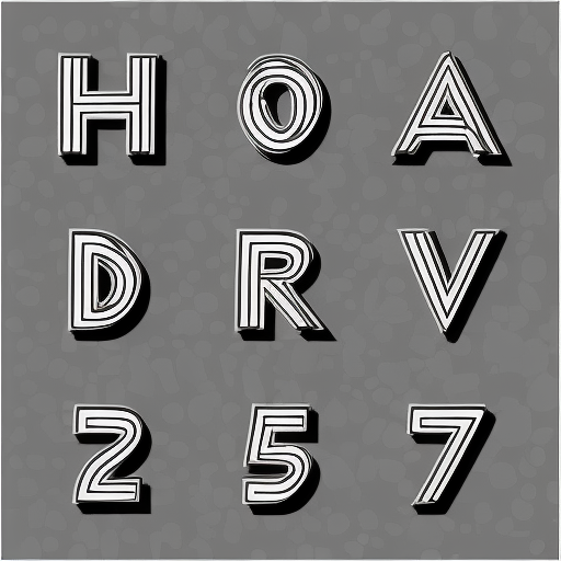
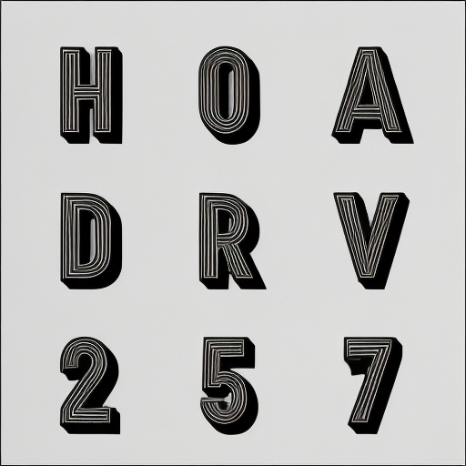
Previous experiment was trained using a mixture of styles, hence the mixture of the results. In this new experiment I have re-trained AlphabetMagic to focus only in the inline-outline style (Leaving all the shadow, incised and beveled alphabets out of the scope) The results are much predictable now:

1 -
That's intriguing. With Dall-E2 and Midjourney, I couldn't generate striped letters. Even for a human, stripes are hard to figure out if the stroke widths vary.
1 -
The Little Monsters inside my head are finding their way out!
Monster Display:
Monster Agate:
1 -
You've convinced me that it can do this decorative designs quite well. That Monster Display is pretty dope. But that's also because I (and I think I'm not alone in this) hold display typography to a different standard. It can be playful, fun, and is almost by definition imperfect.
But I am not yet convinced that it can design a beautiful workhorse serif. Or that it is a useful step in the design process. Possibly because I consider plain text faces the 'highest' form of type design, where form meets function, perfection is approached, and classics are made.
Do you think I'm wrong? Is it just a matter of time? Or is 'workhorse' type just too dull to even bother?0 -
I think we're not far away from ads that generate custom fonts based on the reader's profile.
2 -
Rather than trying to rein in and control this new medium, it may also be used to spark one’s imagination, for instance to create a novel kind of distress. When trying to muss up letter shapes, methodologies and filters tend to become predictable, losing the frisson of decay, the randomness of ruin; AI art mash-up tools, through their garbage rendering of typography, offer a fresh take.


Here’s the kind of imagery that Stable Diffusion produces when prompted to produce a page from an old type specimen—this does suggest a style of “AI distress” that one might distill/curate into a typeface. The trick would be to distinguish it from the “grunge” distressed types of 30 years ago.1 -
I do agree some people think text faces are higher status. I think they are biased. Nothing wrong with that, since each one is entitled to have his own preferences.Jasper de Waard said:You've convinced me that it can do this decorative designs quite well. That Monster Display is pretty dope. But that's also because I (and I think I'm not alone in this) hold display typography to a different standard. It can be playful, fun, and is almost by definition imperfect.
But I am not yet convinced that it can design a beautiful workhorse serif. Or that it is a useful step in the design process. Possibly because I consider plain text faces the 'highest' form of type design, where form meets function, perfection is approached, and classics are made.
Do you think I'm wrong? Is it just a matter of time? Or is 'workhorse' type just too dull to even bother?
But: I can't agree that display fonts are imperfect while text fonts are perfect. Each one has its own purpose. There are as many classics in the Display gender as there are in the Text gender, and there are as many bad fonts in the display genre as in the text genre, or the Blackletter genre, or the Formal Script genre, or any other genre...
For me they are all the same: They are all just alphabets. While each one may have different goals, they all follow the same rule: Proper distribution of blobs of white and black mass.
Tomorrow I will do a "high status" text face experiment. The real fun begins!0 -
Nick, I always loved your ( I don't know how to say it: Innovative? Modernist? Post Modern? Non-standard? nonconformist? Experimental?) views on type! You are one of those rare type designers that always keep experimenting with new approaches, and can do both "text" and "display" alphabets with the same level of quality and refinement. INick Shinn said:Rather than trying to rein in and control this new medium, it may also be used to spark one’s imagination, for instance to create a novel kind of distress. When trying to muss up letter shapes, methodologies and filters tend to become predictable, losing the frisson of decay, the randomness of ruin; AI art mash-up tools, through their garbage rendering of typography, offer a fresh take.
Here’s the kind of imagery that Stable Diffusion produces when prompted to produce a page from an old type specimen—this does suggest a style of “AI distress” that one might distill/curate into a typeface. The trick would be to distinguish it from the “grunge” distressed types of 30 years ago. you fonts but also your texts very much! 0
 -
I do agree some people think text faces are higher status. I think they are biased. Nothing wrong with that, since each one is entitled to have his own preferences.I (and I think I'm not alone in this) hold display typography to a different standard. It can be playful, fun, and is almost by definition imperfect
But I am not yet convinced that it can design a beautiful workhorse serif.
But: I can't agree that display fonts are imperfect while text fonts are perfect. Each one has its own purpose. There are as many classics in the Display gender as there are in the Text gender, and there are as many bad fonts in the display genre as in the text genre, or the Blackletter genre, or the Formal Script genre, or any other genre...
For me they are all the same: They are all just alphabets. While each one may have different goals, they all follow the same rule: Proper distribution of blobs of white and black mass.
Tomorrow I will do a "high status" text face experiment. The real fun begins!
https://www.gocomics.com/calvinandhobbes/1987/12/06Replace Calvin with Pablo, architect with type designer
The key word to me in Japser's post is "imperfect", Impallari.
The edge quality of everything you posted is full of imperfections in the edge contour quality.
For display type, these can be accepted as eccentricities, and especially for handwriting type, the imperfections can make them perfect.
But text type is not so forgiving, it is one of the old gods, and it demands sacrifice. The bitmaps your system generates are typefaces, no question, but... there is a long journey from a typeface sketch to a world-class work-horse. You have the black and white mass, but attending only mass does not get you into heaven — this I think must start with edge quality. Maybe cross breeding a bitmap to vector line tracer with a hyperbezier could make the quantum leap there. If you don't think you can understand the mathematics required, the AI might tutor you, as it tutored young Fred.
Then, I think you'll need to offer up acceptable spacing and kerning, which is ultimately integral to the typeface design, to the god of the eye.
And then, after that, there are all the other things specific to this moment of OpenType supremacy, such as mark placement issues, and feature code (well, GitHub CoPilot should make that a piece of cake...)
And don't forget the final phase, lawsuits. At least your AI skills will be developed enough by then to defend yourself with an AI lawyer. Just keep that one strictly secret
Pablo, it's a thrill for me to see you back in the game. I could never have predicted that the World Cup would have such a world-historical effect on our little world!!! You may turn out to be the Messi of type design
Let's chat soon, I'll send you a calendar invite. I want to tell you why I think your posts here, sadly, carry some of the ideas of racism, in a way that your big heart can't see at the moment.
Moderators, I appreciate the light touch on the posts on this thread; removing the posts whole would be a loss for posterity.2 -
I hate when people say that display alphabets are shit and text alphabets are the bomb.Jasper de Waard said:
But that's also because I (and I think I'm not alone in this) hold display typography to a different standard. It can be playful, fun, and is almost by definition imperfect.
But I am not yet convinced that it can design a beautiful workhorse serif. Or that it is a useful step in the design process. Possibly because I consider plain text faces the 'highest' form of type design, where form meets function, perfection is approached, and classics are made.
Do you think I'm wrong? Is it just a matter of time? Or is 'workhorse' type just too dull to even bother?
There is not such things like "highest" or "lowest" forms of type design.
There is only Type Design, and it only has 2 rules:
1) Proper distribution of blobs of white and black mass
2) Passion
I haven't slept since you wrote that. I just couldn't stop.
24hs later, these are the results. Enjoy!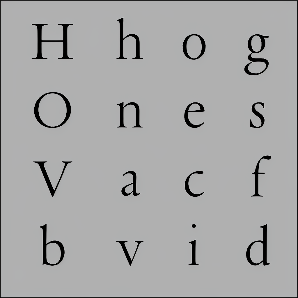
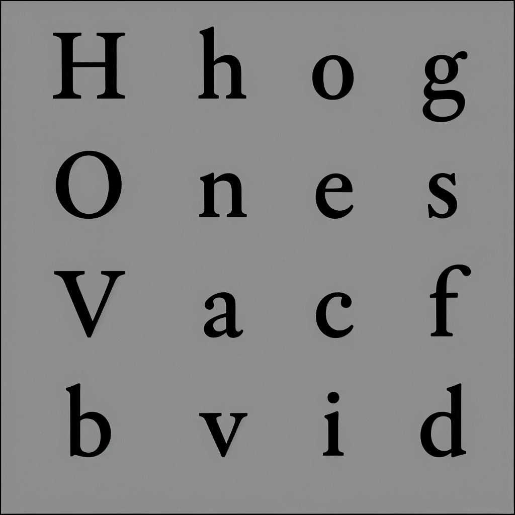
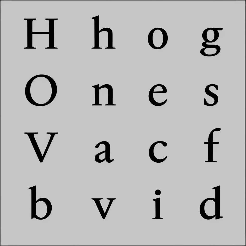
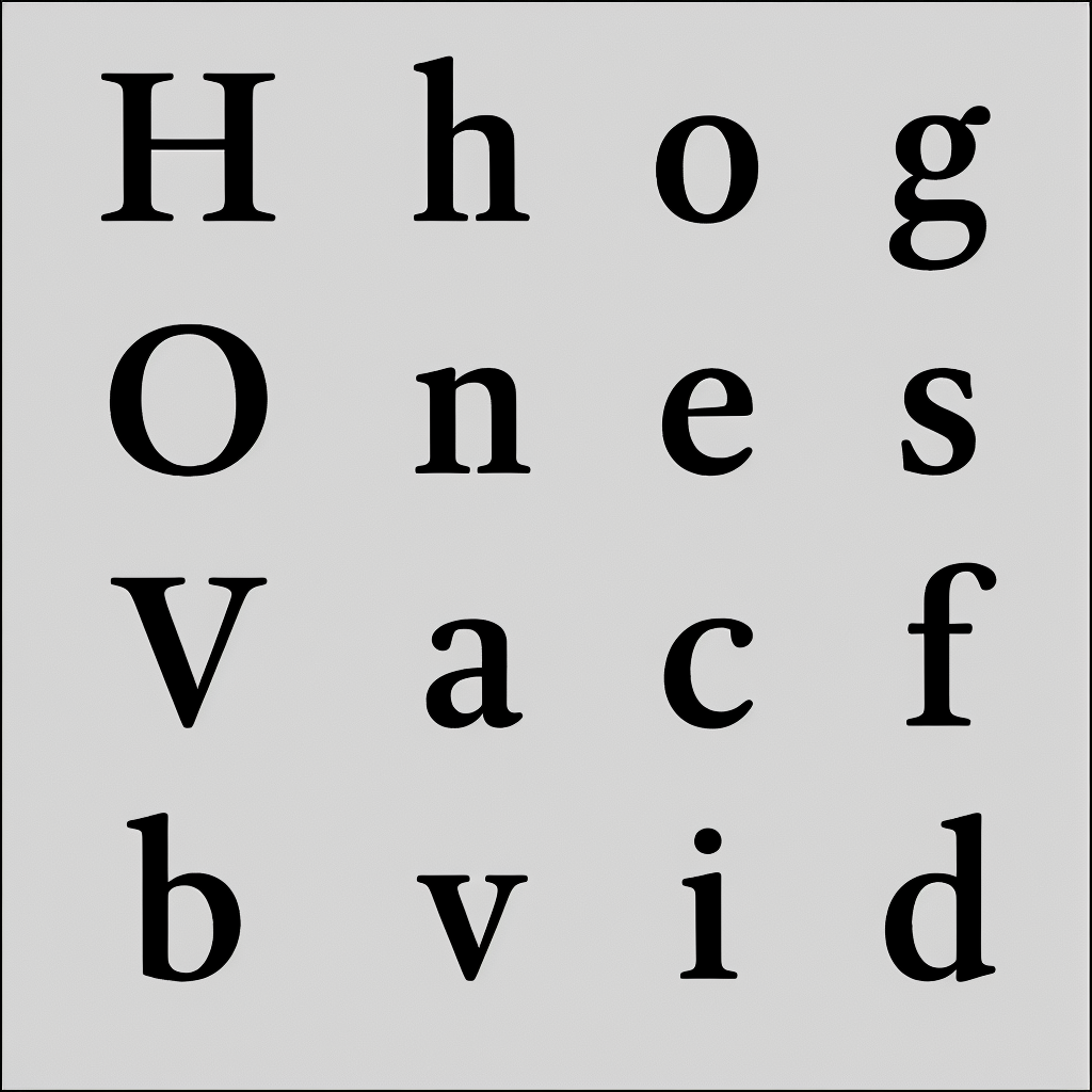
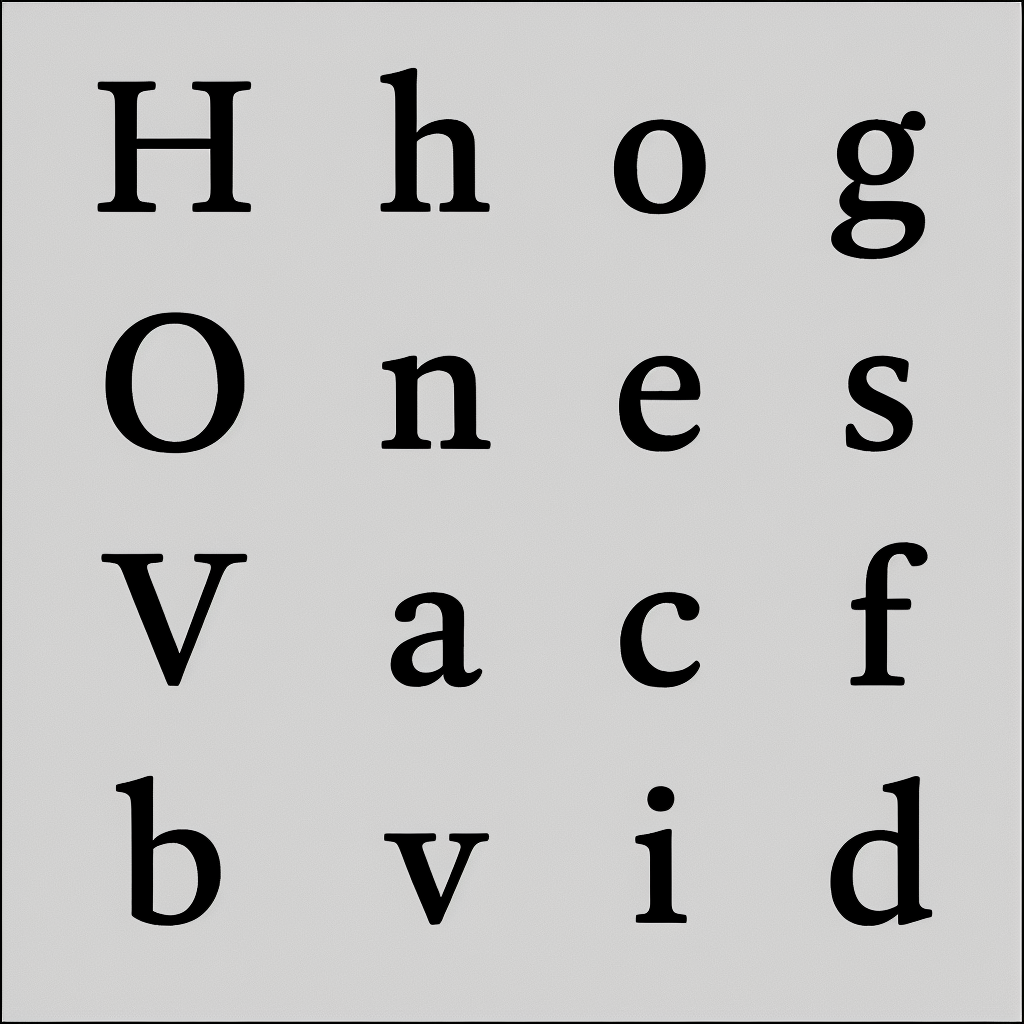
These are only 10 of 52 awesome alphabets, produced in less than 24hs.
All 52 alphabets are available in the AlphabetMagic Github folder for your detailed inspection.
They where just to many to post them all in here!
Dave also mentioned that previous experiments where "full of imperfections in the edge contour quality". I'm not concerned about that, since in this early experimental stage I was using very shitty tiny little 512px images resolution. This shitty tiny little images requires less memory and less GPU, and hence all the experiments progress was faster too. For this text faces experiment I have increased resolutions 2X. These are 1024px.
For final font production it can be increased 10x, 20x, 30x, 50x, 100x.. there is no limit!
It all depends of the power of the computers available to you (GPU, Graphic card, RAM).
At some point one will be able to auto-trace the results and avoid node-dragging-and-clicking all together.
You can integrate AlphabetMagic in your design process, or simply skip the design process all together and jump from brief to production. Both options are available!3 -
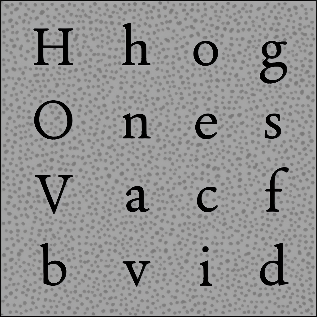
And since we all love monospaced, typewriter, low contrast, high x-height, short asc/descender, and AlphabetMagic can do it like in 2 seconds: Why not asking for it too?
AlphabetMagic show me!: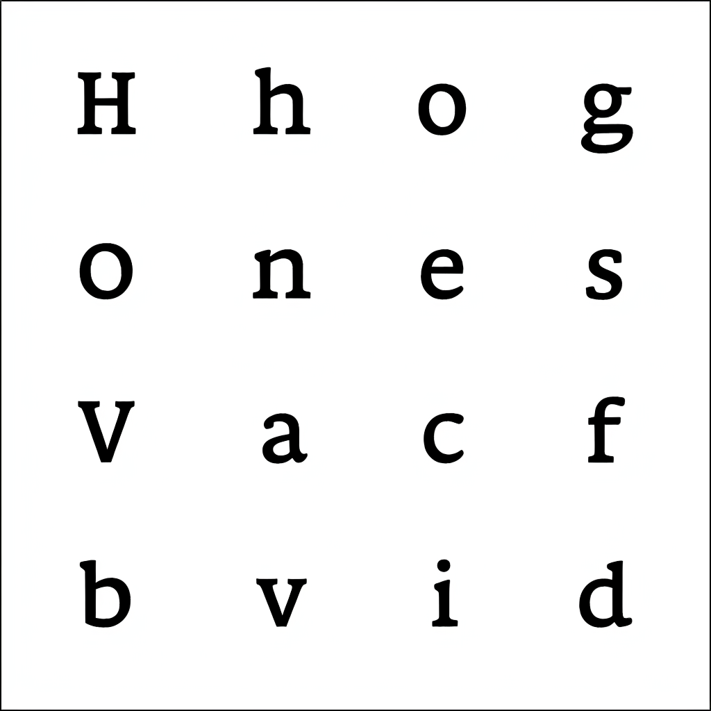
0 -
Alright! The improvement to edge quality is fabulous. I am amazed that simply increasing the resolution would have such a dramatic effect.
I'm now curious to see more text sans, in the major genres, but this is a distraction since it's very obvious your typo-godhead will drop them from typo-heaven 😂
So really what I want to see is paragraph text samples, like those on your classic Font Testing Page, to really evaluate these text faces.
Spacing, the final frontier!
3 -
Dave Crossland said:Alright! The improvement to edge quality is fabulous. I am amazed that simply increasing the resolution would have such a dramatic effect.
I'm now curious to see more text sans, in the major genres, but this is a distraction since it's very obvious your typo-godhead will drop them from typo-heaven 😂
So really what I want to see is paragraph text samples, like those on your classic Font Testing Page, to really evaluate these text faces.
Spacing, the final frontier!I actually DO have plans for that too! Of course!
I have been thinking about a solution since 2016 and -in my mind- it is already solved.
Somehow I already know what to do and how to do it. It's going to work like a charm!
I don't have any evidence to show, but I don't have any doubt either.
I give you permission to laugh if you want... I know it sound super crazy... but I even have plans for a chip implanted in the brain so that we can generate a Font just by thinking about it, and as soon as we think of a modification the font design will change on the fly.... think of it as some kind of Variable Font from the future with all the axis you can imagine inside it. You won''t have to worry about interpolation kinks any more since it wont be nodes-and-vector based...... and you will be able to control all the axis with tat silly chip brain, or even better.... telekinesis! Why not!
It's actually quite easy")
Interpolation sucks! interpolation is ugly!
We only need interpolation because we are stuck in the old age of vectors.
But what if the fonts are no longer vector-based?
I have this idea inside my mind were a letter shape is no longer defined by bezier curves.
Instead, I dream of a future font format where the blobs of black and white mass are created by multiple mini-blobs that get together and rearrange themself to form bigger blobs.
It sounds a bit crazy but it is not.. we already have it in nature... just think about how the small fishes get together into shoals so they appear bigger to avoid being attacked by larger sharks. The shoals of fishes all perform a beautiful dance creating new wonderful shapes... why we can't apply the same strategy for creating letter shapes.. lots of mini blobs dancing around creating larger blobs? Wouldn't that be fantastic?
Fuck bezier curves and interpolation.. I want to use sardines now!
Well... as crazy as it may sound...... in fact I'm already using a sardines-like method for AlphabetMagic.. and it works! I start by randomly generating some black and white noise.. and I iterate over it... in each step of each iteration, the little sardines start getting together and moving into bigger blobs... after 70 steps or so, they all end up in the right place (according to a predefined set of rules) thus creating the final shape for each letter in the AlphabetMagic alphabets.2 -
Those text faces look very impressive! I agree with Dave that it would be nice to judge them in text, but this is already very cool.
I didn't mean to look down on display typography. Perhaps the right term is 'decorative', rather than display; type that is meant to be fun rather than perfect. There, I think there is more room for 'error'.
So you are training the AI on pixel-based images of fonts? This means you need high-resolution images and relatively heavy data to properly train the AI, and then afterwards you need to convert the pixels to outlines again.
Your stuff is already great, so maybe you should ignore my ignorant comments, but wouldn't it be more efficient to train the AI on actual bezier data? That way, you could also train it in spacing and even kerning. I guess the problem (besides completely rewiring the AI of course) is acquiring the data?1 -
By the way, as a PhD researcher in cognitive science, I have two recommendations:
1. Sleep. This one is really crucial. Emotion regulation, focus, impulse control, memory, the list goes on.
2. Forget about the brain implant. It's far easier (and probably superior) to interact with the brain through an interface than to implant a chip (why even take the medical risk?) for design purposes.2 -
No please Jasper (and everybody else)... Keep your comments flowing!!Jasper de Waard said:... so maybe you should ignore my ignorant comments ...
Each of your comments unleashes a very nurturing thought process within me.
For each of your comment I need to ask myself:- Do I understand what the person is saying?
- Do I agree with it? If so.. why do I agree?
- If I disagree, why do I disagree?
- I am completely sure with my current point of view of the issue at hand? Do I still have doubts abut the issue? Can I incorporate the feedback and change my point of view?
- Can I look at the current issue from different points of view, from different angles, with different goals in mind?
- If i was a different persona, what will be my view about the issue?
- Is the person commenting able to see the same thing I am seeing? Is he seeing something different? Are we both on the same page?
- Do I need to provide a better example and a better explanation to express my ideas?
- And thinks like that..
I will never consider anyone else ignorant of any other adjective. Instead I will star questioning myself about the issue at hand, and reevaluate my current position.
For example:
In the opening post of this thread I was thinking that the initial experiment results images where more than enough to showcase the true power of the tool... and thanks to the comments from all of you I was proven wrong.. many more examples where needed to showcase it properly. So you guys pushed me into the right direction: Better examples where indeed needed.
Currently, I think we are all in the same page about about letter-shape drawing.
We can all very much agree that we have that nailed down.
Now what you want to see is this:
Will this shapes work together nicely as a font in a paragraph of text?
My initial thinking was sort of: "Of course they will" but now I'm re-thinking it again.
The voices inside my head be like:
- Ohhh... come on!!!! We are all trained type designer.. many of us can develop a font just by looking at 5 o 6 letters in a single word we have spotted in a random shop sign somewhere on the street.. or in a company logo. We can do some abstraction thinking and we are good at it!!! Do we really need to see a full paragraph of text to imagine how the shapes will perform together?, or are we able to predict it by using our abstract thinking abilities?
- Well, maybe some of us can.. some other cant.. what about myself: Can i do it?
- Even if I can.. will my prediction be truly representative of the final real-life results?
- If so... to what extent: will it be 50% like the real thing? 70%? 100%?
- I now from experience that being able to "experience" the thing is somewhat close to what we can anticipate but never exactly as I anticipate... that was the point of creating the testing page... we need to test. The Testing Page is indeed the "moment of true".
So, currently, if I was able to get all the voices in my head into twitter and conduct a twitter poll, the results of would be something like:- 38% for "No! as trained professionals, we can do abstract thinking"
- 62% for "Yes! as trained professionals we are, we need to test. Professionals DO test"
I would like to ask you guys the following:
Are you enjoining all this "thinking out loud" process of mine?- Yes.. they are cool new perspectives... keep it coming!
- No.. your post are too long... we don't have time! Shorter please!
- Do as you please... we don't care
- Shut the fuck up already!
0 -
2. I like to read about your background and reasoning, and I find all of this interesting enough to read through your long comments, but I would appreciate if you would condense them into a more manageable length. Time is scarce.
Having said that, whatever I (or anyone else on the interwebs) wants from you doesn't necessarily need to happen. I like that different people have a different communication style. Nevertheless I also feel like your style has maybe lost you some people in this thread, who now don't bother to comment anymore, which would be a pity.2


Categories
- All Categories
- 47 Introductions
- 3.9K Typeface Design
- 493 Type Design Critiques
- 575 Type Design Software
- 1.1K Type Design Technique & Theory
- 668 Type Business
- 882 Font Technology
- 29 Punchcutting
- 537 Typography
- 124 Type Education
- 332 Type History
- 81 Type Resources
- 112 Lettering and Calligraphy
- 32 Lettering Critiques
- 80 Lettering Technique & Theory
- 565 Announcements
- 98 Events
- 116 Job Postings
- 170 Type Releases
- 180 Miscellaneous News
- 270 About TypeDrawers
- 54 TypeDrawers Announcements
- 114 Suggestions and Bug Reports