AlphabetMagic. My first AI experiment
Comments
-
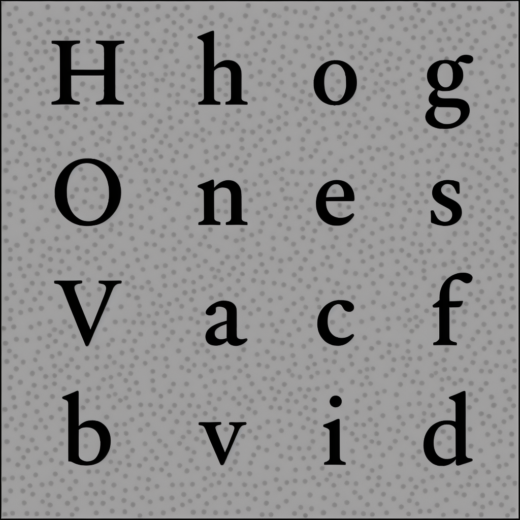
Just for fun: Here you can see the small grey dots floating around in the backgound.
Those are the little sardines that didn't make into into the shoal.. they will be eaten by sharks and die

1 -
Maybe you want to give a more condensed style a try in answering this question

What is your problem with bezier curves and interpolation? Personally, I feel like they are both beautiful ways to capture a lot of typographic information and variability in minimal amounts of data.
0 -
They are too labor intensive. Drawing with bezier takes forever. They have served us well over the years, but I have this optimistic gut feeling that there has to be a better way!1
-
Sure, but if an AI makes the Beziers it would no longer be labor intensive. As a means of simply carrying the information (as opposed to creating it) it is pretty ideal, no?
0 -
Yes.. AFAIK we don't currently have any other solution for it. But we still have interpolation issues. Erik van Blokland has pointed that out on a number of occasions. Underware also wrote about it.
0 -
Anybody who does not enjoy the thread can always… not read the thread.
It isn’t as if you have drifted off topic. This was always the topic.3 -
Jasper de Waard said:Sure, but if an AI makes the Beziers it would no longer be labor intensive. As a means of simply carrying the information (as opposed to creating it) it is pretty ideal, no?
Depends on your view of "ideal". IMO no, binary bitmap at high enough resolution for storage is just as good as vector. Only it consumes more memory when uncompressed, but with modern hardware it is not a problem.
2 -
(2) please, as for length, well, I like Tarantino movies, even though they are also too long.
Testing is the moment of truth, indeed. Real artists ship, and all that.
1 -
- You get an inbound email from a prospective client. In 2,000 words, they tell you that they want Helvetica but a little wider
- You tell ChatGPT: "Hey, there's a prospective client who wants a custom typeface that is like Helvetica but a touch wider. Write up a proposal but make no reference to Helvetica at all. Talk about Univers, Folio, Gerstner-Programm. Attach some images from Dan Reynolds' archive, find a nice wide 19th century sans to reference, Royal Grotesk is too narrow this time. Make sure to reference Karl Gerstner's writing on design spaces in the 1960s because we want to upsell them on the VF. And make sure to say something sappy about how this typeface will help give a voice to the words spoken by the brand or whatever, and how exciting this all is. But don't sound desperate, in fact split this over a few emails"
- You send off the first email written by ChatGPT and the client is ecstatic. They accept before you can write a second email. "Wow," they say. "Karl Gerstner."
- You generate the entire font in two minutes using AlphabetMagic.
- Instead of sending your client the font right then, you have MidJourney or Stable Diffusion create some realistic sketches of a sans based on your AlphabetMagic-generated font, as well as this video of Erik van Blokland sketching. You send the sketches over for feedback. The client remarks on your lettering. This continues back-and-forth for months, with your replies coming entirely from ChatGPT
- Eventually, your work is complete, and you send your client the font you generated months ago in exchange for many thousands of dollars. No one is any wiser.
- You generate more sketches and write up the whole process in a blog post and later you are featured on It's Nice That. This helps you get more leads on custom work so you can do it all over again. One of your leads is a referral from the first client.
- You have succeeded, but at what?
6 -
@jeremy tribby What point are you trying to make?
No one is telling you to lie to your clients. And if you do, you will soon be pushed out of the market by non-lying designers who produce the same quality for a much lower price. So yes, this could push down the price of custom type, probably of type in general.
Should that scare you? Maybe. Is it an argument against this (or any, for that matter) AI? Probably not. People have been predicting large-scale disappearances of jobs after every technological innovation, and somehow the world has always managed to create enough new jobs.
Typographic expertise will not become redundant. Its function will change, as it has changed many times over the centuries.0 -
I'm not concerned about what this means regarding font economics. Rarely do I see a font that is commissioned because it is necessary - usually some perceived brand value, legal reason, or other intangible value for the company commissioning the font that would likely not be met if it were knowingly generated entirely by AI. We don't strictly need new typefaces (though the ones that exist need stewards for changing needs over time) and their continued creation by expert hands is the proof that you are right about this.Jasper de Waard said:Typographic expertise will not become redundant. Its function will change, as it has changed many times over the centuries.This brings me to my point — for type designers, doesn't AlphabetteMagic remove the most enjoyable part of type design? Why use it? Will I become lazy and worse at my craft? Design is such a small part of the process compared to the rest of it - engineering, kerning, hinting, managing projects, and so on - those are the things I wish to spend less time on.My example of the AI-enabled charlatan as a user is an extreme one, but it's meant to express that I am wary of the period we are entering with regards to AI in a very general sense, largely unrelated to labor1 -
Because my posts are fairly pessimistic, I should add that I'm very open to being wrong about how this plays out and how I might find ways to use this kind of technology; this is a brilliant and exciting effort. I should have lead with that, sorry Pablo! What I'm not excited about is the effort it takes to avoid all the noise that AI generates already, and how that effort is encroaching into an area of interest that I rather enjoy in its current AI-free form
1 -
“doesn’t AlphabetteMagic remove the most enjoyable part of type design?” My presumption is that if it can handle the fun aspects of type design, it can also handle the boring bits. But I'm not certain that aspect will be useful in the long term. As a type designer, I don’t believe there’s going to be a long term.
AI-generated images were shockingly terrible a couple of years ago. Illustrators were concerned a few months later when high-quality images could be made in seconds. It happened almost overnight. Don't be concerned by the noise in these font samples—AI improvements can come very, rapidly. It will soon be able to create high-resolution glyphs with perfect curves if given adequate processing power. It will create fonts that are nearly as good as those created by humans. Then it will create fonts that are exactly as good as those created by humans. Soon after, it will be able to create fonts that are superior to those created by humans.
AI creating jobs—I think that’s a delusion. AI tools will make fonts cheaper for the users and swiftly chip away type designers’ incomes. People will still need fonts, but they’ll generate their own, so we won’t be needed anymore. The concept of humans manually creating and assembling glyphs in font design apps will blow away in the wind like Letraset sheets. I'm fascinated by the shift to AI, but I'm often disgusted by the way it's hyped by the people creating the tools. We're all supposed to be thrilled and to accept their word that this will somehow create jobs and improve all our lives. AI font tools will absolutely make some people's lives better: the people who use the fonts and the people who own the tools. Forgive us if we don’t applaud while you’re tap-dancing on our graves. It seems like a lack of human empathy is a job requirement in the AI field.
I'm interested in this topic because it's an historic moment. I’m not afraid of AI-generated fonts, but I am pretty bummed out, man. I wish it could be 1996 with a copy of Fontographer and a world of possibilities, but all good things come to an end.
7 -
Keynes wrote about "technological unemployment" nearly 100 years ago, with the excellent title, Economic Possibilities for our Grandchildren (1930). AI is just the latest step-change up in what economists call productivity - no different to the the spinning jenny, the coal steam engine, the oil engine, the electric grid, electronics, and earlier waves of computing.
I became a design student in 1999, and was surrounded by teachers who were absolutely howling about all these kids with a copy of Fontographer tap-dancing on the graves of their careers and forcing them into teaching. The "Desktop Publishing Revolution" was a revolution no different to the current AI revolution.
An excellent science fiction short story on this is Manna. But I think the only reasonable real-world response to the current step-change, at the global society level, is hours reduction.
The 40 hour work week was established in the age of the steam engine, and given the multiplication of productivity in the global economy since then, we should not have the same work week.
The way it should work as a smooth change, not a radical smash, is doing it on a ratchet - we reduce the work week in say 4 hour chunks once every 6 months until unemployment is zero, and then each time productivity jumps up or unemployment becomes non zero for any other reason, we wind the ratchet and get everyone employed again. This can be initiated by government jobs; a huge % of all jobs are directly and indirectly government funded already - eg, typically state school teacher salaries are maybe considered "government jobs," in this economic sense; but the school meals companies are not, yet they depend entirely on state funding - and so all government funded salaries have the same pay for less hours.
Then the spinning plate of the private sector gets a poke - like the pandemic gave a poke to in-office work and remote work has become much more common - so the competition dynamic is set in motion where the private sector has to competitively offer reduced work weeks too. And most high GDP countries have max work week labor laws already, which can simply be changed.
Many large western european jurisdictions already have a 36 or 32 hour work week in that way, and that is the context of the "precariat" making up a lot of employment, along with their shadow-twin, "bullshit jobs".
So probably we could all globally already benefit from a reduction to 24 hours - every weekend a 4 day weekend! And production itself would not suffer, the material abundance of the present world would remain the same, but with all the free time, the voluntary sector would expand with true volunteers (unpaid) to provide more support to production that isn't possible under paid conditions, and those who lose the most in the current situation would benefit more.
Maybe the 3 day work week would be the inflection point, maybe the 2 day work week, maybe the 1 day, maybe the half day... but at some point, there is an event horizon where free association in free time will completely out-produce capitalist production, and the work week ends completely.
1 -
Not really. Desktop publishing still required people to do work (creative or otherwise) for which they could be compensated. AI removes the person (and therefore the need for compensating them) almost completely.Dave Crossland said:...The "Desktop Publishing Revolution" was a revolution no different to the current AI revolution...2 -
Don't get too paranoid: AlphabetMagic alphabets are not done with mirrors!
1954 - Harold Horman and Edward Rondthaler:
"It is estimated that today each alphabet has more than 10,000 potential "derivative" shapes and stvles. To photolettering techniques as a whole the production of derivatives is no less important than the machine's ability to adjust each letter individually to any given set of proportions and weight. For example, a Photolettering machine operator ordered to reproduce faithfully the original body of a letter character, while lengthening or shortening the letter's ascenders, can expose the two parts of the same letter under different sets of lenses, thereby obtaining the desired and uniform results."
At some points in the article they even used the term "Variable Fonts"

0 -
Maybe... just maybe... we are already there!Ray Larabie said:“... Soon after, it will be able to create fonts that are superior to those created by humans..."
Point 13: Those in which the g just look wrong.John Hudson said:According to ‘a certain Chinese Encyclopedia’, The Celestial Emporium of Benevolent Knowledge, typefaces are divided into the following categories:
- those used to typeset the words of the Emperor,
- no longer available ones,
- those that are good for ‘the small print’,
- the ones you used last week,
- those that remind you of former lovers,
- fabulous ones,
- those in unknown formats,
- those included in the present classification,
- those you have forgotten,
- innumerable ones,
- those that are too light to be used for the present job,
- others,
- those in which the g ‘just looks wrong’,
- those that will be used to typeset this list.
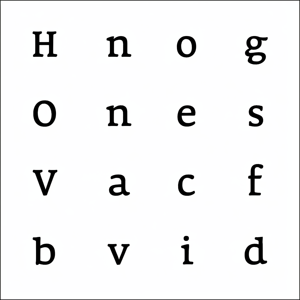
Let me show yo something.. this is a variation from the typewriter alphabet I showed you in post 618. I didn't show it before because my initial reaction was to dismiss it it because of the g... it just looked wrong, as John wisely said.
But at closer inspection it perplexed me:
Is that crazy /g really wrong? or is it even better than the ones we always draw?
Let's admit it: Most /g's ears always look like an afterthought.. however in this one it looks like a fully integral part of the letter... and the tail was shifted away to compensate for it.. its actually a quite clever solution.
I don't believe I've ever seen a similar /g, thats why it looked wrong to me at first sight..
But now I'm starting to think its pure genius, although I'm still perplexed!
Maybe it went a little bit to far... maybe it is a great idea but its exaggerated... however if you look at the other letters in this very same alphabet.. they all have this sort of speed.. this sort of movement.. don't know how to say it... look at the feet of the /i /H /h etc.. yo understand what I mean, right?
What do you think guys.. It's unconventional, that's for sure, but:- Good or Bad /g?
- Is this a failed result or is AlphabetMagic already teaching us something?
0 -
jeremy tribby said:
Ha ha ha ha ha ha.
Hey, there's a prospective client who wants a custom typeface that is like Helvetica but a touch wider. Write up a proposal but make no reference to Helvetica at all. Talk about Univers, Folio, Gerstner-Programm. Attach some images from Dan Reynolds' archive, find a nice wide 19th century sans to reference, Royal Grotesk is too narrow this time. Make sure to reference Karl Gerstner's writing on design spaces in the 1960s because we want to upsell them on the VF. And make sure to say something sappy about how this typeface will help give a voice to the words spoken by the brand or whatever, and how exciting this all is. But don't sound desperate, in fact split this over a few emails" I can't believe you actually wrote that !!!!
The dirty secrets of custom/branding type just revealed... Lol!
2 -
I can't even begin to judge a g unless I see it next to a y.
1 -
Let's make it easy: What about the /i ?Ray Larabie said:I can't even begin to judge a g unless I see it next to a y.0 -
It seems like genius to me, but it's hard to tell out of context. It looks like it would create some nice harmonies.
1 -
Yes.. I'm getting ready to release a OTF font, so we can play with it on the Testing Page.
I tried to increase image resolution to 2048px but failed.. at some point it run out of resources and crashed. Memory overflow or something. I now has to start all over again. https://www.youtube.com/watch?v=7V4E_GK1dt8&list=PLr__F7dgmrahjGmHjDRMmAl_yPnoKyAmp&index=13
1 -
PabloImpallari said:Ha ha ha ha ha ha.
 I can't believe you actually wrote that !!!!
The dirty secrets of custom type branding just revealed... Lol!I thought you might enjoy that. I couldn't help myself, this thread is too wild
Yes.. I'm getting ready to release a OTF font, so we can play with it on the Testing Page.
does that imply you will be autotracing high resolution output?
2 -
Yes indeed... thats what I "wanted" to do..
But... since 2048px got me into a memory overflow I will revert to 1028px.
In my current set-up this is the best I can do now.
The things is: The more glyphs we include inside that 1028px image, the smaller they need to be in order to fit inn... hence the autotracing result will look like shit.
- If I only include 16 glyphs as in the previous examples, autotracing is quite good.
- If I include the whole A-Z a-z 0-9 range of glyphs, autotracing will be shitty and node-dragging will be needed to polish the little corners and all that.
It''s summer here. 27℃...
I will go for a beer or two, and will be thinking about a nice average between the range of glyphs included vs. the auto-tracing quality. Once decided I will quickly generate the OTF file and release so you can play with it.
1 -
Tell that to the typesetting union on Fleet StJames Hultquist-Todd said:
Not really. Desktop publishing still required people to do work (creative or otherwise) for which they could be compensated. AI removes the person (and therefore the need for compensating them) almost completely.Dave Crossland said:...The "Desktop Publishing Revolution" was a revolution no different to the current AI revolution...0 -
Does anyone have an image of the anti-Apple ad that was put out in the late 1980s by an organization representing typesetters?
1 -
Exactly...
1st) We have computers... we have fonts... we have AI... however lots and lots or people are now into hand-lettering, maybe more than ever before.... because population also grows and the pie gets bigger, even if its a smaller slice.
2nd) France!
3rd) We have Facebook, Wasap, Instagram, TickTock... however 40.000.000 people got together, face-to-face, to celebrate the world cup championship!0 -
What do you mean, France?0
-
I think it's teaching us something. The entire design feels "wound up," like a sprinter or a swimmer at the Olympics coiled up and waiting for the starting gun in just a secondPabloImpallari said:
Maybe... just maybe... we are already there!Ray Larabie said:“... Soon after, it will be able to create fonts that are superior to those created by humans..."
Point 13: Those in which the g just look wrong.John Hudson said:According to ‘a certain Chinese Encyclopedia’, The Celestial Emporium of Benevolent Knowledge, typefaces are divided into the following categories:
- those used to typeset the words of the Emperor,
- no longer available ones,
- those that are good for ‘the small print’,
- the ones you used last week,
- those that remind you of former lovers,
- fabulous ones,
- those in unknown formats,
- those included in the present classification,
- those you have forgotten,
- innumerable ones,
- those that are too light to be used for the present job,
- others,
- those in which the g ‘just looks wrong’,
- those that will be used to typeset this list.
Let me show yo something.. this is a variation from the typewriter alphabet I showed you in post 618. I didn't show it before because my initial reaction was to dismiss it it because of the g... it just looked wrong, as John wisely said.
But at closer inspection it perplexed me:
Is that crazy /g really wrong? or is it even better than the ones we always draw?
Let's admit it: Most /g's ears always look like an afterthought.. however in this one it looks like a fully integral part of the letter... and the tail was shifted away to compensate for it.. its actually a quite clever solution.
I don't believe I've ever seen a similar /g, thats why it looked wrong to me at first sight..
But now I'm starting to think its pure genius, although I'm still perplexed!
Maybe it went a little bit to far... maybe it is a great idea but its exaggerated... however if you look at the other letters in this very same alphabet.. they all have this sort of speed.. this sort of movement.. don't know how to say it... look at the feet of the /i /H /h etc.. yo understand what I mean, right?
What do you think guys.. It's unconventional, that's for sure, but:- Good or Bad /g?
- Is this a failed result or is AlphabetMagic already teaching us something?
1 -
I assume “France!” is a reference to the ATypI Paris conference in May?
I will be there!0
Categories
- All Categories
- 46 Introductions
- 3.9K Typeface Design
- 489 Type Design Critiques
- 572 Type Design Software
- 1.1K Type Design Technique & Theory
- 663 Type Business
- 876 Font Technology
- 29 Punchcutting
- 530 Typography
- 121 Type Education
- 328 Type History
- 81 Type Resources
- 111 Lettering and Calligraphy
- 32 Lettering Critiques
- 79 Lettering Technique & Theory
- 561 Announcements
- 96 Events
- 116 Job Postings
- 169 Type Releases
- 179 Miscellaneous News
- 269 About TypeDrawers
- 53 TypeDrawers Announcements
- 114 Suggestions and Bug Reports


