Eau de Garamond — a sans distilled from the essence of Garamond
Comments
-
@Craig Eliason: Is this /x (and /z) better? Less stiff, but they strike me as a bit messy. I'm particularly not fond of the counter-pen cut in /x.

0 -
Yes, I like those, but of course you have to!
The rounded acutes of /z/ seem odd to me; did you try chamfers there?0 -
Very good work! The /j/ it's perfect (for me), I think the /f/ descender should have a similar 'design' (I mean that the terminal should be thinner).
Whit the premise that I liked the old /h/, the terminal of the new one should perhaps go a little further down (the /h.ss02 is also beautiful!).
Thanks for the updates!
0 -
Craig: I adopted rounds after chamfers didn't work out well, but I've given those another try, and they work now. Definitely better than rounds!

Flanker: Thanks! I actually like the symmetry of the Garamond italic /f and wouldn't want to spoil that impression. I just looked at EB Garamond and was surprised to see the same descender on /j as on /f. I tried adding the /f's descender to /j, but that doesn't work at all. I do like it on /f, /ß, and /ſ. So I'm probably going to keep things as they are for now.
I'll take another look at that /h.
Cheers!
0 -
I think the x should slant a little more to the right. The h looks pretty good to me, v and w could be a bit less round at the bottom (especially on the right half of the curve). Top-left terminal of z, and bar of t, f, and g could be slanted more. I think the r should end in a more vertical direction, which would also allow for it to become narrower. Something about the modulation at the top of e is a bit off. I think the j could go a little further to the left, and maybe try that structure on the f as well. The curves in in m and n look much better in the light than in the regular (too pointy on the inside). Same for p. The stroke modulation of b looks a bit off at the bottom-right. I prefer the slanted tittles but they still look a bit too big to me. Maybe the eye of g could smaller to make more room for the tail.
That said, you've got cool vibes going on here! Try to keep some of the irregularities that make old italics cool, but make sure they're not actually mistakes") 0
0 -
Thanks for the feedback! Trying it out in text:

(Punctuation and ligatures not done yet.)
1 -
-
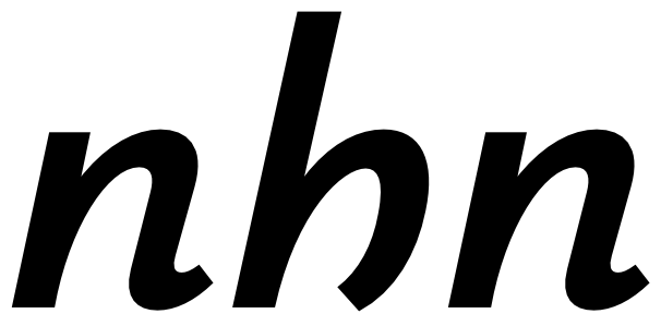
The foot of the h is much better now. But it seems to be a bit light and/or short in the bold weight?0
-
@Georg Seifert: I've tweaked the /h so many times, I've stopped seeing it... is this better?
@Jasper de Waard: Did you mean that the /r's terminal should end with a more vertical stroke, or with a more vertically cut stroke?
0 -
Sorry, more vertically cut, and probably more horizontal in the direction of the stroke.0
-
Italic /y/ looks like it doesn't lean enough. (Getting an italic /y/ to lean well, especially with a considerable italic angle, has always been difficult for me.) /t/ also looks like it leans less than it should.
I think roman /f/ reaches over too far, but I'm not sure if you're still accepting feedback on the roman!0 -
Sometimes the /y looks right to me, other times agree with you... I feel like it's an unsolvable geometrical problem. No wonder you get all kinds of weird designs in italic humanist sanses, like the godawful /y of Novel Sans Italic. Slanting /t a bit more should be straightforward enough.
I absolutely love extravagant flags on /f, and it strikes me as one of the most characteristic features of Garamond... you're not the only one to give me that feedback, but I'm not sure whether I should act on it.
BTW:
0 -
In your picture, your f is less tall than Garamond's, which makes it look like it reaches to the right even further, though it's a small difference.0
-
-
Still not convinced. And always draw it with a b nearby. You need to make sure that it is distinct enough.
Here is my version (in Graublau Italic).
0 -
-
Now the cut is at a different angle. Did you try to move the corner nodes down ~10 units?0
-
The angle is also different from the neighboring angles in your Graublau sample... I don't see a problem there. I do have other cut angles in other letters as well.
Also, I'm opposed to making the stroke dip below the baseline visibly. All my attempts to that end have looked wrong to me, and in fact the foot of the Garamond /h sits squarely on the baseline.
That said, I didn't like the visible break in the right leg of the /h as I had it. Yet another attempt:
0 -
The bottom right part of the h looks so much lighter to me, compared to the n. I thought that could maybe be corrected by some overshoot.0
-
In that version, I've removed most of the contrast there, so it doesn't look visually different from the left stem of /n to me anymore. It also feels well-aligned with the baseline to me.
0 -
For me it's perfect. I think if you focus too much on a single glyph, you will find it somehow strange.
0 -
Got some feedback from someone who installed Eau on their e-reader (a Kobo Auro One, apparently). Looks pretty solid!
This is the Infant version. I feel the /a is a bit too confusable with /o at this size; maybe I should make it less symmetric and more teardrop-shaped?
The user said Eau Text was their favorite reading font now.
Any chance I could upload a font to my Kindle...? I guess not?
3 -
Depends on what version of Kindle and firmware you have. It used to be easy for one of the versions, but now you have to pry open every ebook file and embed the font directly in it.Christian Thalmann said:Any chance I could upload a font to my Kindle...? I guess not?
0 -
Eau’s Regular/Bold/Italic/BoldItalic does not have name ID 16 and 17.1
-
Aren't ID 16+17 only needed if different from ID 1+2?1
-
Or, put another way, IDs 16 & 17 are only typically needed for those beyond the core RIBBI styles.
0 -
So nothing I need to worry about, then?
0 -
Providing them for the entire family may be better.Christian Thalmann said:So nothing I need to worry about, then?0 -
I don't know how to do that.
If it's good to have, can't Glyphs do it automatically?
0 -
Plenty of respectable fonts from large families don’t have IDs 16 & 17 for RIBBI styles. Like Minion Pro and Myriad Pro, for instance. Or Georgia Pro and Verdana Pro.
0


Categories
- All Categories
- 47 Introductions
- 4K Typeface Design
- 494 Type Design Critiques
- 576 Type Design Software
- 1.1K Type Design Technique & Theory
- 670 Type Business
- 884 Font Technology
- 29 Punchcutting
- 537 Typography
- 124 Type Education
- 332 Type History
- 81 Type Resources
- 113 Lettering and Calligraphy
- 33 Lettering Critiques
- 80 Lettering Technique & Theory
- 569 Announcements
- 100 Events
- 116 Job Postings
- 170 Type Releases
- 182 Miscellaneous News
- 270 About TypeDrawers
- 54 TypeDrawers Announcements
- 114 Suggestions and Bug Reports