Eau de Garamond — a sans distilled from the essence of Garamond
Comments
-

5 -
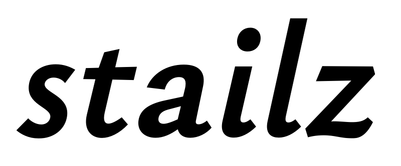
Oh, I forgot to activate SS04: IPA support... that would have replaced the default italic /a/ with a two-storey one so as not to conflate it with /ɑ/, among other things.
 5
-
@Christian Thalmann The ɩ U+0269 and i U+0069 should also be distinct in italic. If you use the same strategy then italic /i/ can be slanted instead of cursive with ss04.
0 -
Is ɩ used in IPA with any regularity? And doesn't the dot on i tell the difference? (Add to that that italic IPA isn't used often at all...)0
-
The ɩ was an alternative to ɪ from 1949 until is was withdrawn in 1989. However it is currently used in several orthographies. The issue is not ɩ and i as such, but ɩ and i when accented. In IPA or orthographies, vowel symbols can often carry tone marks or other marks. With i being soft dotted, it may look identical to ɩ with an acute for example: ɩ́ vs. í. It would be helpful to have them clearly distinct.Looking at the italic a bit, a few current standard IPA characters should use slanted variants: v (confusable with ʋ, also in orthographies), θ and β (the forms seem unusual for IPA).
You can add Latin ꞵ U+A7B5 as you have Latin χ and Greek ꭓ but Greek β U+03B2 is still mainly used in IPA in practice so the ss04 can make it look like ꞵ U+A7B5.
The ɸ U+0278 in italic should be slanted by default. The Cyrillic ef form seems unusual in IPA.
There’s also a problem with italic ƒ U+0192 and f in Ewe and other language orthographies using both letters.
5 -
Dear users of Ysabeau — someone on GitHub asked for a version of Ysabeau in which the oblique top and bottom cuts of vertical stems have been flattened to horizontal.This would obviously require a ton of stylistic alternate glyphs (around 800), but the good news is that each glyph would be rather trivial to derive from the default cut.What’s your opinion on this? Is this a worthwhile endeavor? (Personally, I don’t see the difference at small sizes, and actively prefer the humanist obliques at large sizes...)
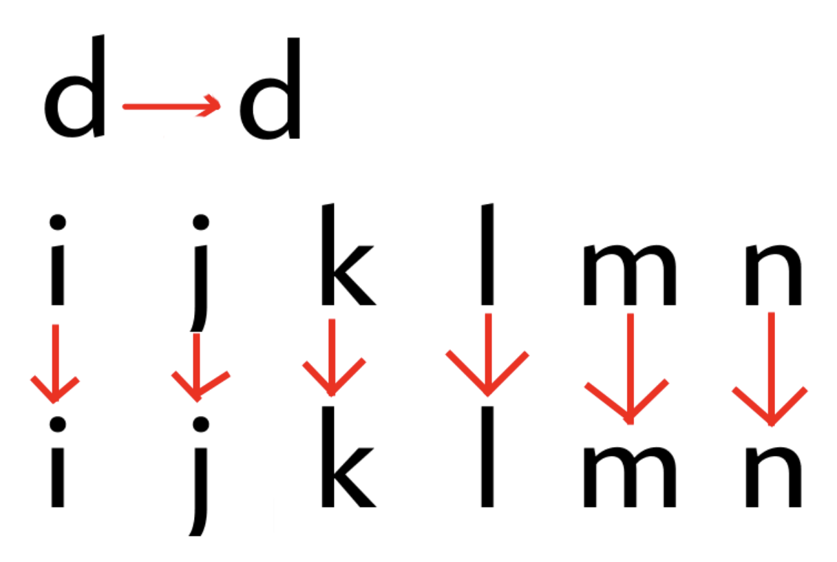 (Image by GitHub user grampuscrustus)
0 -
If doing this, I would treat it as a separate font, not using a stylistic set substitution.Is the person who requested this going to pay you to do the work?1
-
I have considered marking all the flattened letters as non-exporting and cycling them in during export in a set of spin-off fonts. That way it wouldn't weigh down the main fonts, but still all be in one file so I don't have to apply updates to two source files separately in the future.There was no mention of payment, but given the scale of the job, it's not a bad idea.1
-
I think making a less interesting version of your typeface in response to a single request from someone who isn’t going to pay for you to do the work is indeed a bad idea.9
-
I'm glad you also see it that way. I figured it might be worthwhile if everybody had secretly been waiting for it. (I mean, Proza Libre exists)less interesting version0


Categories
- All Categories
- 47 Introductions
- 4K Typeface Design
- 505 Type Design Critiques
- 597 Type Design Software
- 1.1K Type Design Technique & Theory
- 679 Type Business
- 911 Font Technology
- 29 Punchcutting
- 545 Typography
- 129 Type Education
- 334 Type History
- 82 Type Resources
- 114 Lettering and Calligraphy
- 33 Lettering Critiques
- 81 Lettering Technique & Theory
- 590 Announcements
- 102 Events
- 118 Job Postings
- 181 Type Releases
- 188 Miscellaneous News
- 270 About TypeDrawers
- 54 TypeDrawers Announcements
- 114 Suggestions and Bug Reports