

 Jagged (1888)
When did high-waisted (and low-waisted) fonts/lettering first appear?

Craig Eliason
Posts: 1,502
in Type History
There's a period charm to typefaces with intentionally high middles of letters like /B/E/F/H/K/S. Sometimes A/P/R join in, or sometimes they instead have intentionally low middles. /M and /W and maybe /N might get in the act too.
I associate this quirk with Jugendstil (central European Art Nouveau) around the turn of the twentieth century, as in these examples:

But it can be seen in Charles Rennie Macintosh's Arts & Crafts work,and American Arts & Crafts folks like Dard Hunter, and later in proportional games played by Art Deco designers. I also guess that this style was adopted into type from sign-painting and hand-lettering practices.
Any ventures as to when and where it first came about (in type and/or lettering)? (And when you think it peaked?)
5
Comments
-
-
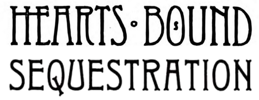
Love the question too! I haven’t found a typeface example before Florian’s 1881, but there were plenty that arrived later that decade. Other prominent early ones below. All but one of these (Typo) are credited to John F. Cumming at Dickinson. Thanks to this exercise, I think we can now say he was one of the originating, and certainly most prolific, designers of the genre.Jagged (1888)
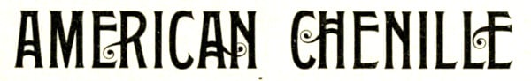
 Typothetæ/Skjald (1889)
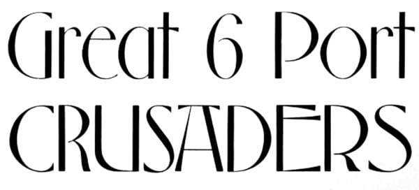
 Elandkay (c.1892)I would guess the peak was around the turn of the century – as you say: Arts & Crafts/Jugendstil/Nouveau – and then it faded out in the late Deco period, circa 1935.7
 -
Do you think there was an influence by Runes?
0 -
Indirectly, I think, Chris. One river of inspiration feeding this style flows from the Middle Ages, from manuscript titling letterforms that are inluenced by runic scripts.


3


Categories
- All Categories
- 46 Introductions
- 3.9K Typeface Design
- 491 Type Design Critiques
- 572 Type Design Software
- 1.1K Type Design Technique & Theory
- 668 Type Business
- 878 Font Technology
- 29 Punchcutting
- 534 Typography
- 122 Type Education
- 331 Type History
- 81 Type Resources
- 112 Lettering and Calligraphy
- 32 Lettering Critiques
- 80 Lettering Technique & Theory
- 563 Announcements
- 97 Events
- 116 Job Postings
- 169 Type Releases
- 180 Miscellaneous News
- 270 About TypeDrawers
- 54 TypeDrawers Announcements
- 114 Suggestions and Bug Reports