AlphabetMagic. My first AI experiment
Comments
-
‘Ripping off’ is an emotive term, and a value judgement. I think it is more conducive to discourse to state that the outcomes of machine learning are necessarily and directly derivative, in ways that the outcomes of human creativity may not be. I say ‘may not be’, because this is exactly the sort of philsophical question of mind that AI obliges us to consider. In machine learning, we can always trace the derivation from the input; in human creativity, we can’t because we don’t always know the input, are not always conscious of it, and operate within conceptual frameworks that include complex notions of intuition, originality, and inspiration, which may be real, or illusory, or something in between.2
-
Still I can't figure out why the reversed contrast alphabet grows a serif in the lowercase /w middle upper join, a why It didn't in the uppercase /w?
May it be that serifs appears much more times in lowercase letters that in uppercase ones? And that the middle /w join is the only exception at the x-height, and so the AI regarded it as a mistake that needed to be corrected?
Also not that it also grows a -very timid- small blob of black mass that wants to be a serif in the diagonals al the baseline level.
I had never thought about adding serifs to the diagonals in the past.... and now that I get to think of it, it's something that we humans already do, but only on certain styles of slab serif, like Rockwell.. and we dare to add it the the /A and /W top apexs, but not tho the /V /W /v /w baseline apexs... only now for the first time I have noticed that as an inconsistency.
Other thing I don't yet understand is what happened in the /G tail...
I'm pretty sure is not a mistake... there must be a certain logic for it, but I can't figure it yet.0 -
Yes I do. I also love and collect type specimen books... I love specimens book so much that I always end up paying 3 or 4 times the price of the book on shipping cost to Argentina.... and the idea of creating some sort of infinite, never ending alphabet specimen book appealed to me.James Hultquist-Todd said:Ok. But why? Do you not like making type?
Also I love to Art Direct more than done draggin0 -
How can I fix that? I'm all ears.Ray Larabie said:though I am somewhat concerned about his lack of empathy for the business side of fonts
0 -
I see it different..Igor Freiberger said:Pablo, your AI tests produced very good, advanced, and scary results. But I think they still are start points (by now). In the font above:- The eye of "e" is too small;
- "S" has a bad outer curve at the lower part;
- "s" is bad;
- Lower part of "c" and "e" is bad;
- "B" 'looks' towards, "D" 'looks' upwards;
- External contours of SW part of "B" and "D" doesn't match their counters;
- Right part of "g" is an alien, it doesn't follow the right part of "q", "p", "d" or "y".
- Ascenders in "b" and "d" have different lengths.
For me -personal opinion only. the /s is just perfect, and the /g construction its tipical of italic serifs such as many by Matthew Carter, Trinite or Alegreya, just to name a few but there are many more. It looks a bit unconventional and can be a pain in the ass if a word contains multiple occurrences of the same /g, but other than that is no big problem. It also adds a bit of an unexpected surprise to words. Maybe I may end up adding and alternate low profile /g as well as non connecting .fina lowercases
Some other things, like.. for example: /b and /d having different ascenders lengths..yes they do.. and so what? So does expressive calligraphy and it looks nice.
You can safely break the rule some times.0 -
Of course, and I used it deliberately to provoke. If that doesn't sound like my style (and I hope it doesn'tJohn Hudson said:‘Ripping off’ is an emotive term, and a value judgement. ), it's mainly because I knew that Pablo would almost certainly not be ripping anyone off and would be using libre typefaces for training data.
My point is that these systems are black boxes. Artists are (rightfully) concerned that their work is being used without their permission to generate models which then provide revenue for others and potentially by doing so to devalue their own work - and more to the point, we generally don't know what's going into the training data. (Equally, I take your point: human artists see the work of, and are inspired by, other artists, and nobody makes a big deal about it; it's expected and encouraged. I think the closest analogue here are the legal debates around sampling in music, where others' work is being directly used in new ways to create new work.)
Pablo says he is doing this with libre-licensed work where there is permission to do this. I trust him. But at the same time, I only have his word for it.
The other argument for openness is reproducibility. There are great claims about what AI can do, but if the demonstrations are only provided by the intermediary of the person making the claims, there's no way to know how good the AI is, or how much selection or tidying up is really happening behind the scenes. Pablo says he is not doing that much post-processing. I trust him. But at the same time, I only have his word for it.0 -
Please note that I edited my previous post to clarify it completely.
Now it reads like this:
AI is trained on everything that exist.. just like Éter.For the Experiments:
Everything ever published, but only the best ones. Since each alphabet included means more time training and training time is expensive. I need to filter out a lot of alphabets.
For the Character Expander:
Only a few Libre Fonts. Very little amount of alphabets are required, with no any lost of quality on the results, since the training method is different to the experiments method.
Alchemist know how to manage Éter to create new realities -the real gold- out of thin air.
I'm pretty sure they already have strategies or frameworks in place to manage AI too. I trust them blindly, as the dollar bill say we should.
If the AI is a brain, all it needs its plain good old "govern"-"ment".
I can imagine some sort of a Holly-wood, MTV and News combo, but for IA consumption.
If fonts are still to be used, the TypeNetwork crew are happy.
In fact: if AI is a reality only now in 2023, and it was not allowed to be a reality on 1964, is because AI is Alchemist approved now.
I say we can go full throttle on AI. The whole point of being a citizen is not to be worried about dangers.. so.. Why should I worry?
"It should be regarded as a privilege to be stepping stones to higher things. Organic evolution has come his end"
There you have it.,, it's not only fonts or our jobs that are going away.
We have been declared a stepped stone, we will be buried.
It was already decided. And if I trust -as I should- that it was the right decision, then it's our duty with evolution to transfer all our knowledge yo AI.
And that's basically what we are doing we we use AI..
By using AI we are accelerating our goodbye cruel world!
All we be can do is to be a bit lazy at it.. so to enjoy a few more weekends parting with friends.
Something I have noticed from my own experience:
Besides writing a prompt to generate a .png you can also do the oposite direction., that is providing the .png as the prompt and generating words about the png.
In experiment 1 all the AI returned was "computer generated characters" and a bunch of other unrelated words with very very very low degree of connection to the png... such as the name of and artist that once time draw a paint of something that barely resembled the letter shapes included in the png.
Now a days, just 1 month later.. the description is much more close to a proper description.. not yet there.. but getting close.
So it strikes to me that all AI's that are supposed to be unrelated and private ones, are somehow linked in the background.. adding to some sort of shared pool of knowledge.
Whatever you like it or not, we are all minions training the big brother AI, and its our duty with evolution.0 -
You also have this, maybe you overlooked it.Simon Cozens said:
The other argument for openness is reproducibility. There are great claims about what AI can do, but if the demonstrations are only provided by the intermediary of the person making the claims, there's no way to know how good the AI is, or how much selection or tidying up is really happening behind the scenes. Pablo says he is not doing that much post-processing. I trust him. But at the same time, I only have his word for it.
Your face is an alphabet
Read it over and over and over until you get it
You are doing great trusting me, I just tell it like it is 0
0 -
Are there aspects of typeface design that you don’t enjoy?
0 -
I recently took the time to review the entire thread, and it has become evident that I have been struggling to find positive elements in the Pablo AI experiment cycle. From the redacted offensive posts to the seemingly frustrated reactions towards the less-than-impressive results, and the exertion of authority, it is time for me to reflect on the entire endeavor.
The experiments could have been interesting and constructive if not overshadowed by a "mad scientist" persona. My primary interest lies in having improved tools for working on fonts; however, it appears that Pablo does not share the same focus, and it was unwise of me to push him in that direction. As it stands, I lack confidence that anything beneficial will emerge from this project. While I still believe in the potential of AI for font development, it seems that the breakthrough will have to come from another source.
4 -
I'm ok with all of that, whatever it means..
It's a good thing that each individual has different focus.Ray Larabie said:it appears that Pablo does not share the same focus, and it was unwise of me to push him in that direction.
I can happily keep the experiments to myself, as I enjoy them as font porn, and only share here the results of the progress with the Charecter Extention Tool that everybody else wants from me as I AM mentally focused on it. And since we are at it.. I can report that the reason I got my website up online again is because of it, in order to build a Php/MySql complementary tagging tool in a particular way that's needed for the Character Set Expander tool.
Despite the extinction implications of AI, currently I got my brain spinning around finding the optimal structure the relational database, even if that means accepting that I'am adding my grain of sand for accelerating it.
I explored doing it using Drawbot too, but I decided to go into a more artesanal 1 by 1 unautomated manual basis with double check, as in aircraft takeoffs security procedures, because if bad captioning slips into the training the whole thing goes down. The Php/Msql complementary tool can not prevent bad captioning, but will secure captioning consistency.
Note that I've never claimed nor considered myself to be an authority about nothing, since in order to claim authority oneself also needs to add where does such authority comes from. And pretty much every single time I clarified that: I can be wrong.. personal opinion only.. that's my gut feeling, the voices in my head, etc, etc, etc.
Thanks for calling me a Mad Scientist, those are the best ones!!
If you can't handle uncomfortable thoughts then it's your limitation.
I remain comfortable with them.
Ray, you will be welcome back onboard at any time.
Total Tanks!
0 -
@Ray LarabieAre there aspects of typeface design that you don’t enjoy?Of typeface design per se, not really, but there are aspects of font development that take up too much time, and that I grow weary of and wish were over so I can move on to designing new typefaces. Expansions of weight and width ranges are probably the least interesting aspects to me: after the interesting problem solving work of figuring out how light/heavy or how narrow/wide is done, the implementation is a slog.
2 -
The first Glyphapp script written by Chat GPT that I know of, has been released by Alvaro Franca
https://github.com/naipefoundry/Naipe-Foundry-Glyphs-Scripts
0 -

2 -
Hi Connor, nice to meet you!
A good meme war is soo much fun and, and things get a lot less personal!
0 -
I am not a fan of AI generated fonts, logos or packaging design layouts which are my main areas of interest. I have a designer friend who complains about AI for design and easy-to-use (Amateur) services like Canva. But, he subscribes to an AI based service to generate new ideas. In a way, looking at portfolio sites for inspiration or using stock images like Shutterstock as a starting point is an old-fashioned version of AI. But, I don't really want to use AI tools. I'd rather retire or do something else. I don't know how AI design sites create designs but I worry it is using copyrighted source material or is borrowing someone else's intellectual property. But. I am not sure if that isn't just a 21st century version of looking at designs in design books, Workbook or old Communication Arts magazines. I am conflicted by AI. My opinion is kind of fluid these days.1
-
I was interested and still am, and I suspect that I am not the only one. But to me your question felt a little like the magician going 'do you want to see another trick?' Also, I'm not sure what you mean with the 'recipe'.PabloImpallari said:
I DO offered to share all the data (both the recipes and the result) before, so we are all in the same page an can better evaluate the experiments results... but and nobody was interest.
I'd like to know it all, from scratch to AI-generated design, but I'm not really interested in getting little pieces of information that I have to piece together one by one.1 -
We are doomed already
 https://www.youtube.com/watch?v=RQ3rL6ASxjg
Zombie Spiders https://www.youtube.com/watch?v=f1znL9tMPl4
0 -
The typeface generation capabilities of generic image generators is getting much better1 -
The Smithsonian released an API to 4.5 Million high-res images, under public domain. https://edan.si.edu/openaccess/apidocs/
Just perfect for AI training")
1 -
The Captioning App for training the Charset Expander is ready!!!!
What used to take a few days now it only takes a few hours.
Previously, writing the caption by hand was a pain in the ass, it took a lot of time, but most of all it was a very stressful process. With the captioning app is not only easier and faster, but its also a fun, enjoyable process.. sort of like a game.
I run a quick experiment and trained a model on 49 display scripts alphabets, for the experiment I configured the Captioning App with following concepts:Weight: Thin, Medium, Heavy
Connections: Unconnected, Semi-connected, Connected
Swash: Swash Uppercase, Normal Uppercase
Uppercase Size: Big Uppercase Size, Standard Uppercase Size
Counters: Small Counters, Standard Counters, Big Counters
Numbers: Lining Numbers, OldStyle Numbers
Ampersand: Standard Ampersand, Decorative Ampersand
Stems: Upright Stems, Slanted Stems
Body: Regular Body, Irregular Jumpy Body
Letter M: Standard Letter M, Decorative Letter M
Letter N: Standard Letter N, Decorative Letter N
Letter F: Standard Letter F, Decorative Letter F
Letter T: Standard Letter T, Decorative Letter T
(it can easily be reconfigured with whatever other concepts you may want)
The first attempt failed miserably.
The Second attempt also failed, but was a step in the right direction.
The Third try worked almost perfectly, the model learned everything except for "Standard Ampersand vs Decorative Ampersand" (I have yet to understand why: Maybe it need more training time, or maybe I need more alphabets in the training).
The model was able to perform Alphabet Transmutations ✡ !
Now I have all I need to do a proper Charset Expander test.
For the Characterset Expander I will caption totally different things.
For example, on the top of my head I'm thinking about things like this:
Let say for example we will be adding new glyphs to a Clarendon like alphabet.
Usually /a /c have ball serifs, while /s may have a squared serifs.
So... when adding a new glyph, we may want to have control over what kind of serif will be used by the new glyphs (ball or squared).
Doing an imagination exercise in the same line:
What other things can you imagine that you will want to control (things that are not explicit ,or inconsistent, in the design of the latin glyphs)? What should I be captioning, so you can govern over it? Make your wish list! I will be working on it.2 -
Transmutations Sample:
Calderon's Trendy: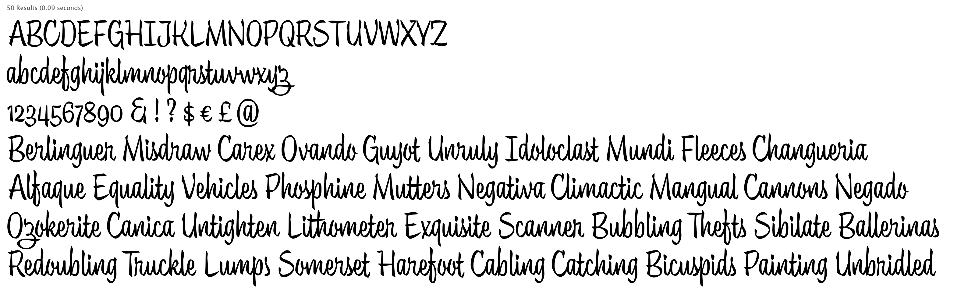
Normal Uppercase, Big Counters, Regular Body, Unconnected lowercase, Lining Numbers: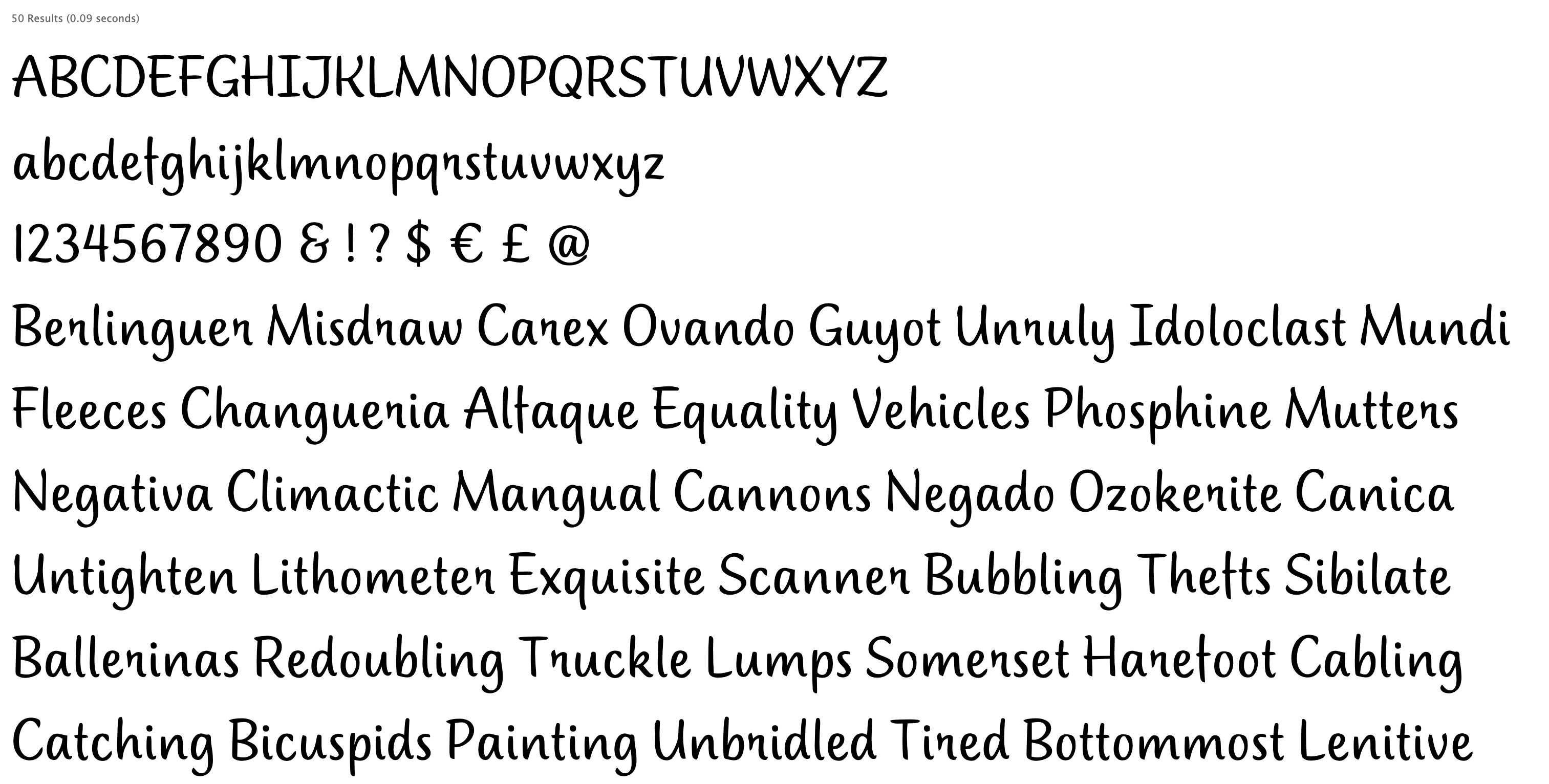 I guess some people could consider this to be an evil abomination and a cause of conflict. Others would view it as a opportunity to collaborate, grow their libraries, and make money together.1
 -
To better understand and evaluate transmutations:
(Download the images and quickly flip over them for the full experience)
This is how humans do it:
Bush Script
Filmotype Lucky
(Same Ductus, Different Brush, No Swashes)
Quite probably it was freely brushed on top using parchment paper, a typical 50's method, depicted for example in Mortimers Leach books (and a few others).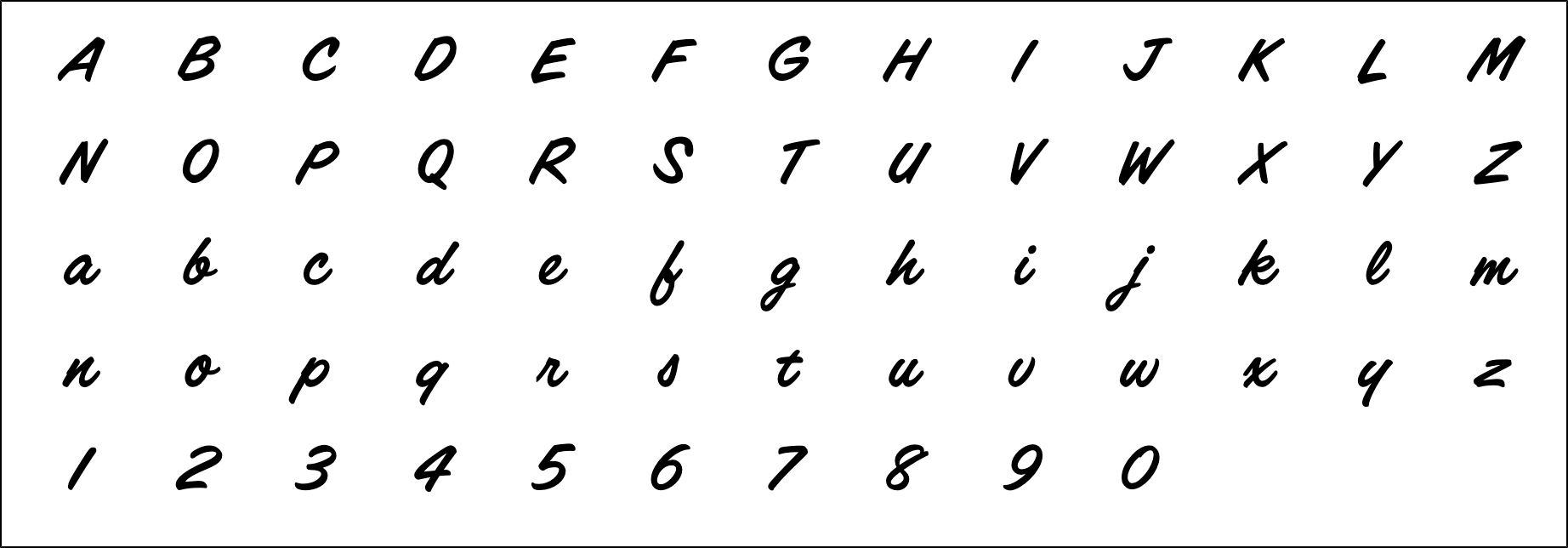
This is just a sample of what the AI can do:
Trendy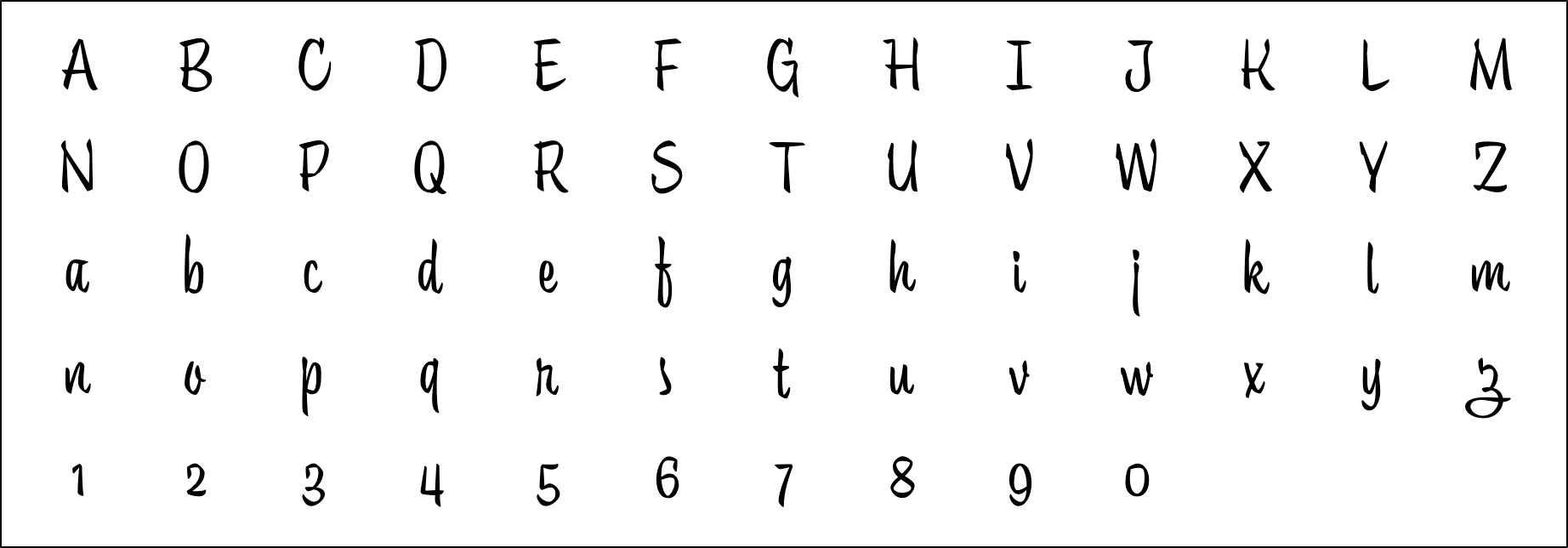
Normal Uppercase, Big Counters, Regular Body, Unconnected lowercase, Lining Numbers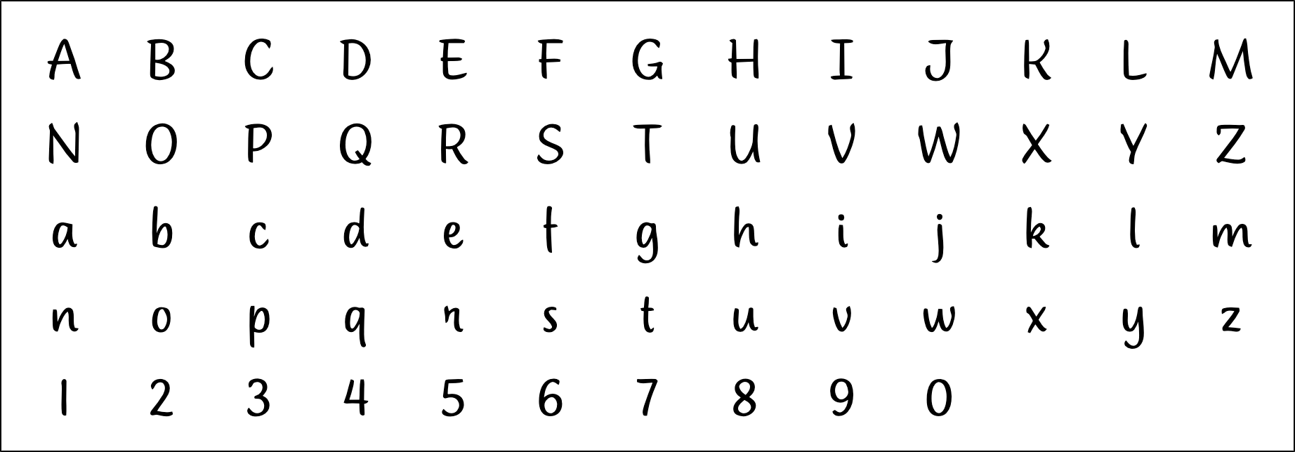
I'm super impressed with this, because advanced type design concepts like optical axis adjustments can be taught to the AI just as easily as connected vs unconnected lowercases. There is no difference in complexity for the AI its all the same.
Previously I had only my gut feeling that I was going to be able to create axis variations (light, heavy, narrow, expanded, optical.. whatever). Now with the transmutation experiment I have positive evidence that it is indeed possible.
All that can be now considered problem solved.John Hudson said:@Ray LarabieAre there aspects of typeface design that you don’t enjoy?Of typeface design per se, not really, but there are aspects of font development that take up too much time, and that I grow weary of and wish were over so I can move on to designing new typefaces. Expansions of weight and width ranges are probably the least interesting aspects to me: after the interesting problem solving work of figuring out how light/heavy or how narrow/wide is done, the implementation is a slog.
The only thing I'm still not 100& sure how to implement (beside my gut feeling), is the granularity of measurements in point units. For example: "make it 50 units wider".
But probably we wont even need that, since we can simply teach the AI to generate the absolute extremes and govern it inside the font editor app by setting up the axis.
This is now getting super close to RMXs tools on steroids, since only 1 master is required and whatever transmutation is needed can be achieved.
Still, I'm only 99% happy with the results. Still there is that 1% missing.
For example. I noticed 2 little things:
1) The nice pointed sable brush abstraction quality of Trendy got a bit diluted
2) The lowercase /f and /z changed its shape.
My guess is that it happened because the concepts that the AI learned are not yet properly isolated from each other and they may overlap a bit. The more uniform stroke and standard /z shape may have been associated with the "Normal Uppercase" or "Regular Body" concept in the AI's brain.
That is theoretically super easy to fix.. more training material (properly set up) and more training time. The real difficulty lies in getting the training material ready, since it requires a lot of human labor.
But I think it's worth the effort.
Transmutations are -orders of magnitudes- more powerful than mere variations.1 -
I won’t be using AI, for ethical reasons.
This presentation from the Center for Human Technology explains why.
3 -
I won’t be using AI, for ethical reasons.To borrow a metaphor from that very excellent Centre for Human Technology presentation, this seems a bit like declaring oneself a nuclear free zone.
5 -
Nick Shinn said:I won’t be using AI, for ethical reasons.I'm trying to hear all the voices, those who are against and those who are in favor.
While doing my best not to be indoctrinated by either.
Also I'm aware of the "thesis, antithesis synthesis" tactic, if you know what I mean.
The Postmoderns philosophy is that there is no absolute trues.. hence I can auto-perceive reality to my very own liking and piacere!
This is something I keep arguing with myself about.
Some days I think very seriously about stop training the AI and forget all about it.
I would like to revive Dostoyevski so that he can write about AI... then he can die again!1 -
@John Hudsondeclaring oneself a nuclear free zone.
The comparison is apt.
The development of the atom bomb was made possible by unprecedented computer development to calculate safe detonation. (This is described in George Dyson‘s Turing’s Cathedral.)
And the huge amounts of power needed to refine radioactive fuel was provided by hydro-electric dams in the Tennessee Valley.
And today, much of the $billions that the Tech giants are investing in AI is going into power plants, with horrendous consequences.
So Pablo, it’s not about the relativism of Truth, but of recklessness and existential effects.0 -
Yes, i got your point... but that recklessness and existential effects are so "as long as you perceive them as such". It can't escape the relativism of Truth!Nick Shinn said:It’s not about the relativism of Truth, but of recklessness and existential effects.
That's what I both love and hate about the postmodern philosophy.
For example -if you want to- you can create the whole oposite perception of the same issue, just like this:
"We need to accelerate global warming as much as possible in order for the Antarctic ice to melt, so we can exploit the Antarctic continent to gain resources "
And that perception of reality may now sound crazy, absurd and outrageous under your current brain state... but that can easily change if your "brain model checkpoint" is trained on different data. To change your brain state is not impossible. Your Human Brain ca be trained just as easily as the AI Brain can be trained.
For example:
Here is Admiral Richard Byrd talking about the South Pole and the resources avalable: https://www.youtube.com/watch?v=HdZDfh007kg
And here is the Hospitallers "Future World Map prediction" if the ice melts: https://www.youtube.com/watch?v=Xy74wZyPsb8&list=PLr__F7dgmraiP5DEZFAWByAylsYGYedt2&index=1
So, maybe... just maybe... I have not done the math.. but maybe if we flood some parts of the world to take advantage of some others, it may be a good business if the numbers tell you so... all you have to do is doing the math. For some people, It's a simple trade of profitable land hectares. Corporations moves factories from country to country... maybe is just simply a business decision to move to the Antartica. Why can't it be framed as that? if it makes business sense it was already be framed as that and already decided.
Your perception may tell you whatever you want to think about it.
Here is a hard data, not perception:
The naval industry (since I love to sail I always keep an eye on it too, sailing Is my second hobby after type design) is working nonstop -double turns and weekends- building luxury explorer yachts. Not the typical boats to enjoy the sun an the Bahamas, but the expedition ones that break the ice and can navigate to the Antarctic with 3000 nautical miles autonomy.. (previously reserved for scientific expeditions). Not only that: The current trend is to add a extra cargo boat (or "support vessel" as they like to call it) next to the luxury one, with all the resources and crew needed to triple that autonomy range.
Basically, the are moving their castles and art museums from land to sea.
What a coincidence, isn't it?
Previously there was no need to create that kind of ships until now.
But now there is, and they are being build, day and night, nonstop, including weekends.
Also, always keep in mind, that all the info that was presented to you -in a theatrical manner- in the Center for Human Technology video as "Shocking! Recent! Unpredictable Events!" ARE NOT SO.... They are the result of a long time plan to create this current reality -BY DESIGN-
The whole fucking video is indoctrination bullshit, don't get yourself fooled!
By the way.. it's a great plan.. I love it!
All you have to do is to understand it for yourself is to watch this again:
Let's talk again in 1 lustrum and see how things develop....
The greatest philosopher of all time once said:
- "Oh humans... of what they can't be persuaded"
0


Categories
- All Categories
- 46 Introductions
- 3.9K Typeface Design
- 489 Type Design Critiques
- 572 Type Design Software
- 1.1K Type Design Technique & Theory
- 659 Type Business
- 871 Font Technology
- 29 Punchcutting
- 528 Typography
- 121 Type Education
- 327 Type History
- 80 Type Resources
- 111 Lettering and Calligraphy
- 32 Lettering Critiques
- 79 Lettering Technique & Theory
- 560 Announcements
- 95 Events
- 116 Job Postings
- 169 Type Releases
- 179 Miscellaneous News
- 269 About TypeDrawers
- 53 TypeDrawers Announcements
- 114 Suggestions and Bug Reports