AlphabetMagic. My first AI experiment
Comments
-
@PabloImpallariHow else could there be such an exact coincidence?
Well, you might look a little further afield than the digital domain.
Cooper Black originated in Oz’s lettering, which does not seem to have been traced over Bodoni!
Cooper Black was published by Barnhart Brothers and Spindler, which did not have a Bodoni, AFAIK.
There may be some other explanation for the “exact coincidence”; I suspect it is some kind of artefact of the digital fonts on which your AI was trained. Forming conclusions about RW history from such things is dubious.

3 -
That's a good point... it made me think.....Cooper Black was published by Barnhart Brothers and Spindler, which did not have a Bodoni, AFAIK.
Maybe is the other way around and Bodoni Black was draw having Cooper Black as a reference. Which sort of make sense given Cooper Black's success. Goudy did his Heavyface to compete and maybe the ATF guys tried jump inn with Bodoni too.
Whatever the case, I stand my point that they are linked, even if I made a mistake in the chronological order. Thanks Nick for digging in to this!
I will add a "notes.txt" on Github.
Speaking about that... I'm trying to re-create the my list of specimen and lettering books. I used to had a huge one, but it wasn't online and got lost when my computer got stolen. I don't what that to happen again, so this time is on-line.Well, you might look a little further afield than the digital domain.
If someone has time and desire, I would like to invite you to collaborate with more links to complete it.
0 -
Those Cooper images are taken from:
The Book of Oz Cooper, published by the Society of Typographic Arts, Chicago, in 1949.1 -
Right now the experiments seem to be: the AI draws stuff, and the human decides how good it is. Even in the most exciting moments where it seems the AI is producing wholly unforeseen and original developments, it's still a human (Pablo) who is recognizing their exciting character (and conversely throwing out or ignoring the AI's ventures that seem like dead ends).
The tipping point happens when/if AI is not just the one generating designs, but also the one recognizing which of them are great. Then we've gone from AI replacing Pablo as typedrawer to AI replacing Pablo as typemaker entirely.
Of course, even if we never reach the point where AI really "knows" that a particular design generation is brilliant, we will probably reach the point where AI's "faking" of that knowledge is persuasive enough and/or efficient enough to become standard practice.5 -
Today I have been working in a model to create the Heavy master from the Regular master. I'm not yet there, but I think i'm on the right path to it.
Cabin Regular:
Make it Heavy!
I need to keep improving the model to properly isolate the "Heavy" concept, so it is more respectful of the original forms (So it does not replace the /i dots, the /g, or the /v /w apex, /a tail, etc.... the "weight" concept needs to be fully isolated for the "shape" of the letters, and not to transform the original letters beyond a "reasonable point"... the thing is that finding that "reasonable point" is not so easy).1 -
One thing is bugging me: the model needs to have optical correction at the joins. Normally this increases as the weight goes up.1
-
Yes, is bugging me too.
But also, another thing that bugs me even more is that the "heaviness" is not as heavy as it can be.... what I really want as a result form the model is more like an "Ultra" more than a standard "Heavy".
Since there is not a standard definition of what a heavy weight is, I included many "heavys" in the training data that are not really all that heavy... for example, AtlasGrotesk Black or Acumin Black, are not as black as AGBook Black or AktivGrotesk Black. There are different degrees of "Blackness" ranging from font to font, even within the same design features.
This is the Cabin Heavy master I did by node-dragging back in 2020:
The goal I'm trying to achieve for the "MakeitHeavy" model will be to get a result as close to this as possible. (ignore the /g.. I can't remember why I decided to go with a single story g back in 2020)
The logic to make it happen in theory is already there. I think I need to keep refining the training data selection to make it happen in practice.0 -
Just For Fun:
These are some of the RayWantsCrazy experiment result turned into fonts.
If "Good text fonts should be invisible" and go unnoticed to the reader, then good display fonts should be all the opposite: Super visible to draw all the attention possible from the reader and catch his eye.
Crazy Franklin Black:
Just lines: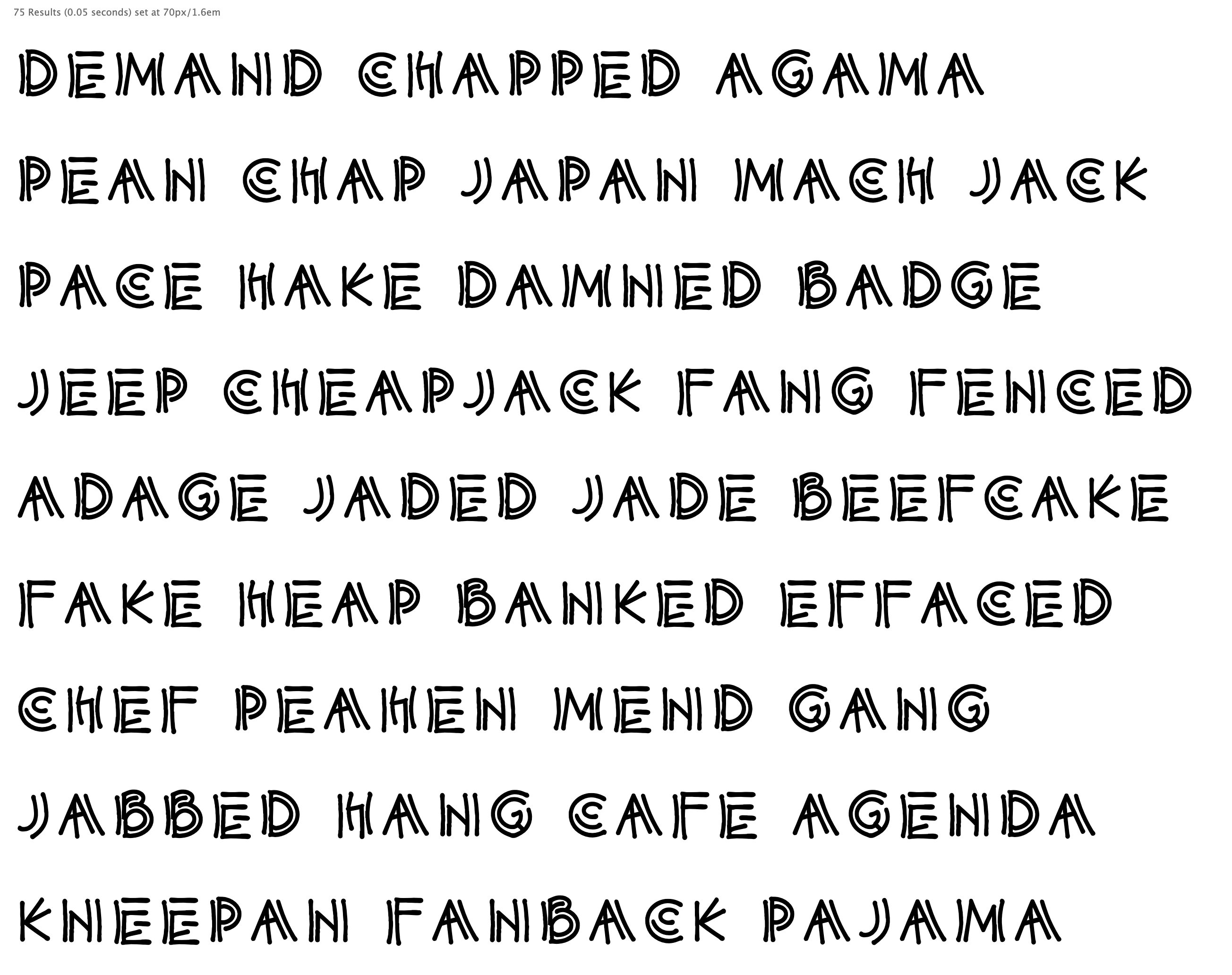
Mecano / Futuristic: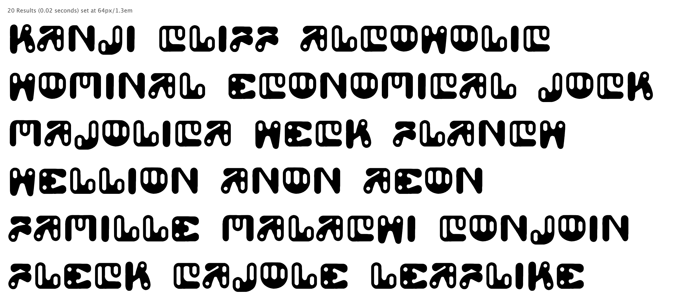
Old Greek inscriptional style fonts are -to me- cool, but boring.
By adding a blackletter style emphasis to the initial uppercase, they become more fun
They may be crap, or not... but they look so much different from everything else....
I'm loving n2 "Just lines", and can imagine it being used for vegan pseudo-food brands or things like that.
1 -
The Esoteric one:

0 -
2
-
Any news Pablo?0
-
2
-
New and improved “pseudo-random” feature!1
-
And the spacing needs work
")
But the legibility, and the overall cohesiveness of forms, is very high, compared to stuff that was seen just a few months ago.2 -
I'm particularly impressed with the “toilet seat” lettering in that it echoes the pen strokes of the accompanying artwork. I wonder what fonts (if any) the system uses as models.5
-
I wonder if the AI learns well enough that it studied old lettering manuals available on the web. Try generating spencerian stuff.1
-
https://serce.me/posts/02-10-2023-hey-computer-make-me-a-font
I expect another announcement some day from someone heretofore unknown to the type community who posts something like this which is really really good. Just personal speculation on my part.2 -
"AI is like an immigrant... learns fast, works hard and is here to steal our jobs"
- Rafi Bastos1 -
Hola Pablo! Te he enviado un mail interesada sobre el tema
") 0
0 -
Sardine based multi-axis image generation. How long before this applies to fonts?
https://x.com/msfeldstein/status/1812250580578103749
1 -
what the fuck ... isn't this the second time, in this thread, that you made racist remarks???PabloImpallari said:"AI is like an immigrant... learns fast, works hard and is here to steal our jobs"
- Rafi Bastos3 -
-
Interesting paper, Dave. The resolution improvement is definitely notable, but I don’t know enough about Chinese character to design to comment on the quality of the shapes. I would love to read some analysis by CJK design experts.
[Years ago, at a conference exhibition, @Toshi Omagari talked me through all the small things that were wrong in a Japanese typeface design, and I was aware a) how little I know about CJK scripts and b) how little of my knowledge of other scripts is applicable to CJK.]0 -
Gentype (experiment by Google), it creates letters made of anything.
I've tried "squash blossoms pizza" (Rome's delicious Fiore di Succa pizza)
Read more at https://developers.googleblog.com/en/how-its-made-gentype-alphabet-creator/
1 -
Incredible what 100 billion dollars and a complete lack of ethics and values can accomplish!
 2
2 -
I've tried "boobs" and it was restricted, looks like "genitals" escaped the filter.0
-

3 -
bicycle drivetrain components

0 -
I stumped it with “Ernst Haeckel radiolaria”, “Julia sets” and “viscera” but got results from “Arabesque Ornaments”, “Granjon Ornaments” (which incidentally were not very Granjon), plain “radiolaria”, and “poop”.0
-
“Rhizomes”, “guilloche”, “lagomorphs”, “semiregular polyhedra”, “lichen” and “slime molds” all work.
“Cappadocia” generates results but doesn’t really work.
0


 bicycle drivetrain components
Categories
- All Categories
- 47 Introductions
- 4K Typeface Design
- 495 Type Design Critiques
- 577 Type Design Software
- 1.1K Type Design Technique & Theory
- 671 Type Business
- 885 Font Technology
- 29 Punchcutting
- 539 Typography
- 125 Type Education
- 333 Type History
- 81 Type Resources
- 113 Lettering and Calligraphy
- 33 Lettering Critiques
- 80 Lettering Technique & Theory
- 569 Announcements
- 100 Events
- 116 Job Postings
- 170 Type Releases
- 182 Miscellaneous News
- 270 About TypeDrawers
- 54 TypeDrawers Announcements
- 114 Suggestions and Bug Reports