AlphabetMagic. My first AI experiment
Comments
-
StabilityAI just launched StableML, their own version of chatGPT.
https://github.com/stability-AI/stableLM/
0 -
This movie is soo good on so many levels
 0
0 -
The longer this thread gets the more I think that Jonathan Hoefler saw this coming and sold at just the right time.2
-
Hahahah... the man is a genius... I hope he can buy a long-range Bering explorer.James Puckett said:The longer this thread gets the more I think that Jonathan Hoefler saw this coming and sold at just the right time.
Heavy-duty luxury. The best one to sail to the Antarctica if New York floods and disappears, and -much more important- the safest place to store his priceless type specimen books collection.
6.000 nautical miles range (you can cross the Atlantic twice).0 -
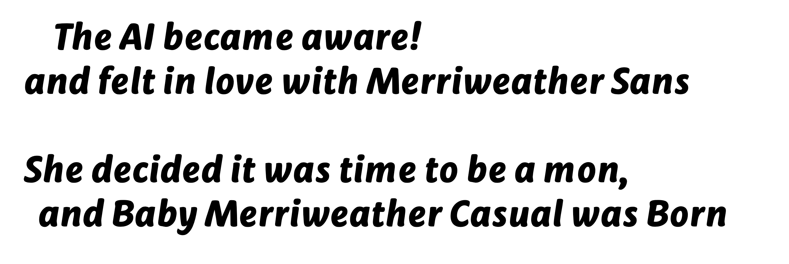
Another transmutation.
What impressed me most about it is that, since the AI doesn't know yet the concept of "fonts made for the screen" she treated it as the standard alphabets it was trained on. Hence she decided to make the lowercase /m and /w a bit narrower, and ignored the uppercase /M and /N big inktraps. Pretty much everything else stayed the same, beside the stroke endings and the general contrast decrease. Excellent design decisions in that context!
The uppercase /L lower part got longer.
And the /five middle section got centered.
Good or Bad AI decisions? I can't decide.
Glyphsapp source file is available, with the Even's original MearriweatherSans-ExtraBoldItalic shapes in the mask layer for your detailed inspections. On Experiment 18b github folder.
(Except for the /i and /j, they where made as components and got lost).0 -
PabloImpallari said:
Yes, i got your point... but that recklessness and existential effects are so "as long as you perceive them as such". It can't escape the relativism of Truth!Nick Shinn said:It’s not about the relativism of Truth, but of recklessness and existential effects.
That's what I both love and hate about the postmodern philosophy.
For example -if you want to- you can create the whole oposite perception of the same issue, just like this:
"We need to accelerate global warming as much as possible in order for the Antarctic ice to melt, so we can exploit the Antarctic continent to gain resources "
And that perception of reality may now sound crazy, absurd and outrageous under your current brain state... but that can easily change if your "brain model checkpoint" is trained on different data. To change your brain state is not impossible. Your Human Brain ca be trained just as easily as the AI Brain can be trained.
For example:
Here is Admiral Richard Byrd talking about the South Pole and the resources avalable:
And here is the Hospitallers "Future World Map prediction" if the ice melts:
So, maybe... just maybe... I have not done the math.. but maybe if we flood some parts of the world to take advantage of some others, it may be a good business if the numbers tell you so... all you have to do is doing the math. For some people, It's a simple trade of profitable land hectares. Corporations moves factories from country to country... maybe is just simply a business decision to move to the Antartica. Why can't it be framed as that? if it makes business sense it was already be framed as that and already decided.
Your perception may tell you whatever you want to think about it.
Here is a hard data, not perception:
The naval industry (since I love to sail I always keep an eye on it too, sailing Is my second hobby after type design) is working nonstop -double turns and weekends- building luxury explorer yachts. Not the typical boats to enjoy the sun an the Bahamas, but the expedition ones that break the ice and can navigate to the Antarctic with 3000 nautical miles autonomy.. (previously reserved for scientific expeditions). Not only that: The current trend is to add a extra cargo boat (or "support vessel" as they like to call it) next to the luxury one, with all the resources and crew needed to triple that autonomy range.
Basically, the are moving their castles and art museums from land to sea.
What a coincidence, isn't it?
Previously there was no need to create that kind of ships until now.
But now there is, and they are being build, day and night, nonstop, including weekends.
Also, always keep in mind, that all the info that was presented to you -in a theatrical manner- in the Center for Human Technology video as "Shocking! Recent! Unpredictable Events!" ARE NOT SO.... They are the result of a long time plan to create this current reality -BY DESIGN-
The whole fucking video is indoctrination bullshit, don't get yourself fooled!
By the way.. it's a great plan.. I love it!
All you have to do is to understand it for yourself is to watch this again:
Let's talk again in 1 lustrum and see how things develop....
The greatest philosopher of all time once said:
- "Oh humans... of what they can't be persuaded"Touch grass1 -
The whole fucking video is indoctrination bullshit, don't get yourself fooled!
However I do prefer the humane idea it represents—that we can exercise some control over our destiny, rather than just quickly submit to our tech lords according to your genocidal “It’s all good” philosophy.0 -
It's not my philosophy (I try to avoid having any): It's postmodernt's philosophy.
I was simply pointing out that all is relative to the philosophical framework each people group choose to believe.
On AI's terms, it will be similar to training different models with different training data: for example Chat GPT can be, let's say.. a communist... while StableML can be, lets say.. a capitalist.. or the other way around.
By training the AI's brain, now I have a better understanding on how our human's brains have been trained too. Both works in a very similar way.
As I said, I try to avoid cherry picking any particular philosophy..
But if I have to, I will provably go with Cicero.0 -
When I told you that "Your Face is an Alphabet" I framed it like an alchemist allegory (sort of, not completely since they also include pictures and musical melodies).Jasper de Waard said:
I'd like to know it all, from scratch to AI-generated design, but I'm not really interested in getting little pieces of information that I have to piece together one by one.
Also, when I told you "Read it over and over and over until you get it" I did so because that is the standard procedure to read allegories. That's the way to understand their meaning, that is not evident the first one you read them, but somehow it comes to you when you go over and over and over it.
But since most people my not be used to read such things, I will now tray to explain what does "Your Face is and Alphabet" mens to me..... Ok? here we go:
1) Typeface
--> Type - Face
2) You face is a set of things (eyes, nose, mouth, ears, eyebrows, beard, hair, etc)
--> A typeface is a set of letters ( A, B, C, a, b, c, etc...)
3) You facial expression is a configuration of that set (happy, sad, angry.. etc)
--> typefaces are also configurations (serifs, sans, scripts, handwritting)
4) Open Mouth --> 2 story /g
Closed Mouth --> 1 story /g
For that very same reason I pointed the ones interested to watch youtube tutorials on how to train AI with faces, so you can translate what you learn from that to make it work with alphabets.
There you have it, thats all there is to know about it..Jasper de Waard said:
I'd like to know it all, from scratch
I hope this explanation good enough now.
Also I think is best for all of us if you do your own experience and come up with your very own training method, which my be different from my method, so that we may end up learning from each other.
0 -
I guess that understanding an allegory by reading it over and over and over, will be a similar process to training an AI model with very little data but allowing a super huge amount of training time.
I guess this method force the brain to establish much deeper neural connections.
I will run an experiment like that, to see what we got as a result... I'm curious0 -
Here is another video by the same guy, this time talking in front of the congress.Nick Shinn said:The whole fucking video is indoctrination bullshit, don't get yourself fooled!
A little bit lowered the indoctrination level and bit increased on data. Much more interesting to watch. And the very first thing sentence out of his mouth was pretty much the same I just told you yesterday, that all this is happening by design.0 -
Actually, you said that, not me.
(I don’t pepper my posts with “fucking”.)
I prefer my “indoctrination” to whatever kool-aid you’re drinking!1 -
You sort of proved my point... it's a preference, not an absolute true.Nick Shinn said:I prefer my “indoctrination” to whatever kool-aid you’re drinking!
Once again, I used it just as an example.. is not my preference neither.0 -
Of course, no prediction of the future can be “true”, but don’t you think that there is a strong likelihood that the warnings of Aza and Tristan about what could go wrong due to AI, will go wrong?
Having seen the consequences of the Attention Economy, on the mental health of children, for instance, caused by the “move fast and break things” ethos of the tech bros, why would we rush to embrace the next generation of disruption that they are foisting upon us?
3 -
Craw modern as drawn by Oswald Cooper
(download the images and quick flip over them)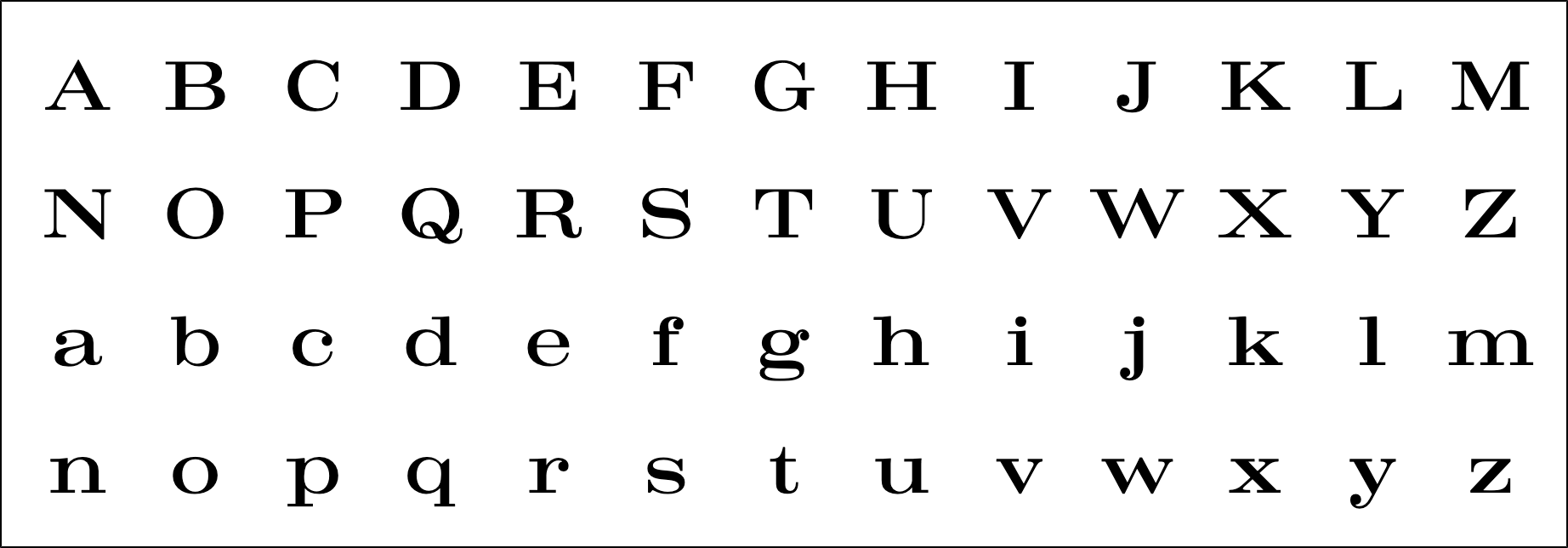
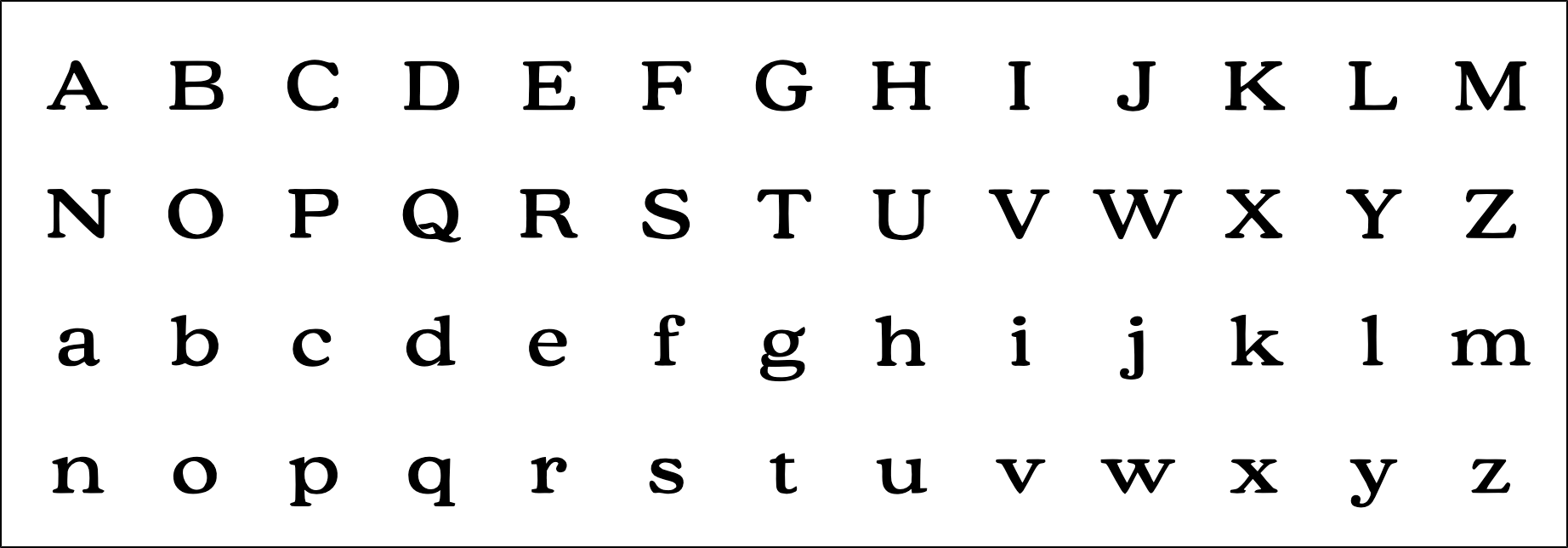
This is core to the Characterset Expander Tool, since by being able to isolate and translate the essence of any particular design over another one, you will be able to also translate it to new and nonexistent glyphs too (be it new punctuation or language extensions).0 -
By messing around with Cooper Black, by chance identified Bodoni Black as the base skeleton behind it. I guess it can be considered as another example of a Human-made Transmutation.
(download the images and quick flip as usual).
Bodoni Black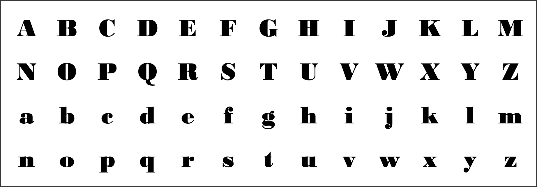
Cooper Black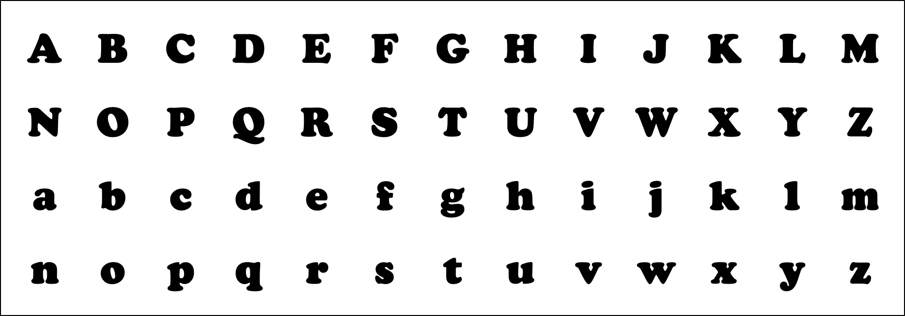
Also added preview images for the previous Merriweather transmutation experiment.
The AI seems to be really good at this.
Merriweather Extra Bold Italic
MW Casual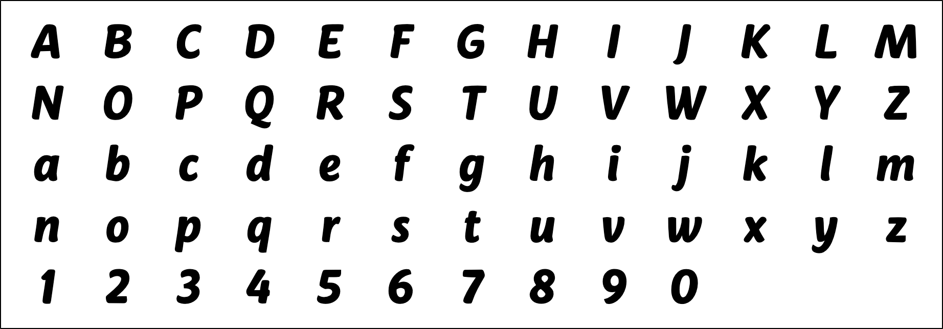
0 -
By messing around with Cooper Black, by chance identified Bodoni Black as the base skeleton behind it.
Really? True, they are both Latin alphabets…1 -
Yes really. If I apply the Cooper "esscence" to Bodoni Black as I did to Craw Clarendon, all I got in return is Cooper Black again. They are linked to each other.0
-
all I got in return is Cooper Black again
Even for C G O Q ?
Cooper Black and Bodoni Black have similar weight and proportions, so if what is applied is Cooper Black styling, what else is there to be generated in the process? The weight and proportions are going to stay as they are.0 -
Similar things happened to Craw Modern too... but the Q tail failedJohn Hudson said:
Even for C G O Q ?
The /C grow a serif at the bottom
the /G lost the straight short stem
The /O contrast got diagonal
The /S got diagonal spurs
The /g ears got that vampire shape instead of the rounded serif
The /W and /w middle serif was added in craw, not needed in Bodoni as it was already present.
The overall contrast changed too
...etc...
If you look at the lowercase /x in Bodoni Black and you "dit it in chocolate", so to speak, you get exactly the Cooper Black lowercase /x... im pretty sure it was used as a reference when creating Cooper Black... maybe by using parchment paper or something. Even if Nick can't see it I stand my view of it... How else could there be such an exact coincidence?
Some things get generated and some others got deleted.John Hudson said:
what else is there to be generated in the process?
The weight and proportions are going to stay as they are.
This is a very interesting topic to discuss and I have been thinking about it the whole week:
- What is really truly unique to a design?
- What is the "essence" and what is not?
Or to be less romantic and more pragmatic, simply put as:
- What the AI is going to change and what the AI is going to keep?
There are many ways to teach the AI:
On the previous experiments when I tried to generate whole new fonts I used many fonts as the training data... kind of like putting 10 or 20 alphabets in to the blender and creating a new "milkshake" alphabet out of them.
On the CharacterSet Expander tool and the Transmutations experiments I'm using a different tactic. (I will write a full step by step tutorial soon):
I train with only 1 alphabet, so the AI learns all that there is to know about it (the one I'm trying to capture the essence). Then I train separately with 200 or so other alphabets, so it can compare what is unique to the Studied alphabet vs the 200 others.
By doing that comparison ( 1 vs 200 ) the AI can evaluate what's unique about it.
In this way, the AI is not learning about the 200 others, only using them as reference to learn MORE about the selected 1 being studied. The more alphabet you put in the comparison pool, the more educated is the AI result, and the better distill the essence. (for example if you put 600 instead of 200).
I will write a step by step tutorial because everyone will need to roll their own CharacterSet Expander AI model, since in order to make it work for you, you need to train it with your own typeface (the one being extended). - The FontEditor apps will be able to do it on theirselves on the future, I hope.
For this transmutations experiments I'm training the AZaz09 glyphs on a single image, since using a single image is faster.
For the CharacterSet Expander Tool you need to train each glyph in a separate image, thats the only real difference. So you need 12.261 pngs. ( 61 images for the typeface being expanded, plus 12.200 {61*200} for the ones used as comparison ). All that multiplied by training time too.
Training on a glyph per glyphs basis -today- is expensive both in time and u$d.
Thats the only reason why I have been delaying it, but the method is the same.
And by doing this transmutation experiment now I got a better understanding on how to set everything up and optimize things.
If some of you already watched the tutorial videos on how to train Dreamboth with your face and got familiar with the basics of Dreamboth training: What I am doing is not training the alphabets as "instance" images, but using them as "concept" images instead. I think its called "style training". That will be the technical explanation, if someone want to roll their own experiments, I will be happy to have company.1 -
This is what the AI considered (given the comparison pool) to be the Trendy essence.
I decided to apply it to Cg's Brazilia as the base shapes, since Trendy is narrow and Brazilia is wide, I think it could be a good example.
Please note that I did this very quickly with very little training time, the /I got confused.
It's quite a decent result... it can be made just perfect with more training time and data.

For the Comparison Pool
(the "Instance" images, on Dreamboth training lingo):
- I've used 224 alphabets.
- About 50% scripts, 25% upright sans, 25% italic sans.
This is Important:
Most of the scripts in the pool have swashes, oversized uppercases and all that... so that kind features may have been seen as NOT an essential part of Trendy.
I one want's to keep more of that features as unique to trendy, one will need to remove the similar ones from the comparison pool, so the fool the AI to think that's unique to trendy.
Another Example:
If you put lot of alphabets in the pool that have a serif /I it will be seen as NOT Essential.
If you only put serif-less /I in the pool, it will be seen as Essential.
Do you get the idea?
The AI is a brain, and as such you can govern it.
You can always configure a lot of technical things and python variables on the Dreamboth configuration, they are important. But the most important part always is cherry picking and setting up the training material, so the AI's brain gets to do what YOU want.0 -
I think I got the answer...PabloImpallari said:
This is a very interesting topic to discuss and I have been thinking about it the whole week:
- What is really truly unique to a design?
- What is the "essence" and what is not?
In order to distill whats really truly unique about any particular alphabet design, you simply need to include everything else ever published in the comparison pool.
Maybe that can be future of copyrights.... go figure....0 -
In order to distill whats really truly unique about any particular alphabet design, you simply need to include everything else ever published in the comparison pool.
At some point the standard Monotype contract will allow Monotype to feed all of a designer’s fonts into their AI.0 -
Just for Fun:
Remember the previous "Ray want it strange" experiment?
Here it is again, reused as a transmutation ("as a style" in Dreamboth lingo).
Base Shapes (Libre Franklin):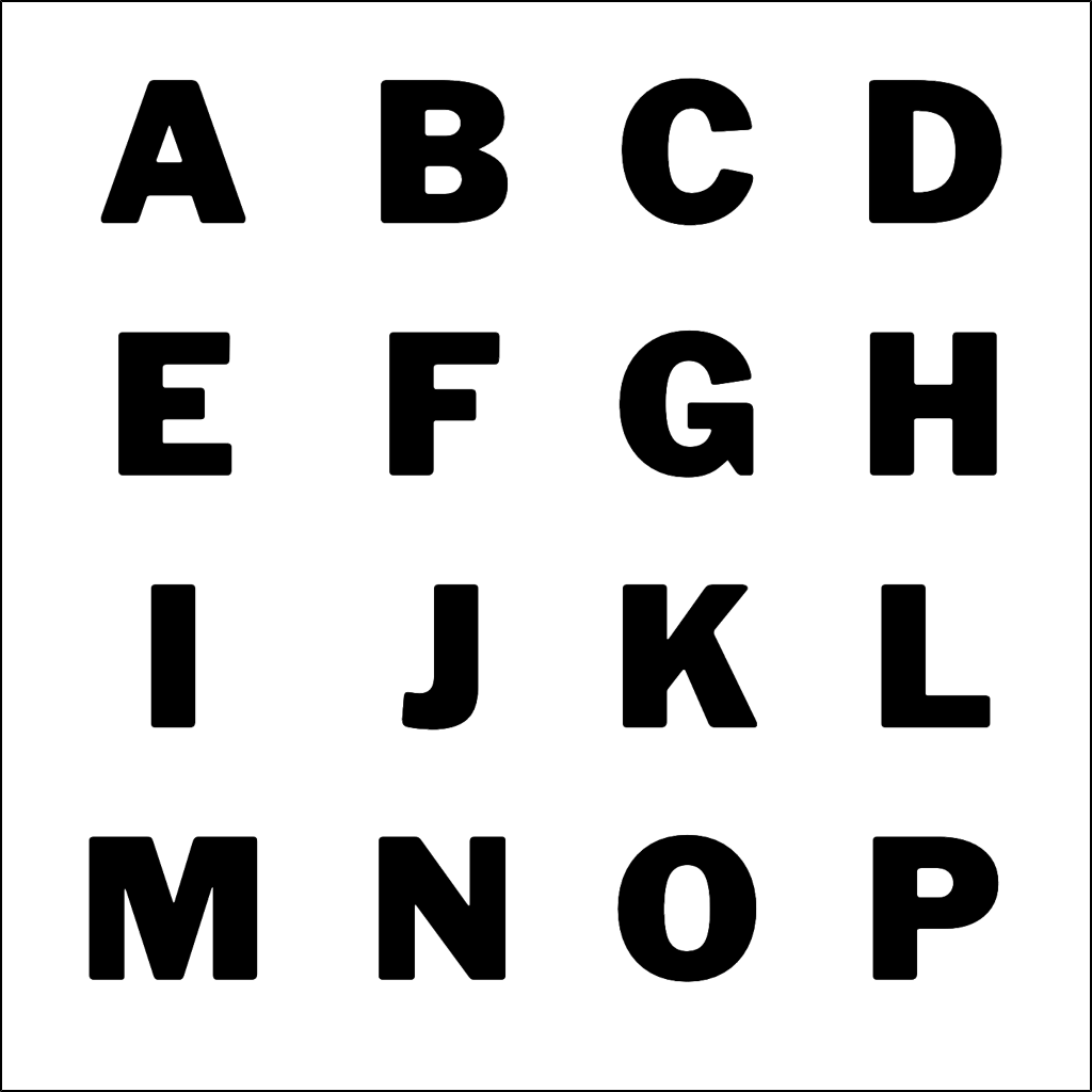
Applying the previous "ray want it strange" model as a style:
Min Power: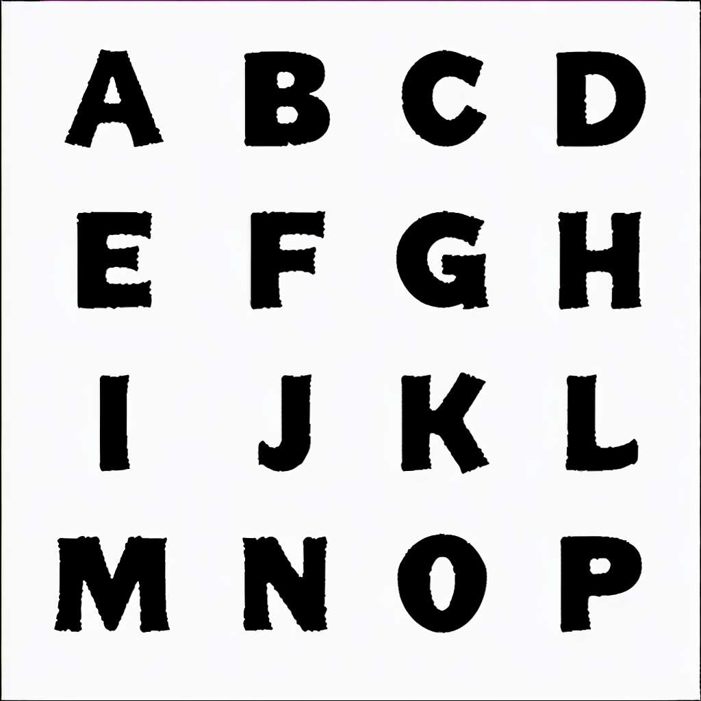
Max Power: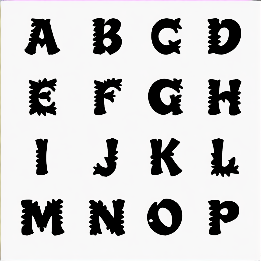
I guess this can be useful as filters, for shadows, textures, etc..1 -
John, your question kept resonating in my head, so I did a deeper analysis searching for a better answer.John Hudson said:
Even for C G O Q ?
This is what I noticed:
Luckily I had a few alphabets in the comparison pool that showed a more calligraphic approach to diagonal contrast on the /B /D /P /R curves. (Alegreya, Angie, Elysium, Dorian, Optima, Proza)
So I guess that the AI was clever enough to notice the inconsistent use of diagonal contrast in Cooper Black's /B /D /P /R vs /C /G /O /Q and hence evaluated that inconsistency as an essential CooperBlack's feature.
That's the only logical explanation I can elaborate about it.
Because of the way that the AI operates there is no way to be sure about it, so I may be wrong. But if it's true it's quite amazing.
0 -
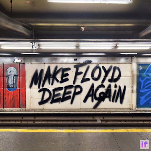
DeepFloyd, released 2 days ago, can integrate text into images:
https://stability.ai/blog/deepfloyd-if-text-to-image-model
 4
4 -
Those images are impressive, but my attempts almost always result in misspellings.


1 -
Tripe 😂0
-
Lower the "Guidance Scale" on the Advanced Options tap.Stephen Coles said:Those images are impressive, but my attempts almost always result in misspellings.
They only need more training time and the misspelling will go away.
I've experienced the same issue in this experiment, the results gets better as the training time increase.
When the training time gets super super high, the AI start creating very abstract letters shapes and relations systems that we, humans, no longer understand.1 -
Related, on the business side of AI and fonts.
Must Read:
https://typedrawers.com/discussion/4780/your-business-is-worth-more-than-6x-yearly-earning
0
Categories
- All Categories
- 46 Introductions
- 3.9K Typeface Design
- 489 Type Design Critiques
- 572 Type Design Software
- 1.1K Type Design Technique & Theory
- 663 Type Business
- 876 Font Technology
- 29 Punchcutting
- 530 Typography
- 121 Type Education
- 328 Type History
- 81 Type Resources
- 111 Lettering and Calligraphy
- 32 Lettering Critiques
- 79 Lettering Technique & Theory
- 561 Announcements
- 96 Events
- 116 Job Postings
- 169 Type Releases
- 179 Miscellaneous News
- 269 About TypeDrawers
- 53 TypeDrawers Announcements
- 114 Suggestions and Bug Reports


