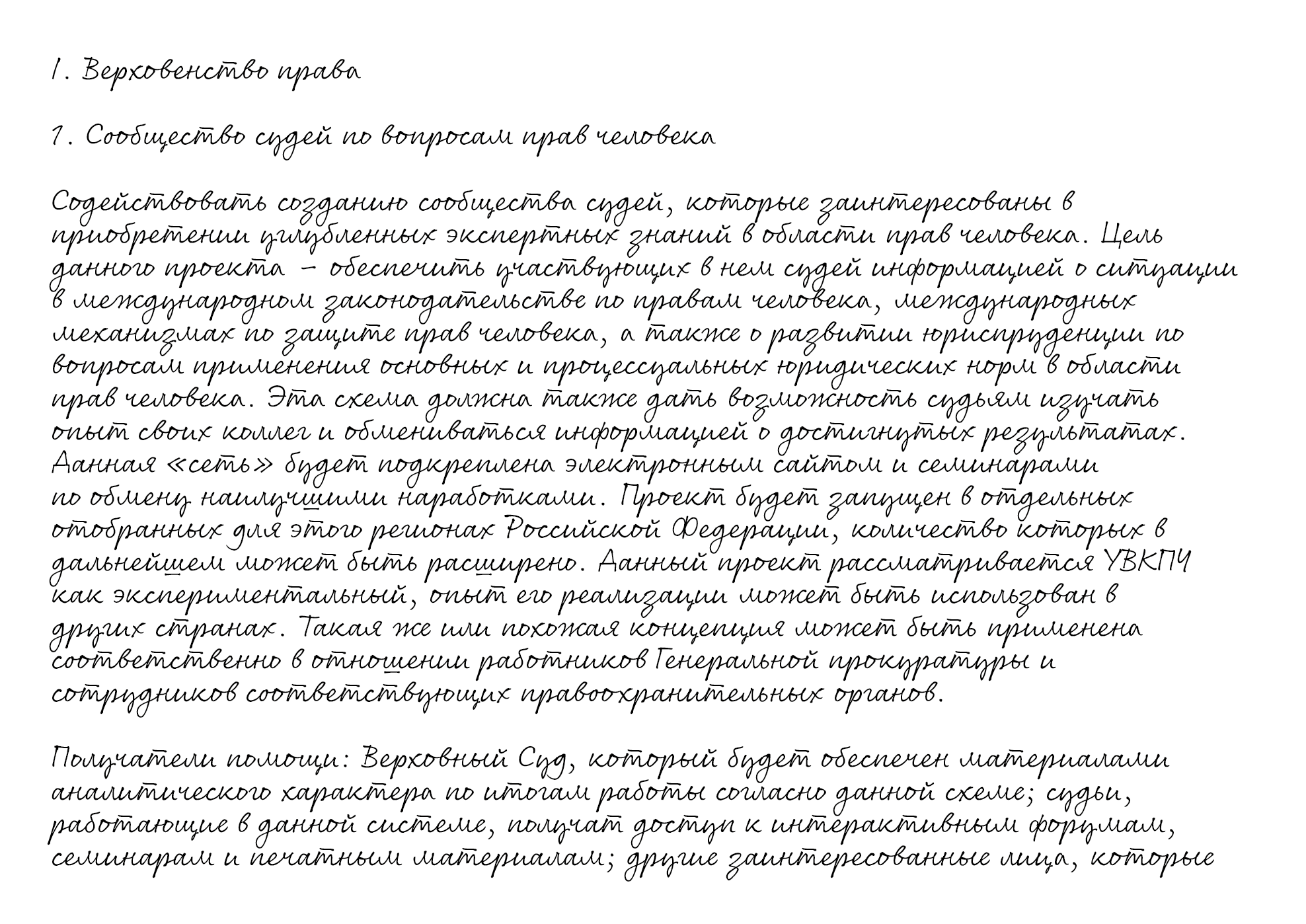
Cyrillic 'handwriting' font

Nick Cooke
Posts: 209
I'm updating the Cyrillic in my font Rollerscript, along with adding more weights and making it variable.
It fits better with the style of Rollerscript as I was told the original Cyrillic was very old-fashioned.
It's quite tricky as the formal Latin style looks different to Cyrillic handwriting.
Does this sample look like convincing handwriting? Are any changes needed?
It fits better with the style of Rollerscript as I was told the original Cyrillic was very old-fashioned.
It's quite tricky as the formal Latin style looks different to Cyrillic handwriting.
Does this sample look like convincing handwriting? Are any changes needed?

0
Comments
-
The letter Д (Decyr) catches the eye because it is very similar to A. It would be better to make the legs a little more noticeable (extend to the sides), or make the upper part a little thinner.
The letter т (tecyr) with a stroke on top and the letter ш (shacyr) with an underline were indeed used in handwritten text, and my wife still writes the character т exactly like that, with a stroke, but many of my acquaintances no longer add this strokes. So this is currently relevant mainly for the Serbian language. The issue is that the letters т and ш are usually look similar in handwriting (especially in cursive), so the accentuation makes sense. Although in your sample the letters are quite different in structure and they are technically doesn't need the upper and under lines for that characters for most Cyrillic languages except of Serbian. Anyway it works good as a stylistic solution, or if you want to convey a more historical version of the writing.There is a fragment in the sample text that is pretty ironic, out of context!
Here the translation:
"The project will be launched in selected regions of the Russian Federation, the number of which may be expanded in the future".I mean, Oh yes... "expanding the regions" is what Russia likes a lot...0 -
My comments (+ ukrainian -ґ- samples) you can find in Twitter :-))
0 -
About -Д-, I didn’t write in detail on Twitter. Now the construction of the glyph is erroneous as for writing an adult. This is how, basically, preschool children who are just learning to write draw this letter. The horizontal should be at the level of the baseline (fig. 1). But for a handwritten version, such a design is not convenient, it contradicts the essence of writing. The school teaches to write as in fig. 2. But taking into account the entire font, fig. 3 as in the Latin part can be safely used.And about -т-. Look at my version - given the font style, it has a right to exist. Also, I agree with Michael Rafailyk – in the modern handwritten Cyrillic script, the lines under -ш- and above the tripodal -т- (similar to latin -m-) are perceived as an anachronism.

0 -

This one? (with other variations).3 -
0
-
Overall, it looks nice and convincing.
I would personally lower the central stem of the т down to the baseline. It is not an m. When considering the letter's history, I would argue the centre stem to be the most important one, unlike a latin m, where the two exterior stems are more important.
I would also prefer to see the middle of the м to touch the baseline. It's almost there.
The shape of the л is something that I find would be difficult to write. I've never seen one like that in handwriting. In general, it is just pointy.
I would only consider adding the little bars on top and bottom of т and ш in such cases as shown here (I wrote мишка and лишь).
I'm guessing you haven't yet gone around to making the ligations for the г and ч.
0 -
Thanks for the info. That’s good to know, I will update those glyphs and post an updated version soon.0
-

I saw this somewhere but now I can't find it. Is it correct?0 -

Here's an update of the original. Is it better?-1 -
Nick Cooke said:

I saw this somewhere but now I can't find it. Is it correct?Considering the general style of the font - i like. I would advise adding an alternative - a school version (first line).P.S. word is -аґрус- :-)
0 -
Nick Cooke said:
Here's an update of the original. Is it better?i think, needed corrections for -з-. Now the connection with the previous letter is artificial - the end of the previous sign and the beginning of -з- are clearly visible. There should not be a hard border in this place - there should be a smooth transition. 0
0 -

1 -
0
-
Given the style, I would prefer a simpler construction of Ф, at least as an alternative.
While I agree with Olexa that the connections to з look unnatural at the moment, my own preference would be to make this a non-connecting letter.0 -

1 -
0
-
I guess this isn’t possible?

0 -
John Hudson said:I guess this isn’t possible?

not readable, even as a conditional ligature. same situation as -ал- or -aм-.
1 -
I think the bottom ones will be easier to implement as contextual following glyphs. Thanks for that Olexa.Olexa Volochay said:Nick Cooke said:
Here's an update of the original. Is it better?i think, needed corrections for -з-. Now the connection with the previous letter is artificial - the end of the previous sign and the beginning of -з- are clearly visible. There should not be a hard border in this place - there should be a smooth transition. 0
0 -
well, my handwriting got messed up, but the whole point of the example was that there shouldn't be any breaks between the first glyph and -з-, as it is now.Nick Cooke said:I think the bottom ones will be easier to implement as contextual following glyphs. Thanks for that Olexa.
0 -
It’s good. I can make it work.0
-
John Hudson said:Given the style, I would prefer a simpler construction of Ф, at least as an alternative.
 Something like one of these?0
 -
The second Ф is closest to the contstruction in my writing. I tend to write it as non-descending, though, so am unsure of the proportions in this style.0
-
O+I design for Ф not characteristic of Cyrillic handwritten. I tried to write it live (top row) - very inconvenient. Similar to the greek Phi - perhaps, but not as the main one, as an alternative. This design is possible and very good for lettering. but it differs in style from the rest of the letters. All the same, the most comfortable option for writing is based on «infinity» (as you can see, there is an opportunity to play around with the size of these «ears»).

1 -
Latest amends, two different ze, and redrawn Ef:


0 -
Nick Cooke said:Latest amends, two different ze, and redrawn Ef:

The vertical at Ф «asks» for a longer down – like at Д, for example.
0 -
Does anyone know what should go in the Bulgarian and Serbian positions?

0 -
O-oh, no... It seems that you misunderstood the moment with the Ukrainian -ґ-. It is an independent letter with its own handwritten design. It does not affect -г- and -ѓ- in any way, your original version of these letters was correct (mirrored s-like). (+ not sure but it looks like in Ѓ the acute fell).

0 -
So the Ukrainian -ґ- is called geupturn-cy in the glyphs palette. Is that a Russian or Ukrainian Cyrillic letter?
I'm even more confused now.
Is this right? 1
1 -
Nick Cooke said:So the Ukrainian -ґ- is called geupturn-cy in the glyphs palette. Is that a Russian or Ukrainian Cyrillic letter?
I'm even more confused now.
Is this right? This is correct.Ґ ґ (ghe with upturn) is 5th letter of ukrainian alphabet.P.S. Purely scientific from Wiki - The letterform of this letter is based on the letterform of the letter ⟨Г г⟩, but its handwritten and italic lowercase forms do not follow the italic modification of ⟨г⟩.
0
Categories
- All Categories
- 46 Introductions
- 3.9K Typeface Design
- 489 Type Design Critiques
- 572 Type Design Software
- 1.1K Type Design Technique & Theory
- 664 Type Business
- 877 Font Technology
- 29 Punchcutting
- 530 Typography
- 121 Type Education
- 328 Type History
- 81 Type Resources
- 111 Lettering and Calligraphy
- 32 Lettering Critiques
- 79 Lettering Technique & Theory
- 562 Announcements
- 97 Events
- 116 Job Postings
- 169 Type Releases
- 179 Miscellaneous News
- 269 About TypeDrawers
- 53 TypeDrawers Announcements
- 114 Suggestions and Bug Reports


