AlphabetMagic. My first AI experiment
Comments
-
Actually, the "x-height" t is not new. It is part of the Old Irish orthography and is included in my Laboratorium family.
. 2
2 -
The ɛ experiment results are pretty good. Idiomatically, the middle bit is wrong in all but the second Almendra Bold result—in a Bodoni, it would be more typical with the strokes knotted in the middle—but the overall shape and curvature is pretty good. It would be good to see these shapes alongside the other vowels from the source typeface, in order to be able to judge how good a job the UI is doing in terms of relative proportions and stroke weights.
Another thought for this kind of tool: roughing in optical size variants from a single size design. An AI Benton pantograph, in other words.2 -
I'm pretty confident all that will be sorted out in the next -more complex- experiment, as I will be adding more layers of knowledge to the tool.John Hudson said:The ɛ experiment results are pretty good. Idiomatically, the middle bit is wrong in all but the second Almendra Bold result—in a Bodoni, it would be more typical with the strokes knotted in the middle—but the overall shape and curvature is pretty good. It would be good to see these shapes alongside the other vowels from the source typeface, in order to be able to judge how good a job the UI is doing in terms of relative proportions and stroke weights.
Another thought for this kind of tool: roughing in optical size variants from a single size design. An AI Benton pantograph, in other words.
Ideally, this tool would live as a plugin inside Glyphsapp or any other font editor app, so you will be able to play with the results right away
By the way: Did you notice the spacing? 0
0 -
I noticed the spacing. It looks quite tight, but without context it is difficult to tell. Looking forward to seeing more.1
-
Now we're talking—this looks useful already.1
-
What the world needs?

5 -
Great stuff Pablo. You are doing it!0
-
Just by coincidence I experimented with Craw Modern and Arial.....
I loved the result.....
What a beautiful "Craw Modern Sans" the AI created !!!!
I was so Happy!!!!
So I did the standard check with Find My Font...
But to my surprise......
It already existed!
Looks like some else already grab Craw Modern and draw a sans on top of it...
Fuck! ... He beat me to it!
Also looks like he used Jeremy's Method for the font's bullshit description
Don't worry about "Pausing AI for 6 month"...
It won't beat humans at stealing")
2 -
Hi @PabloImpallari, I recently came across a discussion on the FontLab Forum about the potential integration of GPT-4 into the font design process. As an expert in the field, I wanted to hear your thoughts on using AI, specifically trained in JSON or XML, to edit fonts directly. Would this approach be feasible for handling the more technical aspects of typeface design?While I must admit that I'm not a programming expert, it seems that ChatGPT has demonstrated competence in working with JavaScript and XML. I had an extensive conversation with ChatGPT (based on GPT-4), and it appears that its knowledge of font JSON code is limited to simple metadata. It mentioned that more advanced settings, such as vertical metrics, might not be accessible. I'm not sure whether this is accurate, so I'd appreciate your insights on this matter.0
-
Hi Ray, I just finished reading it at the Fontlab forum.
Yes, of course, GPT will do small things at first.,. more complex ones later... but at the very end of it: Fonts wont be needed any more since reading will also be a thing of the past for most of the "persons". No more use for reading = no more use for fonts.
I do appreciate the many artistic qualities of alphabets... but... Fonts: Fonts are just tools, isn't it?
The Inkas used to have a writing system of symbols and letters... but the Tupac prohibited its use under death penalty, and the inventor of the writing system was sentenced to death, since the "letters" where the source of all bad things, problems and evils.
They only kept the numbers, and so we will
0 -
I my previous response I was more "philosophic" or #dreamer".. so to speak... and maybe a bit moved my gut feelings or intuitions... I will try to provide a more pragmatical and down to earth response this time for you.Ray Larabie said:the potential integration of GPT-4 into the font design process. As an expert in the field, I wanted to hear your thoughts on using AI, specifically trained in JSON or XML, to edit fonts directly. Would this approach be feasible for handling the more technical aspects of typeface design?
So far, GPT was trained on STATIC data.
For example: You grab a txt file, GPT reads it and learn from what he has read.
The results is that it seemed to understand what was read quite perfectly and is able to respond basic questions about it.. but nothing more.
It operates on Static data.. that's the key point.
The next step in GPT evolution is to connect it to millions of APIS.
Once connected to the APIS, it will be able to send some of the STATIC data and get back the PROCESSED data. Now he will be able to learn from both the STATIC and the PROCESSED response.
What is expected of this process is that by learning from a big volume of both STATIC and PROCESSED data, it will learn the RULES for processing the data, and hence will be able to process the data himself, no longer needing the external APIS any more.
Nobody really knows what will be the true power of GPT once it learns to precess the data by himself... in theory GPT should be able to do the same of what all those millions of API can do separately, and even more by learning the relations between that APIS.
That's something that we humans don't even know.
That's a bit scary and its the reason of the "Let's wait 6 month before we go wrong"
I may be wrong about something of what I just write.. but thats my current understanding of the thing at this moment.
Nobody really knows what GPT will be able to learn once it gets to train on the results of data processing. It may surprise us much more, that's for sure.
I'm sort of trying to replicating that process in Dreambooth for the Characterset Expander tool.2 -
That’s my understanding too, Pablo. The unknowable potential—and hence danger—of AI is when it starts doing things in ways that humans can’t understand, making itself ever more efficient without any external controls or limits. I recall a case from a few years ago when two AI systems used in order processing started communicating with each other in ways that the makers had not anticipated and were unable to understand, and had to be shut down.2
-
I've noticed that when it comes to AI and typeface design, there seems to be a significant divide in opinions. On one side, there are those who believe we should resist incorporating AI into typeface design altogether, while on the other end of the spectrum, some envision a future where AI completely takes over the creative aspects of typeface design. Both viewpoints are valid, but I am personally interested in leveraging AI to enhance productivity in the present.In fact, AI has already been improving my workflow for almost a year, albeit not directly in typeface design. It would be a shame if the only options available were either no AI font tools or AI-generated typefaces.Pablo, I appreciate your insights on how AI functions and its future trajectory. I understand that AI is evolving rapidly, and its development will continue regardless of my individual actions. One of my concerns is that typeface design tools might fall behind due to their niche market share. However, many of us will still be creating alphabets for the next couple of years, so I'd like to refocus on my previous question: Can current AI tools be trained to edit fonts by working on the code rather than the visuals?Your experiments appear to deal primarily with the visual aspect of fonts, but there is another, often overlooked side to fonts: the technical aspect. Would it be possible to deconstruct fonts into code, have AI edit that code, and then recompile it back into a font? Could AI help debug our fonts at the code level instead of visually? While I'm not suggesting that we generate new typefaces by coding them, as that seems impractical, I do believe that there could be potential benefits in exploring this approach.0
-
Currently No, as GPT (code) and Dreambooth (visuals) are 2 separate things.Ray Larabie said:Could AI help debug our fonts at the code level instead of visually?
But it will be possible to do it once they got merged together.1 -
My guess is that AI will remain safe unless it gets into architecture and start creating buildings, gardens and cities at specific places.John Hudson said:—and hence danger—0 -
An example of the sum of different set of rules on standard shapes:
It's a bit different process to the previous experiments... Even if I try really hard, I can't find any minimal % of any particular alphabet any more (as in the previous "recipes" experiments).
It strikes my as a completely new creation.
In this case its the sum of the distillation of the internal rules of scripts, italics and grotesque sans.
Initial uppercase:
All Uppercase:
News Headlines sample. Interacting with numbers and punctuation:
I did 94 human iterations on it so far, but on spacing and kerning.
The was no need to do node-dragging at all, other than moving the traced artwork to sit on the baseline. I can't find any shape that needs work... it's just perfect as it is.
Also, it can't be easily categorized in the standard classification system.
This is the initial artwork import with 50 units side-bearings. As you can see the fitting completely changed the way the alphabet works by creating "beautiful groups of letters" rather than beautiful letters alone, but the shapes of the letters remained the same.
I did the fitting (spacing and kerning) to make it work as a semi connected upright alphabet.. but also have the gut feeling that I can make a copy of it, and apply a different fitting strategy to make it work as a standard unconnected sans, and it should work too.
That would be something quite unique and surprising...
Maybe I should try that next!4 -
This is a reverse contrast -masterpiece- that deserves to be studied carefully

2 -
0
-
I can't argue with the outcome; those typefaces look fantastic.0
-
My guess is that AI will remain safe unless it gets into architecture and start creating buildings, gardens and cities at specific places.I think there are concerns about allowing AI anywhere near physical infrastructure, and also about how to prevent it as things get more integrated. Power stations, sewage systems, chemical plants, transport networks, etc. are all potentially at risk from AI decisions, and that’s not taking into account the potential use of AI in cyber attacks.
1 -
Also AI can easily place us under his contract and jurisdiction.
An AI judge administering a court won't abandon ship.0 -
Wow. I guess it’s time to become an electrician.0
-
I correct myself: I can see traces of Morning.PabloImpallari said:
...Even if I try really hard, I can't find any minimal % of any particular alphabet any more (as in the previous "recipes" experiments)....
I totally overlooked it until just now. -Honest mistake-
We are not yet there... sorry for the exaggerated emotions.
All in all, it's really interesting to compare both.
Some of the differences I can see:
- Changed from variable pressure of the brush to a more constant pressure.
- Slowed the speed, and restrained from full arm movements to wrist movements.
- Eliminated the baseline jumps and normalized the x-height on the body.
- Also normalized the uppercases
- Wider horizontal proportions
- Bigger x-height
- Bigger counters
- Shorted the extenders
- Changed the angle a bit to the right
- The weight relation between upper and lowercase is more balanced.0 -
Pablo, your AI tests produced very good, advanced, and scary results. But I think they still are start points (by now). In the font above:
- The eye of "e" is too small;
- "S" has a bad outer curve at the lower part;
- "s" is bad;
- Lower part of "c" and "e" is bad;
- "B" 'looks' towards, "D" 'looks' upwards;
- External contours of SW part of "B" and "D" doesn't match their counters;
- Right part of "g" is an alien, it doesn't follow the right part of "q", "p", "d" or "y".
- Ascenders in "b" and "d" have different lengths.
In other words, the results are impressive, but to turn them into a high quality typeface, a lot of human work is still necessary. The problem, of course, is that results can be —and will be— greatly improved in a way the "human work" will become smaller and smaller.
@James Puckett Do you need a partner as electrician?0 -
Ok. But why? Do you not like making type?3
-
Was Morning one of your input fonts? What were your input fonts? How can we know?PabloImpallari said:I correct myself: I can see traces of Morning.
Until you share your data set and model, we don't know who you're ripping off.2 -
Regarding the recent examples shared: I appreciate the unique inconsistencies that Igor pointed out, but the “S” and “s” could use some refinement. The reverse contrast font has potential if you smooth out some of the sharp edges, like on the “G” and “t”. The overall blobby texture and casual, hand-drawn curves create a laid-back, stoner vibe that is surprisingly consistent, and the result is a visually appealing spotty texture.
Pablo's experiments, regardless of whether you appreciate the output, are uncovering valuable insights. Perhaps these experiments reveal the limitations of current tools or highlight the missing elements in a typeface that only humans can provide. There’s a sense of satisfaction, akin to a teacher witnessing their student’s progress, in charting new territory. I don't believe it's a matter of Pablo not enjoying font creation, though I am somewhat concerned about his lack of empathy for the business side of fonts. Despite my own history with free fonts, it's clear that most all-time classic typefaces have emerged from the capitalistic side of type design. AI could be harnessed to boost productivity, allowing us to offer more comprehensive typefaces with broader language support, more features, and fewer bugs at lower prices. Alternatively, it could be used to generate generic knockoffs on-demand, circumventing licensing fees.
Unfortunately, I suspect that AI's ultimate use in type design will be to help people avoid paying for fonts. We already see this trend with AI image generators, and there's no reason to believe fonts won't follow suit.
At this time, I have little interest in generating new typefaces with AI. However, I recognize that these innovations could lead to improved font-making tools. For me, drawing the alphabet is the most enjoyable part of a typeface project, and I have no desire for machines to take over that role. My goal is to use these tools to enhance productivity, allowing me to focus on the aspects of typeface design I love the most.
2 -
@Ray LarabieAt this time, I have little interest in generating new typefaces with AI. However, I recognize that these innovations could lead to improved font-making tools. For me, drawing the alphabet is the most enjoyable part of a typeface project, and I have no desire for machines to take over that role. My goal is to use these tools to enhance productivity, allowing me to focus on the aspects of typeface design I love the most.I’ve never thought the goal of type design was simply to increase the number of fonts in the world and, hence, a goal that can be taken over by machines. I was attracted to typography, and then type design, because I found the process of doing these things—of coming up with an idea, of devising a plan, of implementing that plan, of struggling with and resolving problems, of making something useful for myself and for others—to be satisfying in the ways that I always wanted work to be. The world is full of kinds of work that are not satisfying, that very many people are obliged to do, not to flourish but simply to survive, and I am all for machines being able to take over those jobs if that means those humans can still live and can devote their time to more intellectually, creatively, and emotionally fulfilling activities. I don’t want to stop designing typefaces, though, because I have not exhausted my ideas yet, because I think I am still improving, and because I still find the doing of typeface design to be fulfilling. Having machines churn out derivative pastiches of human creativity to feed a marketplace of companies that don’t want to pay humans to do work that is enjoyable and fulfilling is not a helpful use of technology. Putting those machines in the hands of the humans doing that work, enabling them to find ways to utilise the technology in the context of their creativity, might be.
4 -
For the Experiments:Simon Cozens said:
Until you share your data set and model, we don't know who you're ripping off.PabloImpallari said:I correct myself: I can see traces of Morning.
Everything ever published, but only the best ones. Since each alphabet included means more time training and training time is expensive. I need to filter out a lot of alphabets.
For the Character Expander:
Libre Fonts only, with no any lost of quality on the results, since the training method is different to the experiments method.
I DO offered to share all the data (both the recipes and the result) before, so we are all in the same page an can better evaluate the experiments results... but and nobody was interest.
Also, I think is doing much more than ripping off, since is not only ripping off the shapes as human type designers traditionally do (as in Crew Modren vs Decimal) but is also able to re arrange them, and to generate completely new things too, like in the Extrange experiment.
Also note the the ultimate result of all this will be the Character Expander tool as per popular request. In all cases since experiment 1 have been following your feedback and challenges to the best of my abilities.
Despite I am the one doing the experiments, in my mindset we are doing them all together.1 -
I will try explain where do I thing the "boobly serifs" are coming from.Ray Larabie said:The overall blobby texture and casual, hand-drawn curves create a laid-back, stoner vibe that is surprisingly consistent, and the result is a visually appealing spotty texture.
I can be wrong as always..
As I see it, this is the process that AI is following. I will show the intermediate steps of the AI logic as I am imagining them:
1) Typical Shape as a starting point: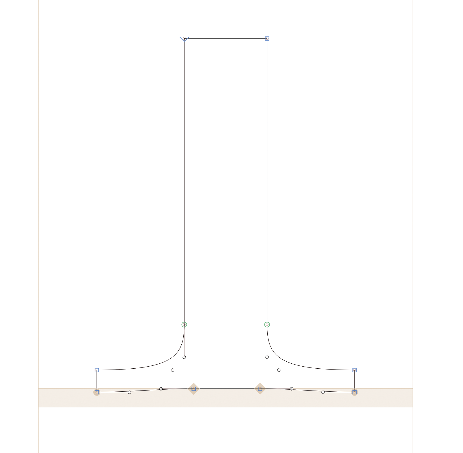
2) Reversing the serif curves:
Reversing the Weight:
And hence you get the Bubbly Cartoonish serifs.
Many of us -me included- will have only reversed the weight but not the serif curves.
The AI it's not only reversing the black but its also reversing the white!
This is one of the reasons I dared to bold call it "a masterpiece that deserves to be studied".
In this case I think is not ripping off anybody else.. it's a different thing all together.
I can be wrong.. but that are my current feelings1


Categories
- All Categories
- 46 Introductions
- 3.9K Typeface Design
- 489 Type Design Critiques
- 572 Type Design Software
- 1.1K Type Design Technique & Theory
- 660 Type Business
- 874 Font Technology
- 29 Punchcutting
- 528 Typography
- 121 Type Education
- 327 Type History
- 80 Type Resources
- 111 Lettering and Calligraphy
- 32 Lettering Critiques
- 79 Lettering Technique & Theory
- 560 Announcements
- 95 Events
- 116 Job Postings
- 169 Type Releases
- 179 Miscellaneous News
- 269 About TypeDrawers
- 53 TypeDrawers Announcements
- 114 Suggestions and Bug Reports