AlphabetMagic. My first AI experiment
Comments
-
I think I will be able to train AMv2 to perform a "Make it interesting!" experiment: Technically speaking is not too much different to the "Make it boring" experiment.I think that is one approach, but what appeals more to me is being able to describe the kinds of the adjustments I would like to make, and have the AI make them for me. So, for example, in your iterations you decided to flare the extenders, which in terms of node-dragging means a bunch of work to be done on a set of letters. What I look for in tools is ways to reduce the amount of labour I need to do to achieve my ideas, so that is more attractive than abstracting notions of ‘interesting’ or ‘boring’ in the AI’s ideas.
Instinctively, I suspect that this will ultimately mean training an AI to understand concepts of letter construction, stroke dynamics, weight manipulation, etc.. Think of an AI that could interpret TypeCooker prompts.
____
Also thinking that I would like to see your experimental methodology applied to scripts other than Latin, because I suspect that part of what makes this approach produce such advanced results across so many styles is the wealth of input material available. In this respect, other-than-Latin scripts may be as disadvantaged in AI as they are in so many other ways.1 -
With this AI, can you take an arbitrary font and find it in the latent space? I'm curious about this as a design tool to make tweaks. This would be part of the reflexive issue, though.
0 -
Yes.. exactly.. but the point is that ,regardless of the name we give it, it can be trained too.John Hudson said:I don’t think a woodcut looks more ‘human made’ than something made by a human on a computer. They’re just different media with their own characteristics. There’s certain slickness to rasterised beziér type, antialiased at high resolution, that is hard to overcome and affects a similar ‘digital feel’, and I think type designers have gravitated towards embracing that feel in the methods they use to define outlines, e.g. using harmonised node placement and balanced control handles. I suppose one could say that a lot of recent type design has been ‘digitally inflected’, and this is what you are responding to when you think the iterative results looke more ‘computer made’.
0 -
Hi Evie... what do you mean by the "latent space".. this is the 1st time I heard that term. Can you elaborate? Thanks!Evie S. said:With this AI, can you take an arbitrary font and find it in the latent space? I'm curious about this as a design tool to make tweaks. This would be part of the reflexive issue, though.0 -
Yes... exactly... but in order to be able to ask for it by using words instead of using visuals, we need to expand and remove ambiguities on our Type Designer's language corpus.John Hudson said:I think I will be able to train AMv2 to perform a "Make it interesting!" experiment: Technically speaking is not too much different to the "Make it boring" experiment.I think that is one approach, but what appeals more to me is being able to describe the kinds of the adjustments I would like to make, and have the AI make them for me. So, for example, in your iterations you decided to flare the extenders, which in terms of node-dragging means a bunch of work to be done on a set of letters. What I look for in tools is ways to reduce the amount of labour I need to do to achieve my ideas, so that is more attractive than abstracting notions of ‘interesting’ or ‘boring’ in the AI’s ideas.
Also, we can choose:
a) Make little plugins for each task.... or
b) Make a big tool to do it all....
Every approach has his pros and cons.
Yes. That will be easy. You only need to training it with that goal in mind.John Hudson said:
Instinctively, I suspect that this will ultimately mean training an AI to understand concepts of letter construction, stroke dynamics, weight manipulation, etc.. Think of an AI that could interpret TypeCooker prompts.
I think the difficult part will be in "our communication with the tool", for example:
In the recent other thread about the French Ego Lawsuit, when comparing both typefaces i have noted that Spectral has consistent stress treatment -following the nib- while in LMJ the Uppercase /O has vertical contrast, lowercase /o have a bit of diagonal contrast, and lowercase /e has extreme diagonal contrast.. and I ended the review by saying:
Whatever you want to call it a "mistake" or a "design decision in order to increase letter shapes differentiation" is up to you.
Thats the sort of things that will be difficult to deal with.... we will need to find a channel of communication with the tool... so that the tool can understand what to do for us, and what not to do too... we will need to be very very very specific.
The other option to being specific... is to ask for something more general, and give a higher degree of freedom to the tool... that can lead to very interesting and surprising unexpected results... can be good too
But of course, there are use cases for both scenarios.
Yes, you know it better than anyone, since you are the expert on that fields.Also thinking that I would like to see your experimental methodology applied to scripts other than Latin, because I suspect that part of what makes this approach produce such advanced results across so many styles is the wealth of input material available. In this respect, other-than-Latin scripts may be as disadvantaged in AI as they are in so many other ways.
But the AI can also help them to make progress faster too... I hope!
0 -
PabloImpallari said:Hi Evie... what do you mean by the "latent space".. this is the 1st time I heard that term. Can you elaborate? Thanks!Disclaimer: I'm not an expert, so I know little about neural networks and such.I don't know what software you use, but behind the scenes most AIs are like a variable font with hundreds of levers - this is the latent space. You can use prompts and interpolation to take care of the lever-pulling for you, but you can also match a desired output (like a WIP font) to somewhere on the latent space. Then you could introduce minute variations to it to produce variations. The trickiest thing is decoding the levers, such that you can figure out how to pull the levers in such a way to make the x-height larger.1
-
I'm not expert neither.. this is my first experience with AI ever... I do had a super strong motivation to get into it.. but I am trying to figure out how all of this works too... Thats the reason for all these experiments little too. There are soooooo many things and so many values on so many little things that you can change the values of it.. and you don't really know what the effect of each configuration will be until you do it... its sort of "fuck around and find out"The trickiest thing is decoding the levers, such that you can figure out how to pull the levers in such a way to make the x-height larger.
0 -
The result looks good. It's not overly modular, which gives it a hand-painted feel. The only letter that stands out is the lowercase L. Apart from cleaning the curves, you've increased the modularity. You likely visually compared the letters to each other. Perhaps the AI can use a self-referential technique to attenuate modularity the way a type designer does. In other words, pick a key glyph, adjust other glyphs to match its characteristics. Those adjusted glyphs become key glyphs and in the end, there's a consistent level of modularity throughout. Extreme modularity would produce a font with a 1990s ultra-modular style, low modularity would produce a font like your current Alphabet Magic, medium modularity would produce a font with a good balance.1
-
Experiment 15 update:
- Today iterations ended at Nro 127, just uploaded.
- Glyphs done are: "abcdeghijlmnopqrstu"
- I'm happy with /r and /t since they now seems to work without the need for kerning next to the rounded letters. I'm trying to make it work with spacing only -as far as I can- in order to make the kerning process easier later on.
Also started Experiment 14b:
- Ray wants crazy, but toned down
- Got kicked out of Collab, so only got 3 results.
- Not there yet. Will continue tomorrow with much better results, I hope!


1 -
The interactive demo of http://vecg.cs.ucl.ac.uk/Projects/projects_fonts/projects_fonts.html is a fine demonstration of "latent space"4
-
Interesting.....0
-
https://magenta.tensorflow.org/svg-vae shows you may be able to train your model on vectors
4 -
shows you may be able to train your model on vectors
Also shows that what researchers think of as ‘different styles’ are mostly thirty-years-late entries to the grunge typography aesthetic. 3
3 -
Experiment 14b appears to indicate that it does not recognize a typeface as a system in which glyphs must operate together in every possible combination. It can effectively fit glyphs together like a lettering artist would, but it doesn't appear to understand that every glyph needs to look beautiful next to every other glyph the way a type designer does. Ongoing self-iteration is an essential aspect of typeface design. The process of testing type in various combinations and making modifications should be included in the font generation process.1
-
Keep in mind that Experimenrt 14b is unfinished yet.
I have been doing more of it, but got kicked out of Collab again... give me 1 more day.
The "make it strange" experiment is the more difficult one, so far.0 -
-
Huh. For Experiment 15, I have to say, most of the differences between iteration 127 and 161 must be quite subtle.1
-
There are some promising outcomes. The design of the F in this example is particularly interesting. A human designer might not have come up with an F form with pointed sides and yet, a vertical stem.
This techno style appeals to me. The A looks like the Aphex Twin emblem.
This isn't legible, but it demonstrates that it can provide consistent, modular output.
Even humans struggle to create something like this. It's getting close.
This is a charming alphabet.There's something brilliant going on here.
This idea appeals to me. It could be a luxury brand typeface if it were cleaner.See the system it devised? When verticals meet the top bar, they are fractured, but when they are diagonal, they are joined. M is a practical solution that operates inside its set of rules.
This example appears to be split between two distinct ideas.
This example has some issues, but it also offers some interesting concepts.You can see how it's attempting to prevent going flat on the baseline—intriguing.
This is almost ready for use. An art deco design with some unique touches. This tool appears to be ideal for designing art deco typefaces. Sometimes you want to purposely avoid consistency in favor of variety.The tool looks to be adept in creating comic book typefaces.
Possible progress can be seen in this instance, as does this one.Many of these examples show some sort of dispute with letters, which frequently have two forms. A human designer would decide if their typeface should have a vertical or slanted M, whereas AI frequently attempts to develop a hybrid. Perhaps the solution is to create both styles. Generate a sample with both kinds of M, monocular/binocular a and g etc. At some stage, a choice is made on which type of letter is appropriate. When I create a font based on hand lettering, I normally write approximately ten instances of each character, scan them, and select the strongest prospects. Perhaps it is a strategy that can be used to generate creative-style typefaces. There may be a human or non-human eye that selects the best candidate for each letter. The context determines these options. One option may be the most legible, but it may not equal the amount of originality suggested by the rest of the typeface. Even human type designers sometimes wind up with one dealbreaker character, and having someone else point it out can help.
4 -
Oka.... Time for you to run your own experiments!
Go to youtube and search: "how to train stable diffusion with your face". Watch and Learn.
Now, replace "your face" with "alphabets"
1 -
An aspect of type design that AI can help you with today: writing bland ad copy.ChatGPT: Please write ad copy for the famous typeface, Neuropol.
Introducing Neuropol, the futuristic typeface that will elevate your designs to a new dimension. This sleek and stylish font is the perfect choice for those looking to make a bold statement and leave a lasting impression.
With its clean lines and distinctive curves, Neuropol is a true standout among typefaces. Inspired by the sleek, sci-fi aesthetic of the future, this font is the perfect choice for anyone looking to create designs that are both cutting-edge and timeless.
Whether you're designing a website, creating a logo, or putting together a marketing campaign, Neuropol is the perfect choice. Its unique design ensures that your message will stand out from the crowd, while its versatility means it can be used in a wide range of applications.
Neuropol is available in a range of weights and styles, allowing you to customize your designs to suit your needs. From bold headlines to sleek body copy, this font has you covered.
So why wait? Take your designs to the next level with Neuropol. Try it today and see the difference it can make in your work.
2 -
Experiment 16: New Latin Lowercase Lettershapes
This time I wanted to experiment if the AI can create new latin lowercase letters shapes.
For this I've super-trained the network (30x more time than usual, about a whole week)
I've used Arial a-z lowercase ONLY as the training data. No other font was involved in this experiment.
1) Low Variations results:
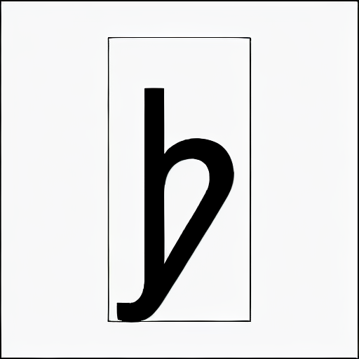
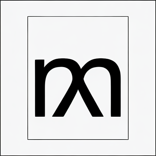
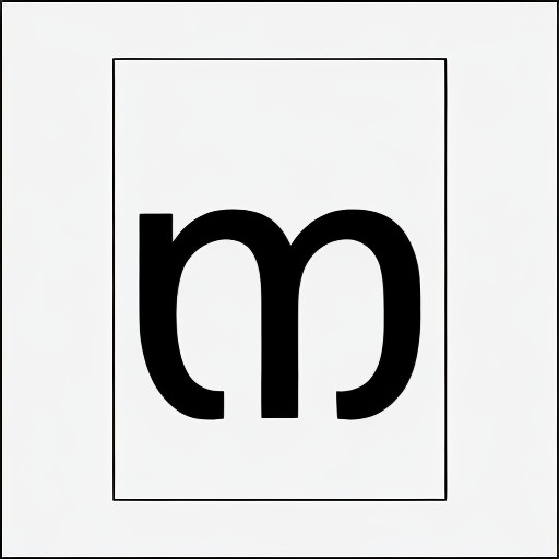
This looks like a /h and /m merged together: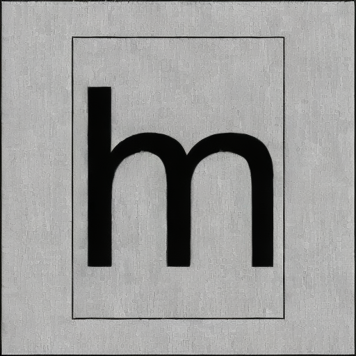
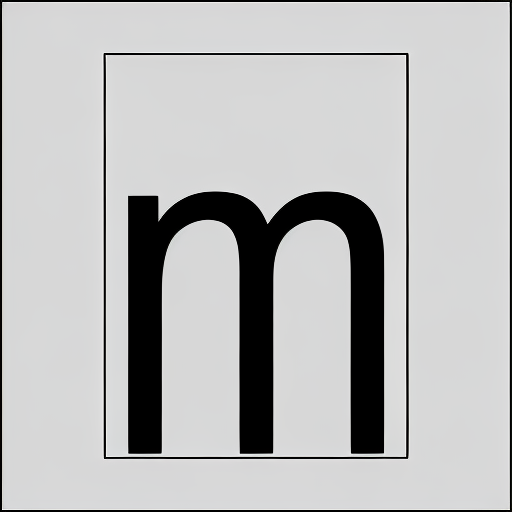
An /m with descenders")
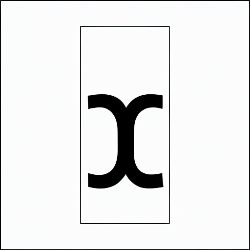
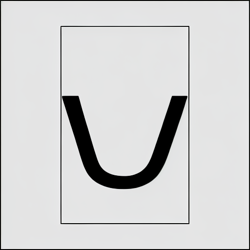
O new interesting /i like shape: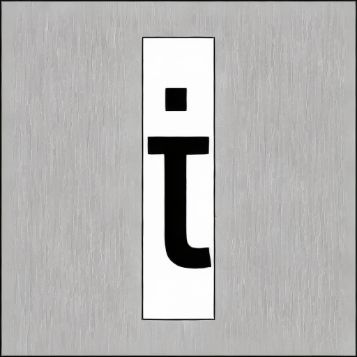
A /k and /z mixture: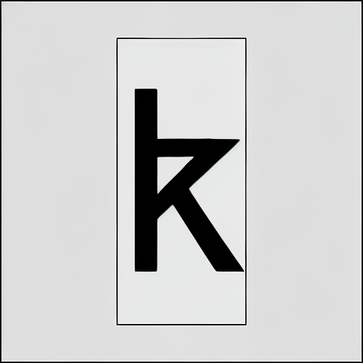
The /l developed a /t like tail and top of the ascender: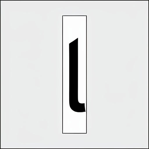
2 Medium Variation results: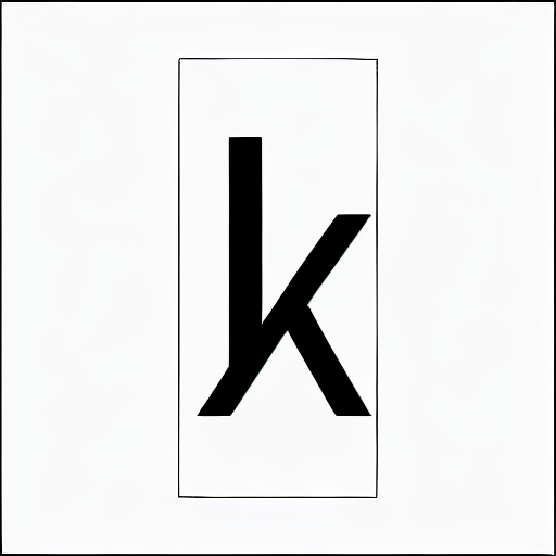

3 High Variation results:
This are the really crazy ones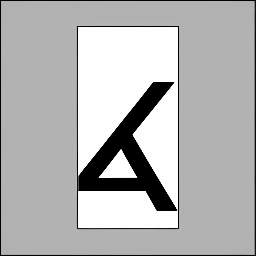


This are just a few samples.
There are many many more at the Experiment 16 github folder
What do you think:
This was just a silly intellectual waste of time? or there may be some use for it?2 -
The Experiment 16 output isn’t useful, but I think the idea is useful, and could possibly play a role in extending glyph sets. What it is doing at the moment is mixing elements of different letters to create novel shapes, but that suggests that what it could do is mix elementsof different glyphs to produce known shapes. This could be useful for roughing in extended character sets including IPA, Americanist, or pan-African letters. It implies two models for the machine to learn from: one to learn the shapes and one to learn the style.1
-
How would you imagine such an experiment for that?
What would be the input or the training data? and what would be examples of the expected results?
0 -
I suppose the question is: can you train the machine to understand shapes as something distinct from the particular style applied to those shapes? I don’t understand enough about how the training works to be able to answer that or to be able to advise you how to do it. Conceptually, one would want to be able to prompt the system to ‘Take the shapes from image A and apply to them the characteristics of image B’. So far, you seem to be doing pretty well in the ‘apply the characteristics bit’, but you are mixing characteristics from sets of the same shapes in different style sources. Is there a way to apply the characteristics to shapes that are not included in the style sources?
For shape training, you could start with a set of the less common letters from e.g. Noto Sans and/or Noto Serif, e.g. 1
1 -
As I say, I don’t know enough about how the machine learning works to know whether the AI will be able to reach a point of generalising shapes independent of style in the way that a human does. So, for example, looking at that Noto Serif image, I know that the squareness of the bowls is a characteristic of the Noto style, not part of the structure of the letter shape. I don’t know if the AI will be able to learn that distinction.1
-
That was a fascinating experiment. I appreciate all the effort you put into research. But I'm losing faith in narrow AI generating a useful, complete font. Wide AI is a different story. Once there can be some intent behind font generation, things will get more interesting.This question is similar to what John was asking, but perhaps closer to interpolation than extrapolation. I have a typeface with a basic Latin set. Can this tool generate additional glyphs that match the characteristics of the rest of the font? Examples: generating currency symbols, old-style numerals. What about making a skinny version of a fat font or vice versa? This is probably less captivating than experiment 16, but for typeface designers, that’s likely the kind of font AI we're most interested in. I guess there are some people who enjoy filling out character sets, but I'd be happy to never draw ₾ again: What about generating some boring basic Latin characters like Œ, Æ, Þ, §?3
-
unrelated to the latest experiment, I had a thought around beziers. could you do some kind of reinforcement learning on the autotraced outputs? I only have a cursory understanding of how this works, but, for example, what would happen if you fed an AI (separate from AlphabetteMagic) an image of Open Sans, autotraced it, and then trained the AI to know the actual Open Sans vectors are preferable to the autotraced output. with a large enough dataset like this, could you make a better autotrace?
5 -
That's an interesting idea! @jeremy tribby2
-
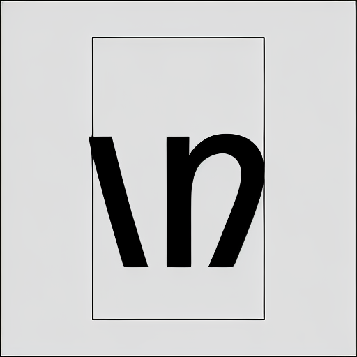
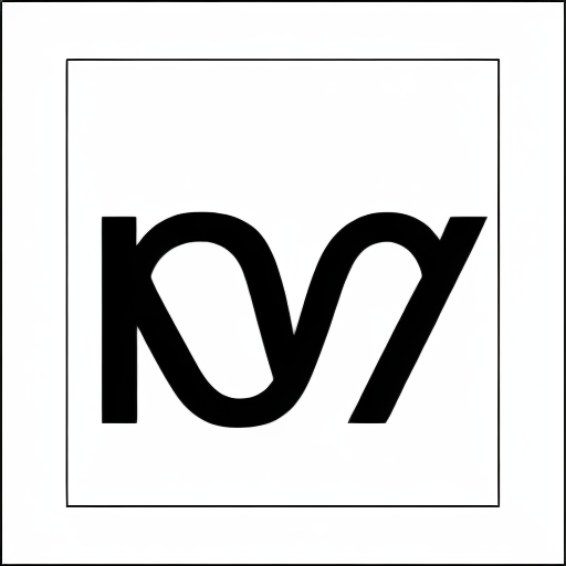
Experiment 17:
AlphabetMagic Characterset Expander Tool
- Proof of Concept -This are the very 1st results of a "Proof of Concept" experiment. Just baby steps.New /ɛ for Libre Bodoni Regular: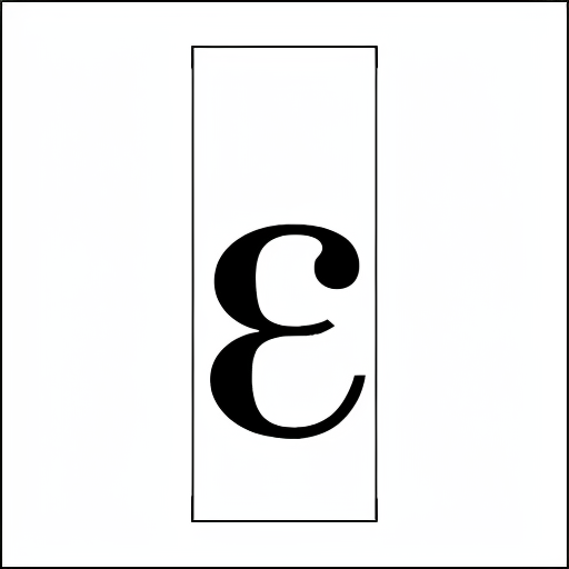
 New /ɛ for Almendra Bold:

Quite good results for a -very limited- proof of concept experiment!I only used 10 Basic latin a-z 0-9 Libre fonts to train this one!
I will be posting more results as I go...
Just wanted to let you know that the thing is going on.
What do you think guys?6 -
Nice! Seems like “generate more characters (as bitmaps) for an existing font, to support [missing thing]” could become a common use for AI pretty much right away.
1


Categories
- All Categories
- 47 Introductions
- 3.9K Typeface Design
- 493 Type Design Critiques
- 574 Type Design Software
- 1.1K Type Design Technique & Theory
- 668 Type Business
- 882 Font Technology
- 29 Punchcutting
- 535 Typography
- 123 Type Education
- 331 Type History
- 81 Type Resources
- 112 Lettering and Calligraphy
- 32 Lettering Critiques
- 80 Lettering Technique & Theory
- 565 Announcements
- 98 Events
- 116 Job Postings
- 170 Type Releases
- 180 Miscellaneous News
- 270 About TypeDrawers
- 54 TypeDrawers Announcements
- 114 Suggestions and Bug Reports