Your most valuable Tips & Tricks in Type Design!

BMoricke
Posts: 22
Hi, my name is Britt and I'm new here, and I really hope you can help me! I have been a typography teacher for over 10 years at different art academies in The Netherlands, which I love. Since a few weeks I'm also organising my own courses to private students, which I love even more:-)
I have a small group of people, from different countries, different ages, different experiences. One thing the have in common: THEY START LOVING TYPE! Since we are heading to our last lesson I would like to give them something extra. I think the most valuable thing I can give them are tips and tricks from YOU.
So do you have any tips and tricks (preferably in Glyphs) that you would like to share about making the perfect outline?
Thanks a million, especially from my students! Have a great weekend:-)
0
Comments
-
So what's the title of your upcoming book on type design tips & tricks?0
-
Theoretical:
You are not making a final product, but a notan machine for other people to use.
Practical:
Know the severe limits of the grid, transcending it with optics sooner rather than later. And not only the Cartesian grid, but the chirographic as well.1 -
Know where to start and proceed systematically.
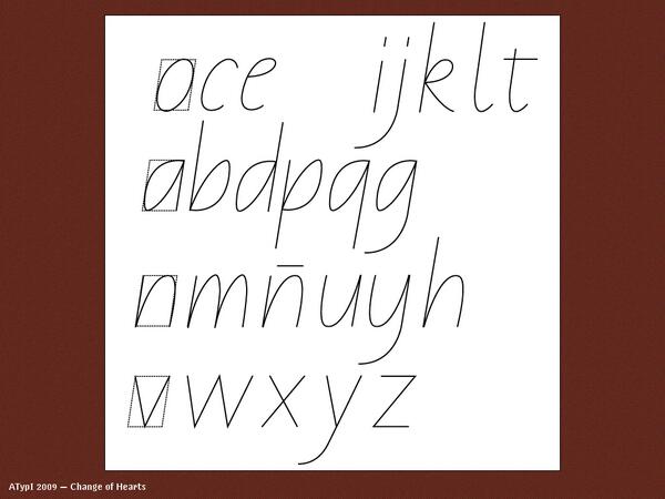
When it comes to actually creating glyphs in a tool like FontLab or Glyphs, I like to start with the structural glyphs, the ones that establish the common repeated shapes, spacing, and proportions, so in a Latin typeface usually the sequence i l n h m o (my first test word is always nihilim, which is a great way to establish the visual rhythm of letter widths and inter-letter spacing). But at the same time, I have in mind an overall idea or mental image of the typeface, including the flavour glyphs, the ones that impart most of the distinctive character of the typeface: a e f g k r s t, and the often problematic diagonals v w x y z.
That kind of mental image—the ability to picture in your mind what a block of text in a non-existent typeface would look like—is something that only comes with lots of experience both of looking closely at typefaces and of creating them. So it makes sense to beginners to spend more time sketching ideas, including those flavour glyphs and however roughly, before proceeding to a tool like FontLab or Glyphs, to help establish the design in the mind. The worst thing is to start randomly fiddling in the tool without having either an end or a path in mind.
Space the glyphs as you go, rather than thinking of spacing as something to be done after the shapes are made. A typeface is a system of shapes in spatial arrangement with each other, so you can’t design the shapes without the spacing.7 -
The most valuable lesson I've learnt from designing type is removing all pressure to create the perfect outline. It's easy to open a font file and believe the designer created and balanced each letter with minimal effort and time, but it's rarely the case. The end product likely took hours of crafting, reviewing, refining, and repeating until it was complete. Acknowledging this taught me a valuable lesson in the early stages of my type design career: good work doesn't just materialise the next day, it comes from hours/days/months of time investment. I believe this fact can get lost considering how fast past and immediate the world has become.
Secondly, a blank glyph is worse than a poorly designed glyph. It's better to get 'stuck in' and accept that crafting the perfect outline (and a balanced typeface) is a journey. What's helped me tremendously is removing all outside influence during the initial design stage. It's easier to digitise an initial pass of horrible outlines when you believe no one else will see this work. The fear of assessment stifles ones creativity.10 -
Proceed as a child about to play for the first time with no "ideal model" in mind. Do something, then react to what you have done by seeing it happen.
3 -
Don’t draw curved shapes by drawing curves with a pen tool. Instead place the extrema points, pull the curves out of them, make the on-curve points into smooth connections, and then even out all the handles to get an even shape.
2 -
I appreciate the comments on your post. Very clever and not too "guru".
Dissecting the title of your post "Tips and Tricks in Type Design", it evoques 2 excellent and rather different books I use as references (among others).- Designing Type by Karen Cheng: not the ultimate reference but very complete, I find it sometimes not clear enough but I don't know a better approach.
- Type Tricks by Sofie Beier: not a "Type Design for dummies" but instead a series of tricks well explained and illustrated.
And, to quote Sofie Beier "As soon as you have learned all these little things, you can then forget about them, and go play with your designs."4 -

10 -
1. When discouraged, imagine you are working in conditions that are ten times worse, and muddle through until it you get accustomed to the pressure. Pressure makes diamonds, not hugs.
2. Sweat more so you bleed less.0 -
Best tip I heard from Gerry: write yourself a design brief - what kind of font do you want to make, what do you intend it to be used for, and why - and use it to evaluate what you are doing.5
-
This approach was particularly useful to me starting (others may have a better way of wording it):
Don't get stuck solely on the exact math or geometry of shapes, it's sometimes necessary and better to make optical corrections that look and feel right more than they are following a precise measurement.
(Of course, consistency is important in things like stem weights, etc. but there is freedom to break the "grid" when needed.)2 -
Understand the difference between optical deviations within a system and arbitrary measurements. The more things you make quantifiably systematic, the easier the work will be, especially when you start expanding your design into multiple weights or widths, size-specific instances, extending kerning, etc.. The more measurements—stems, bowls, counters, sidebearings, kerning values—that are arbitrarily variant, the more difficult all these taks will be, because you will be constantly needing to take the variance into account. So, yes, optically deviate from mathematical standardisation when necessary, but start with the standardisation and track the deviations. Most crucially, if you deviate in a particular way in one part of the design, deviate in the same way in all related parts of the design: don’t apply different methods arbitrarily across a design space.5
-
@John Hudson The key concept here is that easier and better are not best friends... But because both are necessary, one has to know when to let go.0
-
Further to this, I wrote up a long explanation of what might go into a type design brief. https://www.quora.com/Typeface-Design/What-does-a-typical-brief-for-a-new-typeface-look-likeSimon Cozens said:Best tip I heard from Gerry: write yourself a design brief - what kind of font do you want to make, what do you intend it to be used for, and why - and use it to evaluate what you are doing.
Even if there is no ACTUAL external customer, pretending there is one is a great way to help focus the design. Typefaces developed to address very specific real-world problems can be great typefaces and get much broader use. (Times New Roman has seen a lot of play beyond just newspapers.)3 -
The key concept here is that easier and better are not best friends.They tend to be when what you are making is a complex system of interrelated elements that all has to work together. If you don’t work systematically and quantify as much as possible—i.e. not more than possible in the particular context of the project—, a typeface is not only more difficult to make but likely will not work properly. I say this as someone who has spent quite a lot of my life cleaning up the messes that people have got themselves into by trying to do everything by eye instead of working systematically.
1 -
@John Hudson Any font is a system of inter-related elements that is inherently too complex for consciousness to perfect... and perfection being impossible, it simply becomes an issue of where to let go of system purity (and for every person/situation that will happen differently). Ergo: nothing works "properly", but only well enough depending on the context; and ignoring that makes life more difficult. As Sumner Stone has said: a font is like offspring in that you can never finish working to improve it but eventually you have to make it leave the house. :-)1
-
For sans serif designs, they will likely be producing a family with more than one weight.
Certainly, start with the “Regular”.
But after that, work on the extremes, and interpolate the other weights.
For the Hairline weight, draw a skeletal path for the glyphs—this is easy to manipulate, then stroke it to, say 20 units of 1000 unit em.
Interpolating between Hairline and Regular produces very subtle Light weights that would otherwise be really hard to draw from scratch.
For the heaviest weight, there will no doubt be a fair amount of “cheats”, and it might not interpolate so well, but it’s better than putting a lot of work into an Extra Bold, and then having to do almost as much again, for the Ultra.4 -
Related: using coarse units of adjustment.nothing works "properly", but only well enough depending on the context; and ignoring that makes life more difficult.
https://typedrawers.com/discussion/comment/51660/#Comment_51660
0 -
Make sure you take time to REALLY consider the width of the space character. The difference between a decent and a total amateur font is the width of the space character and many newbie font makers make it WAY too wide. It was suggested to me that it should be half the width of the uppercase O as a starting point but I usually end up around 70% of that width, I just like a tighter space character.13
-
Hrant, I was offering practical advice about working systematically—recognising that making a font is a manufacturing task—, not suggesting or inviting philosophical ruminations on perfection, a word I didn’t even use. Again: I have had to clean up a lot of messes made by people who thought they could make fonts without a systematic manufacturing process.2
-
@John Hudson Disengaging philosophy from practice is... against my philosophy. :-)0
-
The mistake that took me a tremendous amount of valuable time and effort so far is that I focused on one glyph at a time.
After the first iteration where I draw all set roughly, I used to start with "final iteration" where I tried to make glyph by glyph "perfect and done" and then proceed to the next. What a mistake...
Eyes are so adaptive sense, so the more you look the less you see when it comes to type design. You might spend two hours trying to make the glyph perfect just to realize that's far from that later.
It's good to take a close careful look sometimes looking for bumps on curves etc. But working on a group of letters at the same time (even during the "final final final" phase) is much more effective. A few tweaks here, a few there, don't go too deep")
4 -
@BMoricke I would like to read some feedback from you as the starter of this post.
You asked for Tips and Tricks. The least you can say is you provoked an avalanche of not only tips and tricks but also of the deepest ideas of experts on type designing.
You mentioned your 10 years of teaching the subject so I guess you already have your own idea on the matter.
I'm interested to read about it and your reaction to this avalanche.3 -
@Yves Michel You're right, I was waiting for notifications, but since I'm new here I didn't know exactly how it works. I just checked in to see if there were any comments, and then I saw, like you say, this avalanche of responses!THANK YOU ALL for taking the time to share your advice with me and my students! I'm really glad that the advices given here are not technical at all, but from your experience... A lot of what you're saying is recognisable.I'm trained at the Royal Academy of Arts in The Hague, which I really enjoyed. However, it also left me quite being 'brainwashed' about what is good or bad type design.Since type design is more open nowadays to more people than only for 'the happy few', I find it quite hard to find a balance in being 'strict' and let people be free. Since I missed being free during my studies, I motivate students to work freely, but WITH knowledge.
The cliché ‘To break the rules, you first have to know them’, doesn't always work. Usually I work the other way around now: first let them free and then try to show them how to make things better with knowledge. Because if people take too much freedom, the work becomes arbitrary. What do you think?3 -
@BMoricke Thank you for your quick answer !
As a retired teacher in gym, sports, computer science, I totally agree with your idea about teaching.
Except for swimming, where I would recommand to be very careful with "free work".
I think knowledge, rules, tips and tricks must be acquired by experimentation and the masters' experience. And to avoid gurus!
An important element in type design is the difficulty to master the very complete and dense software (I used Fontographer, Studio 5, FL6 and now Fontlab 7). I learn each day!2 -
@Yves Michel Usually I don’t focus on the technical level too much, because in the beginning, there are more important things to focus on. First let them find out what water is before they start swimming... Personally, I find this more interesting to teach then teaching them the perfect front crawl:-)Technique however, is essential to be able to make what you envision!1
-
Right. I hope my saying there is "freedom" to break from rigid math and measurements didn't convey a lack of quality control and the importance of consistency and a good system.John Hudson said:... I have had to clean up a lot of messes made by people who thought they could make fonts without a systematic manufacturing process.
I simply found that in the beginning (having worked with a lot of layouts, guidelines, and exact geometric shapes) I had a hard time feeling like I could stray from the "grid" if needed.
This made me feel stuck and too robotic at times by trying to force certain glyphs to match precisely to other similar ones, which in cases like the thickness of the crossbar of an /e or overall density of an /s, it didn't really work in heavier weights.4 -
A helpful reminder:
The “the perfect outline” is achieved less through any particular techniques as it is through time. What you draw today, even if no changes occur, will look different to you in one week, 6 months, and 1 year from now.
What can you take away from this reminder?
Be patient with yourself. Be patient with your work. Scheduling time away from your type is just as important as drawing the type. Know that it is okay to move on from a font—you may come back to it later in life with a fresh perspective.7 -
What I like to tell beginners is to start with a rather simple design in a regular weight. Not to stifle creativity but getting to a point where they can see and understand the relationship between weight, contrast and most importantly the rhythm of the spacing. The look in their faces when they first print a page and see what works and what doesn't…6


Categories
- All Categories
- 47 Introductions
- 4K Typeface Design
- 493 Type Design Critiques
- 575 Type Design Software
- 1.1K Type Design Technique & Theory
- 669 Type Business
- 884 Font Technology
- 29 Punchcutting
- 537 Typography
- 124 Type Education
- 332 Type History
- 81 Type Resources
- 113 Lettering and Calligraphy
- 33 Lettering Critiques
- 80 Lettering Technique & Theory
- 569 Announcements
- 100 Events
- 116 Job Postings
- 170 Type Releases
- 182 Miscellaneous News
- 270 About TypeDrawers
- 54 TypeDrawers Announcements
- 114 Suggestions and Bug Reports