Gryffensee, the “Futura” of blackletter

Christian Thalmann
Posts: 2,068
Here's my most recent project, a textura blackletter typeface built from a limited inventory of straight segments and circular arcs of consistent weight, with exclusively orthonormal or diagonal cuts. I'm aiming for a "geometric sans" among blackletters.
The project was inspired by the letters |ABCD| hand-painted by Sasha Prood in what seemed to be a geometric blackletter. I later found out he drew these letters from an existing font, Bastard by Jonathan Barnbrook. Luckily, my own rendition of the concept had taken on a life of its own by then, and had turned out very different from Barnbrook's approach. I used Wilhelm Klingspor Gotisch as my main reference for blackletter shapes.

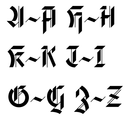
Since some traditional blackletter letterforms can be hard to parse for modern readers — in particular the capitals —, I made more legible alternate forms for |AGHIKZ|. They can be accessed through the Stylistic Set 01 in the main font, and I intend to release a companion font in which these forms replace the default forms for easier use.
Here are some PDF specimens:
http://www.cinga.ch/type/gryffensee_specimen.pdf
http://www.cinga.ch/type/gryffensee_alt_specimen.pdf
And full character inventories:
http://www.cinga.ch/type/gryffensee_inventory.pdf
http://www.cinga.ch/type/gryffensee_alt_inventory.pdf
I intend to release the font soon, unless there are issues remaining that would call for a major overhaul.
Opinions?
The project was inspired by the letters |ABCD| hand-painted by Sasha Prood in what seemed to be a geometric blackletter. I later found out he drew these letters from an existing font, Bastard by Jonathan Barnbrook. Luckily, my own rendition of the concept had taken on a life of its own by then, and had turned out very different from Barnbrook's approach. I used Wilhelm Klingspor Gotisch as my main reference for blackletter shapes.
Since some traditional blackletter letterforms can be hard to parse for modern readers — in particular the capitals —, I made more legible alternate forms for |AGHIKZ|. They can be accessed through the Stylistic Set 01 in the main font, and I intend to release a companion font in which these forms replace the default forms for easier use.
Here are some PDF specimens:
http://www.cinga.ch/type/gryffensee_specimen.pdf
http://www.cinga.ch/type/gryffensee_alt_specimen.pdf
And full character inventories:
http://www.cinga.ch/type/gryffensee_inventory.pdf
http://www.cinga.ch/type/gryffensee_alt_inventory.pdf
I intend to release the font soon, unless there are issues remaining that would call for a major overhaul.
Opinions?
2
Comments
-
BTW, Gryffensee is a mediaeval spelling of the lake near which I grew up. It's pronounced ['gri:fənze:] (approximately GREEF-un-zay).0
-
I like it very much. A very unique/interesting style and one of the few blackletter typefaces where all caps setting actually looks great.
Let me know when it's out and I spread the news.0 -
Looks like the first two links in your post aren't working. Missing URLs.0
-
@ Ralf: Thanks! I'll take you up on that offer.
")
@ Stephen: Oh, right, I must have gotten the HTML wrong. Here are the two links:
Sasha Prood's hand-lettering: http://www.sashaprood.com/art/Scroll_Portfolio_02.jpg
Bastard font: http://www.myfonts.com/fonts/virusfonts/bastard/
Wilhelm Klingspor Gotisch font: http://www.myfonts.com/fonts/linotype/wilhelm-klingspor-gotisch/0 -
After some iteration on the Typophiles board, I've updated the abovementioned PDF files to represent the current state of the typeface. Unless someone spots a glaring flaw, I'm likely going to submit to MyFonts within the week.
The biggest change so far has been the replacement of the |s|. I have two versions of it now:
I intend to ship the more traditional Fraktur-style |s| on the left side with the default Gryffensee font, and the slimmer |s| on the right with the Gryffensee Alternate font (which also contains the more legible capitals). The slim |s| will furthermore be available in the default font as a stylistic alternate.
0 -
The alternate s looks like it belongs in a stencil font. By the way, design a contemporary blackletter stencil font.0
-
It looks like a tangram to me.0
-
Agree, it does looks a bit like a stencil /s.
But at the same time it also looks more modern and less traditional... it's a hard decision...
I think I like it
Print a few paragraphs of text using each one, review, and them decide.
A few paragraphs will give you better context than isolated words.
I'm also guessing the new one will be a bit more easy to read, given the simplified construction.
The /s have a high frequency of repetition in pretty much all languages.
Changing it will also change the “feeling” of your paragraphs.1 -
I think that the bigger problem with the alienate /s (and to some extent the /c as well in the above example), is that the counterspace is now way too big. This kind of blackletter really hinges having a really black, even tone, and to my eye the new version breaks with this (especially in "minusculum"). The density of the /s in your original PDF seems more appropriate to me. Other characters have this "problem" to lesser degrees. /r and /t are usually helped by the terminating foot to close their open counter on the right.
I realize that this is a modernization of a style, and i might be being a bit pedantic, but I feel like what unites the individual characters in Fraktur is less the verticality and pen angle and more the monotony and relentlessness of it.2 -
Thanks for the comments, everyone.
Yes, the slim |s| looks like it's folded from paper, which is not a terrible association for this kind of font.
@ James: A blackletter stencil sounds intriguing, though I'm worried that it would fall apart — fraktur letters tend to have a rather tenuous coherence already, and it wouldn't help legibility either.
@ Pablo: Good idea, I'll try that.
@ Jack: Consistent blackness is certainly important. Actually, my original |s| always struck me as too black compared to other characters. This becomes very evident if I use the blurring function in Glyphs. The slim |s| was too light, though, as you noticed. I believe I've alleviated that problem by adding some weight to the spine, though.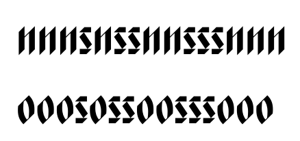
I don't think I can do much about the relative lightness of |r| and |c|. I've taken care to keep Gryffensee sans-serif so far, and anyway I've always found those two letters too similar for my taste in typical blackletter renditions. I suppose this is one of the concessions I'll have to make to the "geometric sans" aspect of the font.
0 -
I think you can improve the /r and /c be increasing the size of the small strokes at the top right. They look quite small in comparison to other features of the font, even if the stroke width is the same.
And move it to the left a bit in the /c to be able to have a tighter spacing.1 -
@ Georg: Good catch, dankeschön. The stroke of the |r| was actually a bit lighter than the stem. I've made it heavier and longer. The suggested compactification of the |c| worked exceedingly well — I was afraid the junction with the second stroke would become too flat, but it didn't:

And the same thing in fuzzy:
BTW, I love Glyphs, it's made my life very much easier!0 -
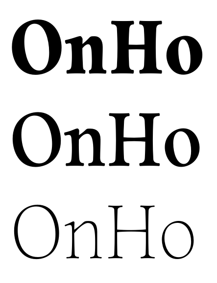
The "legible" caps lend themselves surprisingly well to all-caps usage:
 1
1 -
Christian,
Just an observation from a lettering/type perspective, is it possible to subdue the curves in c, d, e, a etc. to preserve the "picket fence ethos" that Blackletter is so famous for? I like the rounded quality in the capitals.0 -
I really admire this face, and have been wondering whether to jump in, since you say you're just about ready to release it. But it increasingly bothers me that the vertical lowercase stems are cut off at such a steep angle: 45°, it looks like. For me, this makes them much less monoline-looking than your caps; they seem more like strokes tapered at top and bottom. It also makes them look shorter and lighter than lc letters with curved strokes, like /a, /c, and /g. When I look at either of your 'minisculum' samples, the /s and /c really jump out. Would you consider decreasing the angle to 40° or 35° from the horizontal to make these letters blacker and more substantial?1
-
Max... I think maybe what you are seeing is the volume vs. space ratio in curved vs. straight. It lacks "evenness" as a result of the curves. Hard to explain but I think the white space created by the curved throws off the texture/weight balance. Does that compute for you? :-)0
-
I think that's part of it, Michael. But I think the sharply cut stems dematerialize the /m, /n, and /u a bit even without reference to the curved strokes. And if you look at the /o, which does have curved strokes, it's diminished in weight by the 45° cuts as well. Meanwhile, the new /s, which has no curves, seems much more solid to me, simply because most of its strokes are not chopped off diagonally, and because it is flush against the x-height and baseline, rather than only touching those lines at two points at top and bottom, as the /n does.0
-
Max, I think you are in part right; but I think this is where actual chisel edge pen experimentation would go a long way in resolving problems. In the curved strokes there are diametrically opposed terminal angles which create a huge dilemma in spacing/letter structure/fit (believe it or not). The wide curves DO NOT help. To me this cannot be resolved until the curves are restrained and reconfigured. Then the angle you speak of in "m, n, etc. will be resolved/coherent at that point, but I think the uniqueness of the font will be lost. This is the conundrum of an endeavor such as this. I wish the ability to post exemplars was not such a pain in the ass, I could make the statement quickly with pictures. For example... imagine the the concavity/convexity of the capital "S's" curves being reversed. This would make much more sense... it shows a lack of understanding of the pen form... which does actually help in the overall fit.0
-
@ Michael: I can see that the curved strokes in the lowercase break some of the "picket fence" consistency. However, they've been an integral part of Gryffensee from the beginning, and I'm not willing to give them up. As you say, it's a conundrum and I have to make sacrifices somewhere — I'd rather sacrifice a bit of picket-fence consistency than the geometric uniqueness. I often feel the only benefit of not having a typographic education is a lack of scruples when it comes to departing from convention for the sake of creativity.
I don't understand your point about the capital |S|. While the circular arcs in many of my letters violate pen rules for the sake of geometry, the |S| happens to be made entirely of pen-friendly strokes. Wilhelm Klingspor Gotisch even has exactly the kind of stroke I'm using on the left side of the |S| (and uses a different architecture on the right half). What exactly "shows a lack of understanding of the pen form" here?
@ Max: I'm aware that the pointy-tipped strokes feel like they're "hovering" a bit. I actually like that effect, it gives the font a certain lightness. Of course, I do want those strokes to line up with the other lowercase letters. The current version already include some adjustments (the curved or even horizontal strokes end close to, but not on, the baseline and x-height), but I guess I haven't gone far enough with that.
I'm rather partial to 45°, since it embodies the geometric cleanness I'm aiming for. Of course, I have blatantly cheated before (such as with the not-at-all circular stroke of the traditional-style |G|), but I wouldn't want those angles to stand at odds with the other 45° cuts and strokes I have everywhere in the font... and I don't feel changing all the angles everywhere in the font.
Do you think I could solve the problem by extending the vertical strokes a bit more, rather than changing their cut angle?0 -
I think bigger overshoots should help, Christian, but I don't think they can do the whole job. And while I agree that the 45° terminal angles give your /m and /n a nice lightness, I think they also clash with the glyphs I mentioned, which are not especially light.
And of course I agree that 45° enhances the face's geometric feel to it, but you might find that 40° has the same feel—in fact, it might look more like 45° than 45° does—and that the 5° difference is not noticeable or bothersome. Cheating is good. Renner cheated all over the place while drawing Futura, and the final product still has a strong enough geometric feel to inspire you 85 years later.
Why not just try modifying the terminal angle on /m, /n, /i, /l, and /o, and see how it plays with your caps and other glyphs were 45° is really baked into the design? Shouldn't take too long to run up a variant font.1 -
nice, I thought about the NYT nameplate redesign thing too0
-
Have fun Christian.0
-
@ Max: I've started experimenting with a ~38° angle (x/y = 4/5) on the vertical stroke cuts. It makes the letters look taller overall, but that's not necessarily a bad thing for a blackletter. I might still reduce the height a bit to restore the original proportion.
I haven't changed the slope on the descender of |g|. Is that jarring? I see it when I look at it purposefully, but not at first sight. I suppose I could restructure the descender to accommodate the new angle, too, but then things get a bit more complicated. I rather like the new |d|, though.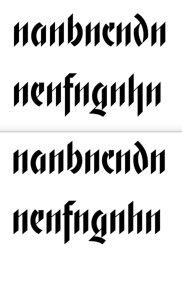 1
1 -
That looks good, not as "cheap heavy metal band"ish. I know you're eager to publish it but I think subtle refinements like this one increase its value tremendously.
The /g/ being a bit different is no problem at all in my view.1 -
Big improvement, Christian. Handsome, much more cohesive, and still very geometric. Much better /d. /g is working fine in context; absolutely no need to make it mathematically consistent. Nice!0
-
I'm glad you guys are keeping me from publishing — things do indeed improve with each step.
Here's the entire new lowercase. I also like the new |o| much better. I lowered the ascender of |t| a bit, as it is often the case in Roman fonts... does that work in blackletter?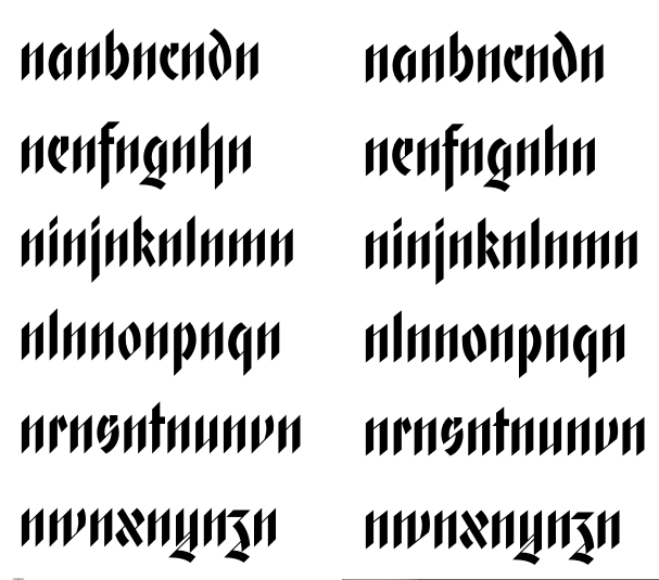 0
0 -
Did you ever try a diagonal sheer on the right side of the /t/f/ crossbar (so it would essentially be a flipped version of the triangle pointing out the other side)? Might lighten that clunkiness. The vertical terminal you have there feels like an outlier in the typeface.
I'm not sure but I think your curved thick lines are optically a tiny bit too heavy compared to the straight thicks--see the dark /g/ in ngnhn or the dark /o/p/q/ in nlnnonpnqn.1 -
@ Craig: You're right about the curves; I had blindly applied Briem's recommendation of making curves thicker than vertical stems, but here the curves might be vertical enough not to care about Briem much. Better now?
As for the crossbars in |f t|, I originally started out with diagonal cuts on both sides, but found that used too much horizontal space for too little visual impact. Wilhelm Klingspor Gotisch also has a slightly out-of-character vertical cut on those crossbars, so I guess Koch had the same problem. ;o)
Here's a line-up of three versions, which the status quo on the left and your suggestion of mirroring the left spur on the right. In the middle, I made the right part of the crossbar longer while retaining the diagonal cut — it works pretty well, but I'm not sure yet whether the improved consistency is worth the loss in readability. What do you think?
 0
0 -
The middle is what I had in mind, and I think it works well. I really don't perceive any "loss of readability."
Curve thicknesses look better, maybe still could be thinned further but it's hard to tell from this rasterized example. I don't think the Briem rule is inapplicable because these curves are vertical enough; rather the main thing is that they don't thin at all unlike in a conventional typeface with contrast. An /o/ in something like Bodoni has to have thicker thicks than an /l/ primarily because it's at its thickest only for an instant unlike the straight stems. But your monoline curves are a different animal.0 -
I agree on the new crossbars, I've meanwhile adopted them into the font. As for the curved strokes: I've ironed out a subtle inconsistency in the |o|, but I don't think I can make the |a b g q| curve any lighter without making it look too thin around the middle. I've added a gap between the vertical stem and the curve a while back; I suppose I could expand that a bit more if needed... though I've tried, and found the |a| then starts to look stencily.
Looks like we're close to converging on a final version, though... neat!0


Categories
- All Categories
- 47 Introductions
- 4K Typeface Design
- 493 Type Design Critiques
- 575 Type Design Software
- 1.1K Type Design Technique & Theory
- 669 Type Business
- 884 Font Technology
- 29 Punchcutting
- 537 Typography
- 124 Type Education
- 332 Type History
- 81 Type Resources
- 113 Lettering and Calligraphy
- 33 Lettering Critiques
- 80 Lettering Technique & Theory
- 569 Announcements
- 100 Events
- 116 Job Postings
- 170 Type Releases
- 182 Miscellaneous News
- 270 About TypeDrawers
- 54 TypeDrawers Announcements
- 114 Suggestions and Bug Reports