Gryffensee, the “Futura” of blackletter
Comments
-
Alright, I've wrapped up my work on Gryffensee with a few ligatures (|cz rz zz|) and contextual alternates (a |c| that coexists peacefully with a following |f t|; a |z| that tucks in its tail when another wide descender follows), and sent it all in to MyFonts. It should be up for sale soon.
Meanwhile, I'm seriously tempted to expand Gryffensee into the cyrillic domain. It seems there's almost no cyrillic blackletter out there, so it might be a big challenge as well as a big opportunity. I don't speak a language written in cyrillic, so I'd need some help with legibility issues...
Whaddya think? Worth the effort?0 -
Here's a teaser, just for fun...
 1
1 -
Maxim Zhukov contributed some images of 19th Century Cyrillic blackletter types in a discussion over at The Other Place.0
-
Sounds interesting! Link is borked, though.0
-
Fixed.0
-
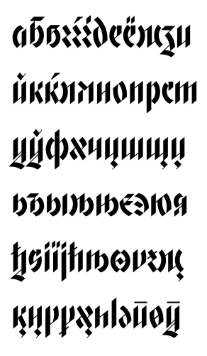
Thanks! Meanwhile, here's my lowercase. I'm having trouble with the |я|, it just won't look right. The |э| was also a tough nut, but I think it looks acceptable now. No idea whether it's legible, though!
 0
0 -
Never mind!
0 -
You mean you are converging
") I like a lot about this work.
I like a lot about this work.
However, I have not warmed to the curves you too question... The contrast with the identical location and direction of the n's branch is just too great to look much more than original cute.
s is too busy! k too uptight and narrow and how did d get there and nowhere else?
And would you let us see the word "arrest"?0 -
@ David: I'm not sure what curves you refer to in your first comment.
As for the |s|, I have three versions of them, the last of which feels very un-busy to me. So there should be something for everyone. ;o)
You're right about the |k|, it was pretty cramped. I made it a bit wider now, and did the same to |ß|, which suffered from the same problem.
I don't understand your point about |d|. It's a pretty unique letter shape in all traditional blackletters, as far as I can tell.
Here's |arrest|. Not the prettiest of words, I'll admit...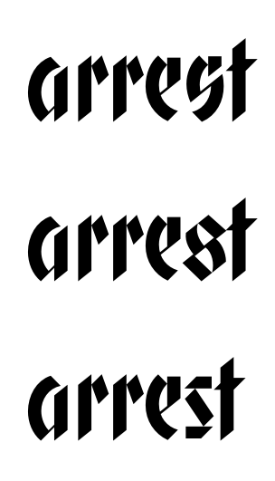 0
0 -
Completed the Russian character set. I should probably also add the rest of the Cyrillic parameter space at some point...
I'd be grateful for a legibility test by a native reader of Cyrillic. First (competent) review gets the font license for free.
 0
0 -
Hi Christian,
I really like the Latin as well as Cyrillic. Looking at the sample, I think that м ч э я ы may need improvement. The м is tricky because of the cut at top left. I have to see it in a text for better judgement, but I feel that I will still find it confusing. The middle part of ч looks lower than usual and I suggest you raise it a bit. As for э, could you try disconnecting the middle and bottom (the z-shaped) stroke? It's possibly not a problem at a reading size though. Cap Э looks like Greek ϡ to me, and the bottom part needs to be more firm. The я’s descending leg feels weird. Could you raise it? The ы looks a bit two letters. I would suggest making them a bit closer, or simply connect them like you did it in the capital Ы.
By the way, I recently found the drawings of abandoned geometric fraktur at Monotype archive. It's very differently constructed and perhaps not so relevant though.
http://tosche.net/2013/04/ullsteinfraktur_e.html
And RIP Rudolf Koch (9 Apr 1934).2 -
I came to this thread to post a link to Toshi's article regarding the Ullstein Fraktur, but he's beaten me to it. Very interesting stuff and nicely analysed.2
-
Thanks John! Actually, I was asked to contribute to the thread with those images, then it became a blog post.0
-
Hi Toshi,
thanks for your insights! I've changed {я ы} according to your suggestions. I also tried raising {ч} and unlinking {э}, but felt it looked worse that way. The former leaves an uncomfortable amount of white space, while the latter looks disjointed. The diagonal link feels pretty natural to me, and I think there's little danger of confusing the letter with anything else, including the schwa.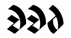
Also, nice link on Ullstein! I quite like it, though I would call its look "sleek" rather than "geometric".
Anyway, here's my full Adobe-extended Cyrillic glyph set (except for {Ҷ}, for which the Glyphs naming scheme is bugged):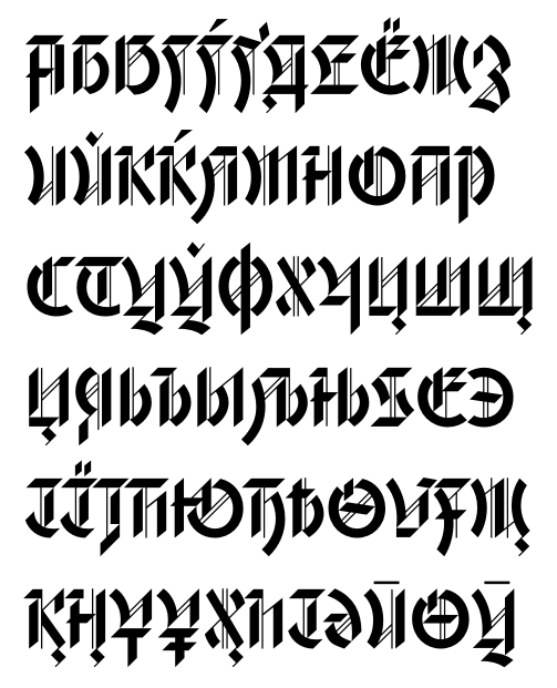
 0
0 -
Just like the lowercase r, the ч is meant to have an open space. Partly because of the design, currently it is easily confused with the и. Many Cyrillic letters (e.g. ч ь њ) are built that way, and I personally think you shouldn't attempt to fill the counter too much.
The э is, crudely put, a mirrored lowercase c with a bar or tilde in the middle. The э in the current shot looks fine to me, but I would also try adding a small stroke like in the image, or use the wavy stroke that you drew in the lowercase ө.
Glad you enjoyed Ullstein!0 -
I'm happy to announce that MyFonts released Gryffensee today. It comes with a 25% introductory sale.
http://www.myfonts.com/fonts/catharsis-fonts/gryffensee/
I will have to make at least 1 update at some point (I noticed the stylistic-alternate I-ogonek is misaligned), so if you have more feedback, do share it. The published version also includes some changes I've made in the last few days that I haven't posted here yet; I'll get round to that. Check out the lowercase descenders in the posters at MyFonts, though — they finally harmonize with the not-quite-45° cuts at the bottom of other letters, and they no longer protrude to the left that much. 0 -
If you don't mind a critique on your marketing material, Christian, I think the typeface is much stronger in pure color (like black, white, red). The gradients, glows, shadows and starbursts cheapen it. It’s really a nice piece of work and would stand up best on its own without the effects.10
-
Hi Stephen; thanks for the feedback, this sort of thing is extremely useful to hear. I'll update the posters accordingly.
What effects exactly are you referring to? I suppose the Três Corações one might be the worst offender, and I should probably remove the gradients from the title slide. The Urban Legend one is supposed to look sprayed-on and thus evoke the "street" aspect of blackletter usage to counterbalance all the more "serious" uses I've suggested; would you also advise against that?
Are the photos a problem, or the half-transparent bar in the feature slides?
Also, by starburst I suppose you mean the 25%-off sticker? Isn't that pretty standard on MyFonts?0 -
Anyway, I've toned down some of the cheap flashiness, rearranged the title poster, added a Cyrillic demo text, and rendered all "in use" posters in black and white. I think it's an improvement. Thanks for the pointer!
http://www.behance.net/gallery/Gryffensee-a-geometric-blackletter-(incl-Cyrillic)/82365332


Categories
- All Categories
- 47 Introductions
- 4K Typeface Design
- 495 Type Design Critiques
- 577 Type Design Software
- 1.1K Type Design Technique & Theory
- 671 Type Business
- 885 Font Technology
- 29 Punchcutting
- 539 Typography
- 125 Type Education
- 333 Type History
- 81 Type Resources
- 113 Lettering and Calligraphy
- 33 Lettering Critiques
- 80 Lettering Technique & Theory
- 569 Announcements
- 100 Events
- 116 Job Postings
- 170 Type Releases
- 182 Miscellaneous News
- 270 About TypeDrawers
- 54 TypeDrawers Announcements
- 114 Suggestions and Bug Reports