FontArk
Comments
-
H proof please!
")
1 -
H proof, plus...
David's* formula:
1/2 of 1/3 of the H counter = O bearings
1/4 of H width = H bearings
Diagonals = Zero bearings
1/2 of 1/3 of the n counter = o bearings
1/2 of n width split asymmetric = n bearings
* There are still chances for messing up on my side, if something is not accurate please advise.
Our demonstration font's values:
Stems = 40
H counter = 380
380 x 1/3=126.6 x 1/2=63.3 rounded to 60 = O's bearing
Half H's width = (380/2=)190+40=230 x 1/2=115 rounded to 110= H's bearing
Diagonals on Zero bearings
n counter = 300
300 x 1/3=100 x 1/2 = 50 = o's bearing
Half n's width = (300/2=)150+40=190 split asymmetric to 110,80 = n's bearing
I must say that this is freaking awesome,
And that this formula is actually begging to be fully automated.
I'm not revising my choice of sizes at which this style is recommended and it stays on:
"poster designs.... Print, seen and looked at from 20m to 50cm, text size scaling from 16px to 300px with generous design flexibility."
Attached two H proof images. H with zero bearings and H with the formulated bearings (if one is not needed any more just say)
I've also recorded my screen at some parts of the spacing process for you to see in this clip
With Tchaikovsky's Dance of the flowers, this time, for your amusement...
Grandpas.") 0
0 -
This is not:
"David's* formula:
1/2 of 1/3 of the H counter = O bearings
1/4 of H width = H bearings"
Read it again please, and don't round beyond a decimal.
0 -
You wrote
Take 1/3 of the H counter,
then 1/2 that third and put it on either side of H.
Then, take 1/2 left side of H and put it on either ride of O,
Stems = 40
H counter = 380
H width = 460
Take 1/3 of the H counter, 380 x 1/3=126.6
then 1/2 that third and put it on either side of H. 126.6 x 1/2= 63.3 = H bearings
Then, take 1/2 left side of H and put it on either ride of O, 230 x 1/2= 115 = O brarings
It doesn't make sense to me that the O spacing will be wider than the H spacing0 -
Perhaps this will help:
"...then 1/2 that third and put it on either side of H. 126.6 x 1/2= 63.3 = H bearings
Then, take 1/2 left side of H and put it on either side of O, 31.65 = O bearings"
0 -
I've done that on the previous page
1/3 of the H counter - 380/3= 126.6
And it was a No.
1/2 that third, on either side of H. - 63.3
1/2 left side of H on either ride of O - 63.3/2 = 31.6 0
0 -
@Jacque
And what about your argumentation Jacque? Did you tested Fontark? Do you know how it works and what it is capable of? Do you know at what stage of the development we are and what is planned next? What do you know about my skills and education and experience?
I wouldn't call Your arguments serious, and you may assume I'm facing such arguments by the gallons.
Skepticism for itself is not a bad thing, but combined with superficial and prejudice judgement it is the typical cane in the wheel of progress, on one hand, and on the other hand I assume it is a vital natural selection force.
The problem with type design is... that it has Many problems. or challenges. And we aim to face them all.
Before we started developing Fontark we analysed and investigated well the wide range of type-design challenges and put out a lot of thinking how to strategically build a tool that will eventually cover them all and bring a truly significant improvement to the field.
Our investigation and vision brought us to decide, as first stage of an over-all solution, to start with developing a Character-synchronization-system!
There are hundreds of tools and local solutions to each and every type design task out there, but there's nothing to tie them all together, so that's what we decided to start with and that's what our SmartX system is doing and built for. (currently for monoline type).
Our unique sync system is so flexible and powerful that it is faster to work with it not by twice or so but by 100s and more, than any other existing solution. As regarding monoline type. Our next development phase is focused on non-monoline type.
I invite you and any one else to send me a pm and schedule a personal demonstration of Fontark capabilities, and promise to personally provide you with all information needed... for better argumentation.0 -
This just gets more and more insane.2
-
@Ofir -- In the formula you used to produce the image you rounded too much which is why David said to not round beyond a decimal. Since he wrote that you have not produced a new example. Give that a try and see what happens.0
-
@Ofir
I am well aware of:
Our investigation and vision brought us to decide, as first stage of an over-all solution, to start with developing a Character-synchronization-system!
The white space and the spacing is at least as important to a typedesign as the "forms". IMHO the white is even far more important, but some might have another view on this.
In the samples you have shown us until now, especially the last few ones, you haven't shown any convincing knowlegde or insight on the matter of spacing and white spaces.
Therefore I will stay sceptical.1 -
George, In this image
the space between H and i is 60 (rounding of 63)... and it's far too narrow. You'll need a microscope to notice the difference between 60 and 63 in this case so I assume that's not the problem, let's wait and see what David has to say.0 -
The middle one.
But the first one may fit more your saying that the amount of white inside and between letters should be optically equal.
I know you guys enjoy very much to give me typography lessons and I have no problems with that, but please remember this is a software thread, and I would appreciate you referring to the software aspects as well. You can see how the spacing is done with Fontark in this clip ... https://www.youtube.com/watch?v=fAFP-G6upcA&feature=youtu.be 0
 -
the space between H and i is 60 (rounding of 63)... and it's far too narrow. You'll need a microscope to notice the difference between 60 and 63 in this case so I assume that's not the problem
Does the i get sidebearings too?1 -
"You can see how the spacing is done with Fontark in this clip ..."
We can all see. But it's hard to be informed when you do something right, and when you do something not so right. Why not stop the music, and record verbally what you think you are doing with all those 1,000's of perhaps semi-concious interactions?
I was expecting this tool to enable one to define e.g. an H side bearing once, and have all the Same Uppercase side bearings ride along, (((forever)(in every Sans this tool ever made)(for anyone))). Your video makes it look like you don't understand that's the advantage of a parametric system.0 -
I was expecting this tool to enable one to define e.g. an H side bearing once, and have all the Same Uppercase side bearings ride along, (((forever)(in every Sans this tool ever made)(for anyone))). Your video makes it look like you don't understand that's the advantage of a parametric system.
Thanks lord, O gracious lord. That's what i'm here to talk with you guys about!
I want to show you HOW we do stuff and find out your expectations/scholarly-opinions about it. Of course we have our in-house consultants, but we're already live and anyone can try it so I want to hear more experts opinions.
I've told it before, FA is not a parametric design tool, and creative flexibility is one of our most important values, therefore FA must allow free-design/free-spacing/free-everything and will never limit our users to one scheme of operation. We might automate certain useful operations though, while maintaining creative flexibility.
At the moment, FA is built upon Multiple glyph editing philosophy - if you want to imply a certain operation over a selected set of glyphs you'll select your desired group*** of glyphs and do your marvels to it.
* a "group" can be a single glyph, several glyphs, or the entire char set.
** saving glyph groups for repeated actions is easy.Why not stop the music, and record verbally what you think you are doing
If i'll record myself i'm expecting a wave of self-righteous comments disqualifying me of preforming in an international scene + of course developing anything, due to my quirky accent and broken English. At least with writing you have to (mostly) bare only my improvised English grammar.0 -
Does the i get sidebearings too?
You're right. together it's a total of 6(FA)points rounding, and it was demonstrated in this image:
After that David saidMy system? No. My system says one will end up with 1/3 of the H counter and an uppercase stem thickness forming the middle of the HIH combination.
So I still don't think it's the rounding issue that is the main problem with the calculations.
David can you please tell us what should be the H, O, n, o bearings provided that values are:
Stems = 40
H counter = 380
n counter = 300
?0 -
I think maybe you should analyze a bunch of existing fonts for relationships, among and between the cases and other character groups,
1. Spacing
2. Weight &
3. Alignment
values.
1 & 3 you can get from just looking at the overall width and ht of the glyphs vs the space they sit on, and 2 you can measure things like H, O V, n, o, v, stems and bars, etc, to see how the weighs of horizontal and vertical round and square strokes relate, in say... Helvetica.
Then examine Helvetica Bold. Then apply that to your newly calmed design, and it's bold version.
0 -
OK
So in my next example I will space and align the font according to these instructions and introduce a normal and bold styles of it, spaced, to the results of my analysis.0 -
Ofir: ‘I know you guys enjoy very much to give me typography lessons and I have no problems with that, but please remember this is a software thread, and I would appreciate you referring to the software aspects as well.’
It’s a software thread on a type-related forum and your tool is meant to become useful for the same people that give you typography lessons, I reckon.
In a booklet with a text from Dr. Karow on Digital Typography & Artificial Intelligence, jointly published by Adobe and DTL on occasion of the presentation of the third Dr. Peter Karow Award for Font Technology & Digital Typography to Dr. Donald E. Knuth at the ATypI Amsterdam 2013 conference, I mention in the introduction the cooperation between the scientist, Dr. Karow, and the, as you know, very skilled type designer Hermann Zapf and I proceed: ‘I think it is plausible that movable type was developed by craftsmen and entrepreneurs like Johannes Gutenberg and Nicolas Jenson as a ‘format format’, i.e. a technological vehicle for type designs, which was as much adjusted to the then existing aesthetic preferences, as that it created new ones. Probably it was the result of an interaction between scientists/technologists and designers, like in case of forenamed hz-engine program.’
I also mention an e-mail David Lemon wrote me in 2012: ‘It seems to me that the great leaps forward in the history of type and printing have stemmed from a sort of dialog between technology and art. Each figure in that history may have been more artist than technician or more technician than artist, but they all had both qualities. The great designers were necessarily also master craftsmen, fully in control of the technologies they used. And the great inventors were never mere technicians; their inventions arose from seeing opportunities that new technology could address –so an awareness of the artistic aspect was a precondition for the invention.
So, I think the typography lessons could be quite helpful for the development of your tool.
1 -
I am quite happy to get typography lessons from the esteemed practitioners of the craft. I have been involved with typography for 60 years but am always ready to learn.3
-
Thanks guys. I couldn't ask for anything better than this, and I appreciate it at every level of appreciation.
Learning is the most important thing and it rarely comes natural to people. I wish there were "learning lesson" in design schools (and in any school). I've seen so much wisdom poured on deaf ears when I was a student that it brought me to the conclusion that there are no 'teachers', only students, for no matter how excellent the teacher was (and some awful teachers were even better) if the student couldn't even slightly release of the illusion that he understand what he's being taught, it was only by chance that he learned anything new.
And some would say that being aware to the fact that you don't understand is the beginning of true understanding, and that's why I never "hurry up" to understand anything and put a lot of efforts on listening and making sure I "got things right". And the amazing thing is that the more a person is intelligent, most likely he'll fall to the trap of "pre-understanding" and miss the whole point of a certain issue.
For the dialogue between art and technology, I'll just say that when we started FA, the chief software engineer once whispered me that people don't normally look at it that way, but... coding is art. (and I'm pretty sure some parts of FA's code looks like that at the moment!
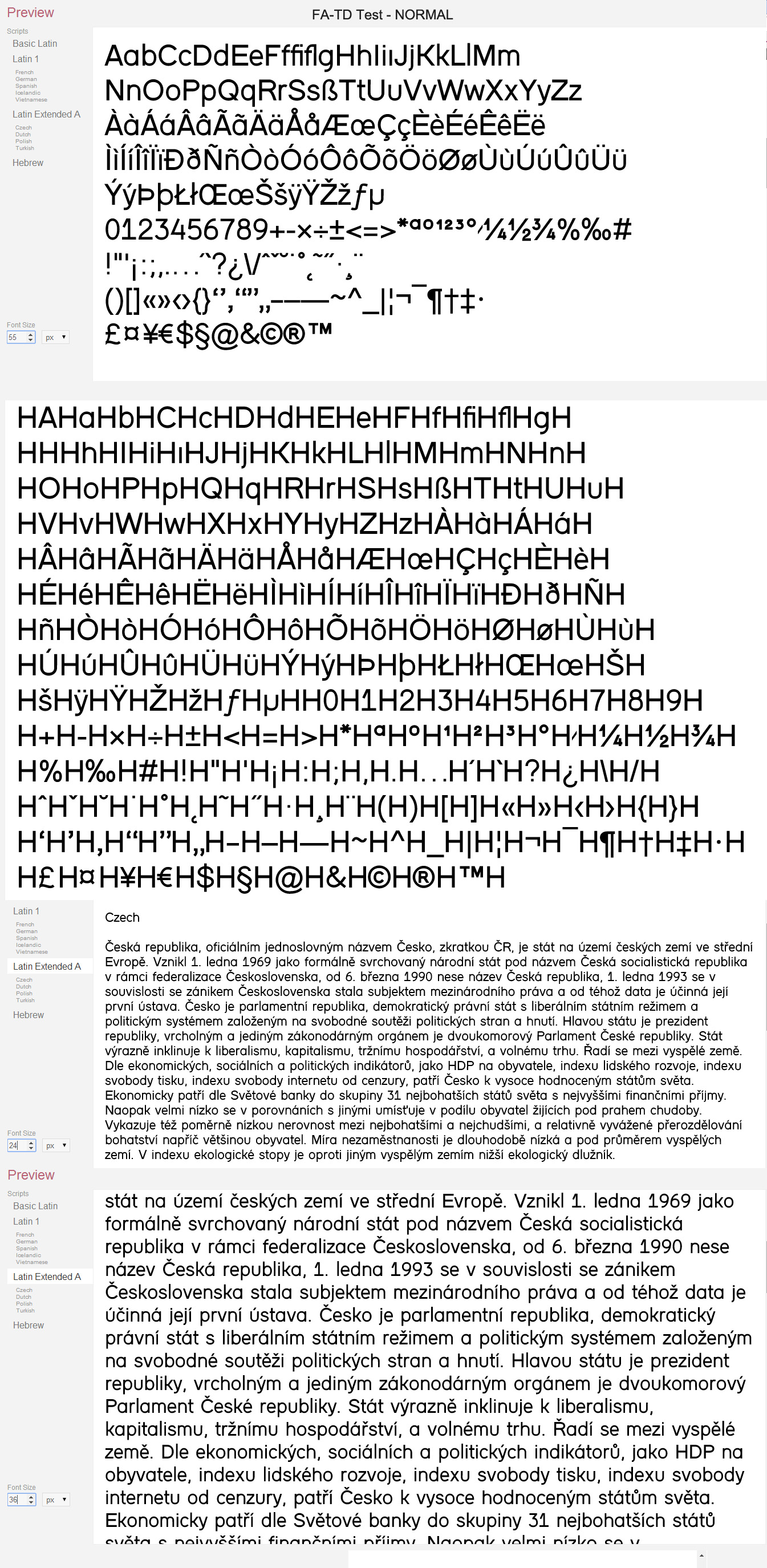
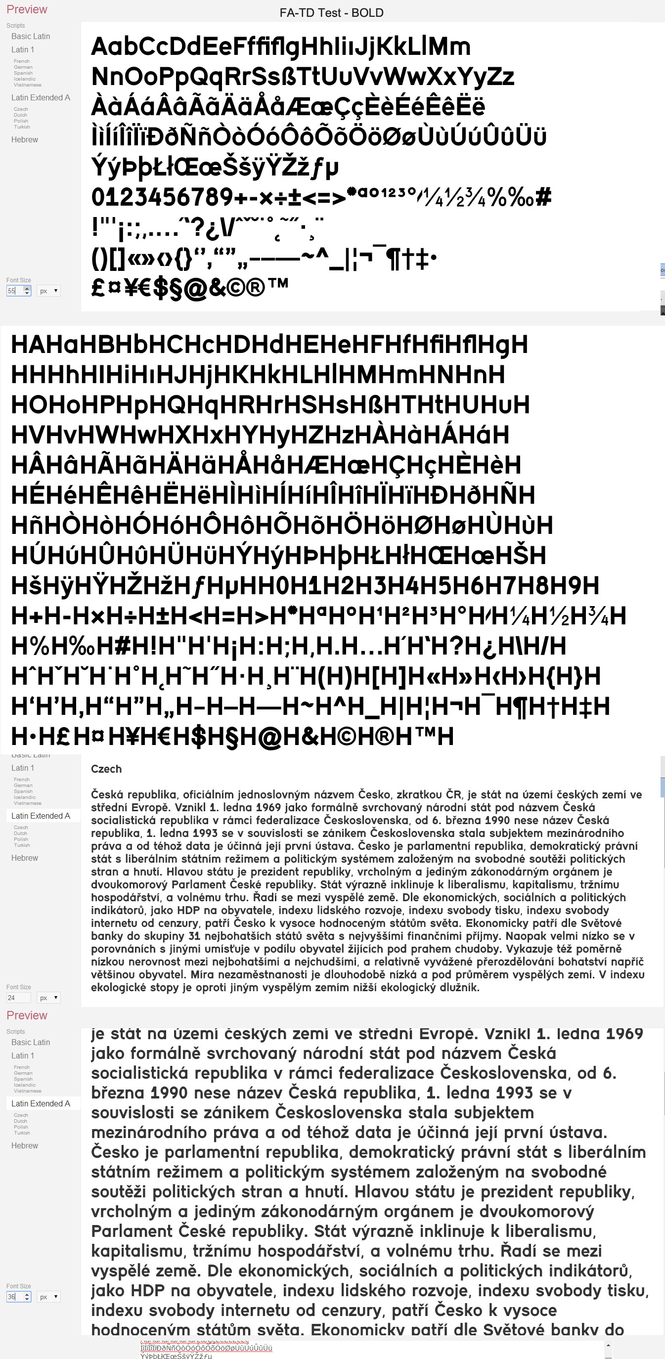
As for my role in the team, it is to negotiate the tech and craft aspects. I don't think i'm going to really master letter spacing in a week, but I'm working on that, still got some work to do but attached are two images of the new Regular and Bold styles of our font.
At the moment I didn't make ANY adjustments in the Outline layer, the strokes width are constant, I've just changed it's width from 40(the initial font) to 90(Normal) and 130(Bold)and you can see clearly the problems in the M,N,A,e,1,* and joints of straights and curves, these will be taken care of after fixing a decent spacing system.
Later on I'll finish up all the adjustments to the best of my understanding and upload a video showing how all of this is done + images of H proofing and all the rest.
Analyzing Helvetica (ahmmm, Arial. I'm a pc dude) didn't help very much (there's a chaos in there!), even the H's side-bearings are not equal, not to mention any attempt to find regularity between the counters , stems and bearings failed.
Remarks for things so far are welcome...0 -
"Analyzing Helvetica (ahmmm, Arial. I'm a pc dude) didn't help very much"
If usable type comes out of a font for 30 years, "(there's a chaos in there!)" and "regularity between the counters , stems and bearings failed" indicates you are not looking at it the right way.:)
0 -
 0
0 -
Oopsy!
 4
4 -
I think this is pretty amazing! Good job Ofir!0
-
Thanks a lot @Charles !
Sorry there's no video yet, a busy week, but our font is spaced in three weights.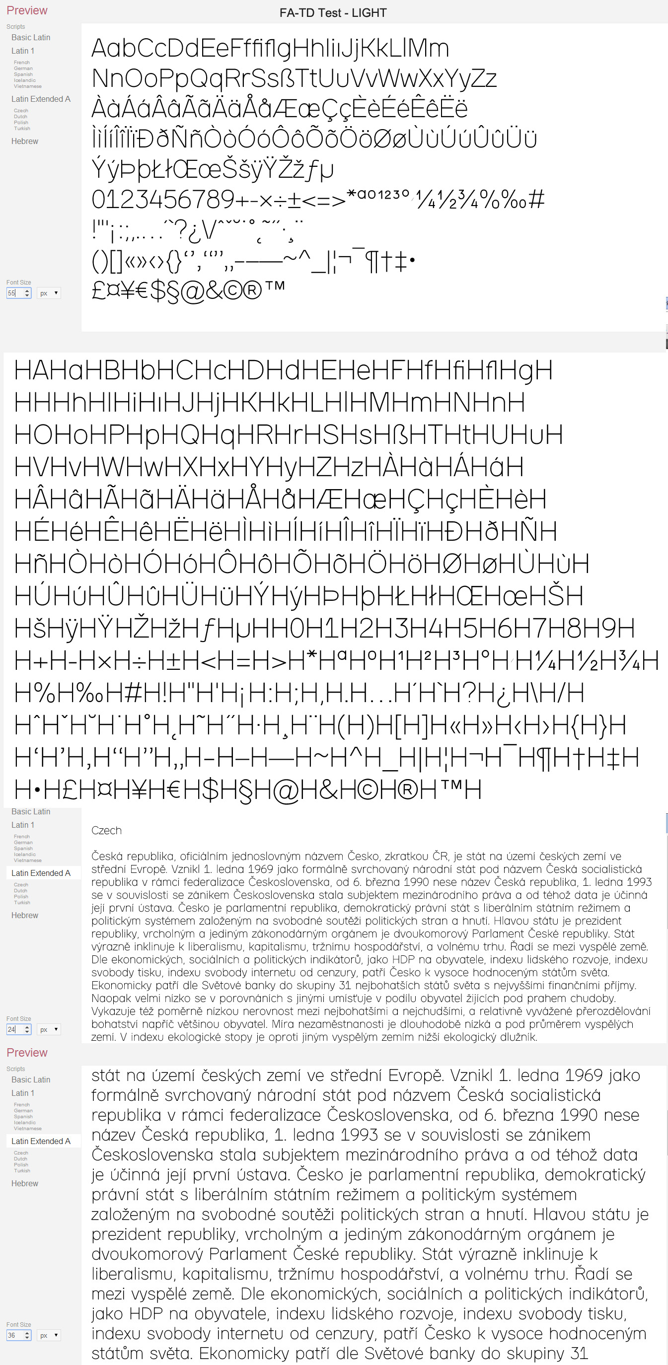
Ready for your remarks and further instructions.
As mentioned in my previous post, I didn't make any adjustments in the Outline level for the time being, the font is mathematically mono-line and all changed has been done only in the Skeleton level. (except for some local adjustments to Latin Small Letter Eth- ð in the Bold style)0 -
Now I've noticed that the e's crossbar was also thinned a bit in the Bold style, and the Bold lower case stroke thickness is a bit thinner.0
-
You've lost the "B" and the "ae"in your proofs.0
-
Right.
I fixed the Bold style image (in the previous page. It has now the HBH)
About the "ae"... it's there, in the 5th row near the "AE" but you couldn't recognize it because it looks like the "oe", which is of course a problem. In the new Bold image I've added it the missing right a stem (it doesn't look good because I didn't yet treat the round and straight joints) but I wonder if it's ok to make the "ae" with a two stories a even though the basic a has only one?0 -
Who said anything about making bold?0


Categories
- All Categories
- 47 Introductions
- 4K Typeface Design
- 495 Type Design Critiques
- 577 Type Design Software
- 1.1K Type Design Technique & Theory
- 670 Type Business
- 885 Font Technology
- 29 Punchcutting
- 539 Typography
- 125 Type Education
- 333 Type History
- 81 Type Resources
- 113 Lettering and Calligraphy
- 33 Lettering Critiques
- 80 Lettering Technique & Theory
- 569 Announcements
- 100 Events
- 116 Job Postings
- 170 Type Releases
- 182 Miscellaneous News
- 270 About TypeDrawers
- 54 TypeDrawers Announcements
- 114 Suggestions and Bug Reports