FontArk
Comments
-
Then examine Helvetica Bold. Then apply that to your newly calmed design, and it's bold version.
I guess I took that as a direct instruction to create a bold version and examine a cross-styles spacing system (and loose some horses). After reading that I've "announced" that I'll create a bold and normal styles....So in my next example I will space and align the font according to these instructions and introduce a normal and bold styles of it, spaced, to the results of my analysis.
(The Normal style was another horse breaking loose
It was quite a good thing to do at that point of the font development because increasing the font's weight from thin to bold (and back to thin again) made me adjust the skeleton, for in higher thickness the sharp angles of the 'A', 'W', 'V' etc' demanded expansion (in the form of splitting the corner skeleton's Node to two Nodes) and you can see it's consequences on the Thin style.
I've also started investigating further outline development (attached. it's just a free experiment, nothing complete or committing!), but you may want to kill me for doing that....
We can ignore all of these and focus on the Thin style (Plus the HBH and 'ae' fix.) if you prefer.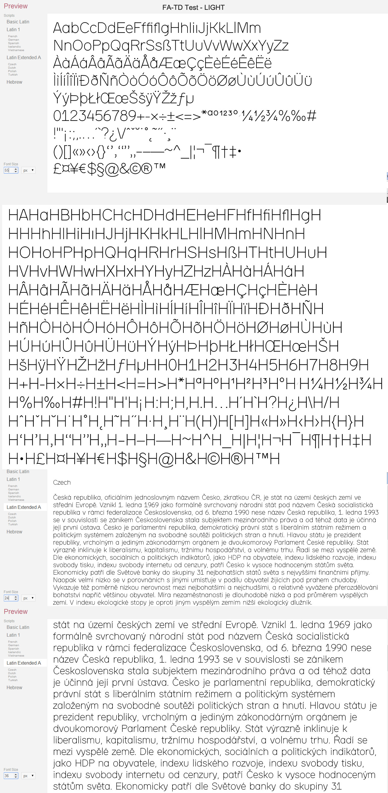
0 -
Congratulations!
Now you said this thin style was intended to work at most sizes and resolutions right?0 -
Yes0
-
So now, each and every glyph of the thin, must work crisply, uniquely and clearly with all appropriate adjacetcies, at all those sizes and resolutions. The relative sizes of glyphs and their interior and exterior spaces, all the way across the glyph repertoire, are in question.
Your asterisk, and probably fraction figures, for starters, are hopeless for all sizes and resolutions. You also have the bold as a starter idea to see how that, which is under pressure to perform because of the additional weight, can guide your thoughts of expanding the weights of the family, again over all the glyphs in the repertoire.0 -
I've revised the Thin style a bit more
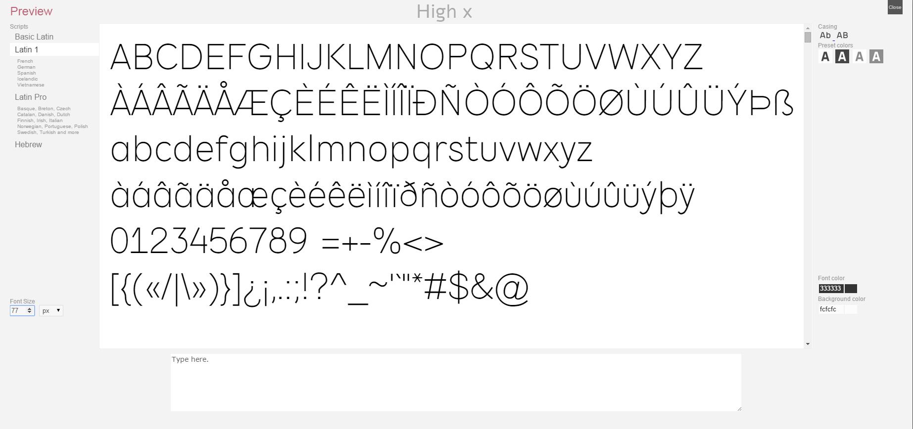
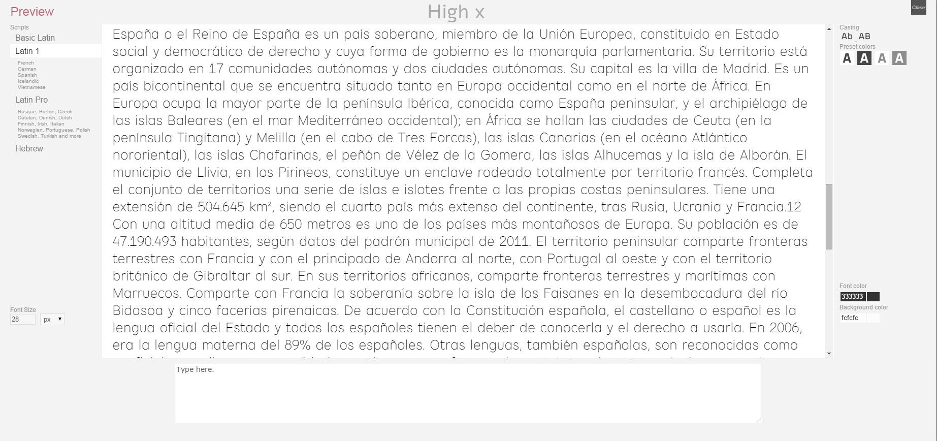
Attached the font as otf and a general pdf specimen (made with the great http://www.impallari.com/testing/index.php tool)
Some of the adjustments made:
- 'e' refinement
- Asterisk and Fractions thinning and refinement
- 'Y' 'M' 'V' etc sharp corners treatment
- Characters width adjustments
Our desirable effective sizes span is 16-300px (for print, so No hinting aspects)
Waiting for your remarks and suggestions for this style
The objectives as I see it (once the Thin style is approved) is to create:
- 4-5 weight styles - Hairline to Bold
- 3 widths - Condensed, Normal, Wide
- Round caps and line-joins is a matter of few mouse clicks to generate
- 1-2 creative variations of the font
And since it'a a collaborated work I thought about licencing it under SIL Open Font License (OFL)
If you have any thoughts or suggestions about it please share.0 -
Print sizes are not usually measured in pixels, to disallow the failure that is counting the resolution as more important than the size relative to the user.
And since I don't trust you to look at 'size' right yet, you should probably show me every glyph from 6 pt to 72 pt. No exceptions.0 -
"I thought about licencing it under SIL Open Font License (OFL)
If you have any thoughts or suggestions about it please share."
On this topic, at this point, we are just getting the chick out of the egg. The next step, I think, for the tool's sake, is an egg-laying chicken (a typeface family with sizes and weights).
Who all is collaborating? The complete set of entities?0 -
show me every glyph from 6 pt to 72 pt. No exceptions.
You want 14 images of the glyphs repertoire at these sizes?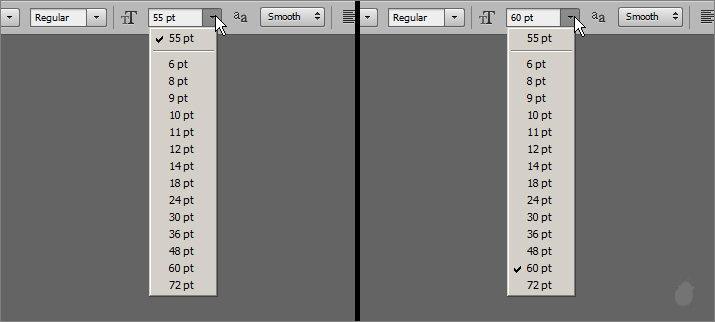
0 -
PDF is scaleable you know (?) you can zoom in and out the pdf file attached in my previous post0
-
He probably wants to print or see it at real size. Scaling is not the same.1
-
-
Who all is collaborating? The complete set of entities?
There's you and me and mr. Shinn, and everyone that posted here contributed in a way. And we're still in the Chick/Egg/Omelette process so other chefs might join up.
I don't have any commercial plans for this font. This font's purpose is to demonstrate FA's capabilities. I'd love to list all the contributors to this font, but some might see it as an attempt of mine to use your names to promote FA and I would not do such a thing. I will accept anything that would be agreed here regarding the copyrights and use of this font.0 -
Please reproof as you have provided, with zero inter-character spacing, flush left.
While I check that, be prepared to STOP.
Please don't change the font in any way, from the proof you show me.
Go do something else and forget about this font until I come back with notes.
(This is normal).
Thanks.0 -
See attached.
Then it was my last chance to refine things. I fixed the euro sign that was too small, the fractions were too thin so got it balanced, the comma's top was aligned with the dot's top, and several other issues.
I'm not touching it from now until you're back.
Thank you David!0 -
Hi.
I'm glad to tell you that we've just released the extended Latin support to FontArk LIVE.
Here are this version's upgrade details
That means that you can now test our demonstration font inside the tool and see how it's built and play with it or what ever...
I've uploaded our font as a template so if you want to load it:
1. click the big green "Start FontArk" button from FA's homepage to launch the tool.
2. In the Welcome dialog click the "New font" button.
3. In the "Create New Font" dialog select the lower right template thumbnail marked with "TD"(see attached image) (disregard the so called template preview) and click "Create"
Our font will be loaded to your browser in a minute or so.
You can check and try it even if you're not registered users/signed in, (choose "Just try it - Font) in the first dialog in such case, but it's recommended to sign-up (simplest email verification sign-up process, nothing vicious) and try it for it'll allow you to save, preview the font and generate it if you'd feel like.
Until the week after next week I will be mostly away from any computer, I'll be able to read/write here via my iphone once or two a day so if you have questions/remarks I'll be glad to reply.
When i'm back I hope we could continue with our demonstration and everything with full power.
Cheers1 -
New video demonstrating FA's accented Latin characters automation
This time with speech
 http://youtu.be/1dxlK4X-ULw 0
 -
Very exited about this one...
After laying the infrastructure, it's time for the next level of FontArk's development to arrive.
Here's a taste of the biggest upgrade we've done yet! http://youtu.be/dLHr1s3gZGY
To be released to the live version soon.0 -
Just upgraded FontArk!
We've equipped our system with fresh new Outline editing tools, leaving the "mono-linear" days behind.
FontArk's synchronized Skeleton infrastructure was built to enable this. You can now control the Outline Nodes freely in relation to the Skeleton Nodes. Although not covering all the possibilities out there (yet), it is, imho, pretty awesome.
This video gives a taste of the new functionality: http://youtu.be/jjgo7boQnxo
Full upgrade details + video tutorial here:
http://fontark.net/farkwp/december-2014-upgrade-advance-outline-editing-is-here/
All the features are freely available to test and use at www.fontark.net
Comments and your experience with it are most welcome0 -
Hi, on every Sunday to Wednesday in the next couple of weeks, I'll be demonstrating Fontark live between 10:00 to 22:00UTC (there'll be several streaming sessions during these hours).
I'm working on several new fonts and practically i'll be streaming my desktop so you could see what and how I do what I do. I'll use a mic (you could use yours as well), and there'll be a chat so we could talk as well.
I'll be using a free streaming platform that only require an email address to connect and there's no need to subscribe or identify yourself, I'll answer any question and love to discuss any issue with anybody.
During a streaming session a "Connect" button will be available in the "Live-demo" section on Fontark homepage, clicking it will launch the streaming app. Jump over to say hi or something!
www.fontark.net0 -
-
Sorry for that. We've disabled all keyboard shortcuts because it was causing some serious trouble (almost as bad as people getting discouraged by it's absence).
I'll check out what can be done about it and inform you in person.0 -
By the way, it is quite hard to realize it, mainly because this way of work is rooted in us so deeply, but with Fontark there is almost no need at all for Copy & Paste.
Yes, no copy-paste is required in most cases. It is one of the most used actions in today's type design workflow, and in FA it is negligible.
Once the typeface's skeletons are attached to the SX system you simply edit in real time all the glyphs and parts of glyphs you'd like to be modified as well. Tweak in one place and all the other places will be changed at once. So it's possible to say that the more you need copy paste in your workflow, the more time FA can save you.
0 -
This is of the very basis, and one of the challenges Fontark's unique core is designed to deal with by definition.John Hudson said:An interesting challenge for deriving outlines from skeletons seems to be asymmetric weight gain. Generally speaking, when making letters heavier, one wants more weight gain on the inside than the outside, which is why equal path expansion is seldom adequate.
This short video demonstrates it in action: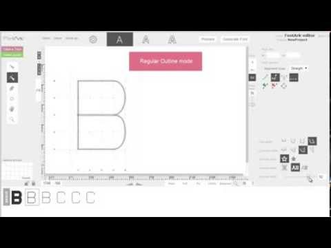 https://youtu.be/Zm542cBJOww
The skeleton nodes are attached to the SmartX's (SX) and the SX's are attached to the Matrix - link
Changing weight with FA is practically Growing the "stroke-width" inwards. It is achieved by recalculating the Matrix position which moves the SXs accordingly which ends up with a skeleton change when weight is changed.
It is a very simple (but not trivial) system of managing the outlines eventually.
The benefits of the Matrix are quite big. Combined with the simple way to selectively select characters for edit, it is like playing a piano https://youtu.be/bMDeH3WHue8
0 -
Lol, from the inside it is fun too (among the rest:)Have to say, from outside its fun to see someone reinvent the wheel. The ability to dynamically alter the stroke weight is pretty slick. I imagine that would be a global change.
Scope of the project is pretty extensive. You're building the thing from scratch?
How clean are the generated beziers?
The scope is really massive, we have designed and built FA engine from scratches and all in JS to work in the browser. Besides that we make use of quite a few Open source projects.
The generated beziers are very clean, it is nothing like the mess you receive by known "stroke-to-path" actions. Our outline generation algorithms produce a pair of nodes on the outline for each node on the skeleton (except for special caps or line-joins) so by controlling the skeleton you determine the outline and you could work with FA's generated font file very easily in any other font editor for further editing.
Here is the demo generated file when opened in Fontlab studio.
I can email you the file if you'd like.0 -
@Ray Larabie
This is very interesting for itself, because these are different logics, and it reflects (as well as derived) in the difference in our languages logic and structure.Ray Larabie said:I think all this is interesting. I keep asking questions about how people might use strokes because it's something I don't think about. It's hard for me to think about skeletons. When I draw letters, I'm thinking about shapes. I deliberately try to avoid the concept of a pen, strokes...how a letter might be drawn.*
"Skeleton"(/root) is built in the Hebrew (and other Semitic languages) language.Wikipedia says:For example, in Hebrew, the root gdl represents the idea of largeness, and from it we have gadol and gdola (masculine and feminine forms of the adjective "big"), gadal "he grew", higdil "he magnified" and magdelet "magnifier", along with many other words such as godel "size" and migdal "tower".
I understand your point very well and this method is just one of several, each suits different manners of work and outcomes.
But I'm not sure the skeleton method is completely inappropriate for your way of work and think it might ease it significantly as well, I suggest another experiment...
If you'll show me several letters/word of a typical to your work typeface, I will make another video that will let us examine it objectively.0 -
I created a typical lowercase a for testing here: Windows FontLab VFB
Sorry, just one letter...
After doing some interpolation tests and developing my weight strategy, I start with the heaviest weight. I focus on the overall silhouette and figure out a way to make the counters readable. The shapes of the counters on the heavy weights have to be precise. The stroke widths aren't measures and the position of the counters are usually bopped around with the arrow keys until they look correct. The kinks in the stem are constructed so they'll collapse when interpolated. The lightest weight has a lower x-height and 20 unit thickness. Rather than make different widths for horizontal and vertical, I keep it all the same and interpolate it down to about 15% of the heavy weight. In other words, the lightest weight will get thrown away; it's merely used as an interpolation target. That way it picks up some of the thick & thin strokes from the heavy weight and a little character here and there.
I'm sure you can take my outline, add a skeleton and make it match precisely. The part I can't see is how I can use a skeleton to design the initial silhouette, set the precise size of the counters, bump the counters around until they're correctly placed.
3 -
I will try to demonstrate it. Hopefully I'll manage to do it toady, otherwise it'll be next week cause I'm away to the weekend.Ray Larabie said:The part I can't see is how I can use a skeleton to design the initial silhouette, set the precise size of the counters, bump the counters around until they're correctly placed.
0 -
@Ofir Shavit nice work, is there some way to try this as a download app I can run locally? Also are there any shortcuts?0
-
@AbiRasheed Thanks.
There's no download version. And no keyboard short cuts (if this is what you asked?) except undo/redo (for pc) so far, but our UI is quite comfortable, no hidden action menus and such, all very simple and in reach when needed.
I strongly recommend anyone that want to try Fontark to talk to me and schedule a personal screen-sharing based demonstration in which I will show and guide him/her very quickly how to work with the tool and direct support you when needed. I'm available all my waking hours so just tell me when it is most comfortable for you, and I will be glad to do it.
1 -
@Ofir Shavit Cool. I think I got the gist of it by following your tutorial section. It's just that trying to grab an anchor to edit is quite challenging, like you have to be so precise to grab the anchor. Are there any plans to release an app to run this locally? Also what are the 100 credits for, it says I have 99 left, what happens if I use them all up?
Edit: Just gave it a shot and tried a logo, imported it to AI, expanded it and noticed it generates a ton of unnecessary anchors, is this a bug or something? "n" was not edited, it came from the font. Here's the image url0
Categories
- All Categories
- 46 Introductions
- 3.9K Typeface Design
- 489 Type Design Critiques
- 572 Type Design Software
- 1.1K Type Design Technique & Theory
- 664 Type Business
- 877 Font Technology
- 29 Punchcutting
- 530 Typography
- 121 Type Education
- 328 Type History
- 81 Type Resources
- 111 Lettering and Calligraphy
- 32 Lettering Critiques
- 79 Lettering Technique & Theory
- 562 Announcements
- 97 Events
- 116 Job Postings
- 169 Type Releases
- 179 Miscellaneous News
- 269 About TypeDrawers
- 53 TypeDrawers Announcements
- 114 Suggestions and Bug Reports


