FontArk
Comments
-
Optimal corner curve would imply that a straight line would be joined to curve in such a way as to be in one smooth motion without bumps. This is not so simple and requires more than aligning handles on a bezier curve. What you are doing is making a technically smooth curve. That is the easy part.0
-
It's not just aligning the handles! we also determine the length of it according to the Kappa formula.
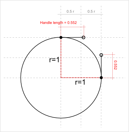
0.552 of each of the ellipse's radiuses. Want to adjust it manually? you know where the handle is, fix it to suit your needs in one place, and it'll correspond in all the other places/glyphs to your will.
0 -
Yes, but that only gives you a continuous curve at the same ratio, as in a perfect circle. The curve that makes a straight join a curve is not so simple, at least it is not as simple as you might expect when you first try it. It is, however, very much used in type design.0
-
I'm sure it isn't. But do you suggest that 1. the tool should do this 2. The tool should let the designer do this 3. Don't call that feature 'optimal'. ?0
-
Don't call it optimal.0
-
Accepted, Thanks!!0
-
I'd say 1 and 3 both. But 1 can be eventually. It too is covered under my list of optical compensations.1
-
Oh, and the Chameleon descriptors... here's the relevant patent link. I believe the patent expires on September 2nd of this year, if I have read things correctly.1
-
Ofir, this hypothetical argument is a waste of time.
Les Paul attached a couple of “wings” to his solid-body guitar concept, and played it in a band. People thought he sounded great.
For a typographic comparison, consider that the OpenType feature of Contextual Alternates was showcased by the design of Caflisch Script.
You need to commission someone to create a “masterpiece” (in the literal sense) with your new tool and launch it with that typeface. A typeface, the design of which plays to, and demonstrates, the abilities of the tool in a creative way. That’s the kind of thing that would interest me (among others, no doubt).
If you’re just trying to make a synthesizer that pleases piano players, you will get nowhere.0 -
What about the spine in that /S?
Ofir, can you implement "Hobby splines" instead?0 -
I knew Chameleon, and Ark is no Chameleon. Ernie Brock actually moved into an upper room of my house for a few weeks to finish Chameleon and the editor, while downstairs other clients frolicked about with no clue of what I'd periodically disappear to do up there. Thomas and Adobe were right in using it as a compression method. Printer memory was still very expensive, but RISD interns were cheap, and eventually we managed to wedge 250-300 fonts into a dew drop.
The danger, and the reason Ernie worked so closely with us, is when one found a feature in the 199th font that required a new master gizmo, all the other descriptors needed to be redone by hand, unless Ernie could save them somehow. The other danger was running into deficiencies in the source material, where either a correction had to be made in the design of the Chameleofont, or the master had to learn to make mistakes, but this is still a secret.")
2 -
Thomas, It is No.6 in you list, I know, but from your example I can only guess that in one case the handles are about 1/100 of a pixel longer than the other.
Nick, I'm not here on a marketing mission, more interested in the professional aspects, but your idea is great and we certainly consider actions in that direction.
Pablo, not at the moment but we're checking it up. Where is it in use? and are there any known restrictions for using it?
David, are we getting anywhere with the exercise? I've suggested two kinds of roundness, and clarified that spacing is done by human-intelligence in Fontark, you just have a much more flexible and flowing control over the char set so you can do it easier.
0 -
Ofir,
I understand that you are currently developping FontArk as we speak, but your approach is very technical. The question/remark David made (and the explanation of Rob) is very fundamental to type design.
Flexibility, repetition and quick overall control is not something I would need/use. Maybe only for a very quick test...
Do you have any experience in designing type yourself ?1 -
Yes I do, and it would have been greater if I had Fontark 10 years ago.0
-
Excercise time! I want you to finish the @ and all the rest of the Latin skelatii. While doing so, (nonstop till you drop) you will develop the means for the ordinals, accents, math and fractions, and iron out % in the traffic involved in composite structures and the glyph skeletons scaled and recipeed non linearly for other glyphs. Then, put a dagger in it, and let me look before putting a double dagger in it.
The round we are looking for is an unnoticed shape, neither too round or too square, and the widths of the characters should vary so this is possible, e.g. the O wider than now. Simplify the figures so the straight strokes of 5 n 7 are just straight, and remove anything else that might be called "design", like the rounded corners of L and E and the demented 3.
Then, drink some Graphemaide and rest.0 -
I want you to finish the @ and all the rest of the Latin skelatii. While doing so, (nonstop till you drop) you will develop the means for the ordinals, accents, math and fractions, and iron out % in the traffic involved in composite structures and the glyph skeletons scaled and recipeed non linearly for other glyphs. Then, put a dagger in it, and let me look before putting a double dagger in it.
That's what Fontark is built for my friend.
Lucky me, we're almost done with the extended Latin support and the cute Add glyph feature")
I'll be back soon...
Email me some Graphemaide.
0 -
In the immortal words of Nathaniel Sackett, I'll stay here.
"Email me some Graphemaide."
More? Not yet. You can't have anymore until you do your Latin Glyphs... and don't spread them around the glyph palette and think you're fooling me. 0 -
“Nick, I'm not here on a marketing mission, more interested in the professional aspects…”
That’s what I’m talking about. I don’t define professional as how well this new tool can replicate the work of older tools, what interests me is what it can do that’s different.
2 -
Frankly, the glyph drawing is not the drudgerous part of type design. It is all the other little things.0
-
That doesn’t mean drawing glyphs can’t be made easier. For example, I like the idea of being able to tweak all my serifs without making them components.2
-
Nick, you have a very strong point here. I'm letting it shock me for a while. thanks!
Chris, we'll attempt to hit them one by one, there's so much to do. And I'm interested with knowing what are the things that particularly disturb you?0 -
Really guys, Fontark is Not a parametric design tool.
Not more than bezier curves are, or any other computed thingy.
It's more of a proud member of the growing ACP (anti-copy-paste) movement.
I'll be ready to go on with our exercise next week with a new font and full Latin-1 support 0 -
O'k, I'm ready.
Please suggest any adjustments to this font. When you'll say it's good enough for the exercise I'll upload it as a font and start the familization process.0 -
Meanwhile, I want to show you the mechanism we came up with for handling combined glyphs...
The Basic-Latin characters are taken from the original BL glyphs,
All you have to do is design the diacritics,
The tool will match and update them for you in real time.
For the positioning of the diacritics we made a one click button, and as always you can manually adjust each and every group or single glyphs.
We're finalizing it these days and will release it to the live version soon.Real-time Combined glyphs handling with @FontArk in the upcoming upgrade http://t.co/gSODkkXXvT
— FontArk (@FontArk) July 2, 20140 -
Looks fine. My only criticisms are that the terminals of the circumflex should match those of the acute and grave, or vice versa; and the top terminal of the ampersand should not have a kink. Also the arms of six and nine could be longer—not quite right. And the oslash and Oslash terminals should match.0
-
Done.
The Twitter embedding trick is not working anymore, or I'm doing something wrong.
Watch this clip to see how we handle the accented characters with few button clicks:
http://t.co/gSODkkXXvT
0 -
Excellent! It looks really good so far.
Short of a larger proof, I only see the dots as too small. Period, lc i, dieresis...
And along with Nick's terminals of the o slashes, make the terminals of acute and grave match circumflex.
Looking forward to seeing a complete spacing test next.0 -
Oh, no. Sorry.. No spacey yeti... You are missing some dashes, broken v bar, fractions, and it is important to get all those little bits a pieces to complete recipes in this case. Also: If the minus is following the plus in your specimen it should be aligned higher. If it's a hyphen, it's too light.0
-
Is there overshoot for round letters?
**
I presume that the width of the crossbars of /I can be made zero.
**
I prefer to have math operators low, not vertically centered.
**
These days, I give all my typefaces both lining and old style figures. I would say that is a must-have for professional use.0 -
ok
Done:
- All dot's were increased by 50%
- Broken bar added
- A subtle overshoot was implied to all rounded parts (can be increased easily if you prefer)
Not done:
- Fractions would have to be done completely manually (copy pasting scaling etc) at the moment with us. We'll need to put some more development efforts to make it synced and it's not going to reach the top of our priority list too soon so I leave them out of this experiment for now.
Clarify:
- The minus following the plus is a hyphen-minus, U+002D
- The in-tool preview (shown in the uploaded images) is an SVG render, so it's not the crispiest, this might cause the minus to look lighter, but it is on the same thickness, you'll see it when I'll upload the otf font.
- You'll have to point me to the specific Unicode value of any dashes or glyphs that are not part of the Latin 1 supplement / Extended-A blocks so I will add them manually.
- If the old style figures implementation is in the way of adding certain glyphs that will function as alternates to the lining ones it's not a problem, if it demands any other setting related to otf functions it'll have to wait till we get to it.
-make the terminals of acute and grave match circumflex.
Match in what sense? alignment/ other? the Circumflex dots are just squares, should I skew them?
-the width of the crossbars of /I can be made zero.
I didn't get you on this one Nick.
I'll lower the math operators a little
0


Categories
- All Categories
- 46 Introductions
- 3.9K Typeface Design
- 491 Type Design Critiques
- 572 Type Design Software
- 1.1K Type Design Technique & Theory
- 667 Type Business
- 878 Font Technology
- 29 Punchcutting
- 534 Typography
- 122 Type Education
- 331 Type History
- 81 Type Resources
- 112 Lettering and Calligraphy
- 32 Lettering Critiques
- 80 Lettering Technique & Theory
- 563 Announcements
- 97 Events
- 116 Job Postings
- 169 Type Releases
- 180 Miscellaneous News
- 270 About TypeDrawers
- 54 TypeDrawers Announcements
- 114 Suggestions and Bug Reports