Distinctive features of the Ukrainian Cyrillic script

Best Answers
-
No, there are no real differences—aside from specific letters that don’t exist in other alphabets—or, to be more precise, there haven’t been any until now. In other words, until recently, it was a unified typographic space. Today, the idea of "demarcation"—or even "fencing off"—is quite understandable; perhaps, in time, we will see a distinct graphic representation of the Ukrainian Cyrillic script, much like what happened in Bulgaria, for instance.For now, what I see is a mangled italic "ф" and a *breve* that has tipped over onto its side; the rest of the letters are decorative, yet they still fall within the realm of what one might find in the catalogs of Paratype or the work of Yuri Gordon.1
-
There Are a differences. Michele, I just messaged you with a few contacts of Ukrainian calligraphers and type designers who can distinguish the differences.
2


Answers
-
It's pretty! I actually like the energetic breve.Kerning’s off in the Latin, though:
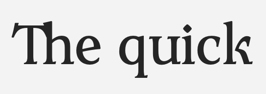 0
-
Michael Rafailyk, that sounds quite intriguing! If this is true—and if such differences really do exist—it would be both interesting and beneficial for the community to bring them to light. It would be especially interesting to point them out using the font currently under discussion, if that wouldn't be too much trouble for you.1
-
My question was actually intended to ensure that the information would be available to anyone in the community who might be interested (I only conduct a few experiments, creating fonts under free licenses that have very limited appeal and circulation).0
-
Since my typefaces are primarily Cyrillic—specifically Russian Cyrillic (as opposed to, say, Bulgarian or Kazakh)—my question stems not from mere curiosity, but from a concrete, professional interest. From my perspective, a divergence is highly likely to occur; surely, there are skilled type designers in modern-day Ukraine who can already see where that line might be drawn. However, without a design consensus—much like the one that emerged in Bulgaria in the 1950s—these will remain isolated, individual practices that fail to alter the broader typographic landscape (which is still defined by a vast number of legacy typefaces, Soviet-era books, and so on).It will take decades to establish new habits and elevate them to the level of a standard.2
-
One of the interesting aspects of this project is that it is based by prior work by six Ukrainian calligraphers and designers. That initially made me wary, because it could easily result in a kind of Frankenstein creation of incompatible letterforms stitched together. But I think today’s designers have done a very good job resolving all the shapes into a cohesive whole, and I suspect this is because those calligraphers and designers were already working within traditions in which these forms had recognised roles and relationships.these will remain isolated, individual practices that fail to alter the broader typographic landscapeThis is precisely where a national typeface that is used in lots of official communications can have an influence. In general, I am not a fan of national or provincial typefaces, because they tend to end up used in situations where they’re not really appropriate just because they’re official. But here I think there is an opportunity to get this idea of Ukrainian typography into the mainstream of the text that people are seeing and reading regularly.There are significant spacing problems in the current beta fonts, including what looks like over-enthusiastic auto-kerning that has tightened up the overall spacing, including for key letter shapes.
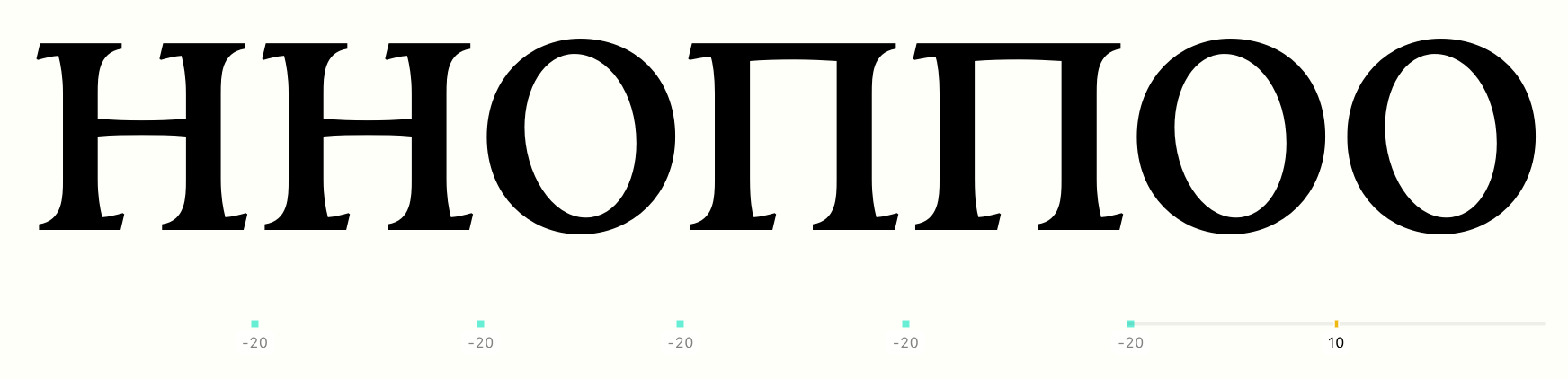 You can download the fonts from the page linked in the top post, and also submit feedback there.
2 -
Allow me to list some issues I’ve observed in the Cyrillic script (I won’t venture to judge the Latin script):1. The lowercase italic *з* has a straight top stroke, making it indistinguishable from the numeral *3*.2. The italic *ґ* features an unusual descender (though this is a problematic letter in general; its italic form, to put it mildly, has yet to become standardized).3. As I mentioned earlier, both the lowercase italic *ф* and the uppercase *Ф* deviate from the familiar, established appearance of these Cyrillic letters.4. The breve—styled like the Greek *psili*—is acceptable for pseudo-historical typefaces (I’ve even used it in two of my own recent fonts), but it’s clear that it was a last-minute addition; it lacks anchor points at the extrema.5. The letter *Ж* is constructed from two *К*s without narrowing them (whereas the *О* within the *Ю* is narrowed, as is standard practice).On the positive side, I like the hryvnia symbol, which features a gap between the strokes. I welcome this departure from the "official" version—I always design it this way myself, as the official version is quite ugly.0
-
Accented Yi is also broken...
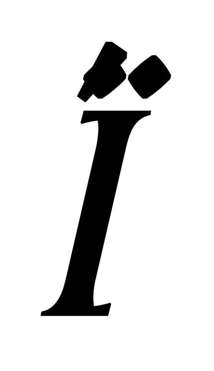 And the Latin lacks even ASCII support. An official Ukrainian typeface would do well to be Europe-ready, if not World-ready.1
-
The Latin character set seems to be focused on Polish, which makes sense given the mixed linguistic communities on both sides of the Ukrainian-Polish border. I agree that it would be good to fill out the set of diacritics for other European languages.0
-
John Hudson said:[…] focused on Polish […]
I don’t see how, in this regard, Polish differs from, say, Hungarian (with its rich array of diacritics!); the number of Poles and Hungarians in Ukraine is roughly the same. I suspect it’s simply a matter of them not having gotten around to it yet, and the currently missing characters will likely appear in future versions—it’s not a particularly large task compared to what has already been done.
2 -
Yes, my impression is that this is very much a project in progress.0
-
In other threads, there has been discussion of how italics in Bulgarian and Serbian differ from what we're used to in Russian. So it is known that real differences exist between typefaces designed for different languages using the Cyrillic script.It is also well known that under both the Russian Empire and the Soviet Union, the government was very dismissive of a Ukrainian national identity. However, there is also a large Ukrainian diaspora community, something I'm well aware of, living in the city of Edmonton, Alberta in Canada.At least in the era before phototypesetting, though, as far as I'm aware people printing Ukrainian-language books and newspapers simply relied on what was available from major producers of type and typesetting machines (i.e., ATF, Linotype, and Monotype).So if anyone were to come to me, and try to tell me that there is a long-standing historical tradition of Ukrainian typography that includes certain distinctive characteristics, I would be highly skeptical. And, furthermore, I think that even given the current political situation, the Ukrainian people have too much sense just to make something up now that is different.And yet - one possibility remains. Perhaps until recently, Ukrainians had little opportunity to engage in typefounding. But that doesn't mean that they didn't engage in handwriting, both for every-day use and as calligraphy.So the possibility of a valid historical source for a distinctive Ukrainian italic is not so slim as to be laughable after all.EDIT: after writing the above, and downloading Zakon, I did a search for Ukrainian typefaces to see if other Ukrainian typefaces shared the disinctive characteristics of Zakon. I did not, for the most part, find evidence of that, but I did learn about the work of other Ukrainian type designers, and other projects aimed at embodying the history of Ukraine's script. I came across the mention of one major one: Ruthenia, a corpus of 60 fonts by Vasyl Chebanyk.0
-
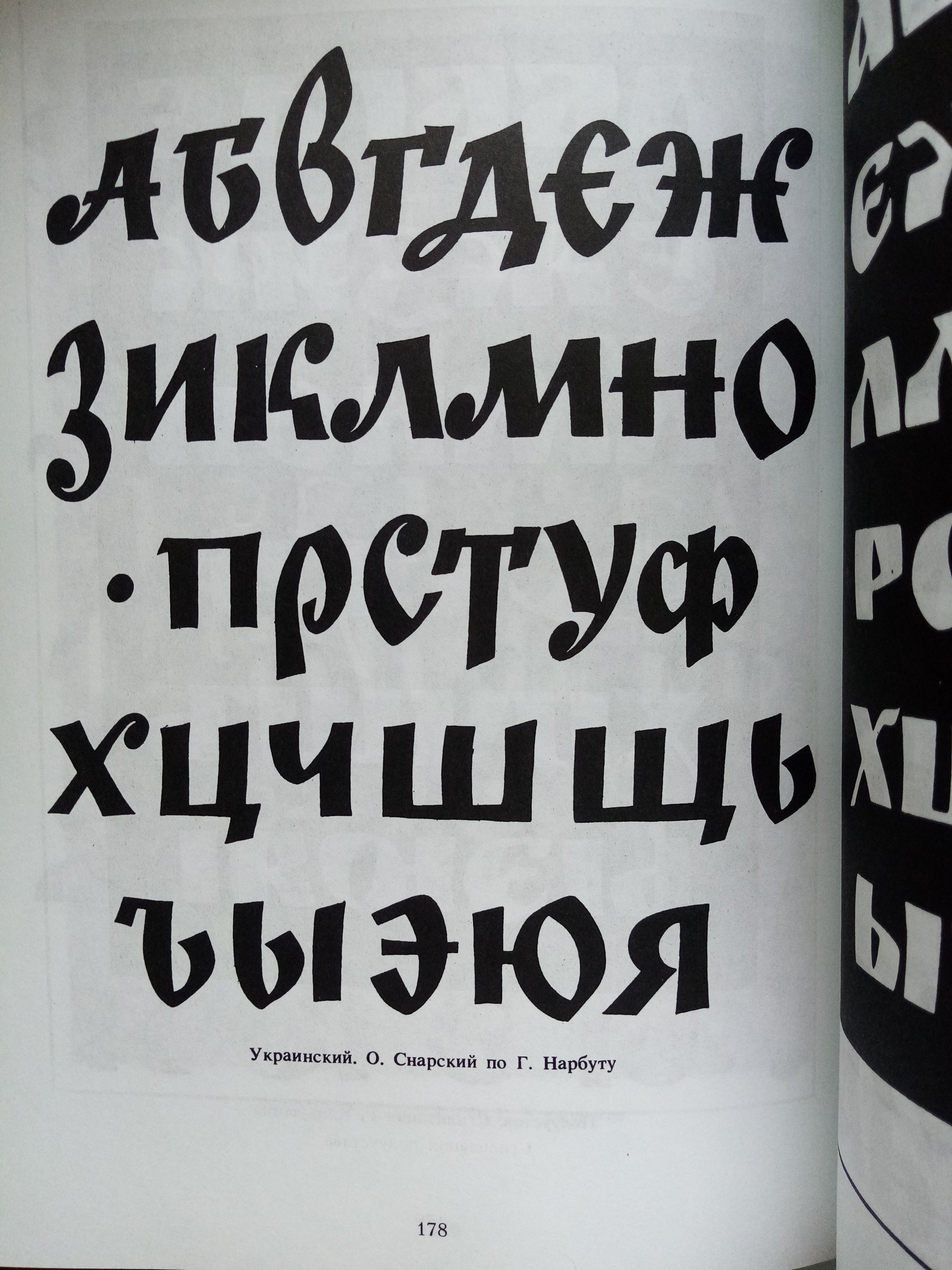
John Savard said:It is also well known that under both the Russian Empire and the Soviet Union, the government was very dismissive of a Ukrainian national identity.Partially, yes; but in a catalog by Klikushin published during the Soviet era, I see at least two typefaces designated as "Ukrainian."
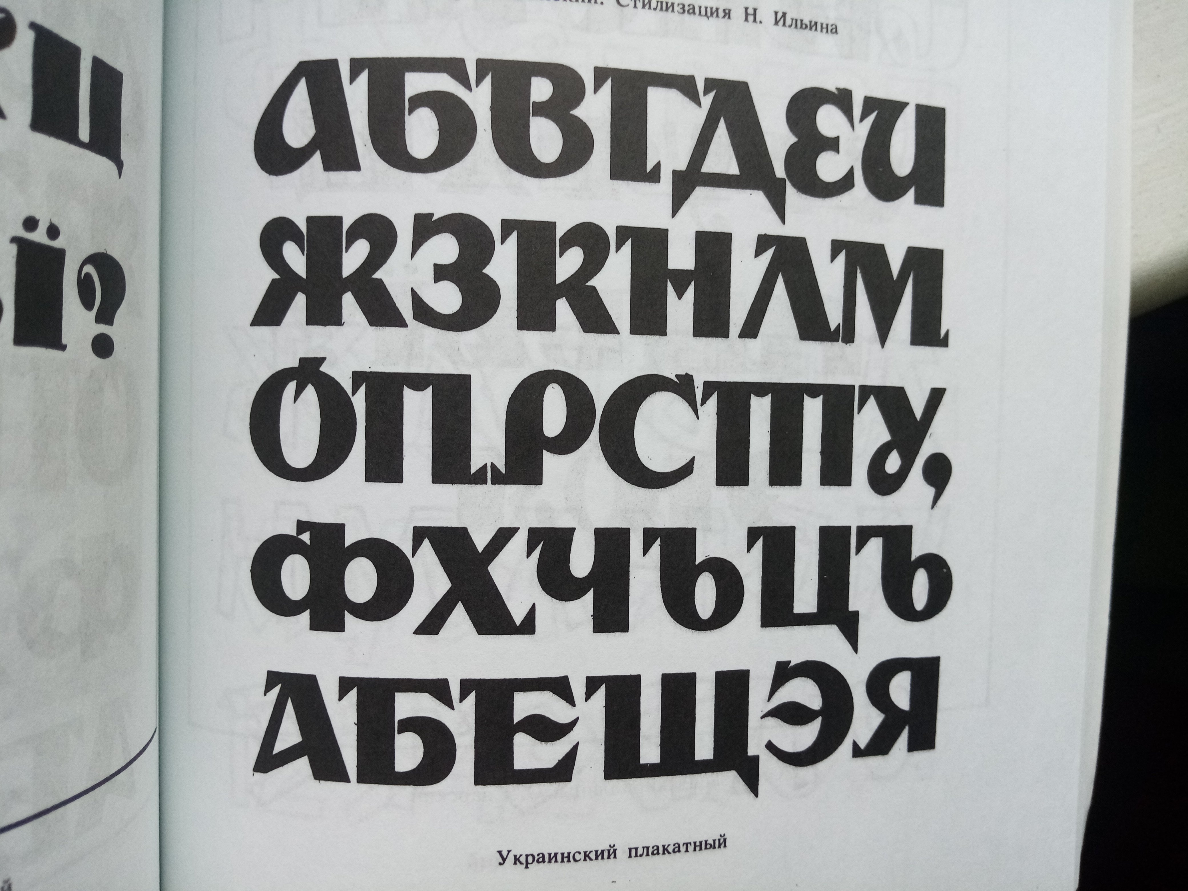
 1
-
Dsche said:Partially, yes; but in a catalog by Klikushin published during the Soviet era, I see at least two typefaces designated as "Ukrainian."
And on top of that... the typefaces you give as examples share some of the same distinctive features as those of Zakon, while in my own searches I didn't manage to find anything that had much in common with it!0 -
Those Klikushin examples are really interesting. Good find. This is a catalogue of display lettering styles, yes? The one example is specifically identified as poster lettering. It’s interesting that this is being presented as a style for a standard Russian alphabet (presumably the same for all the examples in the book), so missing a number of Ukrainian letters.What’s the date of that book? Can you provide an image of the title page? I’d love to see if I can locate a copy for my library.0
-
John Hudson said:What’s the date of that book? Can you provide an image of the title page? I’d love to see if I can locate a copy for my library.«Декоративные шрифты для художественно-оформительских работ» (составитель — Г. Ф. Кликушин, издательство «Полымя», Минск, 1987 год
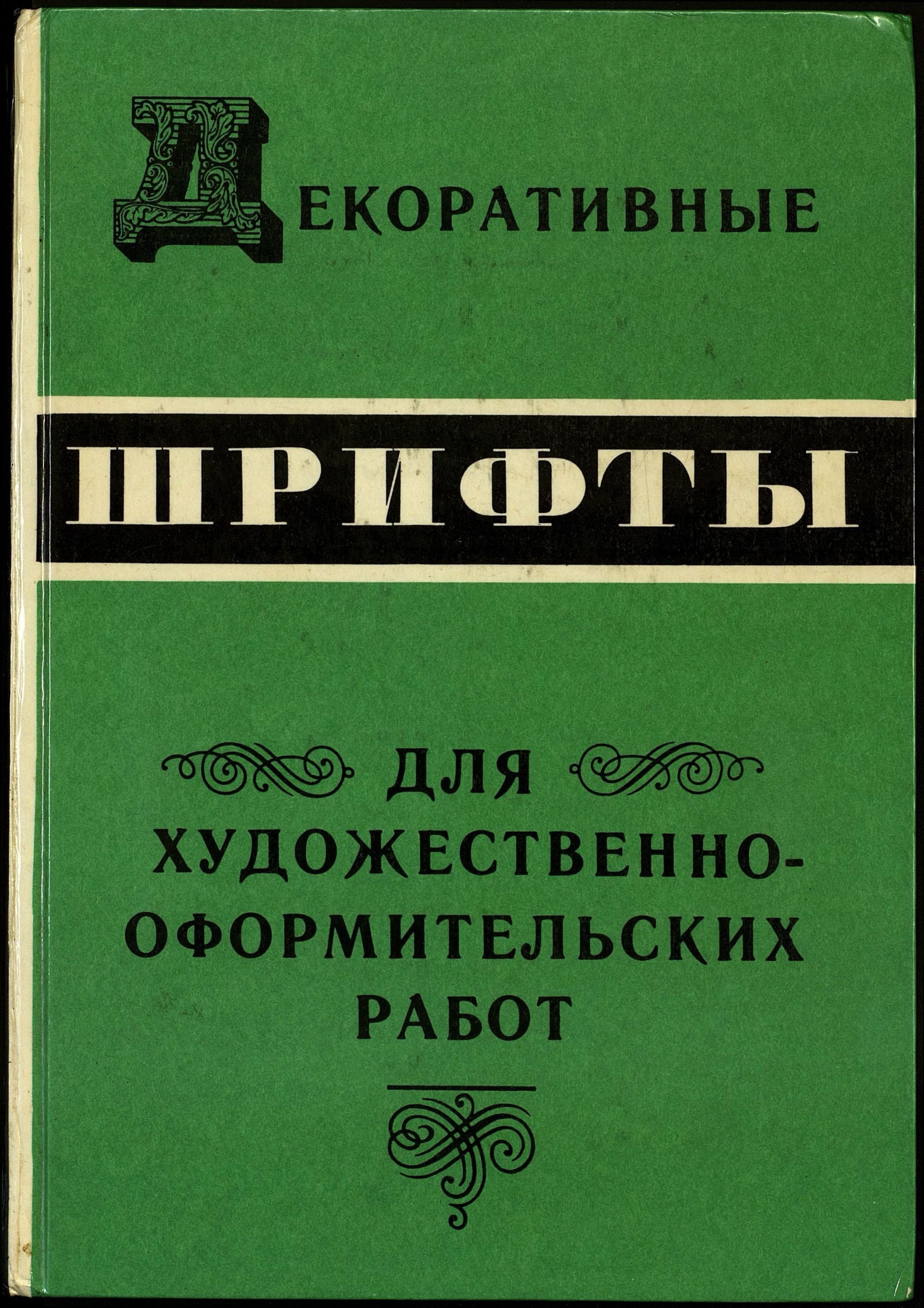
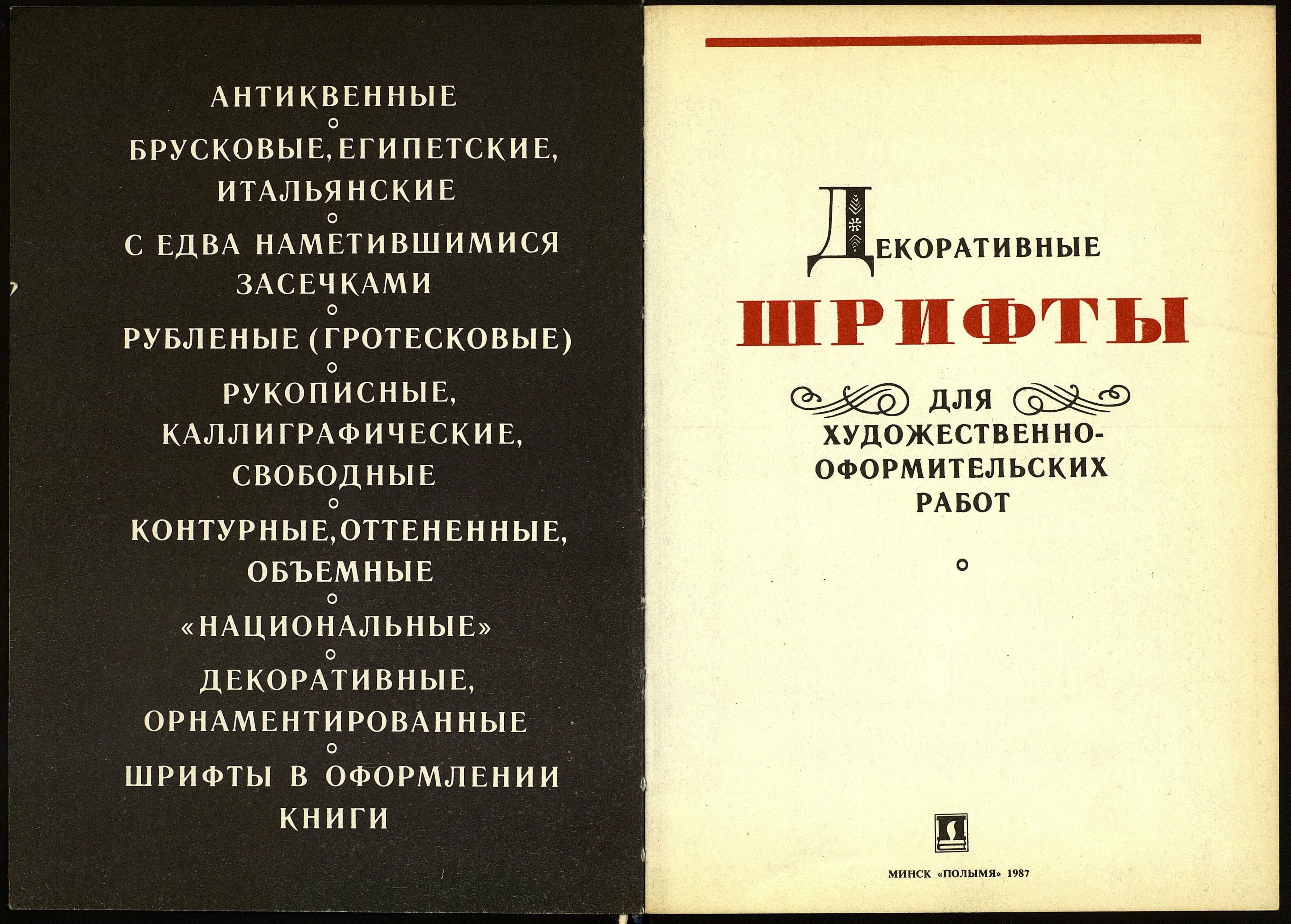 "Decorative Typefaces for Graphic Design and Display Work" (compiled by G. F. Klikushin, Polymya Publishers, Minsk, 1987)
There was an earlier edition in 1984, from the same publisher, with a slightly different title (Шрифты для художников-оформителей, see cover below); however, I cannot currently verify the extent to which the selection of typefaces overlaps between the two editions.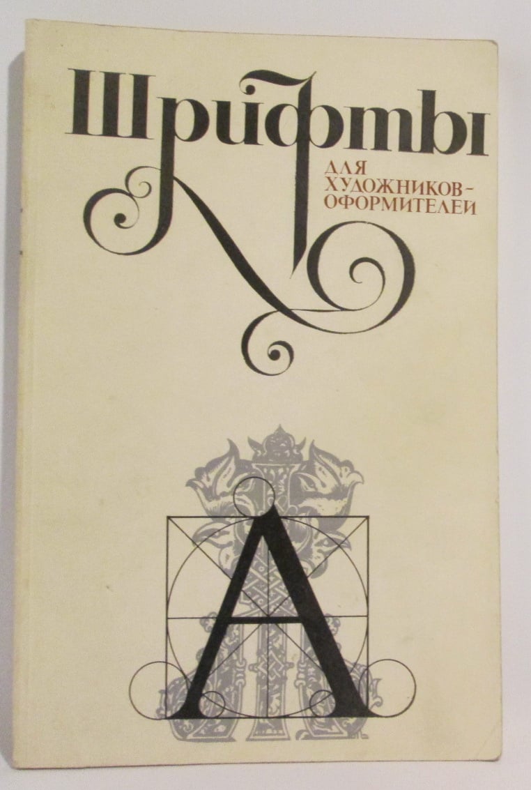 4
-
John Savard said:
[…] same distinctive features as those of Zakon, while in my own searches I didn't manage to find anything that had much in common with it!
On one hand, this book was quite popular among Soviet designers (even though it was not easy to come by), meaning that old-school type designers are, at the very least, familiar with its contents. On the other hand, while one typeface explicitly draws upon Narbut’s work, another—though anonymous—likely also traces back to an original source, serving as a foundation for these "new-yet-old" forms; in other words, the designers of *Zakon* demonstrate a healthy reliance on tradition.
1 -
In the series of reviews "Cyrillic on Google Fonts" by type.today (latest iteration of the series: https://type.today/en/journal/geo2 ), the point that comes up often is "issues with Ukrainian diacritics" – mostly the pair її (U+0457 CYRILLIC SMALL LETTER YI).michele casanova said:Are there specific guidelines regarding the differences between Russian and Ukrainian Cyrillic characters?0 -
The Zakon fonts handle the double її sequence very nicely as a ligature:
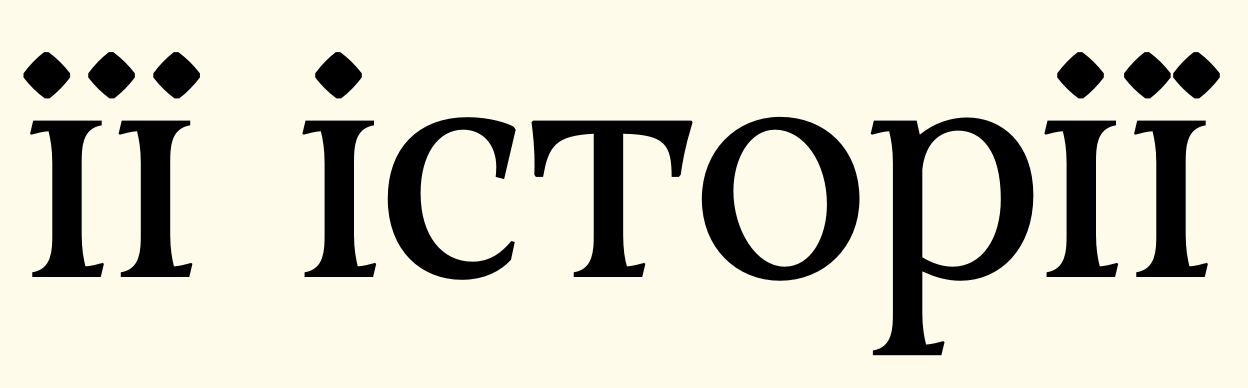
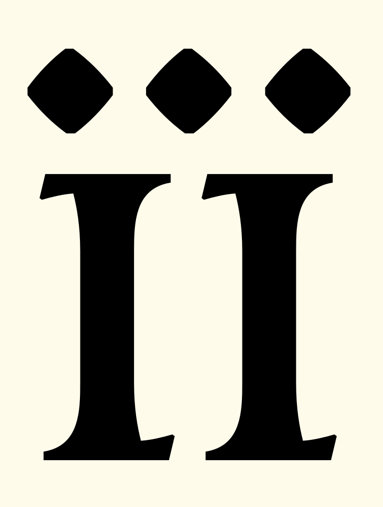 This sequence, pronouced yiyi, is the feminine single possessive pronoun in Ukrainian (her, hers), so while this pair really only occurs in this one word, the word itself is frequent.If handling the pair as a three-dot ligature like this, it should remain visually distinct from ії, which is a common plural noun ending, e.g.Context means confusion is unlikely though.
 1
-
michele casanova said:I saw the release of the Ukrainian national font (website; I haven't found an English version). The available version of the font can be downloaded via Google Drive (the link is on a dark background, with the text "Завантажити шрифт ZAKON").Are there specific guidelines regarding the differences between Russian and Ukrainian Cyrillic characters?Edit: news in English
Thank you, Michele, for raising this question. I would like to share my perspective as a Ukrainian type designer and researcher of historical Cyrillic letterforms.
I was personally involved in the preliminary discussions about the creation of the Zakon typeface, including meetings at the Verkhovna Rada (Ukrainian Parliament) and the Ministry of Culture of Ukraine. However, I did not participate in its actual design, primarily because I am currently serving in the Armed Forces of Ukraine.
Regarding Zakon itself, its designers applied a broadly shared understanding of the distinctive features of Ukrainian Cyrillic. These include asymmetrical serifs, particular constructions of letters such as К and к, and distinctive treatments of the strokes and dots above І and Ї. These are deliberate solutions based on historical research, not arbitrary decorative choices.
To understand their origins, we need to consider the history of Cyrillic writing on Ukrainian territory, which spans more than a thousand years.
Cyrillic, developed from Greek writing and adapted to Slavic languages, spread to the territory of present-day Ukraine during the era of Rus' in Kyiv as one of its major cultural centers. Since then, writing has developed here through manuscript traditions, calligraphy, printing, and artistic experimentation.
Before rigid typographic standardization, scribes and printers had considerable freedom in interpreting letterforms. I am particularly interested in the Ukrainian Hetmanate of the 17th–18th centuries, when the cursive tradition known as skoropys produced a remarkable variety of graphic solutions.
For example, the lowercase Cyrillic к with a construction resembling Latin k has historical precedents in Ukrainian cursive writing. Other characteristic forms include triangular Д and Л, a diagonal crossbar in Н, and a central descender in Щ. Some of these solutions also have connections to the Greek graphic tradition.
We study these historical examples to identify recurring patterns rather than accidental variations. Our sources include not only manuscripts and early printed books but also the work of prominent Ukrainian artists such as Heorhii Narbut, Vasyl Krychevsky, and many others.
I would also like to address a misconception expressed in this discussion.
Some participants appear to evaluate Ukrainian letterforms primarily through the typographic tradition established in Moscow and St. Petersburg, treating it as the original Cyrillic standard.
However, Kyiv had an established written culture centuries before the emergence of the Muscovite state. The later Russian written tradition inherited important elements of the earlier literary and manuscript culture of Rus, including traditions developed in Kyiv.
Peter I's typographic reforms of 1708–1710, followed by Russian imperial standardization, established a particular model of Cyrillic across a vast territory. This does not make that model the only historically legitimate one.
Russian imperial influence significantly affected Ukrainian typography but did not erase its historical continuity. Today, we can study original sources and reconsider graphic conventions introduced or reinforced by that standardization.
The goal of Ukrainian type designers is not to create letterforms merely to distinguish ourselves from Russians. I consider such an approach a form of cultural inferiority, since it would still define our identity through comparison with Russia.
Instead, we study Ukrainian writing as a continuous, self-sufficient tradition. If certain reconstructed forms are identical or similar to Russian ones, that is not a problem. Our objective is historical authenticity and the continuation of our own graphic development, not artificial differentiation.
There is already a broad consensus among Ukrainian type designers and researchers regarding the most characteristic forms of Ukrainian Cyrillic. At the same time, this understanding remains open to further research and experimentation.
Some designers continue working within the established Petrine model, while others explore historical alternatives. These approaches coexist, and their practical use gradually influences typographic conventions. I personally use experimental historical forms in my own typefaces and consider this a natural part of developing a living tradition.
Returning to Zakon, its design represents a conscious contemporary interpretation of Ukrainian historical letterforms, based on a shared understanding of our graphic heritage.
Ukrainian Cyrillic does not need Russian typography as its reference point. We have our own historical sources, established traditions, and sufficient grounds to develop our visual language independently.
I would be happy to answer additional questions or discuss particular letterforms and historical examples.
Best regards,
Bohdan Hdal9 -
Bohdan, thank you for joining the discussion and sharing your valuable inside perspective. Below are a few of my own thoughts (though not necessarily objections).
viterzbayraku said:
[...] Other characteristic forms include triangular Д and Л, a diagonal crossbar in Н, and a central descender in Щ. Some of these solutions also have connections to the Greek graphic tradition.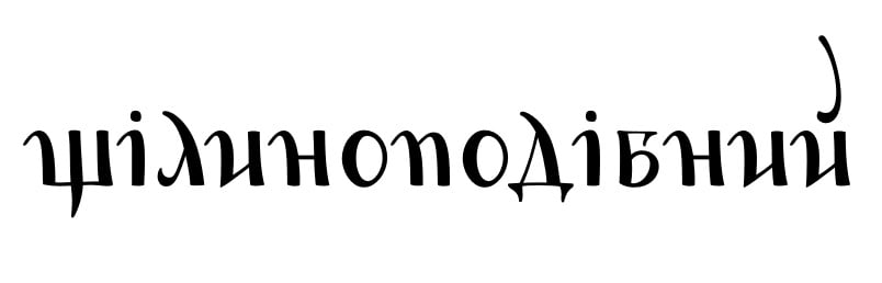
This point, it seems to me, could be interpreted in two ways, so I will simply use one of my own fonts as an example. It is NOT a Ukrainian font. However, it is precisely the type of thing you refer to in your second sentence—a (pseudo-)historical typeface that draws inspiration from the forms of pre-Petrine *skoropis*, which had not yet fully emerged from the influence of Greek forms. Granted, there are likely nuances that would allow a specialist to distinguish between Cossack *skoropis* and the *skoropis* of the Muscovites; but since the tradition was broken—and broken long ago—there is, for the average person, absolutely no difference to be seen.viterzbayraku said:
All those who work with Cyrillic typefaces have questions for Peter the Great.
Peter I's typographic reforms of 1708–1710, followed by Russian imperial standardization, established a particular model of Cyrillic across a vast territory. This does not make that model the only historically legitimate one.viterzbayraku said:
You have repeated this argument several times, using different phrasings. It would be wonderful if things were exactly as you describe—if, one day, we were to see that in fonts created by Ukrainian type foundries, the letter "ё" is positioned in strict accordance with the Unicode standard, without eliciting any strong emotions and—in this regard—being no different from the letter "ű."
Ukrainian Cyrillic does not need Russian typography as its reference point. We have our own historical sources, established traditions, and sufficient grounds to develop our visual language independently.
0 -
"absolutely no difference to be seen"
Muscovite skoropyses from that period are more ornate. There are differences in the forms of certain letters. I have examined a great many examples of Ukrainian parish registers and manuscripts from the 18th century, and therefore I can see the difference. I can even see a significant difference in the styles of cursive scripts, depending on the region within the territory of modern-day Ukraine where they were used.
"the letter "ё" is positioned in strict accordance with the Unicode standard"
You are making another mistake. You reduce the issue of Russian influence to the mere presence of Russian letters. I, however, am speaking about the spirit and focus of point.2 -
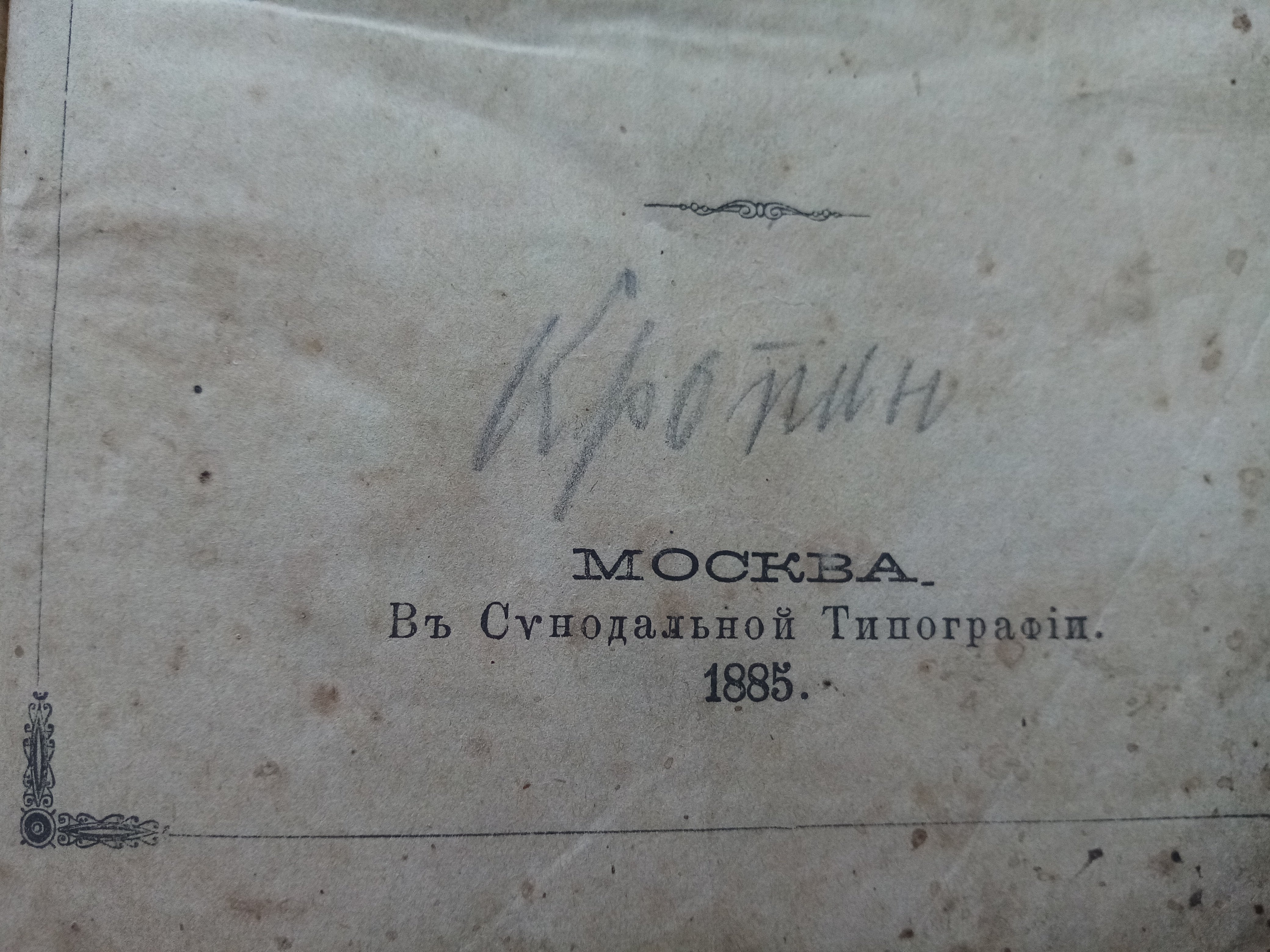
Since the letter Щ with a central tail was used consistently and over a long period within the territory of Ukraine, I confidently classify it as a local, established form—regardless of whether anyone else also claims it as their own.1 -
In my view, the visual culture of Muscovy was significantly shaped by its time as part of the Golden Horde, as well as by its close proximity nonchristian states—peoples whom Muscovy later absorbed and integrated into itself as "russians". This influence extended to architecture, various forms of decorative and applied arts, and even the style of lettering. For example, to me, the helmet-like curves found in the letterforms serve as a clear identifier of their Russian origin. Or the picket-fence-like characteristics of letters in the vyaz style of the period of Ivan Groznyi.0
-
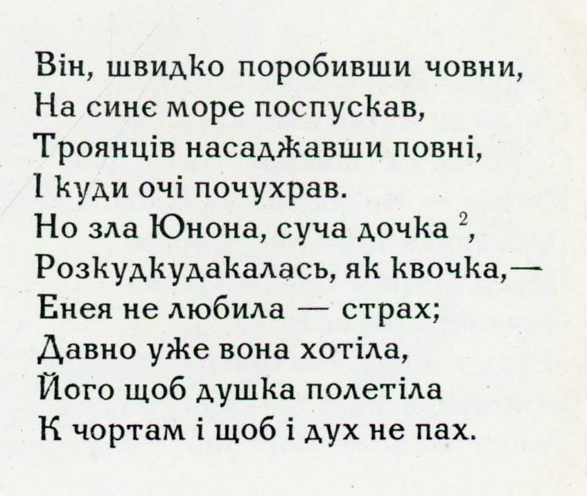 Here’s an extract from an edition of Kotlyarevskyy’s Eneyida published in Kyiv in 1969. The /ka and /zhe with ascenders look very un-Russian.
1 -
viterzbayraku said:"absolutely no difference to be seen"
Muscovite skoropyses from that period are more ornate. There are differences in the forms of certain letters. I have examined a great many examples of Ukrainian parish registers and manuscripts from the 18th century, and therefore I can see the difference. I can even see a significant difference in the styles of cursive scripts, depending on the region within the territory of modern-day Ukraine where they were used.
I would be very grateful if, in your response, you could include my statements in full; they are quite brief and, in terms of meaning, close to what you yourself have expressed: while differences do exist, there is no living tradition—which is precisely why someone without specialized training perceives all of this simply as "ancient Slavic scripts," devoid of any clear geographical connection.
0 -
George Tulloch said:Here’s an extract from an edition of Kotlyarevskyy’s Eneyida published in Kyiv in 1969. The /ka and /zhe with ascenders look very un-Russian.
The name of this typeface is Homenko, also known as Khomenkivka. It was originally designed by Ukrainian graphic artist Vasyl Khomenko in the 1960s and is one of the most remarkable examples of a typeface with a distinctly Ukrainian visual character.
By the way, notice that the design of the letter K in the Zakon typeface draws inspiration from Khomenkivka.
3 -
viterzbayraku said:
Since the letter Щ with a central tail was used consistently and over a long period within the territory of Ukraine, I confidently classify it as a local, established form—regardless of whether anyone else also claims it as their own.As the saying goes, I’ll just leave this here.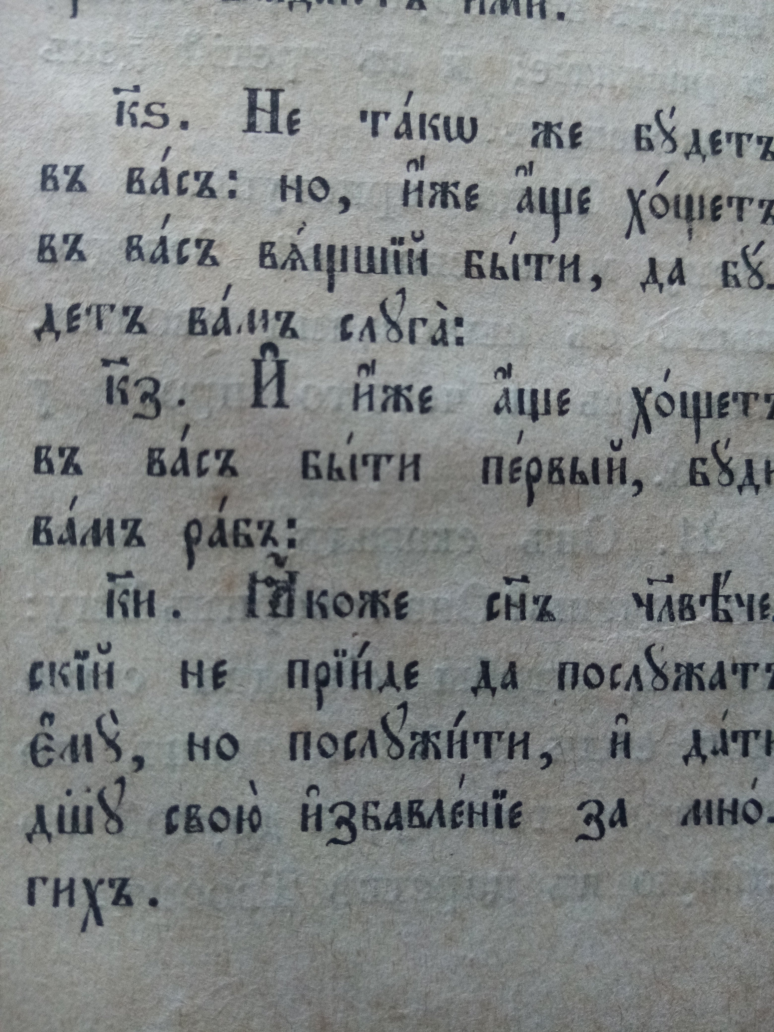
0 -
viterzbayraku said:Peter I's typographic reforms of 1708–1710, followed by Russian imperial standardization, established a particular model of Cyrillic across a vast territory. This does not make that model the only historically legitimate one.That is true, and certainly even for Russian, let alone Ukranian, plenty of Cyrillic typefaces of a pre-Petrine character exist.But the issue with such typefaces, in general, is not any question about their historical legitimacy. Instead, it is that they depart so much from current common practice that they are regarded as only suitable for use as display typefaces. (In fact, some would regard them as only one step below - even if a big step - trying to persuade people to use Glagolitic!)This, of course, does not prevent anyone from making use of subtle pre-Petrine influence in a contemporary Cyrillic text typeface.0





Categories
- All Categories
- 47 Introductions
- 4K Typeface Design
- 505 Type Design Critiques
- 597 Type Design Software
- 1.1K Type Design Technique & Theory
- 679 Type Business
- 912 Font Technology
- 29 Punchcutting
- 545 Typography
- 129 Type Education
- 334 Type History
- 82 Type Resources
- 114 Lettering and Calligraphy
- 33 Lettering Critiques
- 81 Lettering Technique & Theory
- 591 Announcements
- 102 Events
- 118 Job Postings
- 181 Type Releases
- 189 Miscellaneous News
- 270 About TypeDrawers
- 54 TypeDrawers Announcements
- 114 Suggestions and Bug Reports