Distinctive features of the Ukrainian Cyrillic script

michele casanova
Posts: 105
I saw the release of the Ukrainian national font (website; I haven't found an English version). The available version of the font can be downloaded via Google Drive (the link is on a dark background, with the text "Завантажити шрифт ZAKON").
Are there specific guidelines regarding the differences between Russian and Ukrainian Cyrillic characters?
Edit: news in English
Tagged:
0
Best Answers
-
No, there are no real differences—aside from specific letters that don’t exist in other alphabets—or, to be more precise, there haven’t been any until now. In other words, until recently, it was a unified typographic space. Today, the idea of "demarcation"—or even "fencing off"—is quite understandable; perhaps, in time, we will see a distinct graphic representation of the Ukrainian Cyrillic script, much like what happened in Bulgaria, for instance.For now, what I see is a mangled italic "ф" and a *breve* that has tipped over onto its side; the rest of the letters are decorative, yet they still fall within the realm of what one might find in the catalogs of Paratype or the work of Yuri Gordon.1
-
There Are a differences. Michele, I just messaged you with a few contacts of Ukrainian calligraphers and type designers who can distinguish the differences.
1


Answers
-
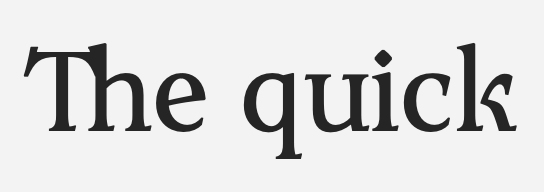
It's pretty! I actually like the energetic breve.Kerning’s off in the Latin, though:
 0
-
Michael Rafailyk, that sounds quite intriguing! If this is true—and if such differences really do exist—it would be both interesting and beneficial for the community to bring them to light. It would be especially interesting to point them out using the font currently under discussion, if that wouldn't be too much trouble for you.1
-
My question was actually intended to ensure that the information would be available to anyone in the community who might be interested (I only conduct a few experiments, creating fonts under free licenses that have very limited appeal and circulation).0
-
Since my typefaces are primarily Cyrillic—specifically Russian Cyrillic (as opposed to, say, Bulgarian or Kazakh)—my question stems not from mere curiosity, but from a concrete, professional interest. From my perspective, a divergence is highly likely to occur; surely, there are skilled type designers in modern-day Ukraine who can already see where that line might be drawn. However, without a design consensus—much like the one that emerged in Bulgaria in the 1950s—these will remain isolated, individual practices that fail to alter the broader typographic landscape (which is still defined by a vast number of legacy typefaces, Soviet-era books, and so on).It will take decades to establish new habits and elevate them to the level of a standard.1
-
One of the interesting aspects of this project is that it is based by prior work by six Ukrainian calligraphers and designers. That initially made me wary, because it could easily result in a kind of Frankenstein creation of incompatible letterforms stitched together. But I think today’s designers have done a very good job resolving all the shapes into a cohesive whole, and I suspect this is because those calligraphers and designers were already working within traditions in which these forms had recognised roles and relationships.these will remain isolated, individual practices that fail to alter the broader typographic landscapeThis is precisely where a national typeface that is used in lots of official communications can have an influence. In general, I am not a fan of national or provincial typefaces, because they tend to end up used in situations where they’re not really appropriate just because they’re official. But here I think there is an opportunity to get this idea of Ukrainian typography into the mainstream of the text that people are seeing and reading regularly.There are significant spacing problems in the current beta fonts, including what looks like over-enthusiastic auto-kerning that has tightened up the overall spacing, including for key letter shapes.
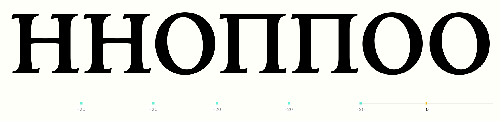 You can download the fonts from the page linked in the top post, and also submit feedback there.
0 -
Allow me to list some issues I’ve observed in the Cyrillic script (I won’t venture to judge the Latin script):1. The lowercase italic *з* has a straight top stroke, making it indistinguishable from the numeral *3*.2. The italic *ґ* features an unusual descender (though this is a problematic letter in general; its italic form, to put it mildly, has yet to become standardized).3. As I mentioned earlier, both the lowercase italic *ф* and the uppercase *Ф* deviate from the familiar, established appearance of these Cyrillic letters.4. The breve—styled like the Greek *psili*—is acceptable for pseudo-historical typefaces (I’ve even used it in two of my own recent fonts), but it’s clear that it was a last-minute addition; it lacks anchor points at the extrema.5. The letter *Ж* is constructed from two *К*s without narrowing them (whereas the *О* within the *Ю* is narrowed, as is standard practice).On the positive side, I like the hryvnia symbol, which features a gap between the strokes. I welcome this departure from the "official" version—I always design it this way myself, as the official version is quite ugly.0
-
Accented Yi is also broken...
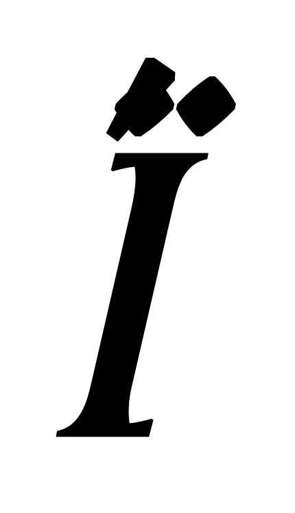 And the Latin lacks even ASCII support. An official Ukrainian typeface would do well to be Europe-ready, if not World-ready.1
-
The Latin character set seems to be focused on Polish, which makes sense given the mixed linguistic communities on both sides of the Ukrainian-Polish border. I agree that it would be good to fill out the set of diacritics for other European languages.0
-
John Hudson said:[…] focused on Polish […]
I don’t see how, in this regard, Polish differs from, say, Hungarian (with its rich array of diacritics!); the number of Poles and Hungarians in Ukraine is roughly the same. I suspect it’s simply a matter of them not having gotten around to it yet, and the currently missing characters will likely appear in future versions—it’s not a particularly large task compared to what has already been done.
2 -
Yes, my impression is that this is very much a project in progress.0
-
In other threads, there has been discussion of how italics in Bulgarian and Serbian differ from what we're used to in Russian. So it is known that real differences exist between typefaces designed for different languages using the Cyrillic script.It is also well known that under both the Russian Empire and the Soviet Union, the government was very dismissive of a Ukrainian national identity. However, there is also a large Ukrainian diaspora community, something I'm well aware of, living in the city of Edmonton, Alberta in Canada.At least in the era before phototypesetting, though, as far as I'm aware people printing Ukrainian-language books and newspapers simply relied on what was available from major producers of type and typesetting machines (i.e., ATF, Linotype, and Monotype).So if anyone were to come to me, and try to tell me that there is a long-standing historical tradition of Ukrainian typography that includes certain distinctive characteristics, I would be highly skeptical. And, furthermore, I think that even given the current political situation, the Ukrainian people have too much sense just to make something up now that is different.And yet - one possibility remains. Perhaps until recently, Ukrainians had little opportunity to engage in typefounding. But that doesn't mean that they didn't engage in handwriting, both for every-day use and as calligraphy.So the possibility of a valid historical source for a distinctive Ukrainian italic is not so slim as to be laughable after all.EDIT: after writing the above, and downloading Zakon, I did a search for Ukrainian typefaces to see if other Ukrainian typefaces shared the disinctive characteristics of Zakon. I did not, for the most part, find evidence of that, but I did learn about the work of other Ukrainian type designers, and other projects aimed at embodying the history of Ukraine's script. I came across the mention of one major one: Ruthenia, a corpus of 60 fonts by Vasyl Chebanyk.0


Categories
- All Categories
- 47 Introductions
- 4K Typeface Design
- 505 Type Design Critiques
- 597 Type Design Software
- 1.1K Type Design Technique & Theory
- 679 Type Business
- 911 Font Technology
- 29 Punchcutting
- 545 Typography
- 129 Type Education
- 334 Type History
- 82 Type Resources
- 114 Lettering and Calligraphy
- 33 Lettering Critiques
- 81 Lettering Technique & Theory
- 590 Announcements
- 102 Events
- 118 Job Postings
- 181 Type Releases
- 188 Miscellaneous News
- 270 About TypeDrawers
- 54 TypeDrawers Announcements
- 114 Suggestions and Bug Reports