On the appropriateness of small-cap-specific symbols
Answers
-
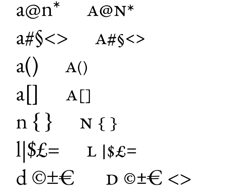
I would consider including smallcap exclamation mark and question mark, for potential use in running headers, which are often set in smallcaps. If parenthetical or quotation marks, including guillemets, occur in such a situation, adjusting the height of the default glyphs is usually adequate.1
-
One detail: if I scale down the question mark and exclamation mark, the dot in both glyphs will also be scaled down proportionally. Should the period and comma - whose "head" is generally identical but slightly larger - also be adjusted, or should they be left as they are (i.e., as they appear in "normal," non-small-cap text)? If I don't adjust them, a noticeable size difference might arise, especially if two short sentences follow one another, one ending with a question or exclamation mark and the second with a period. Or am I overthinking this?PS Actually, I’ve already planned to position the *quoteright* (the apostrophe, which appears very frequently in Italian) lower down, aligned with the top of the small caps.
0 -
I would adjust the size of the dot in the smallcap exclamation and question mark to the weight of the smallcaps, not to their size. So I would begin with that adjustment, which means making the dot slightly smaller than the default one, and then adjust the size of the shape above it vertically as necessary to ensure a reasonable gap between it and the dot.0
-
Another thing to consider is that it might be useful to have full size punctuation retained for small-caps settings and downsized punctuation for "caps-to-small-caps" settings.In the former, caps are big and something like (Cʀᴀɪɢ) probably demands a tall open parenthesis before the capital C. But with c2sc any glyphs that depart from the consistent small-caps height really jump out.
1 -
Oh, I would definitely only map smallcap punctuation in the c2sc feature, and not in the smcp feature. They are only appropriate in all-smallcaps setting.2
-
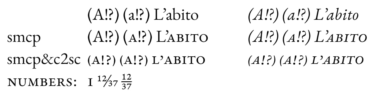
I’ve tried to fine-tune some details in Garamontio (a fork of EB Garamond that I use for testing) regarding smcp and c2sc. Fractions can be generated even when smcp and c2sc are applied.
 1
-
If find the height overshoot of the smallcap ! and ? distracting. I think one should aim for these to have the same vertical relationship to the smallcaps as the full size versions have to the caps, so they don’t stand out.4
-
FWIW, my standard set for all-small-caps punctuation is ! ¡ ? ¿ ( ) [ ] { } ' " ’ ” / \ &Implemented only in {c2sc} as Craig and John advocated above.Coincidentally, I started including the quote marks after a request from an Italian publisher with their desire to have better-behaved apostrophe and not have to manage manually throughout.As it happens, that was still in the Postscript days, so I made up a special SC font for them with these lowered quotes. OpenType makes it easier to have it both ways for U&SC vs. all-SC.3
-
@John Hudson Thanks for pointing that out. Those characters (!?) in the small caps set are still the original ones from EB Garamond. I will try to adjust their size relative to the other letters.Edit: Experiment
 0
-
I totally agree with the need of providing single quotes and guillemets aligned for c2sc feature. In Catalan the situation is the same as in Italian. Words with articles would be, for instance: “l’ham”, “d’or”.
0 -
I'm a little late jumping into this one, but here are some thoughts from the perspective of a book typographer and academic typesetter:
I generally dislike small-cap-specific punctuation because it feels too contemporary for my taste. Older books used normal punctuation with small caps.
I find the fit of small caps against full-height delimiters aesthetically pleasing, especially if — as is my preference — the delimiters span the full lc ascender/descender height. For instance, set some small-cap text within full-height brackets, and the spurs on the brackets imply a pleasing frame around the text. This effect is lost when the delimiters are shortened.
In running text, I always use full-height !? with small caps. I make an exception for small-caps headings and other displayed text, where I will use the shorter variants, if available.
I like normal quotation marks and apostrophes in small-cap text. The lowered versions look wrong to me.
This is a combination of aesthetic preference and historical tradition. I find the mix of small caps and regular punctuation, as in early- to mid-twentieth-century books, pleasing and evocative. "Small-cap" punctuation is to me analogous to "italicized" delimiters — a late-twentieth-century or early-twenty-first-century invention, not part of the tradition of typography, and therefore incongruous.
8 -
mauro sacchetto said:the apostrophe, which appears very frequently in Italian
Of course both these assertions are correct; but I point out that the apostropheʼs use is also common in the very language weʼre all writing in…!pereelmagne said:In Catalan the situation is the same as in Italian.1 -
One more thought: personally, I have no use for small-cap-sized numerals. I use normal oldstyle numerals with small caps, as has been done for five hundred years. Presumably someone wants them, since they seem to be getting more common in text faces. But I find them to be a nuisance, especially if they are automatically activated by the "all-small-caps" attribute. For instance, in Lyon, which I have been using extensively for years, I need to use GREP styles to override this behavior and impose OS figures on SC text. I will shortly be working with my web developer to do the same in our CSS code.3
-
It is possible for a font developer to establish small-caps figures to deploy with All Small Caps and yet be easily overrideable by OsF. I think you can basically have it all.*In the Haffner Text fonts that I recently released, the default figures in the font are lining figures. There are oldstyle figures enabled by the {onum} feature. And I chose to make small-caps figures as well (though I’m not convinced that I’ll make this a regular inclusion with my text fonts).Here is how the figures are deployed relative to the small caps features:If no specific OpenType figure style is specified, then text that is set to Small Caps — i.e., U&SC setting — will have oldstyle figures deployed to accompany the small caps. And if the text is set to All Small Caps, then the small-caps figures will deploy, because the user has not made an explicit figure designation.If, however, the user has turned on Oldstyle Figures {onum} explicitly, then this is respected even when All Small Caps is applied.Conversely, if the user has explicitly specified Lining Figures {lnum}, then the Small Caps setting will respect that. (Don’t ask me when you would want this, but the typographer can readily achieve it without needing to apply features too selectively.) All Small Caps will still deploy the small-cap figures, since this seems to me the logical equivalent in this context.
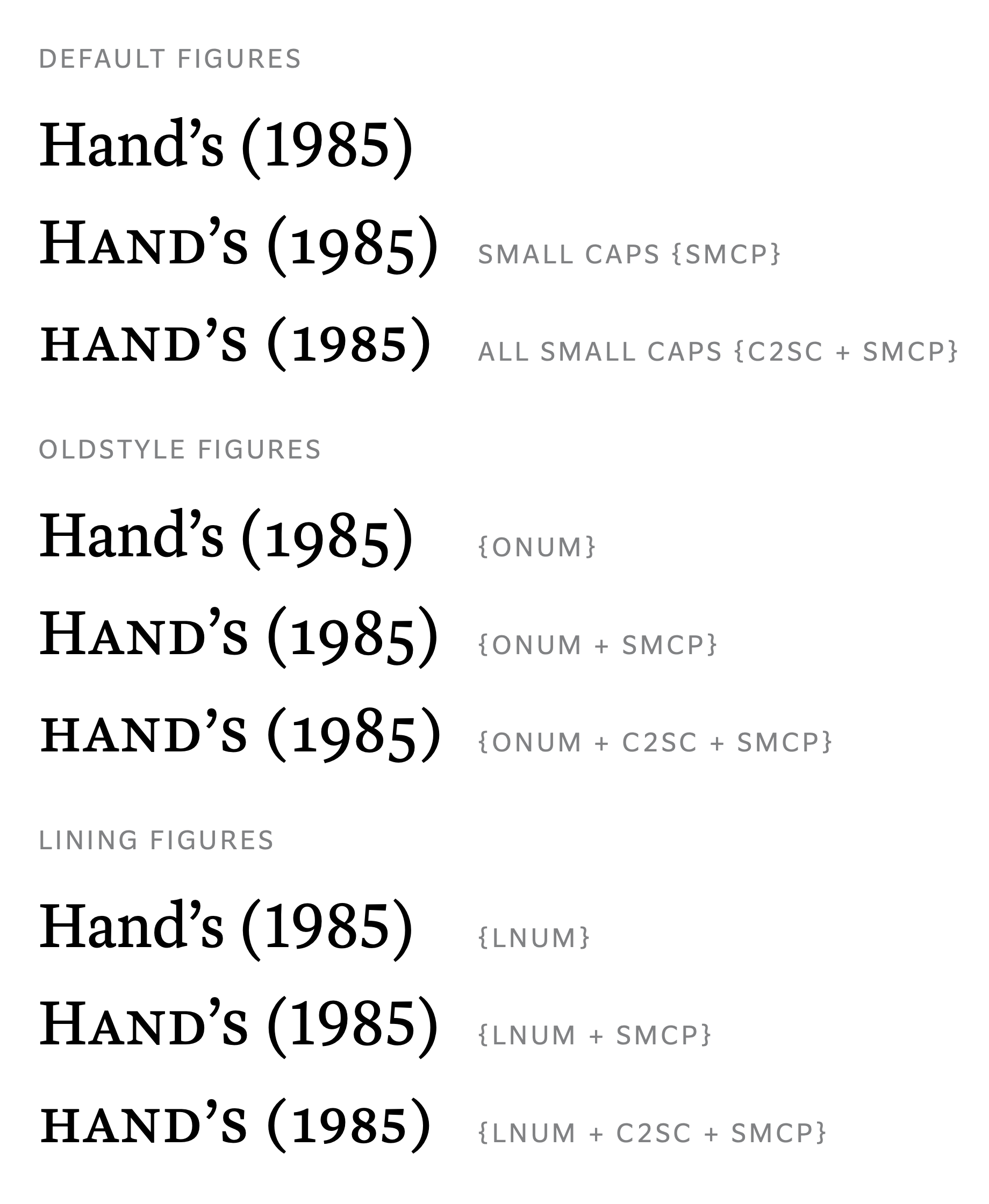 * Okay, so the one combination you cannot readily achieve without selectively turning off a feature for the figures alone is All Small Caps with full-height Lining Figures. (Sorry, I have no sympathies for this use case.)
6 -
Thanks for this, Kent. This seems like a sensible way to program things — perhaps, dare I say, more sensible than the approaches taken in various other commercial text faces I've encountered.
Also, congratulations on your latest release and the launch of your website, which I've just been browsing. I don't have a source for the Walton quotation, but it is reminiscent of a line of Oscar Wilde's; see below:
https://www.oscarwilde.us/quotations/america/took-out-a-comma.html1 -
Joshua — Thanks for the Wilde quote. Yes, it has a similar sense to it, doesn’t it? Well noted.0
-
I generally dislike small-cap-specific punctuation because it feels too contemporary for my taste. Older books used normal punctuation with small caps.
I find the fit of small caps against full-height delimiters aesthetically pleasing, especially if […] the delimiters span the full lc ascender/descender height. […]
In running text, I always use full-height !? with small caps. I make an exception for small-caps headings and other displayed text […]
I like normal quotation marks and apostrophes in small-cap text. The lowered versions look wrong to me.
I share Joshua’s aesthetic, but want to point out the chicken-or-egg causality question.
I think that older books used normal punctuation with small caps, not because of aesthetic or tradition, but simply because foundry types didn’t come with small-cap-specific punctuation sorts. When casting metal type, the delimiters, as well as the slash/solidus, by necessity would have occupied the full em-height (why would you leave empty shoulders on the face?). Also, the dashes were almost always centered vertically within the em, and were most likely generic and not even from the purchased fount!
All these factors contributed to the “traditional book” look, where delimiters would span from the top of ascenders to the bottom of descenders, and extender-free lowercases as well as small caps would sit in the visual vertical center, accompanied by the also vertically centered hyphens and dashes.
Is it because this looked aesthetically pleasing, so that typesetters kept doing this? Or is it because typesetters kept doing this, so that this look became the norm and the expected, to the extent that it became aesthetically pleasing?
2 -
[P]ersonally, I have no use for small-cap-sized numerals. I use normal oldstyle numerals with small caps, as has been done for five hundred years. Presumably someone wants them […]
That someone would be me! :-)
One frequent use case for me is the Canadian postal codes, which are in the letter-numeral-letter-numeral-letter-numeral format. The rapidly alternating letter/numeral pattern does not look great in small caps + OsF (not even Mr. Bringhurst — who always uses this combination in his works — can convince me, sorry!). Small caps + OsF “dances” too much, verging on a SpOnGeBoB meme/parody. It just looks wrong to me.
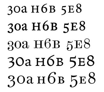
When setting postal codes in running text, I’d still go for full-height punctuation marks. Were they set standalone, I’d prefer downsized, small-cap-specific marks.
3 -
That “dancing” is minimized when the mid-line of small caps and numerals is the same.
I don’t always follow that principal (see Scotch Modern in the middle of Ruixi’s image above), but I have in several designs (Beaufort, Goodchild, Worldwide): That doesn’t look too bad, although I’ve never liked old style numerals in the Didone/Scotch/Century genre, and only include that feature to fill out the OpenType options, and some customers like it anyway. 1
-
Ruixi Zhang said:
I think that older books used normal punctuation with small caps, not because of aesthetic or tradition, but simply because foundry types didn’t come with small-cap-specific punctuation sorts.
Well, of course.This means that it's not necessarily a bad thing to add punctuation specific to small caps, since the fact that it was impractical to do so before means that the reason it wasn't done before is that it is inherently silly.When small caps are used together with normal caps, acting like an alternate version of lower case, as examples above illustrated, the existing full-sized punctuation and numerals are just as fitting as in the case of normal upper and lower case.So the question only arises when small capitals are used by themselves, without being mixed with ordinary capitals.But in that case, a rather obvious (perhaps stupid) question arises: if you want punctuation that goes with your all-caps text, why not just use a smaller point size instead of using all small caps? I would think that the only legitimate answer for why not would be a requirement to match small caps used elsewhere not in isolation, but tightly combined with normal upper-case (and perhaps also normal lower-case).And depending on the strength of the link between the two occurrences of small capitals, the need for smaller punctuation and numerals may be reduced. But "may be reduced" is not the same as "could never possibly exist", so I'm inclined to be okay with the idea of creating this kind of punctuation for a typeface, even if this is so innovative that some readers will find it strange.0 -
John Savard said:But in that case, a rather obvious (perhaps stupid) question arises: if you want punctuation that goes with your all-caps text, why not just use a smaller point size instead of using all small caps?
John, I assume you meant “if you want punctuation that goes with your all-small-caps text […]”. Yes, matching the small caps elsewhere in the text is one reason.
Using all caps with reduced point size causes more trouble than it fixes: the (stroke) weight no longer matches; the reduced caps are ever-so-slightly too narrow in proportions; you’d need case-sensitive forms for the punctuation marks; etc. Unless we’re talking about optical-size compensation/correction, or the metal-type-era practice of using, say, 8 point caps with padded top and bottom spaces to pose as 10 point small caps.
You’re quite right in pointing out the relevance of small-cap-specific punctuation — when small caps and only small caps are used in isolation. I agree that the downsized ! and ?, and the lowered “, ”, ‘, and ’, can look “off” if there’re full-height/normal versions in proximity (hence Joshua’s preference). But when you set all-small-caps in a wordmark with a high-hanging apostrophe? Nah…, that would look out of place…
1 -
Nick Shinn said:That “dancing” is minimized when the mid-line of small caps and numerals is the same.
Nick, you lost me with “mid-line”. I assume you meant “OsF /zero has the same height as small cap /O”, or “OsF /five and /seven align with small cap /E on the top”?
1 -
Kent Lew said:FWIW, my standard set for all-small-caps punctuation is ! ¡ ? ¿ ( ) [ ] { } ' " ’ ” / \ &
Kent, if you already included ’ and ”, why not also ‘ and “? If you already included / and \, why not also | (vertical bar)? And if you already included ' and ", why not also ′ (prime), ″ (double prime), and ° (degree, for good measure)?
The order of these 3 questions is based on my perceived usefulness: 1) Quotes in all-SC headings? Sure. 2) I sometimes want a separator in a one-line all-SC list. The full-height vertical bar doesn’t work for me. 3) Maybe someone wants to write 451 °F or 6′ 1″ in all-SC headings. They don’t need to fake the primes with straight quotes.
0 -
Ruixi Zhang said:
Kent, if you already included ’ and ”, why not also ‘ and “?
That was an omission in the list. Naturally I include the full pairing of curly quotes. Thank you for pointing that out.If you already included / and \, why not also | (vertical bar)? And if you already included ' and ", why not also ′ (prime), ″ (double prime), and ° (degree, for good measure)?That listing above was my minimum (noting the correction mentioned above). I may include other small-cap punctuation as I deem warranted.I sometimes include vertical bar, but not always. I did with Haffner Text, but not with Whitman Text. 🤷♂️In Haffner Text, where I have small-cap figures, I did provide lowered degree and primes for when those are deployed. In Whitman Text, for which I did not draw small-cap figures, I did not.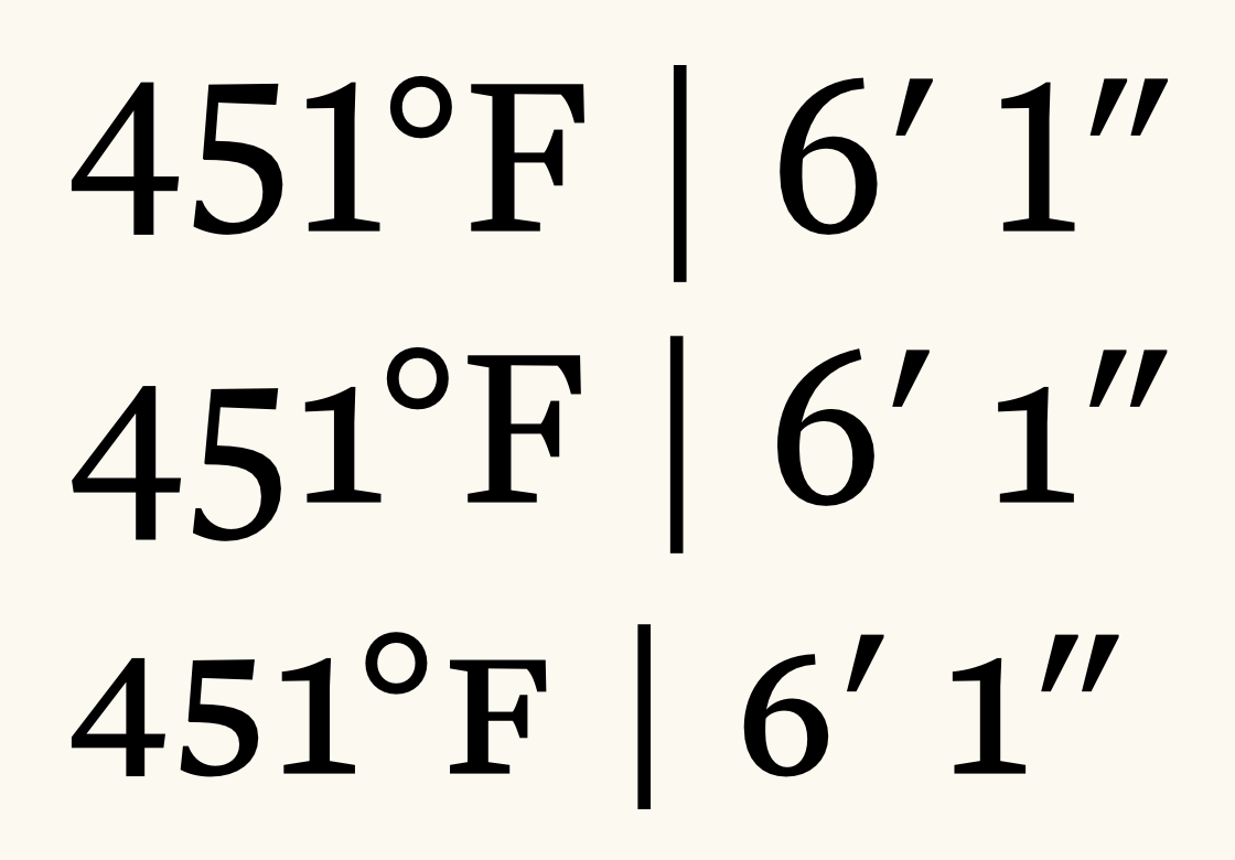
0




Categories
- All Categories
- 47 Introductions
- 4K Typeface Design
- 505 Type Design Critiques
- 597 Type Design Software
- 1.1K Type Design Technique & Theory
- 678 Type Business
- 911 Font Technology
- 29 Punchcutting
- 544 Typography
- 129 Type Education
- 333 Type History
- 82 Type Resources
- 114 Lettering and Calligraphy
- 33 Lettering Critiques
- 81 Lettering Technique & Theory
- 588 Announcements
- 102 Events
- 118 Job Postings
- 179 Type Releases
- 188 Miscellaneous News
- 270 About TypeDrawers
- 54 TypeDrawers Announcements
- 114 Suggestions and Bug Reports