On the appropriateness of small-cap-specific symbols
mauro sacchetto
Posts: 395
Some fonts (such as EB Garamond) include additional punctuation (question marks, exclamation marks, etc.) and other characters (parentheses, braces, guillemets, etc.) designed specifically for small caps; these appear smaller to match the height of the small caps themselves:
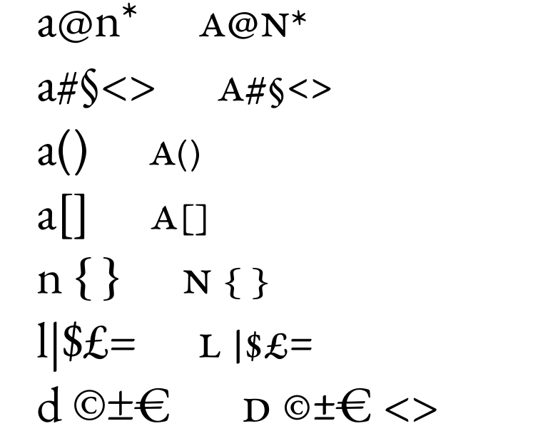
In reality, most fonts (e.g., Garamond Premiere, Brill) do not make this distinction, partly because these symbols are intended to serve both uppercase and lowercase text.
What is your take on this? Is it advisable to have specific versions of certain symbols—such as exclamation and question marks—for use with small caps to ensure visual consistency within the text, while perhaps omitting such specific versions for other symbols?
Thank you
Tagged:
0
Answers
-
I would consider including smallcap exclamation mark and question mark, for potential use in running headers, which are often set in smallcaps. If parenthetical or quotation marks, including guillemets, occur in such a situation, adjusting the height of the default glyphs is usually adequate.0
-
One detail: if I scale down the question mark and exclamation mark, the dot in both glyphs will also be scaled down proportionally. Should the period and comma - whose "head" is generally identical but slightly larger - also be adjusted, or should they be left as they are (i.e., as they appear in "normal," non-small-cap text)? If I don't adjust them, a noticeable size difference might arise, especially if two short sentences follow one another, one ending with a question or exclamation mark and the second with a period. Or am I overthinking this?PS Actually, I’ve already planned to position the *quoteright* (the apostrophe, which appears very frequently in Italian) lower down, aligned with the top of the small caps.
0 -
I would adjust the size of the dot in the smallcap exclamation and question mark to the weight of the smallcaps, not to their size. So I would begin with that adjustment, which means making the dot slightly smaller than the default one, and then adjust the size of the shape above it vertically as necessary to ensure a reasonable gap between it and the dot.0
-
Another thing to consider is that it might be useful to have full size punctuation retained for small-caps settings and downsized punctuation for "caps-to-small-caps" settings.In the former, caps are big and something like (Cʀᴀɪɢ) probably demands a tall open parenthesis before the capital C. But with c2sc any glyphs that depart from the consistent small-caps height really jump out.
1 -
Oh, I would definitely only map smallcap punctuation in the c2sc feature, and not in the smcp feature. They are only appropriate in all-smallcaps setting.0
-
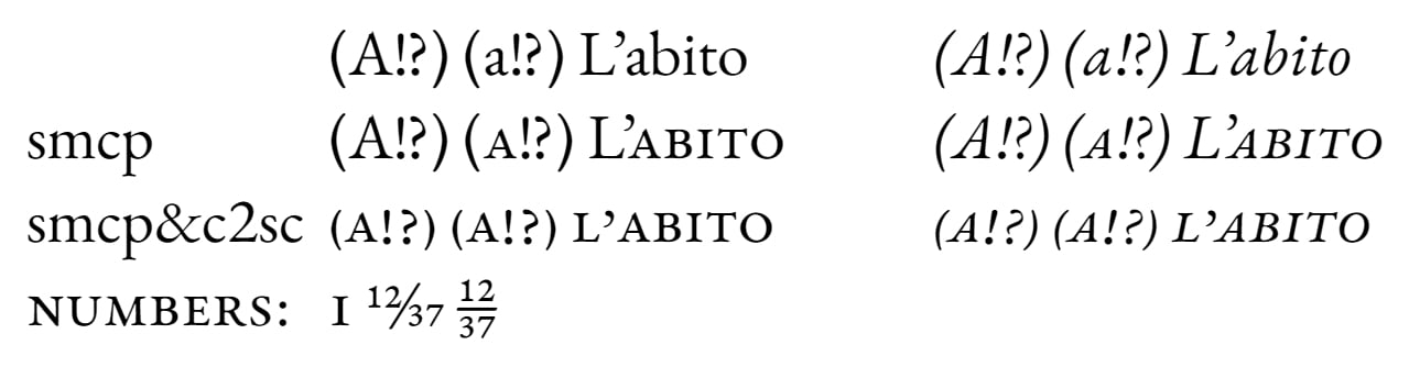
I’ve tried to fine-tune some details in Garamontio (a fork of EB Garamond that I use for testing) regarding smcp and c2sc. Fractions can be generated even when smcp and c2sc are applied.
 0


Categories
- All Categories
- 47 Introductions
- 4K Typeface Design
- 501 Type Design Critiques
- 593 Type Design Software
- 1.1K Type Design Technique & Theory
- 675 Type Business
- 910 Font Technology
- 29 Punchcutting
- 544 Typography
- 129 Type Education
- 333 Type History
- 82 Type Resources
- 114 Lettering and Calligraphy
- 33 Lettering Critiques
- 81 Lettering Technique & Theory
- 580 Announcements
- 101 Events
- 116 Job Postings
- 176 Type Releases
- 186 Miscellaneous News
- 270 About TypeDrawers
- 54 TypeDrawers Announcements
- 114 Suggestions and Bug Reports