Need a pair of eyes on these numerals
Comments
-
@Craig Eliasonthanks for the insight, i'm still working on it. took a few printouts. just gotta sit back and lay off it for a bit.0
-
Perhaps push the lower left triangle section further left than you're comfortable with and see what happens. Agree that it's closer but feels a little narrow still after the change because it was only a slight amount of movement. Then could compare and dial back the width some if needed. Would be curious to see the bigger width change version.1
-
0
-
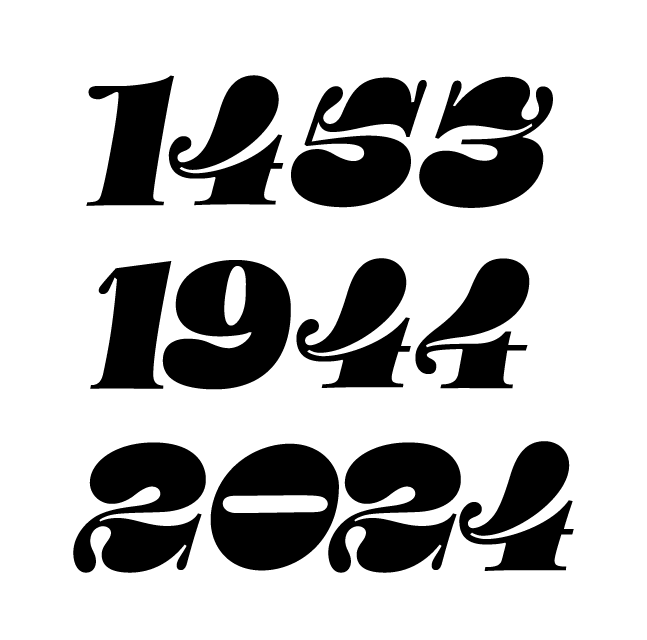
Can we see some year names using only one form of 4, rather than mixing them like this? Having the two forms present is distracting and makes it difficult to judge each individually.1
-
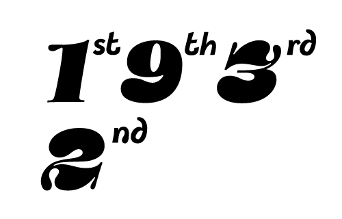
@John Hudson noted but these are only numerals as part of the type face itself planned for like a calendar thingy or a one odd usage with the ordinal suffixes, no letters other than the ordinal suffix here's an image either way with the ordinal suffixes as but those letters need some fine tuning.
 0
-
@AbiRasheed: did you consider to make the horizontal part of the ›4‹ the heavy bit?1
-
@Andreas Stötzneryes i did. in all the updated versions it should be visible in the weight for the horizontal bar for the 2nd 4/0
-
I think he means making it a "thick" rather than a hairline—for instance maybe approaching the thickness of the vertical stem.I think that's worth trying. It connects to my earlier point about the horizontal being an important cue of "fourness." (It also reminds me of a post I made on this forum some 13 years ago pondering what the thickness of /four's horizontal should be!)0
-
@Craig Eliasonthanks for clarifying. thickening the stem would make it out of place no? if i thickened that then the bulb would need to thicken up as well. i always thought it was the hairline stroke that was the problem which i thickened up a tad but now it's the stem too?0
-
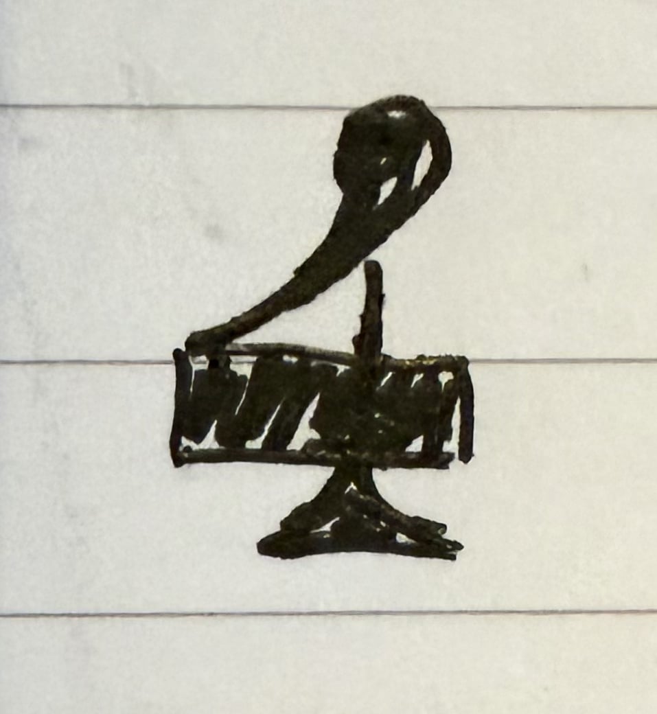
I think Andreas is suggesting an entirely new shape, in which the parts that are thin and thick are different. It could be something like this very rough sketch.
 1
-
@John Hudsonyep i figured thanks for the sketch however it goes against the very dna of what im trying to do. that 4 in the sketch is nothing new, you even have it in the previous exemplar.0
-
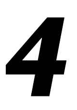
John Hudson said:I think Andreas is suggesting an entirely new shape, in which the parts that are thin and thick are different. It could be something like this very rough sketch.Or keeping the vertical stem thick, but making the horizontal maybe 70% of that thickness. We usually think of thicks crossing thicks as something to be avoided, but it's not at all uncommon in /fours.
 1




Categories
- All Categories
- 47 Introductions
- 4K Typeface Design
- 505 Type Design Critiques
- 595 Type Design Software
- 1.1K Type Design Technique & Theory
- 675 Type Business
- 911 Font Technology
- 29 Punchcutting
- 544 Typography
- 129 Type Education
- 333 Type History
- 82 Type Resources
- 114 Lettering and Calligraphy
- 33 Lettering Critiques
- 81 Lettering Technique & Theory
- 586 Announcements
- 101 Events
- 118 Job Postings
- 179 Type Releases
- 187 Miscellaneous News
- 270 About TypeDrawers
- 54 TypeDrawers Announcements
- 114 Suggestions and Bug Reports