Need a pair of eyes on these numerals

AbiRasheed
Posts: 250
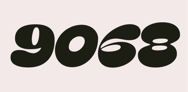
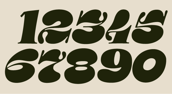 hello folks! been awhile since I got on here and also been awhile since I did any typedesign
I'm back to trying to finish my numerals I left off in 2018. Need some help with the weighting specially the /0 and /8/9/. the counter is mixed is where I'm confused on how to proceed.
any help will be appreciated gratefully!
thank you
Tagged:
0
Comments
-
These are so fun! I hope you are enjoying doing them as much as it looks like you could have.
I would probably go full reversed-contrast on the zero, which is not totally unusual for the zero anyway. (Unless that would make it the same as the cap Oh in the same font, in which case… do the opposite.)
The right side of the lower counter on the 6 is looking just a little tiny bit too pointy like the sharp end of an egg. Which could be fine, but feels incongruent with the bottom right parts of 3 and 5.
2 3 5 and 7 are so darn great! But the related treatment at bottom left part of the 4 is not working so well for me, it feels like something odd added on, and not as much just an exaggeration of something that in itself is not so unusual. Maybe that is just me, though.
9, like current zero, feels like it is coming from a different place than other numerals. It doesn’t need to be a pure rotation of the 6, but its energy currently feels very different. This may be in part because the thins are not as thin as other numerals.
The baseline serifs on 1 and 4 feel a bit out of place — maybe consider making those bulges instead? On the 4 that could also take up some space from the current ornamental swashy terminal at lower left.0

Categories
- All Categories
- 47 Introductions
- 4K Typeface Design
- 502 Type Design Critiques
- 594 Type Design Software
- 1.1K Type Design Technique & Theory
- 675 Type Business
- 910 Font Technology
- 29 Punchcutting
- 544 Typography
- 129 Type Education
- 333 Type History
- 82 Type Resources
- 114 Lettering and Calligraphy
- 33 Lettering Critiques
- 81 Lettering Technique & Theory
- 584 Announcements
- 101 Events
- 117 Job Postings
- 179 Type Releases
- 186 Miscellaneous News
- 270 About TypeDrawers
- 54 TypeDrawers Announcements
- 114 Suggestions and Bug Reports