Fractions
mauro sacchetto
Posts: 389
What techniques do you use to produce fractions?
Let’s start by looking at Adobe Garamond Pro. Here, numerators and denominators have sidebearings that are determined "reasonably" and are identical for both. However, this yields some odd results. Just look at the image:
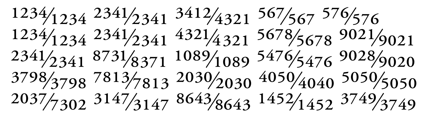
The huge spacing in the second fraction of the fourth row (7813/7813) or the asymmetrical spacing in the denominator of the first fraction in the last row (.../7302), where the 7 is spaced far apart from the following digits.
In the first fraction of the last row (2037/7302), there is a marked asymmetry between the 7 at the end of the numerator (spaced far from the slash) and the 7 at the start of the denominator (which almost touches the slash). And so on...
Now, certain glyphs, like the 4 and the 7, pose problems; they require significant right sidebearing when they appear at the start of a denominator (.../7), yet this results in excessive spacing from subsequent digits when they are part of a multi-digit denominator (.../7302, .../1452).
How do you handle this? Do you use the same sidebearings for numerators and denominators, or different ones for each category? Do you make subsequent kerning adjustments? Or do you simply accept a certain lack of uniformity?
Thanks
m
Tagged:
0
Answers
-
Can’t all that be fixed with some kerning?1
-
True, but some of the fonts I considered don't have any kerning for fractions. It’s probably something that needs to be done, though!
0 -
In Adobe Garamond (the copy I have is from 2007, but I doubt it has changed much), the numerators and denominators are tabular (360 unit). That explains why the fractions look a bit weird, because adding kerning would defeat the purpose of making them tabular in the first place. It's a choice you have to make. I'd say tabular fractions are a special case, and I would rather make proportional denominators and numerators the default, so you can make them look better with spacing and kerning.4
-
You’re right; in AGaramond (my copy is from Adobe FontFolio 11.1), the numerators and denominators are tabular, albeit with varying sidebearings; something I had overlooked.In EB Garamond (to stick to the Garamond family) they are tabular (300pt), except for the 1 and the 3 (who knows why); however, the sidebearing is evidently better calculated, even if there are still some spacing inconsistencies.In Adobe Text Pro are proportional.But they are tabular in Brill as well, so it seems to be the most common approach.What justifies this choice over using proportional figures?Google Search Assistant leaves the question open: «Numerator and denominator glyphs can be either tabular or proportional, depending on the font design. Tabular glyphs have the same width, while proportional glyphs vary in width to fit the text more naturally». Is it the wisest response?
0 -
I treat numerator and denominator numerals as proportionally spaced glyphs, not tabular, and apply kerning to them. Since these numerators are optically scaled versions of the full size lining numerals, their sidebearings and kerning can be proportionally derived from those of the full size numerals.
5 -
Older fonts often treated small figures as tabular. This practice is no-longer common.1
-
Adobe Garamond Pro was among the earliest OpenType fonts from Adobe. Among the first half dozen or so, if memory serves. It would be interesting to compare the later Garamond Premiere Pro (like Adobe Garamond Pro, it was designed by Robert Slimbach and issued by Adobe), to see how it handles the same thing.1
-
Garamond Premiere Pro continues to treat numerators and denominators as tabular, but - unlike AGaramond Pro - it wisely also includes kerning corrections.
2 -
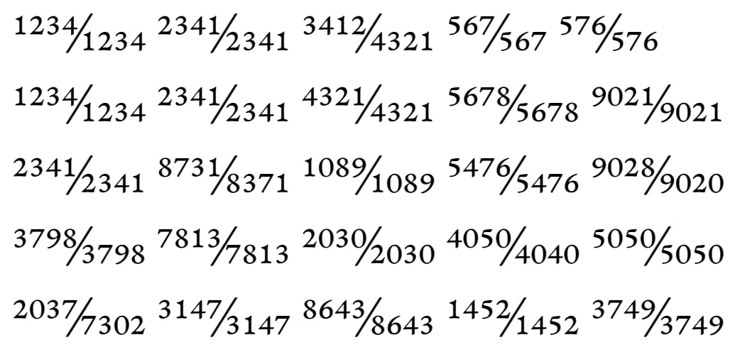
@mauro sacchetto I prefer fractions with tabular figures and no kerning to ensure optimal alignment when using them in tables. The image shows a fork of EB Garamond; it isn't perfect, but I consider it acceptable.
 0
0 -
Who uses fractions like this? That's not a rhetorical question, I'm genuinely curious.
I would think that much shorter, two-digit fractions are far more common and that spacing/kerning should be optimised according. In your example, won't far more common fractions like ⅘, ⅞, ½ look really off?1 -
@SCarewe I had to use those fractions in some texts to cite old books dealing with the comparison of ancient units of measurement.
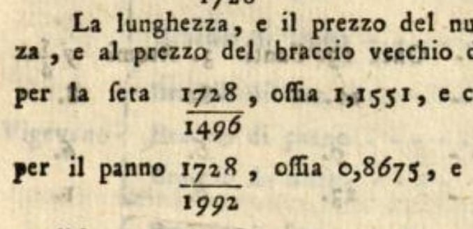 The fraction ⅞ is probably the least pleasing to the eye (though it doesn't strike me as horrible).
3 -
Interesting example. This looks like a case better handled by separate nut fractions. I see the use case, but would argue that these are a different type of fractions. Both approaches thus make sense, but for different applications, which can both be present in a font.3
-
@SCarewe I usually prefer fractions with a slash, but I agree that both versions can be used.
0 -
Vertically stacked fractions really need tabular numerals, not only to look good but also for technical reasons. It’s really, really difficult to calculate line length and offsets for irregular length fractions, i.e. where numerator and denominator length are different, if the numbers are not unitised widths.If someone wants to be able to build a table of arbitrary fractions like Michele shows, a good compromise at the font level would be to provide tabular numerator and denominator glyphs but with kerning. The user can then turn kerning off for the table. Alternatively, one could provide pnum and tnum fraction variants.4
-
I don't know how many users have this kind of need for fractions. I would imagine that this is not a large percentage of users. I would not expect that there are many typefaces that perfectly work for this or that most type designers allow for it. Perhaps this is an occasion where the user may be best served by contracting someone to revise a typeface to that end?0
-
@michelecasanova Indeed, EB Garamond does a decent job. Premiere Pro is even better.Of course, fractions like 98765/12345 are highly unlikely. Two-digit fractions, somewhat less so.But since I am working on refining the font, why not make the effort to address every aspect?To best handle separate nut fractions, word processing programs like LibreOffice and so on offer specific utilities for handling arbitrary fractions on an occasional basis, whereas systematic use requires LaTeX. Naturally, the better the font is designed, the better the results LaTeX will produce.0
-
If you want to address every aspect (which I can understand all too well
 ), I'd make the default fraction figures proportional, so you can kern them against the fraction slash, and include another set of tabular fraction figures via the tnum layout feature.
In my typeface FF Hertz, I have made all fraction figures tabular (400 units width), except for the 1, which is on 300 units width. Then I just added tabular variants for the 1 and the precomposed fractions including the 1.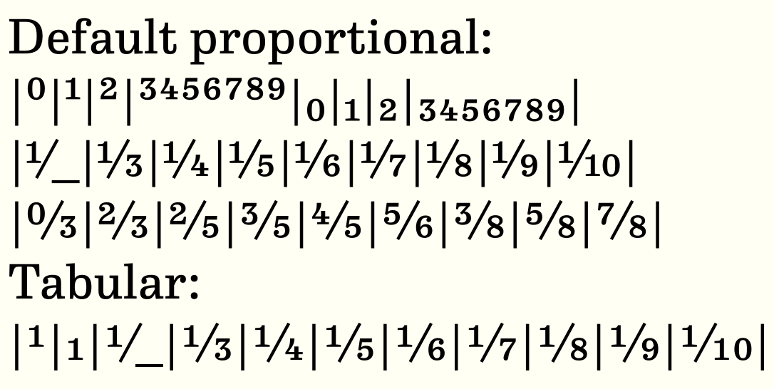
(Apparently I didn't bother to kern the fractions ...)0 -
A very interesting approach, even if a bit laborious.So, did you create different lookups?I'll try to take a closer look into your font.0
-
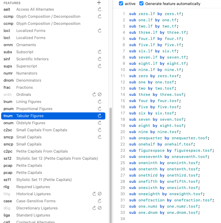
I didn't do anything special feature-wise; the dnom/numr/frac features come first, and then the resulting glyphs from these features are included in the tnum feature (starting at line 21):
 2
2 -
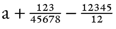
@John Hudson I am creating a version of my fork of EB Garamond to support stacked fractions.Due to my own lack of skill, I couldn't get your Nutso2 working within the variable font, so I used a clunky system relying solely on substitutions (though it seems to work).
0 -
Looks good. I’d be interested to know how you set up the substitutions. What are the parts you are putting together to form the fractions?1
-
@John Hudson The main difference is that my clunky system is limited to a length of 5 digits; it uses 25 pre-formed characters featuring anchors for the starting positions of the numerator and denominator.
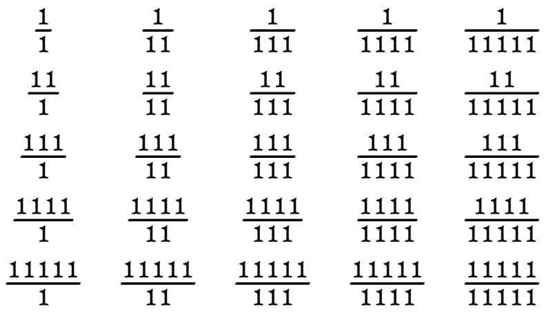 I am still fine-tuning the numerator and denominator substitution, as it currently does not check if the digit count exceeds five.1
 -
John may recall that back in 2014, while he was working on Nutso using GPOS, I had also developed a proof-of-concept with GSUB only, because GPOS support outside of {kern} was spotty in environments I was working in.I only built code to three-digit numerator or denominator. I don’t think I can upload a .mov file, so I can’t share the demo here.I don’t have time right now to dig out my notes or find & parse the feature code. I had started writing a script to automate some of the derived glyph variants and to write the corresponding fea code, but I don’t think I ever finished.We decided not to try to implement in Big Caslon at the time (which is why I had started exploring — Matthew had originally drawn precomposed nut fractions for the PS fonts), so I dropped the project.2
-
I usually make all my fractions the same width.
I suspect this is because I once designed a few recipe books.
In many typefaces, I include half, quarters, eighths and thirds as pre-composed nut fractions; any other fractions are available dynamically in slash-virgule format. I doubt there is much of a market for complex nut fraction fonts, and what there is probably also requires further specialist math characters and features, so really not worth my while to take the time developing all that.
**
When I first started kerning my designs thirty years ago, I was a bit over-enthusiastic. Many of us were—remember the “space-A” kern?! But now I am more inclined to consider the space around characters to be part of the letter. This is particularly so for the numeral “1”.
5





Categories
- All Categories
- 47 Introductions
- 4K Typeface Design
- 497 Type Design Critiques
- 591 Type Design Software
- 1.1K Type Design Technique & Theory
- 674 Type Business
- 907 Font Technology
- 29 Punchcutting
- 544 Typography
- 129 Type Education
- 333 Type History
- 82 Type Resources
- 114 Lettering and Calligraphy
- 33 Lettering Critiques
- 81 Lettering Technique & Theory
- 580 Announcements
- 101 Events
- 116 Job Postings
- 176 Type Releases
- 186 Miscellaneous News
- 270 About TypeDrawers
- 54 TypeDrawers Announcements
- 114 Suggestions and Bug Reports