Fractions

mauro sacchetto
Posts: 383
What techniques do you use to produce fractions?
Let’s start by looking at Adobe Garamond Pro. Here, numerators and denominators have sidebearings that are determined "reasonably" and are identical for both. However, this yields some odd results. Just look at the image:
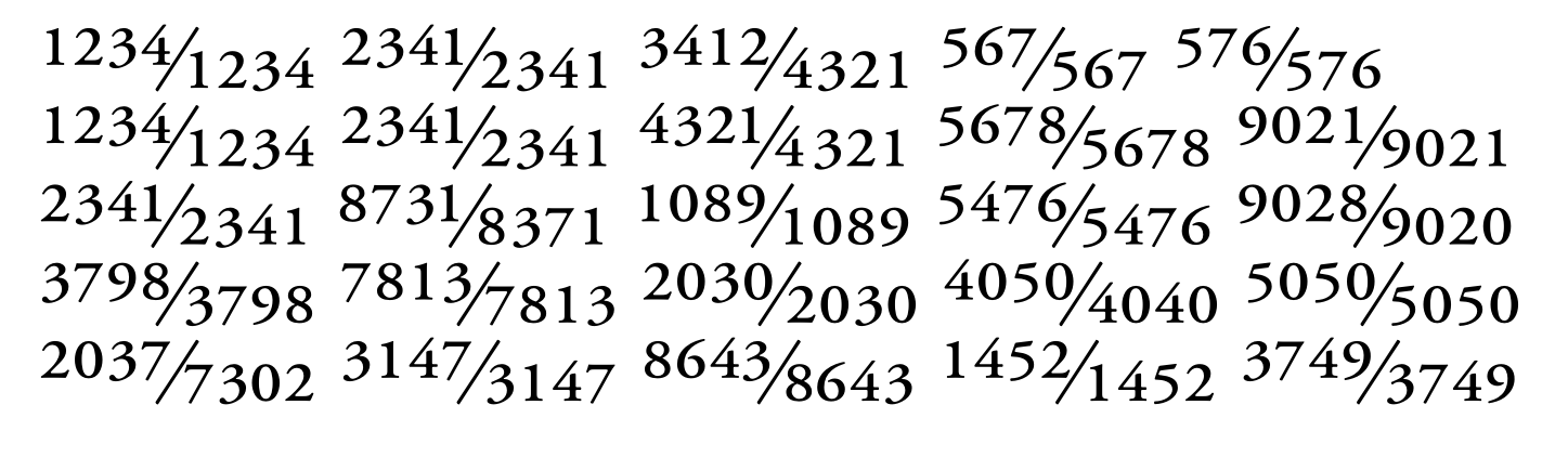
The huge spacing in the second fraction of the fourth row (7813/7813) or the asymmetrical spacing in the denominator of the first fraction in the last row (.../7302), where the 7 is spaced far apart from the following digits.
In the first fraction of the last row (2037/7302), there is a marked asymmetry between the 7 at the end of the numerator (spaced far from the slash) and the 7 at the start of the denominator (which almost touches the slash). And so on...
Now, certain glyphs, like the 4 and the 7, pose problems; they require significant right sidebearing when they appear at the start of a denominator (.../7), yet this results in excessive spacing from subsequent digits when they are part of a multi-digit denominator (.../7302, .../1452).
How do you handle this? Do you use the same sidebearings for numerators and denominators, or different ones for each category? Do you make subsequent kerning adjustments? Or do you simply accept a certain lack of uniformity?
Thanks
m
Tagged:
0
Answers
-
Can’t all that be fixed with some kerning?1
-
True, but some of the fonts I considered don't have any kerning for fractions. It’s probably something that needs to be done, though!
0 -
In Adobe Garamond (the copy I have is from 2007, but I doubt it has changed much), the numerators and denominators are tabular (360 unit). That explains why the fractions look a bit weird, because adding kerning would defeat the purpose of making them tabular in the first place. It's a choice you have to make. I'd say tabular fractions are a special case, and I would rather make proportional denominators and numerators the default, so you can make them look better with spacing and kerning.3
-
You’re right; in AGaramond (my copy is from Adobe FontFolio 11.1), the numerators and denominators are tabular, albeit with varying sidebearings; something I had overlooked.In EB Garamond (to stick to the Garamond family) they are tabular (300pt), except for the 1 and the 3 (who knows why); however, the sidebearing is evidently better calculated, even if there are still some spacing inconsistencies.In Adobe Text Pro are proportional.But they are tabular in Brill as well, so it seems to be the most common approach.What justifies this choice over using proportional figures?Google Search Assistant leaves the question open: «Numerator and denominator glyphs can be either tabular or proportional, depending on the font design. Tabular glyphs have the same width, while proportional glyphs vary in width to fit the text more naturally». Is it the wisest response?
0 -
I treat numerator and denominator numerals as proportionally spaced glyphs, not tabular, and apply kerning to them. Since these numerators are optically scaled versions of the full size lining numerals, their sidebearings and kerning can be proportionally derived from those of the full size numerals.
5 -
Older fonts often treated small figures as tabular. This practice is no-longer common.0
-
Adobe Garamond Pro was among the earliest OpenType fonts from Adobe. Among the first half dozen or so, if memory serves. It would be interesting to compare the later Garamond Premiere Pro (also by Robert Slimbach and issued by Adobe) and see how it handles the same thing.1




Categories
- All Categories
- 47 Introductions
- 4K Typeface Design
- 497 Type Design Critiques
- 591 Type Design Software
- 1.1K Type Design Technique & Theory
- 674 Type Business
- 906 Font Technology
- 29 Punchcutting
- 543 Typography
- 128 Type Education
- 333 Type History
- 82 Type Resources
- 114 Lettering and Calligraphy
- 33 Lettering Critiques
- 81 Lettering Technique & Theory
- 579 Announcements
- 101 Events
- 116 Job Postings
- 175 Type Releases
- 186 Miscellaneous News
- 270 About TypeDrawers
- 54 TypeDrawers Announcements
- 114 Suggestions and Bug Reports