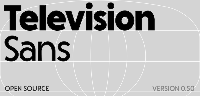
Television Sans - my first typeface

sammularczyk
Posts: 2
A few months ago I started playing around with making a typeface in Glyphs for the first time. It's inspired by old Commodore 64 ads which used some variant of Kabel, but aiming to be a bit friendlier and more modern.

My background's in graphic and motion design, but I've always seen type as pretty central to my work. So jumping in and developing a typeface was the next step I guess!
I'd really love some critique on what I could do to improve consistency, fix basic mistakes I've made, things I've missed. Any techniques to improve readability over longer lines would be lovely too. I'm curious how the kerning comes across as well.
You can download it at: https://github.com/sammularczyk/television-sans
Thanks so much for your time!

Tagged:
0
Comments
-
Attached below is a proof PDF since it didnt work the first time!0
Categories
- All Categories
- 47 Introductions
- 4K Typeface Design
- 497 Type Design Critiques
- 590 Type Design Software
- 1.1K Type Design Technique & Theory
- 674 Type Business
- 904 Font Technology
- 29 Punchcutting
- 543 Typography
- 128 Type Education
- 333 Type History
- 82 Type Resources
- 114 Lettering and Calligraphy
- 33 Lettering Critiques
- 81 Lettering Technique & Theory
- 577 Announcements
- 101 Events
- 116 Job Postings
- 174 Type Releases
- 185 Miscellaneous News
- 270 About TypeDrawers
- 54 TypeDrawers Announcements
- 114 Suggestions and Bug Reports