Television Sans - my first typeface

sammularczyk
Posts: 3
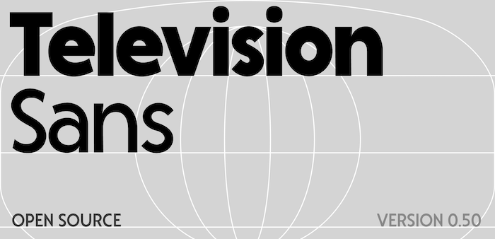
A few months ago I started playing around with making a typeface in Glyphs for the first time. It's inspired by old Commodore 64 ads which used some variant of Kabel, but aiming to be a bit friendlier and more modern.
My background's in graphic and motion design, but I've always seen type as pretty central to my work. So jumping in and developing a typeface was the next step I guess!
I'd really love some critique on what I could do to improve consistency, fix basic mistakes I've made, things I've missed. Any techniques to improve readability over longer lines would be lovely too. I'm curious how the kerning comes across as well.
You can download it at: https://github.com/sammularczyk/television-sans
Thanks so much for your time!

Tagged:
1
Comments
-
Attached below is a proof PDF since it didnt work the first time!0
-
Just going by the preview image, the /n's feel dented in on the top of the right side, and because their counter spaces are so relatively large they feel too wide for the color of this typeface. Bold lowercase /s and regular uppercase /S read as larger on the top and leaning back slightly, while regular lowercase /s shares neither of those traits. /t crossbar may be too thick, and the letter doesn't sit on the baseline very well. In my thinking it's often nice to have the balance between counters of /a and of /e relate to each other which isn't the case here.2
-
Specifically, on the “n” the interior and exterior apex positions are fine. The problem is also how sudden the onset of the curve is on the outside at the right, when you go from the straight to the curve. This can be fixed by pulling up significantly on the off-curve point there.
edit: same problem with the “h” as well, and a similar but less problematic thing happens with the straight-to-curve transition on the lowercase “a”1 -
I am also thinking you need to learn about overshoot. And maybe vertical vs horizontal stroke thicknesses. And... you know, actually, just watch this video on optical compensations in type design:
 https://www.youtube.com/watch?v=LR-CG5eB3nQ
(Yes, the video is old and I used a now-ancient editor, FontLab Studio 5. But the issues and how to address them are unchanged, even if we are on FontLab 8 and Glyphs 4 and other editors these days.)2 -
Sam: PDF was still not attached, btw
Thomas' video is pretty classic and there are now A LOT of great resources listed on https://typedesignresources.com that I encourage you to invest time into reading/watching.2 -
Thank you all so much! A lot to think about, I really appreciate your honest thoughts. Will be back after I've digested a few!Not sure why the proof is not uploading unfortunately... will try again...0


Categories
- All Categories
- 47 Introductions
- 4K Typeface Design
- 501 Type Design Critiques
- 593 Type Design Software
- 1.1K Type Design Technique & Theory
- 675 Type Business
- 908 Font Technology
- 29 Punchcutting
- 544 Typography
- 129 Type Education
- 333 Type History
- 82 Type Resources
- 114 Lettering and Calligraphy
- 33 Lettering Critiques
- 81 Lettering Technique & Theory
- 580 Announcements
- 101 Events
- 116 Job Postings
- 176 Type Releases
- 186 Miscellaneous News
- 270 About TypeDrawers
- 54 TypeDrawers Announcements
- 114 Suggestions and Bug Reports