How to design Serbian Cyrillic PART 2 — True Italics

Igor Petrovic
Posts: 370
I've just published the "Serbian Cyrillic PART 2" article on my blog. The first one was about upright, and this second one is about true italics:
https://nostalgicdolphin.com/blog-post-3/
Italics proved to be harder to describe, taking a month to assemble this instructional study. The thing is that italics are still not strictly established in every aspect, so I had to research historical sources, the official orthography, other Slavic-Cyrillic, modern studies of Serbian handwriting, and personal opinions of type designers and common people.
In addition to being two blog posts, I am also considering putting these two articles into one downloadable PDF which would cost a few bucks. For those who haven't seen the first part, here is the link for it:
https://nostalgicdolphin.com/blog-post-1/
https://nostalgicdolphin.com/blog-post-3/
Italics proved to be harder to describe, taking a month to assemble this instructional study. The thing is that italics are still not strictly established in every aspect, so I had to research historical sources, the official orthography, other Slavic-Cyrillic, modern studies of Serbian handwriting, and personal opinions of type designers and common people.
In addition to being two blog posts, I am also considering putting these two articles into one downloadable PDF which would cost a few bucks. For those who haven't seen the first part, here is the link for it:
https://nostalgicdolphin.com/blog-post-1/
Tagged:
9
Comments
-
Thank you Igor, very good.
1 -
Thanks Andreas, I appreciate it!0
-
Thanks, Igor. It was been a very useful resource. By the way, so to speak, Serbian б is like a Greek delta?0
-
so to speak, Serbian б is like a Greek delta?In writing, the ductus is similar

but in Cyrillic the top is always quite horizontal, while in Greek it may also angle downwards

0 -
It's interesting that some of the Serbian Cyrillic italic forms are used in Russian handwriting, even if not in Russian italics. And, yes, this means that they may be found in the italics of some Russian typefaces too.
0 -
0
-
Thanks Tural, glad to hear that! As per the handwritten Greek delta /δ that John mentions, I don't know what the acceptable area of variance for it is.Tural Alisoy said:Thanks, Igor. It was been a very useful resource. By the way, so to speak, Serbian б is like a Greek delta?
For handwritten /б in Serbian, it can vary a lot. That is natural because it is an outstroke in the free ascender field that breaks connected writing. People tend to be creative at that moment. Here are some possibilities I recalled instantly. All of these are acceptable handwritten forms (субота):
In the article, I mentioned the Greek delta as a nickname for a /б subvariant that tends to deform the /o (base) counter in order to emphasize the handwritten ductus. Opposed to the classic and most common version which keeps the symmetrical counter of the /o base.
Yes, it's interesting what was accepted as a typographic standard in various places that sourced the same handwriting tradition. After "The Great Exoduses of the Serbs", the Serbian intellectual elite and schools ended up in Hungary for about 150 years. They used a lot of Russian books because their printing and cultural development were censored there to a certain point. Even a special language developed "Slavonic-Serbian", which is a heavily Russianized form of the Serbian language. It was deemed snobby compared to the language of the common people that was deemed peasantry. So naturally, the Serbian literates used handwriting very similar to the Russian in that period.It's interesting that some of the Serbian Cyrillic italic forms are used in Russian handwriting, even if not in Russian italics. And, yes, this means that they may be found in the italics of some Russian typefaces too.
The Serbian language reform conducted by Vuk Karadžić rejected "Slavonic-Serbian" and embraced the language of common people as a standard orthography. This was a brave revolutionary move that raised a lot of controversies and implicit persecution of Vuk by the Serbian intellectual and church elite in exile. He was even accused as a "satanist" Especially for borrowing Latin /j that was not present in any other Cyrillic.
This happened about 100 years after the Petrine reform, so Vuk's alphabet had a century to learn pros and cons. His main goal was the fully phonemic alphabet, by the credo "Write as you speak and read as it is written". So naturally, he needed some new solutions.
But still, the typographic standard had a long way to go, and it is still in development. mainly the italics as a midground between upright and handwriting. "Serbian" /б still hasn't entered the standard fully, but obviously it's an emerging trend in the local type design.
5 -
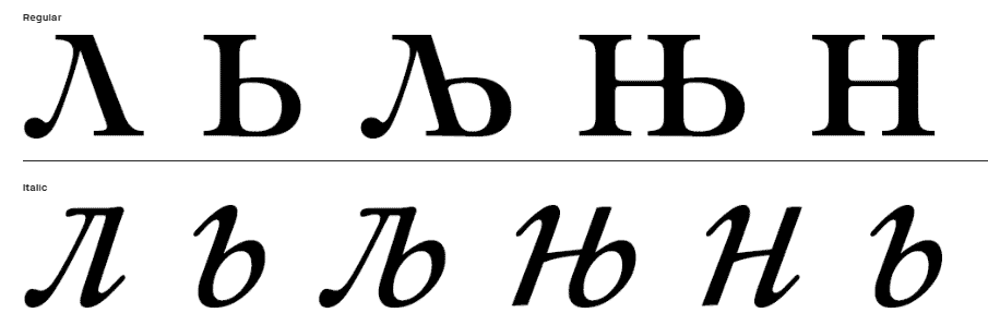
I am very grateful for this series of articles; I hope the knowledge gained has helped me make my typefaces slightly better suited for Serbian Cyrillic.There is one question that keeps bothering me: are there established approaches to constructing the letter *љ* when the letter *л* has the historical, triangular form derived from the Greek lambda?Let me illustrate with an example: here is the letter from the Lazursky typeface (the Serbian characters were likely added by Vladimir Yefimov):
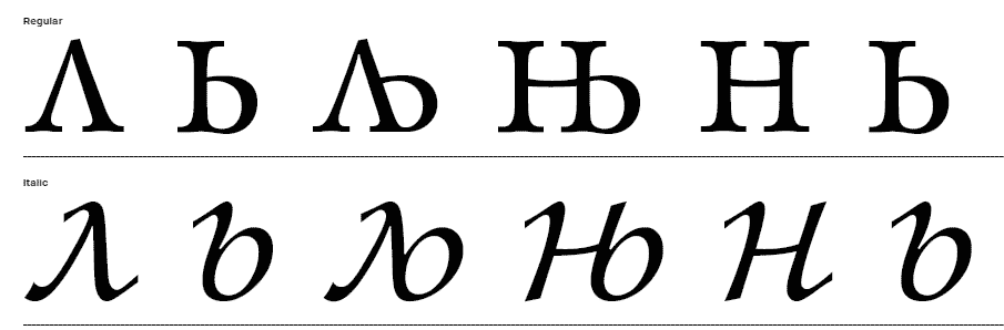 Here is Yefimov’s Cyrillic version of the Kis typeface:
 And finally, here is how I am attempting to design this letter in my current work:
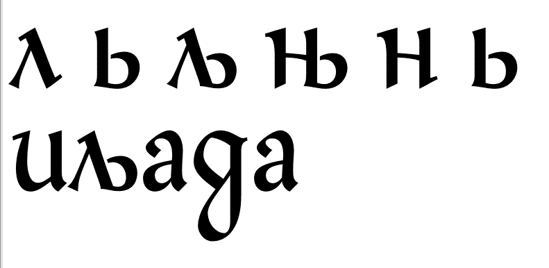 I am not happy with it. While I can manage to balance the letter in isolation, when it appears in the middle of a word during typesetting, it inevitably creates a gaping hole in the upper-right area.Then again, perhaps I’m simply not in the habit of using that kind of ligature at all, and that’s why I stumble at that point.1
 -
The capital AE ligature in English achieves compactness by making the right downstroke of the A vertical rather than inclined; clearly, that's an option for a Cyrillic L based on the Greek lambda as well in order to have less of "a gaping hole in the upper-right area".Of course it would be nice to have historical precedent to draw upon, and I hope someone will be able to find some for you.2
-
I think the shape of your л is introducing a number of problems. The triangular part is small and tight, which makes it difficult to balance with the bowl in the Balkan љ. The lambda shape works best as in Lazurksy and in Bulgarian types, with a pointed apex, allowing the triangular form to fill the x-height.It’s difficult to make other suggestions without seeing more of the design.2
-
It just so happened that I recently came across this interesting example of Serbian Cyrillic...
The second volume of Pierre-Simon Fournier the Younger's "Manuel typographique" was published in Paris in 1766–1768. The book contains specimens of his typefaces, music notation, vignettes, and a hundred alphabets of various scripts, and also serves as a response to the Gando type foundry. Among these alphabets is a Cyrillic one labeled " Serbian, of Saint Cyril." Fournier assembled it with substitutions and glyph replacements from other writing systems — and it looks utterly extraordinary, as if the letterforms were taken from the 10th century and the style from the 18th. This may have been a necessary measure when urgent support for certain languages had to be added.
Source: Manuel typographique, utile aux gens de lettres, & à ceux qui exercent les différentes parties de l'art de l'imprimerie — https://archive.org/details/manueltypographi02four/page/224/mode/2up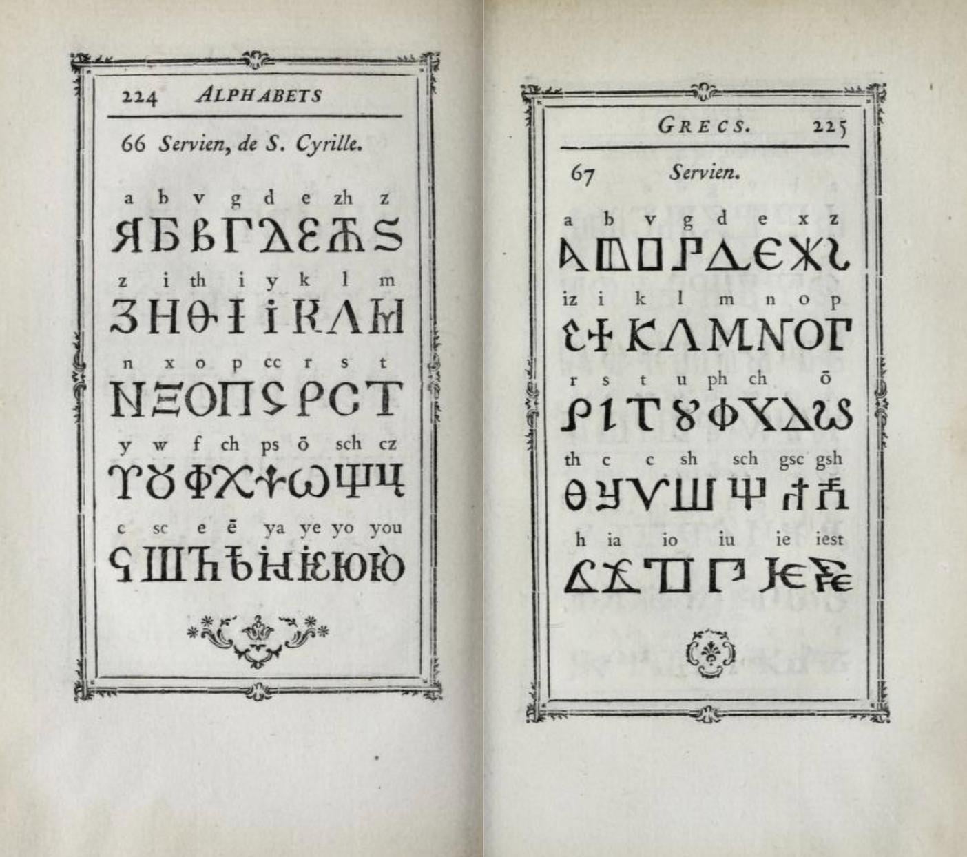 1
1 -
Just... wow. Bizarre.
Is it just me, or is the Serbian Greek possibly even weirder than the Serbian Cyrillic?
(Not that it is a contest!)2 -
A lot of the script and language materials in Fournier’s Manuel are essentially fantasies, in which a tradition dating back to the late Middle Ages that includes things like imaginary angelic scripts meets the encyclopedic cataloguing impulse of the enlightenment. James Mosley told me that a lot of the stuff that Fournier reproduces came from one of the German foundries, and much of it is not type per se but woodcut lettering.4
-
I don’t have it to hand, but in his translation, Harry Carter lists the typefaces that Breitkopf in Leipzig sent to Fournier for the book. These attributions, among other things, are based on correspondence between Fournier and Breitkopf that had survived until at least the 1920s.
Breitkopf almost certainly must have sent Fournier standing type, not woodcuts (this is not to dispute woodcut lettering in the book!).
Breitkopf was a customer of Fournier’s as well, and probably had matrices of some Fournier types. Fournier is, astonishingly, the only European punchcutter Breitkopf did not disparage for copying his novel method of manufacturing musical notation type.2 -
Thanks, Dan. I was struggling to remember the name Breitkopf yesterday. I’ll go check Carter’s list: it will be interesting to see which, if any, of the weirder things might have originated there.I have the section of Diderot’s Encyclopédie about writing systems, which is contemporaneous with Fournier’s manual, and the Serbian Cyrillic shown there is very similar.
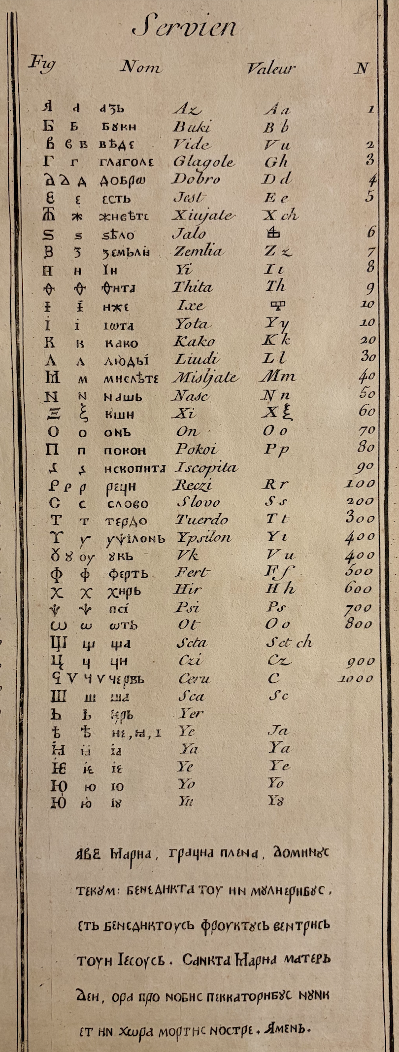
3 -
Sorry, I’m back home today. Carter’s translation has does have a footnote about Breitkopf’s types and where their correspondence had been published. But it is indeed James’s list that has more extensive information. It is in the three-volume edition from Darmstadt that includes two facsimile volumes and one volume with Carter’s traditions and James’s extensive commentary. My mistake!
Breitkopf provided German-script designs, as well as Samaritan, Syriac, Arabic, Coptic, Armenian, and Ethiopian, but not Serbian. I could not find any attribution for that, and it is not in the index, either.1 -
@Dsche The triangular shape for /Л is a standard in Bulgarian, and a perfectly acceptable alternative in Serbian. EDIT: If Cyrillic /Л is triangular /Д should also be.
As for the bowl for /Љ, its origin is the Russian soft sign, which is not used in Serbian. Naturally, they are not seen next to each other in text. So the /Љ bowl has more freedom to adjust.
You mastered the logic of the /Љ in general, now it needs general type design treatment. J. Hudson is right, the triangular shape is too short. The bowl can be narrower. And J. Savard is also right, for this glyph, the diagonals can lean somewhat to the right to balance. Although overdoing it (or making the right one vertical) would be a type design feature that would influence the /Л also, probably.
@pavljenko Very interesting, thanks! It looks very exotic. Vuk's reform came after this, and from that point on it started to look more standardized.3






Categories
- All Categories
- 47 Introductions
- 4K Typeface Design
- 501 Type Design Critiques
- 591 Type Design Software
- 1.1K Type Design Technique & Theory
- 675 Type Business
- 908 Font Technology
- 29 Punchcutting
- 544 Typography
- 129 Type Education
- 333 Type History
- 82 Type Resources
- 114 Lettering and Calligraphy
- 33 Lettering Critiques
- 81 Lettering Technique & Theory
- 580 Announcements
- 101 Events
- 116 Job Postings
- 176 Type Releases
- 186 Miscellaneous News
- 270 About TypeDrawers
- 54 TypeDrawers Announcements
- 114 Suggestions and Bug Reports