Why is there so much confusion around the Cyrillic breve (and other diacritics)?

Hey everyone, this is my first post.
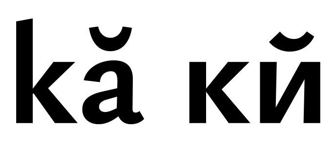
Look what I dug up from a font dataset with a proportional distribution across styles: it turns out most modern fonts use the same glyph for the breve and the kratka. Unicode also treats them as a single character.
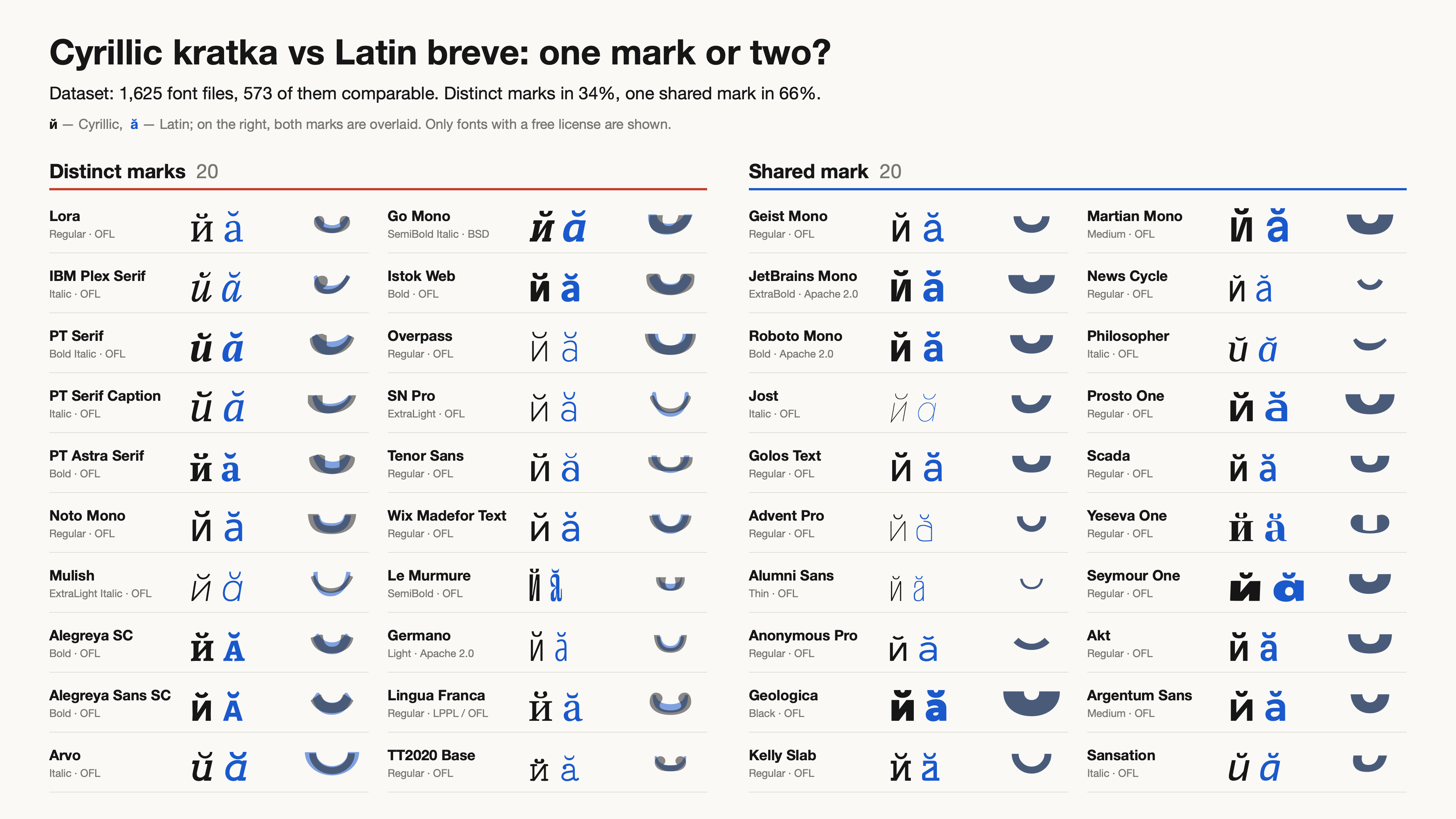
So why is it standard practice in the industry to draw the kratka and the breve differently? Where did this tradition come from, and what purpose does it serve today? I tried to trace its origins but couldn't find anything. Maybe some type designers here know?
Best Answer
-
Your account explains where the drops came from, and I accept it. What it doesn't show is that the difference from the breve was ever a design decision or serves a function. "Appropriate for the script" is a judgment of taste about a style that was fashionable in 1826 — a legitimate taste, but a taste. That's all I was trying to say.I don’t think anyone ever sat down and determined ‘The Cyrillic kratka should look different from the Latin breve,’ as a design principle. The kratka looks different because of its organic evolution independent of the breve. That evolution took place in handwriting and in the context of a succession of typeface styles, each providing models of distinct kratka shapes to influence further evolution.At the time the kratka was (re)introduced into the Russian orthography, the form of the Latin breve and its typical stroke modulation had been well-established for a long time, and is preserved through the transition to new writing tools, styles, and typefaces. It is notable that Cyrillic writers and type founders do not import that form, but instead come up with a different ductus, imparting a different stroke modulation.Note that when I spoke about ‘the various forms that are appropriate or inappropriate for [Latin or Cyrillic] reflect styles of lettering and type from those histories’, I did not mean imply ‘appropriate for the script’ in any absolute or prescriptive sense —the Cyrillic kratka must be like this!—; rather, that there are varieties of forms found in both scripts, some similar and some distinct, some that are normal in one script but that would look weird in the other script.
3

Answers
-
The Latin breve and Cyrillic kratka evolved separately for most of their histories, and the various forms that are appropriate or inappropriate for one or the other reflect styles of lettering and type from those histories. The forms are related to the styles of the letters, and to the writing tools on which these are modeled. The higher the stroke contrast in the type style, and the more traditional the design, the more likely the kratka is to have a distinctively Cyrillic form, but even in low contrast, sans serif types the kratka may differ in size and sometimes vertical alignment (the kratka is often larger, and more prominent than the Latin breve).[W]hat purpose does it serve today?The same purpose it has always served: to represent the cultural evolution of writing systems and typography in contemporary technology.
3 -
John Hudson said:The Latin breve and Cyrillic kratka evolved separately for most of their histories, and the various forms that are appropriate or inappropriate for one or the other reflect styles of lettering and type from those histories. The forms are related to the styles of the letters, and to the writing tools on which these are modeled. The higher the stroke contrast in the type style, and the more traditional the design, the more likely the kratka is to have a distinctively Cyrillic form, but even in low contrast, sans serif types the kratka may differ in size and sometimes vertical alignment (the kratka is often larger, and more prominent than the Latin breve).[W]hat purpose does it serve today?The same purpose it has always served: to represent the cultural evolution of writing systems and typography in contemporary technology.
Wow, great to see you in this thread. Yours were exactly the comments I kept running into while researching this — the Unicode list in 2005 and the TypeDrawers thread on extended Cyrillic in 2017. It's wonderful that someone of your standing just drops into a discussion like this.
Thank you, this is really valuable. But let me push back a little: could this tradition be, at least in part, a historical accident specific to the Russian alphabet? One could imagine a path-dependent story: where a new punch had to be cut, a distinct shape appeared; where an existing accent could be reused, it stayed. If something like that happened, we may now be treating as a mark of quality what began as someone improvising a missing sort.
The material I could find doesn't give a clear answer about where the kratka's form comes from. Accounts are usually vague: some trace it to the Greek breve, some to a Byzantine tradition. My own hunch is that the modern form settled in the post-Petrine reforms of the Russian alphabet in the mid-18th century — the Academy of Sciences introduced й into the civil type in 1735, and that seems like the moment when its shape could have been fixed.
There are also sources showing that the same inconsistency we see today already existed 150 years ago. In the 1870 specimen book of the St Petersburg Academy of Sciences press, the Russian types I looked at draw the kratka over й as two drops joined by a thin arc. But on the sheet of additional sorts, cut mainly for Lepsius's linguistic alphabet and Sjögren's alphabet, other Cyrillic letters carry an ordinary Latin cup-shaped breve. So one and the same academic press was drawing these marks differently: a canonical form for the Russian alphabet, but no consensus about Cyrillic as a whole. The sheet is here: https://archive.org/details/obraztsyshriftov00iaka/page/n342/mode/1up
0 -
So why is it standard practice in the industry to draw the kratka and the breve differently?Are you sure your sample is representative of standard practice?
I’ve always made them different—most diacritics are a bit of a chore, but matching kratkas to the style of the typeface is rather fun, IMHO.
1 -
I would think it's obvious why the breve and the kratka are drawn differently.In most Cyrillic languages, the only letter to which the kratka is applied is I, and this yields a postfix vowel-modifying consonantal y. In Belarusian, it is also applied to U to get W.In both cases, the resulting letter is not treated as an accented letter; it's treated as a full separate letter of the alphabet in its own right. Obviously, an element of the letter itself is something you don't want to get confused with an accent.0
-
I always try to find contemporary professional (scribal) writing, engraving, and/or lithographic lettering when looking at historical type, especially in periods of transition where new styles are emerging. That 1735 date for the introduction of the kratka is significant, because it is in the period where writing masters and engravers are producing lettering that features lachrymal or ball terminals and very fine hairlines, so exactly the context in which one would expect this kind of form to emerge.
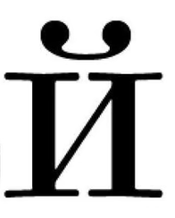 Possibly, the cursive form with the ball on the left and a thin tail comes first, in written and engraved copy books, and the shape shown here is a formal derivative to fit in the context of the more static upright letters.Typography, prior to the 20th Century, exists within a broader culture of text production that includes a huge amount of scribal writing, and other means of reproduction. So I wouldn’t presume that a shape like this necessarily originates in a punch-cutting process, or something like ‘improvising a missing sort’.But on the sheet of additional sorts, cut mainly for Lepsius's linguistic alphabet and Sjögren's alphabet, other Cyrillic letters carry an ordinary Latin cup-shaped breve. So one and the same academic press was drawing these marks differently: a canonical form for the Russian alphabet, but no consensus about Cyrillic as a whole.The Lepsius and Sjögren alphabets are predominantly Latin, aren’t they? and only supplemented with some Cyrillic characters for Slavic languages? So in that context is makes sense that the Latin form of breve is used.
2 -
I've heard of Lepsius. And perhaps his alphabet was predominantly Latin. But I did a web search for the Sjögren alphabet. What I found was an alphabet he created for the Ossetian language. This language was not Latin; it was as Cyrillic as the Russian alphabet is. It had one letter in it with a Latin breve, the one that looked like y, which I assume to be U.None the less, I agree with Sjögren's decision because i kratkoye was not present in that alphabet. I don't know the precise function of the letter with the breve is in that Ossetian alphabet, but it's entirely possible that the mark had a different function from the case in the Belarusian alphabet. Even if that was not the case, just the fact that this alphabet was designed at an early date, perhaps before the purpose or use of i kratkoye was settled, would still make the decision of Sjögren or his punch-cutter entirely reasonable for the date.But nowadays, the purpose and nature of i kratkoye is settled.
0 -
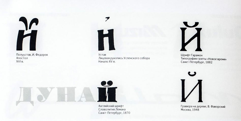
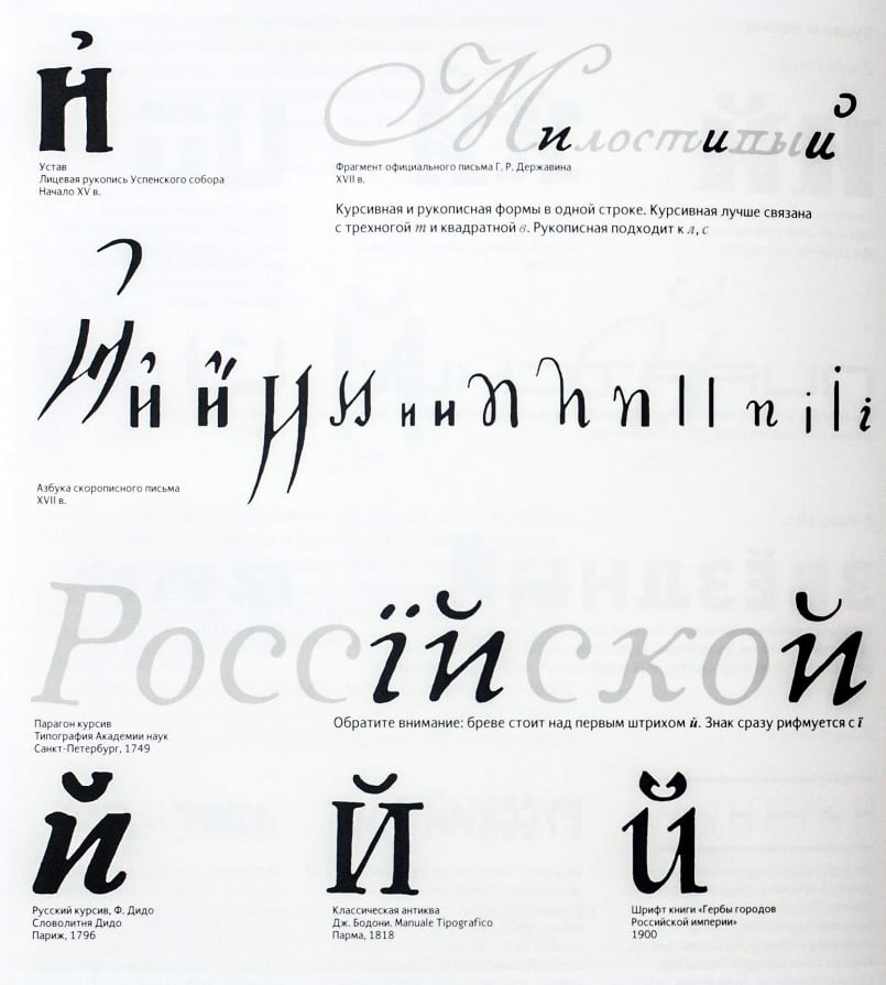
Here are some historical examples. I would say that two parallel processes were at play: native speakers depicted the *kratka* in all sorts of ways—but never like a breve—whereas European type foundries, when fulfilling orders for Cyrillic typefaces, tried to at least approximate the two forms or, ideally, substitute one for the other. That is how we ended up where we are today.3 -
The marks shown on the older examples in those images are Old Slavonic diacritics derived from polytonic Greek accents and breathing marks, which are not the same thing as kratka.In this example from the Flowery Triodion (Тріωдь цвҍтнаѧ, Kraków, pre-1491) you can see different diacritics of that system applied to и.
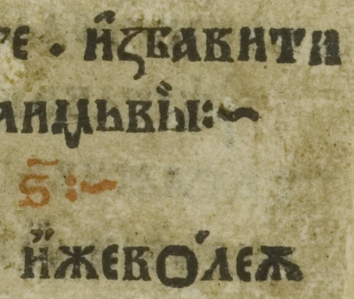
3 -
John Hudson said:Old Slavonic diacritics derived from polytonic Greek accents and breathing marksThat is an important point, and I had never really thought about it (Church Slavonic is still used in church services—meaning it isn't a completely dead language—and I even owned a Church Slavonic textbook at one point, though I certainly don't know the language well enough). Indeed, the words I can make out in the cited fragment (*izbaviti*, *izhe (voleyu)*) must be written without the *i-kratkoye*.However, in the excerpt from Derzhavin’s letter (*Milostivyy gosudar*), which is written in modern language, the *kratka* lies on its left side and looks like the *psili* used in Church Slavonic. It is possible that this is merely a coincidence.0
-
However, in the excerpt from Derzhavin’s letter (*Milostivyy gosudar*), which is written in modern language, the *kratka* lies on its left side and looks like the *psili* used in Church Slavonic. It is possible that this is merely a coincidence.I’d like to see more handwritten examples from that period, to determine if this is a common cursive form at that time or something idiosyncratic.0
-
I was unable to find any compelling examples, but in the process, I came across two instances from the early 20th century where two different artists (Vasnetsov and Zvorykin)—while tackling the task of creating an inscription in modern Russian but within a pre-Petrine aesthetic—employed a similar form of the *kratka-psili*:John Hudson said:
determine if this is a common cursive form at that time or something idiosyncratic.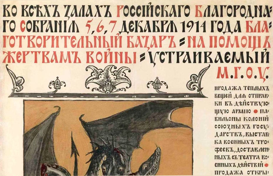
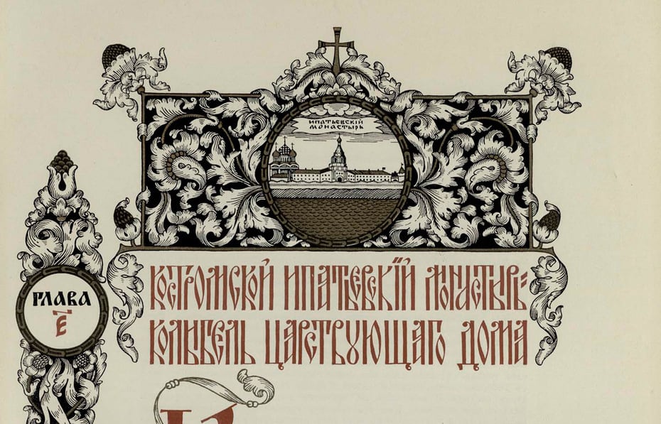
1 -
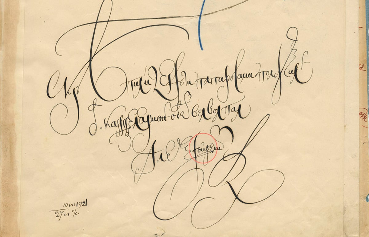
Yes, this is the early 20th century again, but once more it is exactly the same form in cursive handwriting.1 -
Nick Shinn said:So why is it standard practice in the industry to draw the kratka and the breve differently?Are you sure your sample is representative of standard practice?
I’ve always made them different—most diacritics are a bit of a chore, but matching kratkas to the style of the typeface is rather fun, IMHO.@Nick Shinn — That's a fair challenge, and the honest answer is no — my sample isn't representative of professional practice.
What it is: about 1,600 font files, a stratified sample by format and by text/display/mono usage, drawn from a collection of roughly 8,900 fonts, capped at one entry per family. These are fonts freely available for download, so the sample represents what's in circulation, not what trained designers do. Of those, 573 had both й and ă, and 66% use one shared glyph.
A second sample tells a different story, but the line doesn't fall where I implied. Among the 191 families installed on my machine, 26 of 27 text serifs draw the marks differently — against only 50 of 85 sans faces. And several carefully made professional sans faces unify them outright: Inter, Roboto, Manrope, and ParaType's own Golos Text, where the two contours are identical.
So the split isn't professional versus careless. It's serif versus sans — which makes sense if the difference is fundamentally about contrast distribution, since a monolinear sans has no contrast to distribute. Vladimir Efimov's 1996 formulation says exactly that: the Cyrillic breve has reverse contrast relative to the Latin one.
And I take your point about the fun part: your four samples show better than any argument that the kratka is where a typeface's style gets expressed.
___________________________________________________________________
John Savard said:I would think it's obvious why the breve and the kratka are drawn differently.In most Cyrillic languages, the only letter to which the kratka is applied is I, and this yields a postfix vowel-modifying consonantal y. In Belarusian, it is also applied to U to get W.In both cases, the resulting letter is not treated as an accented letter; it's treated as a full separate letter of the alphabet in its own right. Obviously, an element of the letter itself is something you don't want to get confused with an accent.@John Savard — On your first point: I don't think letterhood explains the shape. Ё and ї are also full, separate letters of their alphabets, and so are Macedonian ѓ, ќ, ѐ, ѝ — yet nobody draws their dieresis, acute or grave differently from the Latin ones. The breve is the one mark whose difference got codified, named as a separate glyph, and enforced in practice. So "it's part of the letter, not an accent" doesn't predict which marks get redesigned.
The 1870 Academy specimen makes the same point from the other side: the same letter й appears there with three different marks depending on the fount — two drops in the civil types, a heavy hook in the Church Slavonic type, and the Ossetian setting uses a Latin cup over ў. One letter, one press, three shapes.
Also, the kratka isn't limited to и and у: Chuvash ӑ and ӗ, Moldovan and Gagauz ӂ, Mari ы̆, Tundra Nenets ӑ and я̆, Khanty ӑ, Kildin Sami ҋ. In Unicode all of them decompose to base + U+0306, the same mark as in Latin ă.
On your second post — you're right about Ossetian, and the source confirms it outright. Sjögren writes in his preface that he took the Russian alphabet as his basis, and that he excluded й as unnecessary, putting Latin j in its place. That's why the specimen has ј and no и краткое at all.
Where I'd push back is your last line. For й and ў the matter is settled; for extended Cyrillic it still isn't. A 1982 Moldovan children's magazine sets ӂ with a Latin cup and й with drops in the same face. And there's a second kind of unsettledness worth separating out: Chuvash print has consistently used the kratka form over ӑ and ӗ since at least 1897 — but Chuvash digital text spent decades substituting Latin characters ă, ĕ, ç, ÿ for the Cyrillic ones, because fonts covering extended Cyrillic were scarce. In 2009 the republic's language commission recommended its expert group consider exactly those codepoints for keyboard and font unification. The shape was never in doubt there; the encoding was, and that's what broke search rather than typography.
3 -
John Hudson said:I always try to find contemporary professional (scribal) writing, engraving, and/or lithographic lettering when looking at historical type, especially in periods of transition where new styles are emerging. That 1735 date for the introduction of the kratka is significant, because it is in the period where writing masters and engravers are producing lettering that features lachrymal or ball terminals and very fine hairlines, so exactly the context in which one would expect this kind of form to emerge.Possibly, the cursive form with the ball on the left and a thin tail comes first, in written and engraved copy books, and the shape shown here is a formal derivative to fit in the context of the more static upright letters.Typography, prior to the 20th Century, exists within a broader culture of text production that includes a huge amount of scribal writing, and other means of reproduction. So I wouldn’t presume that a shape like this necessarily originates in a punch-cutting process, or something like ‘improvising a missing sort’.But on the sheet of additional sorts, cut mainly for Lepsius's linguistic alphabet and Sjögren's alphabet, other Cyrillic letters carry an ordinary Latin cup-shaped breve. So one and the same academic press was drawing these marks differently: a canonical form for the Russian alphabet, but no consensus about Cyrillic as a whole.The Lepsius and Sjögren alphabets are predominantly Latin, aren’t they? and only supplemented with some Cyrillic characters for Slavic languages? So in that context is makes sense that the Latin form of breve is used.
I went back to the sources properly, and I owe the thread a correction and a fuller picture.
1. What the 1870 specimen actually shows. Three different marks over Cyrillic letters in one book: two drops on a hairline over й in the Russian text types and in the Chuvash setting; a Latin cup over ў in Ossetian and over ы̆ on the linguistic sorts sheet, identical to the ă beside it; and a heavy hook in the Church Slavonic type. So my "no consensus" was right, but for a different reason than I gave: the shape followed the fount the sort came from. The й was cast as one piece with its own mark; letters for other languages were cast in the linguistic founts and inherited whatever breve those founts had.
2. Lepsius and Sjögren. You're right about Lepsius: the Standard Alphabet is Latin, he warns against borrowing Russian letters because it "surrenders the homogeneity of writing" (p. 167), and he defines the short mark as the sign of Latin prosody (p. 59) — which is exactly the cup over ы̆. Sjögren is the opposite case: his 1844 Ossetian grammar sets out to show how the Russian alphabet can be applied to other languages within Russia (p. XII); the 46-letter table is Cyrillic with five borrowings (Æ, Ö, J, Q, Ω), and he dropped й deliberately in favour of Latin j. So the Latin cup over Cyrillic letters there isn't a Latin-alphabet effect; it's the transcription fount's mark.
3. The kratka before the canon. Dated images, all of which I or my collaborators looked at:
- 15th-c. manuscript: an angular check with a heavier right arm (RSL Horologion); the same in a 17th-c. one.
- Fedorov's Apostol, 1564: a tiny apostrophe-like hook (p. 22).
- Smotrytsky, 1619: the prosodic kratkaya printed as a symmetric U (leaf 24).
- Moscow Psalter, 1649: a single oblique stroke, indistinguishable from the acute (p. 100).
- Moscow Horologion, 1652: a hook with a drop on the left and a thin tail to the right (p. 30).
- 1669 primer: an angular check again (leaf 12).
Five shapes in two centuries, in both orientations, with no sign that anyone thought it mattered.
4. Civil type. Petrine printing has no kratka at all (Kniga Marsova, 1713). When й comes back in 1735 it gets a plain symmetric bracket: the Academy's 1748 specimen and Lomonosov's 1755 grammar, where he literally calls it a skobka, a bracket (§ 85). Meanwhile — and this is a point for your hypothesis — the Academy's 1749 italic already has the drop-on-the-left form (reproduced in Yuri Gordon's Book about Letters, p. 180). Drops on the upright й appear only later: faintly in the 1789 Academy dictionary, clearly in the 1802 grammar's italic, and as the canonical form in the Didone specimens of 1826 — Semen, Selivanovsky, Moscow University (Shitsgal's reproductions).
So the cursive drop form does predate the upright drops, and your sequence is possible. What I can't tell from this is whether the upright drops derive from the italic or simply from the ball terminals of the Didone idiom, because the upright type kept its plain bracket for forty years and acquired drops exactly when Russian type went Didone. Either way, 1735 gives us the letter, not the form.
5. When the difference became a rule. Nowhere before the digital era. The Soviet GOST 3489 series has no Latin accents at all, so the question couldn't arise. Adobe's Cyrillic spec added a
cyrbreveglyph in 1993 without a word of explanation (TN 5013). The first written rule I can find is Vladimir Efimov, 1996: the Cyrillic breve "as a rule has reverse contrast" to the Latin one, justified by the reader stumbling on unfamiliar forms (ParaType, archived). In English it surfaces on Typophile in March 2007 — your own post there says they are "clearly the same character" — then the ParaType glossary (Dec 2007), Wikipedia in 2011–13, and Glyphs in 2014, each citing the previous one.And here Gordon is worth quoting in paraphrase: in the 18th century, he found, the kratka was either a bracket like the Latin breve or a single drop on the left; the two-drop form he traced to Semen's 1826 specimen; and he sees no great sin in replacing it with a Latin-like one — we are simply used to Й with Mickey Mouse ears (Книга про буквы, pp. 177–178).
6. Where this leaves my question. Nobody ever decided to make the kratka unlike the breve. The two marks lived in different founts and never had to agree; the drops are a Didone fashion that happened to be on the й sort when the style froze; and once multi-script digital fonts put both marks in one file, the inherited difference was written down as a rule and justified by habit. Extended-Cyrillic letters cut in the 20th century mostly copied the й pattern — Chuvash ӑ in a 1918 primer and a 1989 book, Belarusian ў everywhere — with lapses like a 1982 Moldovan magazine that has a Latin cup over ӂ and drops over й in the same face (Steluța).
Your account explains where the drops came from, and I accept it. What it doesn't show is that the difference from the breve was ever a design decision or serves a function. "Appropriate for the script" is a judgment of taste about a style that was fashionable in 1826 — a legitimate taste, but a taste. That's all I was trying to say.
2 -
I’m ignorant of the background, but I feel the Cyrillic mark needs to be flatter than the breve simply because Cyrillic as a whole is much flatter than Latin, with its frequent ascenders.
 2
2 -
Christian Thalmann said:I feel the Cyrillic mark needs to be flatter than the breve...
More kratkas for the kratka god

Seriously though — the numbers back you up. Among fonts that distinguish the two, the kratka is wider (median 1.07) but shorter (0.985). Flatter, not bigger.
1 -
I took a day to consider whether I should talk about this—and decided that I really should. Most free fonts, including the vast majority of Google Fonts, contain very weak, unprofessional Cyrillic. A significant number of Paratype fonts created in the 1990s (and still sold today) contain very weak, unprofessional Cyrillic. Some of Yefimov’s fonts (not all of them!) contain very weak, unprofessional Cyrillic.pavljenko said:What it is: about 1,600 font files, a stratified sample by format and by text/display/mono usage, drawn from a collection of roughly 8,900 fonts, capped at one entry per family. These are fonts freely available for download, so the sample represents what's in circulation, not what trained designers do. Of those, 573 had both й and ă, and 66% use one shared glyph.
A second sample tells a different story, but the line doesn't fall where I implied. Among the 191 families installed on my machine, 26 of 27 text serifs draw the marks differently — against only 50 of 85 sans faces. And several carefully made professional sans faces unify them outright: Inter, Roboto, Manrope, and ParaType's own Golos Text, where the two contours are identical.
1 -
This is what I learnt. Stemming from the fact that the contrast is reversed in comparison to the Latin breve (as we can see from the calligraphic examples – heavy in the verticals on the sides), the shape needs to be wider than the Latin breve and often slightly flatter.pavljenko said:Among fonts that distinguish the two, the kratka is wider (median 1.07) but shorter (0.985). Flatter, not bigger.
1 -
pavljenko said:
5. When the difference became a rule. Nowhere before the digital era. The Soviet GOST 3489 series has no Latin accents at all, so the question couldn't arise. Adobe's Cyrillic spec added a
cyrbreveglyph in 1993 without a word of explanation (TN 5013). The first written rule I can find is Vladimir Efimov, 1996: the Cyrillic breve "as a rule has reverse contrast" to the Latin one, justified by the reader stumbling on unfamiliar forms (ParaType, archived). In English it surfaces on Typophile in March 2007 — your own post there says they are "clearly the same character" — then the ParaType glossary (Dec 2007), Wikipedia in 2011–13, and Glyphs in 2014, each citing the previous one.
Just to clarify, the quote you are attributing to John Hudson was actually Chris “Dezcom” Lozos. The original Adobe Cyrillic character set development was managed by Bur Davis and Tony Arcari; the Slavic (as opposed to Latin) portion was defined by David Birnbaum. (See https://github.com/adobe-type-tools/adobe-cyrillic-charsets, which also matches my memory.) What that writeup does not mention is that this was done in close consultation with native Cyrillic experts, including Maxim Zhukov and (IIRC) the late Vladimir Yefimov.
In the early OpenType era (late 90s through at least early 00’s), Zhukov was the number one Cyrillic consultant for Adobe and reviewed a number of type designs, including ones from Robert Slimbach as well as my own Hypatia Sans.
My research (with some minor later tweaks) was the basis of Adobe Cyrillic 2 and 3, but I did not revisit the kratka question in that process, rather treating it as understood wisdom from the ancients. I too consulted Zhukov and Yefimov, as I recall. I also posted my findings publicly, which gave some additional useful character set feedback, though I no longer remember specifically from whom. 2
 -
I’ll also note that anything I did say on Typophile twenty years ago does not necessarily reflect my current thinking.1
-
pavljenko said:
@John Savard — On your first point: I don't think letterhood explains the shape. Ё and ї are also full, separate letters of their alphabets, and so are Macedonian ѓ, ќ, ѐ, ѝ — yet nobody draws their dieresis, acute or grave differently from the Latin ones. The breve is the one mark whose difference got codified, named as a separate glyph, and enforced in practice. So "it's part of the letter, not an accent" doesn't predict which marks get redesigned.
This is absolutely right. I should have been clearer.Typographic practice in a particular language could lead to accent marks looking different from similar accent marks in another language, as well.And the fact that something is a separate letter doesn't automatically mean that the component in question must have a different shape, as you say.I just felt that it being a letter, rather than an accent, makes it easier for a different shape to be sustained; in a sense, giving design room to that letter characteristic.1 -
As an aside, there are a couple of “acute” accents that have language-specific variants:
- Polish kreska (no unique Unicode)
- Greek tonos/oxia
It might even be said cedilla and commaaccent are commensurate, and I cite Adrian Frutiger as the relevant authority.1 -
Thomas Phinney said:Just to clarify, the quote you are attributing to John Hudson was actually Chris “Dezcom” Lozos. The original Adobe Cyrillic character set development was managed by Bur Davis and Tony Arcari; the Slavic (as opposed to Latin) portion was defined by David Birnbaum. (See https://github.com/adobe-type-tools/adobe-cyrillic-charsets, which also matches my memory.) What that writeup does not mention is that this was done in close consultation with native Cyrillic experts, including Maxim Zhukov and (IIRC) the late Vladimir Yefimov.
In the early OpenType era (late 90s through at least early 00’s), Zhukov was the number one Cyrillic consultant for Adobe and reviewed a number of type designs, including ones from Robert Slimbach as well as my own Hypatia Sans.
My research (with some minor later tweaks) was the basis of Adobe Cyrillic 2 and 3, but I did not revisit the kratka question in that process, rather treating it as understood wisdom from the ancients. I too consulted Zhukov and Yefimov, as I recall. I also posted my findings publicly, which gave some additional useful character set feedback, though I no longer remember specifically from whom.Thomas, thank you — this is exactly the kind of first-hand history I was hoping someone would bring, and it changes my picture in a useful way.
One small correction on the quote, though. It really is John's: in the original Typophile page the post is signed "John Hudson — 8 Mar 2007 — 7:32pm". I think the confusion is my fault: I linked to the typophile.github.io mirror, which prints each author's name below their post, so "dezcom" from the previous comment sits right above John's text. Chris was actually arguing the other way in that thread.
But your point pushes me to quote John fairly: in the same post he also says a Latin–Cyrillic font would want a Cyrillic-specific breve glyph. "Clearly the same character" meant one character, different glyphs — not that the difference doesn't matter.
On Adobe, your account matches the charset README, which also credits Thomas Milo for the non-Slavic languages, 1988–1990. And I need to walk back part of what I wrote: TN 5013 has no Latin
breveat all, andcyrBreveis just the uppercase variant, so thecyrnames may simply separate the namespace from Standard Roman. I can't claim Adobe made a shape decision in 1993.What your recollection does is fill the gap I couldn't. Efimov's February 1996 article is the earliest written rule I found — the Cyrillic breve "as a rule has reverse contrast" to the Latin one — and his bibliography cites Zhukov's Peculiarities of Cyrillic Letterforms in Typography Papers the same year. So the likely story is exactly yours: the distinction came from native experts' practice, passed orally to Western foundries in the 1990s, and got written down around 1996. "Understood wisdom from the ancients" is the best one-line summary of the whole thing anyone has offered here.
If you remember: was the kratka's form something Maxim specifically raised in those reviews, or just taken for granted on all sides? And does anyone know whether his 1996 paper discusses it?
1 -
Regarding design reviews by Maxim Zhukov, his approach is often idiomatic, i.e. he identifies the style of typeface being designed, and makes reference to successful types in that and related styles to illustrate his suggestions. When a typeface is in a novel style, he is still able to make suggestions for handling particular forms from his extensive knowledge of Russian lettering tradition (Maxim’s advice strongly tilts towards Russian exemplars, for e.g. Bulgarian forms I ask advice from other people), but also considers new approaches. His core principle is ‘interdependence’, i.e. understanding the ways in which shapes and proportions within the script inform each other.Maxim’s Typography Papers 1* essay does not discuss the kratka.I do know that Maxim’s initial advice to people less familiar with Cyrillic script is often to make the kratka larger and more prominent than they might be inclined to based on their Latin diacritic experience. I’ve done enough Cyrillic design now that I tend to make the kratka, if anything, slightly too large. In the last couple of projects we worked on together, Maxim encouraged me to make it smaller._____* This essay is republished in the recent Bloomsbury Handbook of Global Typography.
3 -
John Hudson said:Regarding design reviews by Maxim Zhukov, his approach is often idiomatic, i.e. he identifies the style of typeface being designed, and makes reference to successful types in that and related styles to illustrate his suggestions. When a typeface is in a novel style, he is still able to make suggestions for handling particular forms from his extensive knowledge of Russian lettering tradition (Maxim’s advice strongly tilts towards Russian exemplars, for e.g. Bulgarian forms I ask advice from other people), but also considers new approaches. His core principle is ‘interdependence’, i.e. understanding the ways in which shapes and proportions within the script inform each other.Maxim’s Typography Papers 1* essay does not discuss the kratka.I do know that Maxim’s initial advice to people less familiar with Cyrillic script is often to make the kratka larger and more prominent than they might be inclined to based on their Latin diacritic experience. I’ve done enough Cyrillic design now that I tend to make the kratka, if anything, slightly too large. In the last couple of projects we worked on together, Maxim encouraged me to make it smaller._____* This essay is republished in the recent Bloomsbury Handbook of Global Typography.
John, thank you so much for your generous contributions to this thread. Your advice and comments have opened up a great deal that is interesting and important to me about how Cyrillic diacritics take shape — and the kratka in particular.
If I read you right, "make the kratka larger" isn't a description of the target form; it's a correction aimed at a predictable bias. Designers coming from Latin under-draw it, so Maxim pushes them the other way — and once the bias is corrected, the advice can reverse, as it did for you. That also explains what I found in the measurements: the folklore says the kratka is larger and more prominent, but among fonts where the two marks clearly differ, the typical kratka is wider and slightly lower than the breve (median width ratio 1.07, height 0.985). And critics fault kratkas for being too big as often as too small. The rule gives a direction, not a size.
"Interdependence" also clarifies what the disagreement here is really about. Maxim's principle is interdependence within the script — the kratka answering to Cyrillic proportions and letterforms; Christian's point about how few ascenders Cyrillic has is a good example of it at work. The unification view is closer to consistency across scripts — one mark shared by Latin and Cyrillic, in the spirit of Maria Doreuli's (Contrast Foundry) treating the two as one system. Both are principled; they just pull in different directions, and a bi-script font has to decide which one wins for each mark. I don't think either choice is wrong.
So, to sum up what this thread has established, as far as I can tell:
- Before 1735 the mark had no fixed form at all.
- Civil type gave й a plain bracket, and the drops arrived with the Didone style around 1800.
- The distinction passed from native experts' practice — Zhukov, Efimov — into Western foundries in the 1990s, and was first written down by Efimov in 1996.
- "Larger" is a teaching correction, and the one measurable tendency in actual practice is Christian's: wider and flatter.
Thanks to everyone who joined in; I learned far more than I expected. And thank you for the Bloomsbury pointer — I'll look up the essay.
3 -
I think @pavljenko has done a great job in summarizing this.
IIRC, I *think* Maxim suggested making the kratka wider and shorter. I do not *specifically* recall whether he brought up the reverse contrast, or if I had already done that. (It was, after all, about 25 years ago.) But if I had already done it, he certainly did not question it — and it is not like I would have defended it.
The above was in the context, specifically, of a geometric/humanist sans serif with mostly minimal contrast (Hypatia Sans).
I don’t recall getting much advice on overall size. But I have been making reasonably large diacritics from pretty early on. The principal I internalized was that designers whose native language is English tend to make diacritics too small, because English lacks diacritics, so they think of them as appendages/extras rather than of equal importance. I don’t know that this applies to other Latin-native designers whose specific languages have diacritics — I tend to think of it as being a problem more particular English-language–natives specifically.5 -
German also, according to your theory.0
-
German has äüö, and we often see diacritics in foreign names; It's common to spell them like in the native language (René being a common one). French terms retain their acute accents sometimes. A cafe is spelled Café in German, for example.3





Categories
- All Categories
- 47 Introductions
- 4K Typeface Design
- 497 Type Design Critiques
- 590 Type Design Software
- 1.1K Type Design Technique & Theory
- 674 Type Business
- 904 Font Technology
- 29 Punchcutting
- 543 Typography
- 128 Type Education
- 333 Type History
- 82 Type Resources
- 114 Lettering and Calligraphy
- 33 Lettering Critiques
- 81 Lettering Technique & Theory
- 577 Announcements
- 101 Events
- 116 Job Postings
- 174 Type Releases
- 185 Miscellaneous News
- 270 About TypeDrawers
- 54 TypeDrawers Announcements
- 114 Suggestions and Bug Reports