Are typefaces for writing different from typefaces for reading?

I've played around with different typefaces for my websites, and I keep coming to a divide between reading and writing.
For writing I find I need generous letter-spacing. For reading, the repetitive pattern of the wide spacing becomes a distraction, and I prefer more compact fonts.
I see that the Terza family capitalizes on this idea, with sub-typefaces Terza Reader, Terza Author, Terza Editor.
The Author and Editor are quasi-monospaced and monospaced respectively.
For my own writing in prose, I find monospaced fonts too rough, but the fonts I like for reading (e.g. Sanomat Sans Text) are uncomfortably compact for writing. I end up preferring wide-stance fonts like Zed Text or Verdana.
For coding, I think that monospaced fonts are just too convenient to eschew, and somehow they don't bother me for code as they do for prose.
Are the debates about readability settled?
Are there proportional typefaces designed specifically for writing?
And, if a typeface is knowingly optimized for writing instead of for reading (therefore publishing), isn't that going to shrink its market?
And, if a typeface is knowingly optimized for writing instead of for reading (therefore publishing), isn't that going to shrink its market?
3
Answers
-
Why are monospaced fonts are associated with writing (even outside of coding)? Some hypotheses:
- Legacy of typewriters? For a century writers used typewriters with monospaced characters, and so that look feels like productive writing.
- Rough says provisional? Writers are more comfortable thinking of the texts they produce as provisional and open to revision, while a nice, proportional font feels like it’s in already-published form, which can discourage useful revision or even stymie perfectionists’ efforts to start writing.
- Aesthetics distract? Perhaps a more homely visual presentation encourages more focus on the content rather than the appearance of the text.
- Reading during writing really is different? While writing, the scope of attention is often at the word or phrase or sentence scale, while immersive reading’s scope is more often at the paragraph or page or chapter scale. Letterforms that make a word easier to read are not the same as those that make a chapter easier to read.
- Monospaced is just a proxy for generous width? It’s possible that writers find monospaced fonts more useful not because they have identical advance widths, but rather just that they have healthy advance widths.
7 -
Thanks. I agree with much of what you say. Couple of questions:
"Aesthetics distract?" - here I think that actually monospaced letterforms can often be more involved and "distracting" than their proportional siblings. The 'i' and 'l' with crossbars, the squashed 'm' and 'w'. They scream for attention. So, are they not more "aesthetic"?
"Reading during writing is different?" - that really is the center of the issue. The question mark in your sentence makes me think that this is not a settled topic?
0 -
Craig Eliason said:Why are monospaced fonts are associated with writing (even outside of coding)?
My first guess would be that a monospaced face might allow someone to directly type in tabular matter without taking the trouble of setting up the formatting.0 -
Sort of true, but… in this scenario there would almost certainly be a font change in between writing and publishing. In which case, I don’t see how having a table that somebody made by using spaces for alignment would be a good thing downstream; quite the contrary.1
-
The use of monospace for writing, outside of coding, is in fashion with some programs like iA Writer. I personally don't see that particular need, it seems more like a gimmick.
The polar opposite is applications like Word/Pages that make you write using the publication font, often Times by default. In my opinion a bad idea.
The famous WYSIWYG (what you see is what you get) is too narrow in my view. I want to be able to write using something like Verdana, and only set the font to something final when the text is set and it's time to typeset.
Web developers and LaTeX users get the best of both wolds…0 -
PageMaker used to have a feature called the “story editor” which was like a text editor separate from the WYSIWYG page layout editor. You could click on a text block and open the story editor, which was a separate window that used the same font and size no matter how it was formatted in the WYSIWYG mode. I think a few other (now dead) page layout apps had something similar. Somehow, it didn’t get copied by Quark or InDesign. (Although, for all I know, maybe there are plugins that add this feature.)
Edit: Never mind. InDesign, did copy this feature from PageMaker. Maybe Quark has it too. Shows how much I used these apps...1 -
I personally really enjoy writing with mono-esque fonts, the example of Duo in iA Writer comes to mind. Absolutely not relevant, but I'm currently writing a thesis and writing everything as .md files in iA Writer, which I then run through a script that uses the Chrome renderer to build my final PDF (which I can customise through CSS). A really great pipeline, I must say, especially since I can use git to version my .md files (using a line break after each sentence).
It's purely subjective, I guess, but I appreciate having more irregular white space when writing (= mono-esque fonts), and prefer "normal" fonts when reading. Terza is a fantastic example; I had forgotton about that project. It perfectly encapsulates my taste in this question. Thanks for the reminder!
So, to reference @Craig Eliason's list earlier: I definitely agree with the second and the last point. I find the rough aspect very pleasing during writing (and easier to navigate with a cursor).
1 -
One reason for monospace typed manuscripts was typographic: it made the calculation of set text length in different fonts possible, by reference to character count tables in type house catalogues.
And of course it provided room for editing and mark-up.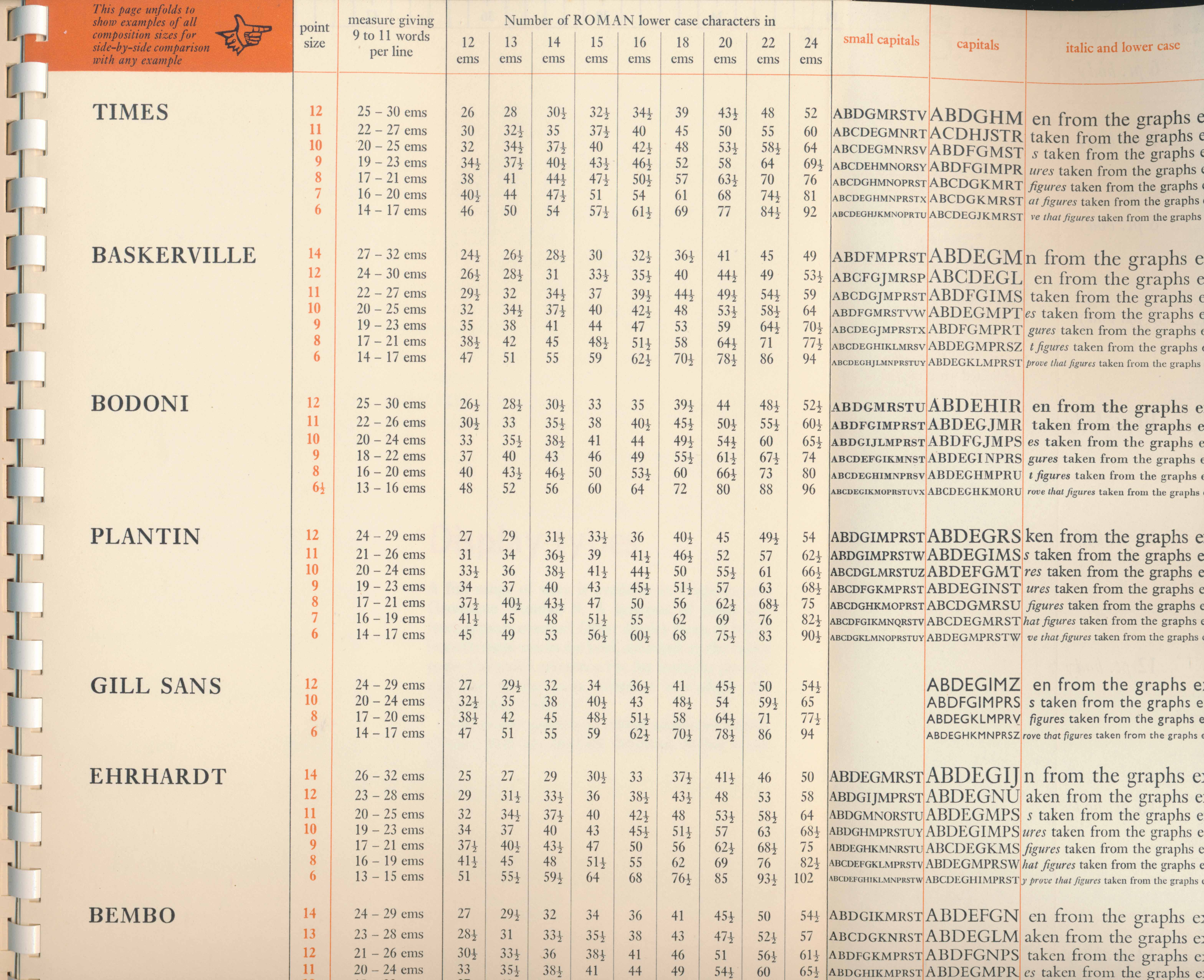
3 -
Well, the use of character count tables was necessitated by the desire to estimate character counts when proportional fonts were being used.
The advantage of monospaced typed manuscripts is that it largely eliminates the need for such tables.1 -
Here’s how it worked, Thomas:
You calculated the number of characters in the manuscript to be set, by multiplying the average* number of typewritten characters in a line by the number of lines.
Then you calculated the number of characters per measure (line length), in your proposed layout, at a nominal size for a particular font, according to the character count table, and figured out how many lines that the copy (i.e. manuscript text) would occupy, by dividing the number of characters per measure into the total number of characters.
Then, taking into account the leading, you would know the total column depth of the entire text (in inches or whatever)—and be able to figure out whether it would fit onto a single page layout, or how many pages would be required in a book.
Then you could adjust the size, and/or leading and/or measure, or change the typeface, in order to get the copy to fit nicely.
*That was an estimate, as monowidth typewriting produced a rag right document, but easy to eyeball.
0 -
I used to do this regularly when I worked as a designer in the pre-DTP era. It was called copyfitting. I even made spreadsheets to help do the calculations in the early ’80s.0
-
> One reason for monospace typed manuscripts was typographic: ...Very interesting!I've read somewhere that for Hollywood screenplays, the standard is to print them in 12 point Courier, and there is a proportion, say one page per minute of screen time, something like that.There are practical virtues to monospaced fonts, to be sure.But going back a bit to the original question: today, with no constraints whatsoever, what typefaces are good for editing/writing?Monospaced have the letter-spacing to recommend them, but IMO not the simplicity.
Sans-serifs may be simpler, but often have little letter-spacing.Is there an ideal trade-off?0 -
In the context of pre-DTP book design, we called this process of calculation “casting off” — an important part of design planning, to estimate the number of typeset pages for a given manuscript. (Or conversely, to figure out how to cram a given manuscript into a set number of pages. 😆)Mark Simonson said:I used to do this regularly when I worked as a designer in the pre-DTP era. It was called copyfitting. I even made spreadsheets to help do the calculations in the early ’80s.
0 -
I find the process is more complex than writing or reading—made so by editing.
When I write my blog, I do it the Pages app, and play around with various of my own typefaces at various sizes, because I’m always testing how they perform.
Then I use WordPress, and import then format the copy in the WP “Visual” dfault, which is my system font, San Francisco, a Helvetica clone.
That reads differently than in my Pages document, so I do the occasional edit, rewrite and addition, in the “visual” option.
Then, when I view it in Preview mode in my website, in that site’s typeface (Neology Deco Light), it looks different again, and I notice how it reads, so there are things that I always decide to add, delete or change—such as paragraph breaks, or noticing errors or issues that suddenly jump out, such as using the same unusual word in adjacent sentences, or “should this French phrase by italicized?”
Then I will do a final, typographic edit, inserting non-breaking hyphens and non-breaking spaces, and any other typographic nuances that need addressing. That’s a really nasty process in the Code option, in a monospace font: the stack is Menlo, Consolas, Monaco, monospace;
So I wonder, how much editing/rewriting do people generally do, upon reading a document in Preview mode?
0 -
Thomas Phinney said:Sort of true, but… in this scenario there would almost certainly be a font change in between writing and publishing. In which case, I don’t see how having a table that somebody made by using spaces for alignment would be a good thing downstream; quite the contrary.Oh, absolutely, it would mean more work by somebody later.However, the argument (weak though it may be) behind this thought of mine is that a writer may not wish to be distracted with the chore of typesetting what he is writing while he is writing it.The writer may be using a keyboard because it's easier than writing in longhand, but it doesn't follow from the fact that he is using a keyboard... that this keyboard ought to be attached to a Teletypesetter Perforator or anything remotely like it or performing a similar function.Of course this is a case where one person being lazy means more total work done down the road, but while one is writing and creating, not to be burdened by extra work at that critical moment when all one's energy is going into the act of creation in one's mind... seems to me to make at least some sense.1
-
I agree with much of what you say here.
Your previous message said.. monospaced face might allow someone to directly type in tabular matter without taking the trouble of setting up the formatting.It's this tabular matter that I don't quite get. For code layout, absolutely, there are code-formatting tools that will generate tabular layout assuming a monospace font.
But for writing regular prose, I don't see that much need for tabular content, no?
And if you're writing a story, a blog post etc without such need, why use monospace?
Could other choices work as well or better than monospace?0 -
jaimes said:But for writing regular prose, I don't see that much need for tabular content, no?And if you're writing a story, a blog post etc without such need, why use monospace?Could other choices work as well or better than monospace?I was trying to think of some reason to use monospace. And tabular matter or even just point form lists were the only straw I could grasp - I did not have a solid case for monospace in hand. So I don't have an answer to your question of my own, although I see that another possible rationale was mentioned by others earlier in this thread: that it would simplify estimating how many characters there were in something one typed.This has its own fundamental problem: given that what an author produces is going to be typeset in a normal proportional typeface, while in the old days of mechanical typewriters, people had to estimate column inches from the number of characters, by assuming normal letter frequencies... using a proportional face to write in ought to permit a more accurate estimate of the space that will be taken up by what one has written.Of course, the problem is that no standardized tool was developed to take advantage of this.0




Categories
- All Categories
- 47 Introductions
- 4K Typeface Design
- 496 Type Design Critiques
- 587 Type Design Software
- 1.1K Type Design Technique & Theory
- 674 Type Business
- 897 Font Technology
- 29 Punchcutting
- 542 Typography
- 127 Type Education
- 333 Type History
- 82 Type Resources
- 114 Lettering and Calligraphy
- 33 Lettering Critiques
- 81 Lettering Technique & Theory
- 571 Announcements
- 100 Events
- 116 Job Postings
- 171 Type Releases
- 183 Miscellaneous News
- 270 About TypeDrawers
- 54 TypeDrawers Announcements
- 114 Suggestions and Bug Reports