Negative slnt values as per VF spec

Thierry Blancpain
Posts: 228
The VF spec describes the slnt values to be negative numbers equivalent to the slant degree*. So a font of ours might receive a -6 slnt value for the obliques. In my view this is insane and in no way reflective of user behavior. Positive values are much more representative of user expectation.
I can’t think of a negative impact beyond it doesn’t match the spec of going with positive numbers. Are there any known software bugs from doing so?
* "Values can be interpreted as the angle, in counter-clockwise degrees, of oblique slant from whatever the designer considers to be upright for that font design."
I can’t think of a negative impact beyond it doesn’t match the spec of going with positive numbers. Are there any known software bugs from doing so?
* "Values can be interpreted as the angle, in counter-clockwise degrees, of oblique slant from whatever the designer considers to be upright for that font design."
1
Comments
-
If you use a positive value, it would be interpreted as a left-leaning slant in terms of interoperability with other fonts that follow the spec and with document settings created according to the spec.In my view this is insane and in no way reflective of user behavior. Positive values are much more representative of user expectation.Which users? Arabic and Hebrew users?
 Why assume that the user experience is directly derived from the font format data type? This is not necessarily the case; indeed, I would say that using the data type as the basis of the user experience is just lazy UX design. Good UX design is a translation of data into user interaction. I would suggest that users typically think about slant as a combination of two values: direction and degree. Yes, the degree is intuitively understood as a positive value, but always in combination with direction. The data format arbitrarily treats the direction as a positive or negative degree value, but a good UX design would include explicit controls for direction and degree, reflecting how the user thinks about slant.I am trying to remember the reason why the slnt axis was defined as it is, but can’t remember the details. I do recall that there was a lot of discussion about it during one working group meeting, and I think it may have been for compatibility with older AAT fonts. The way computer scientists think about numbers is often unintuitive for other people.3
 -
(FWIW this topic showed up at the Glyphs forum a couple of years ago.)1
-
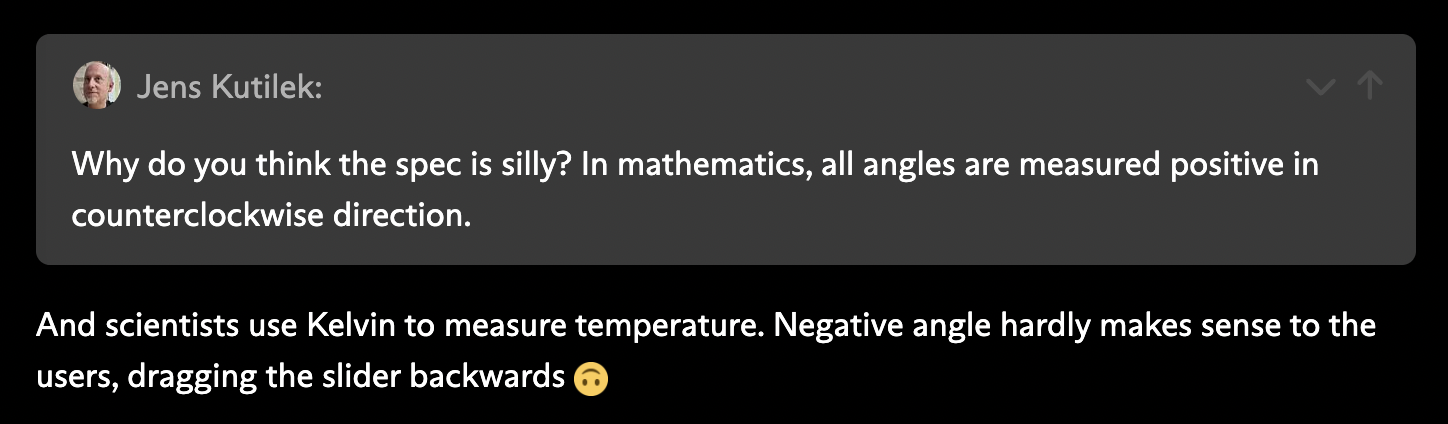
This comment from the Glyphs forum is a pretty good reflection of my views of this spec:
@John Hudson I appreciate your insights, and it seems important that an Arabic or Hebrew slanted font’s user would look at this differently. My understanding is that neither script uses slant very actively but I’m definitely not an expert.
But either way that’s not the spec’s reasoning. If true, simply going with counterclockwise because engineers think that way is an insane reason for this spec: both from a UX perspective (dragging a slider leftwards for obliques makes no sense) as well as for developers (remembering that the slant needs a negative value instead of a positive).
In the case of our GT Planar, the left-leaning retalics are supposed to have a positive number, and the right-leaning italics a negative number. I’m sure this makes sense on some spec level but I can’t really understand a defense of it in terms of real-life applications. Nobody would ever expect that to be the case.
So now I have to decide if I want to follow the spec or break user expectations.0 -
from a UX perspective (dragging a slider leftwards for obliques makes no sense)Again, this is assuming that the UX is dumb. A better UX for a slant variation would default to zero in the middle, and you would drag to the left to slant to the left, and to the right to slant to the right, and the user would never — should never — need to be aware of how the slant values are expressed internally in the font.So now I have to decide if I want to follow the spec or break user expectations.Fonts are technical tools used within complex technical frameworks, with dependencies that you might not be aware of when making such a decision. Sometimes, those technical frameworks are not great, sometimes they have bugs, and every time someone decides to use a hack to work around something that is broken or that they just don’t like, the situation gets worse. Breaking font interoperability because variable font UX sucks would not be helpful.6
-
As John pointed out: simply because most VF axis interfaces haven't been thought out (yet), it's a bad idea to compensate for this by intentionally going against the spec. What's more, if enough fonts adhere to the spec, developers will realise the need for correctly building their UX, as has happened in some cases with the ital axis (binary instead of interpolating 0–1), or the automatic linking of opsz values to point size.2
-
@John Hudson Of course I highly respect your expertise in this regard. But as I pointed out, visual UX is only one part here, and for dev UX we really can’t solve it beyond a note in the specimen PDF, or hope that they know tools like Dinamo Font Gauntlet or Wakamai Fondue.
So I’ll remain with my previous point: we’re stuck providing our users a bad experience or breaking the spec. It’s bad in fonts with just a rightward slant, but even worse for fonts with slant going both ways. Ah well.0 -
The UX is providing a bad experience to the users. That's not the job of the font. The font should adhere to the spec, so that once UX catches up, it works correctly.
Otherwise, you risk having a font that "works as expected" now, but will be the opposite later. I would strongly recommend implementing things that feel "wrong" (due to current UX), but are technically correct, so that UX developers are encouraged to fix things. That's not your job.
One example is given by Florian in the thread you mention: CSS already implements the slnt axis following the spec. Your font will behave unexpectedly for users on the web if you implement it so that it works in apps that aren't correctly updated yet.
3 -
I would be surprised if there were any rasterizer or text line-layout implementation that did not interpret data in a variable font according to the spec.SCarewe said:...Your font will behave unexpectedly for users on the web if you implement it so that it works in apps that aren't correctly updated yet.
John Hudson said:
The reason why it was decided to have 'slnt' measure positive in the counterclockwise direction was to be consistent with fields already in the font format that worked that way.I am trying to remember the reason why the slnt axis was defined as it is, but can’t remember the details. I do recall that there was a lot of discussion about it during one working group meeting, and I think it may have been for compatibility with older AAT fonts.
https://learn.microsoft.com/en-us/typography/opentype/spec/post#header
IIRC, the long discussion wasn't about that specifically, but about whether slant and italic should be treated as separate axes.
4 -
I would be surprised if there were any rasterizer or text line-layout implementation that did not interpret data in a variable font according to the spec.I agree with everything you and John have said about the wisdom of following spec. And I would also assume that all implementations follow the spec. And a good intuitive interface will make it obvious what result is to be expected, without the user necessarily needing to worry about the value-signing.What I think Thierry is complaining about is the situation when a user (esp. web designer) has to explicitly set the axis position manually, e.g. in CSS, and the non-intuitive* nature of specifying a negative position for <slnt> axis in order to get a forward slant.(* non-intuitive to the uninitiated and/or visual design–oriented)
3 -
I worded that oddly. What I meant by "not yet updated correctly": the axis interface in a lot of apps doesn't (yet) account for some things in the VF spec that go against users' intuitions (like negative values for the rightward slant). Building a VF so that the net result is meeting the users' expectation will reverse that result once the app implements a UX that matches users' expectations while following the VF spec.I would be surprised if there were any rasterizer or text line-layout implementation that did not interpret data in a variable font according to the spec.0 -
Just like the unfortunate decision to include different 2 axes (slnt and ital) for 1 user function: <i>.Thierry Blancpain said:In my view this is insane and in no way reflective of user behavior.0 -
Just like the unfortunate decision to include different 2 axes (slnt and ital) for 1 user function: <i>.CSS already distinguished italic and oblique.In context of OTvar, the slnt axis affects slant, and the ital axis affects type style; the latter mainly exists to provide an one-to-one mapping between fvar and the italic entry in the STAT table spec. Unless you have a design space in which roman letters interpolate to italic letters as something other than a toggle, there’s no very good reason to ever use the ital axis: stick the roman and italic in separate fonts and map them via the name and STAT tables. The slnt axis is for slanting glyphs, regardless of their style, so it is entirely plausible that two separate roman and italic variable fonts might each or both have a slnt axis.
2 -
Why is it in the spec then? There are custom axes for such rare edge-case scenarios.Unless you have a design space in which roman letters interpolate to italic letters as something other than a toggle, there’s no very good reason to ever use the ital axis
There’s only one italic in the broad sense as the secondary style for emphasis, as people use it. It can be of any style or angle, so neither style nor angle defines italic-ness. So, how many axes does it take to make a font italic?John Hudson said:
In context of OTvar, the slnt axis affects slant, and the ital axis affects type style; the latter mainly exists to provide an one-to-one mapping between fvar and the italic entry in the STAT table spec.
…
The slnt axis is for slanting glyphs, regardless of their style, so it is entirely plausible that two separate roman and italic variable fonts might each or both have a slnt axis.
One would think that’s what ital is for… but it’s not recommended except for some edge-case scenarios.
Slnt controls the angle, regardless of italic-ness. Except no, it does controls italic-ness because ital should not be used, and most italics are slanted anyway.
One can argue that italic-ness is not controlled by any axis at all, but by the STAT entries because it’s a binary choice. Ok, maybe, but then what’s the purpose of the ital axis?
0 -
Why is it in the spec then?
...
what’s the purpose of the ital axis?@Peter Constable might be able to provide a more complete answer. This is my understanding from my memory of the meetings:The STAT table was designed around variation axis architecture, even though the STAT table is not specific to variable fonts, i.e. you can include a STAT table in any OT font. So was decided to provide an corresponding axis definition for each entry in the STAT table. Since we wanted the STAT table to be usable to map between fonts, including between roman and italic fonts, we defined an italic axis as one of the initial registered axes. This means that the STAT table can either map between separate fonts, or between axis locations, or a mixture, and how this is implemented is up to the font maker.
2 -
John has the gist. In part, the group picked up on an idea from Eric Muller (previously at Adobe) of being able to characterize any style member within a family in terms of some set of distinguishing features. Another need was to be able to map between different font family models: RBBI, WWS, or any other limited model to a fully extensible model---allowing whatever style axes a designer wanted within a family (since variable fonts could have arbitrary axes). The STAT table supported both of those. But to make the style characterization of a font complete, you would need to be able to indicate italic within the STAT table. And since italic is conventionally known, it made sense to make it a registered axis.
1 -
To Thierry's original point, there are LOTS of ux problems with all major design apps affordances for variable fonts - most do not apply automatically the optical size axis based on font size, I think none allow sorting styles by optical weight only by weight axis value, same for width - and many do not handle any and ital axes in a sophisticated way and even browsers do not do it well, which is why Google Fonts doesn't distribute fonts with an ital axis, only separate Roman and Italic files linked via STAT or a slnt axis.
Correctly showing the slnt axis in the direction the type moves is a great addition to this long list of things that UIs should do to say that variable fonts are truly supported by an app.
I hope in future that some kind of conformance testing to pass to obtain access to some trademark can be used to get apps to have better ux for this stuff.
It's only been 10 years 0
0 -
I hope in future that some kind of conformance testing to pass to obtain access to some trademark can be used to get apps to have better ux for this stuff.What would conformance look like in the context of UI/UX? And who would determine the conformance criteria, given that no one has yet developed a good UI for variable fonts? Microsoft owns the OpenType trademark, so would they deny use of that trademark to themselves because of their own poor OT variations support?
 Companies view UI/UX as an area where they can distinguish their products from those of competitors, even when they do it badly. I think they would be resistant to being told how to implement it.Perhaps a viable approach would be making some kind of open source, common OTvar API available to underpin the font and UI interface? One function of that could be to translate font data into user-facing intuitive data that would then be easier for the software maker to put an branded UI on top of. Another function could support automatic size axis instance selection, including a way for the software to provide its native unit scaling to the API and get back the appropriate optical size as specified in the axis definition.0
 -
What would conformance look like in the context of UI/UX?Do you apply auto-opsz, with these details? Yes or no
@Thomas Phinney wrote a blog post last month that covered many of these kinds of UX problems...
https://www.thomasphinney.com/2026/07/variable-font-ui-is-broken/0


Categories
- All Categories
- 47 Introductions
- 4K Typeface Design
- 497 Type Design Critiques
- 590 Type Design Software
- 1.1K Type Design Technique & Theory
- 674 Type Business
- 904 Font Technology
- 29 Punchcutting
- 543 Typography
- 128 Type Education
- 333 Type History
- 82 Type Resources
- 114 Lettering and Calligraphy
- 33 Lettering Critiques
- 81 Lettering Technique & Theory
- 577 Announcements
- 101 Events
- 116 Job Postings
- 174 Type Releases
- 185 Miscellaneous News
- 270 About TypeDrawers
- 54 TypeDrawers Announcements
- 114 Suggestions and Bug Reports