Negative slnt values as per VF spec

Thierry Blancpain
Posts: 226
The VF spec describes the slnt values to be negative numbers equivalent to the slant degree*. So a font of ours might receive a -6 slnt value for the obliques. In my view this is insane and in no way reflective of user behavior. Positive values are much more representative of user expectation.
I can’t think of a negative impact beyond it doesn’t match the spec of going with positive numbers. Are there any known software bugs from doing so?
* "Values can be interpreted as the angle, in counter-clockwise degrees, of oblique slant from whatever the designer considers to be upright for that font design."
I can’t think of a negative impact beyond it doesn’t match the spec of going with positive numbers. Are there any known software bugs from doing so?
* "Values can be interpreted as the angle, in counter-clockwise degrees, of oblique slant from whatever the designer considers to be upright for that font design."
0
Comments
-
If you use a positive value, it would be interpreted as a left-leaning slant in terms of interoperability with other fonts that follow the spec and with document settings created according to the spec.In my view this is insane and in no way reflective of user behavior. Positive values are much more representative of user expectation.Which users? Arabic and Hebrew users?
 Why assume that the user experience is directly derived from the font format data type? This is not necessarily the case; indeed, I would say that using the data type as the basis of the user experience is just lazy UX design. Good UX design is a translation of data into user interaction. I would suggest that users typically think about slant as a combination of two values: direction and degree. Yes, the degree is intuitively understood as a positive value, but always in combination with direction. The data format arbitrarily treats the direction as a positive or negative degree value, but a good UX design would include explicit controls for direction and degree, reflecting how the user thinks about slant.I am trying to remember the reason why the slnt axis was defined as it is, but can’t remember the details. I do recall that there was a lot of discussion about it during one working group meeting, and I think it may have been for compatibility with older AAT fonts. The way computer scientists think about numbers is often unintuitive for other people.3
 -
(FWIW this topic showed up at the Glyphs forum a couple of years ago.)1
-
This comment from the Glyphs forum is a pretty good reflection of my views of this spec:
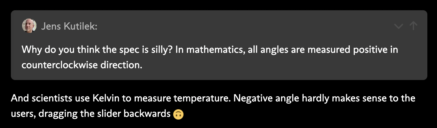
@John Hudson I appreciate your insights, and it seems important that an Arabic or Hebrew slanted font’s user would look at this differently. My understanding is that neither script uses slant very actively but I’m definitely not an expert.
But either way that’s not the spec’s reasoning. If true, simply going with counterclockwise because engineers think that way is an insane reason for this spec: both from a UX perspective (dragging a slider leftwards for obliques makes no sense) as well as for developers (remembering that the slant needs a negative value instead of a positive).
In the case of our GT Planar, the left-leaning retalics are supposed to have a positive number, and the right-leaning italics a negative number. I’m sure this makes sense on some spec level but I can’t really understand a defense of it in terms of real-life applications. Nobody would ever expect that to be the case.
So now I have to decide if I want to follow the spec or break user expectations.0 -
from a UX perspective (dragging a slider leftwards for obliques makes no sense)Again, this is assuming that the UX is dumb. A better UX for a slant variation would default to zero in the middle, and you would drag to the left to slant to the left, and to the right to slant to the right, and the user would never — should never — need to be aware of how the slant values are expressed internally in the font.So now I have to decide if I want to follow the spec or break user expectations.Fonts are technical tools used within complex technical frameworks, with dependencies that you might not be aware of when making such a decision. Sometimes, those technical frameworks are not great, sometimes they have bugs, and every time someone decides to use a hack to work around something that is broken or that they just don’t like, the situation gets worse. Breaking font interoperability because variable font UX sucks would not be helpful.2
-
As John pointed out: simply because most VF axis interfaces haven't been thought out (yet), it's a bad idea to compensate for this by intentionally going against the spec. What's more, if enough fonts adhere to the spec, developers will realise the need for correctly building their UX, as has happened in some cases with the ital axis (binary instead of interpolating 0–1), or the automatic linking of opsz values to point size.0


Categories
- All Categories
- 47 Introductions
- 4K Typeface Design
- 496 Type Design Critiques
- 582 Type Design Software
- 1.1K Type Design Technique & Theory
- 674 Type Business
- 891 Font Technology
- 29 Punchcutting
- 540 Typography
- 125 Type Education
- 333 Type History
- 82 Type Resources
- 113 Lettering and Calligraphy
- 33 Lettering Critiques
- 80 Lettering Technique & Theory
- 570 Announcements
- 100 Events
- 116 Job Postings
- 170 Type Releases
- 183 Miscellaneous News
- 270 About TypeDrawers
- 54 TypeDrawers Announcements
- 114 Suggestions and Bug Reports