New logo with a modified type: Luz de Luna. What are your thoughts?

Cristóbal Alarcón
Posts: 84
Hey Typedrawers! It's always nice to come back with a post. I might be back with logo design and for my very first comeback I did some adjustments to a typeface, so it could be appropriate for the client.
This time it's not really that much of a new typeface, but a modified one so it aligns more to the style I was looking for.
The client is called Luz de Luna (Moonlight), a cabin rental service. They were looking to be aligned with traditional, approachable and warm values. Traditional was the stronger one that could have a strong typeface direction.
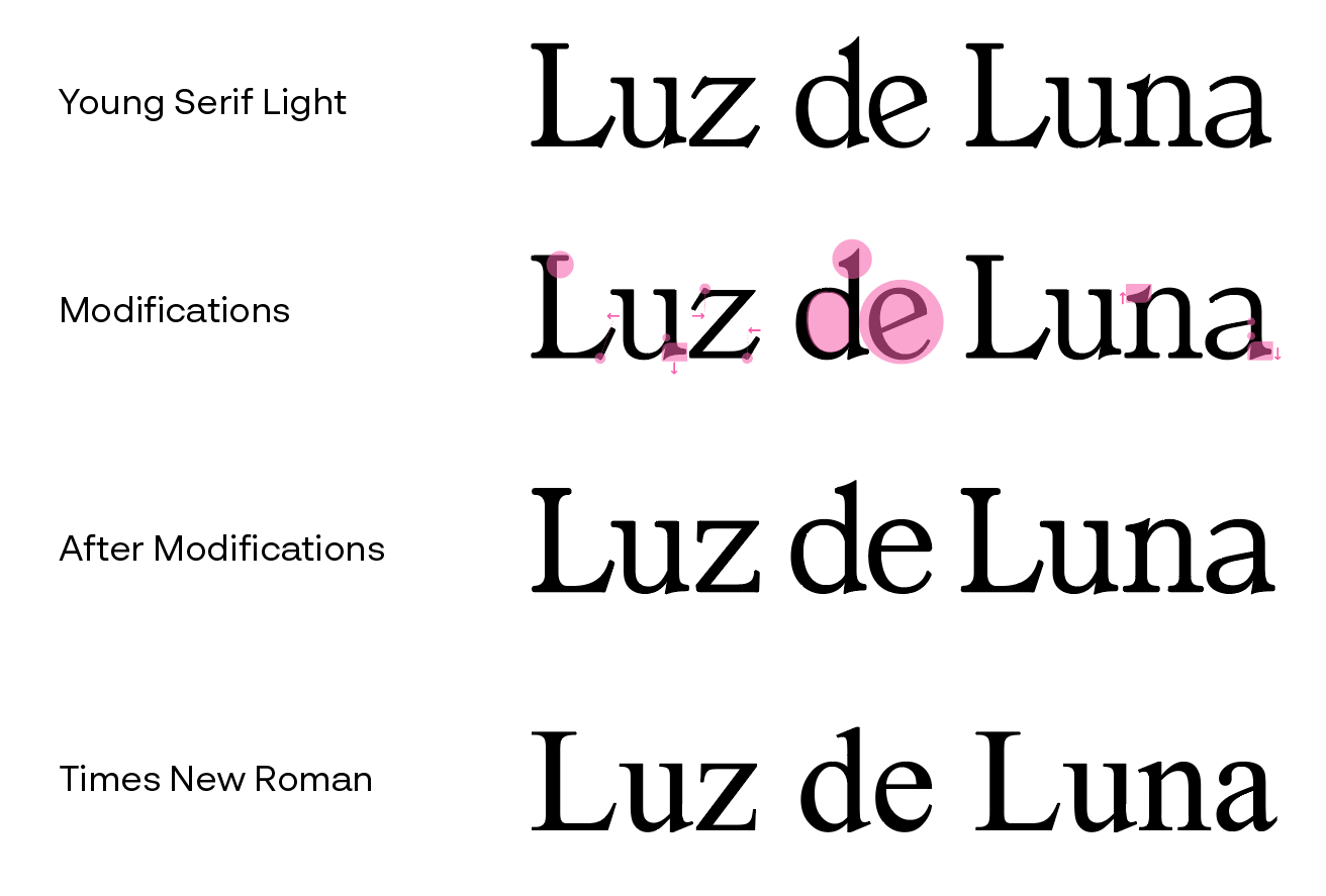
After defining the strategy the logo should be mainly a symbol, and the typeface should be as standard as possible. So, what was the most traditional and standard typeface I could think of? Times New Roman. Problem is that typefaces alike have too much contrast in its strokes, which is problematic for logos and for the legibility needed for the client.
Still, I found an alternative that felt close to what I needed, but I would have to make some adjustments so it doesn't steals the spotlight from the symbol.
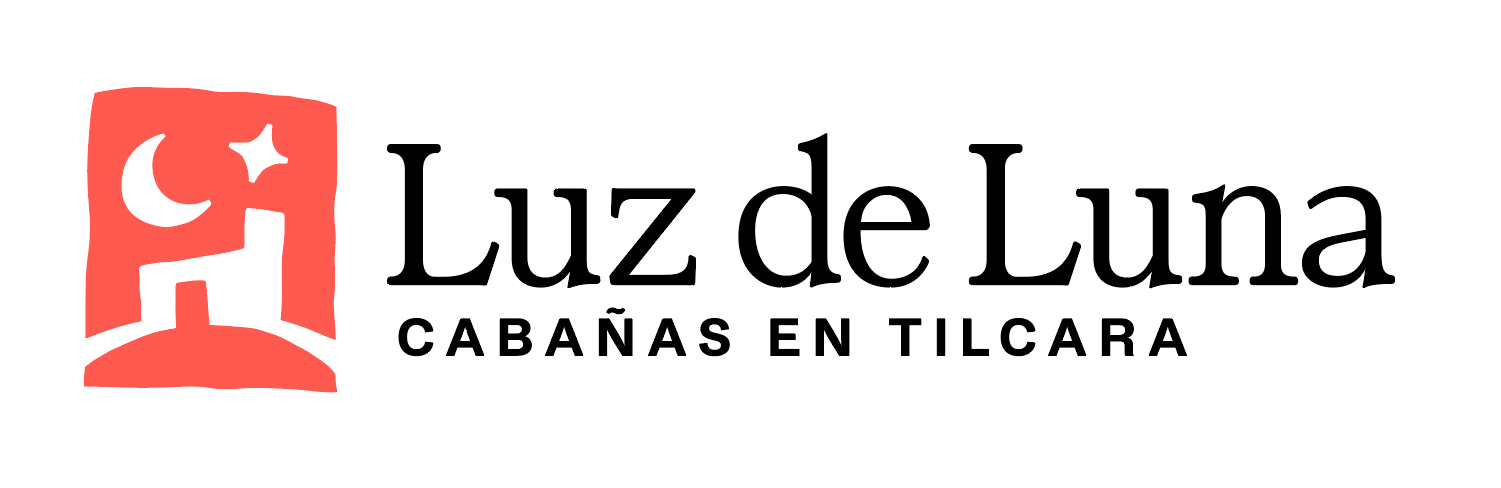
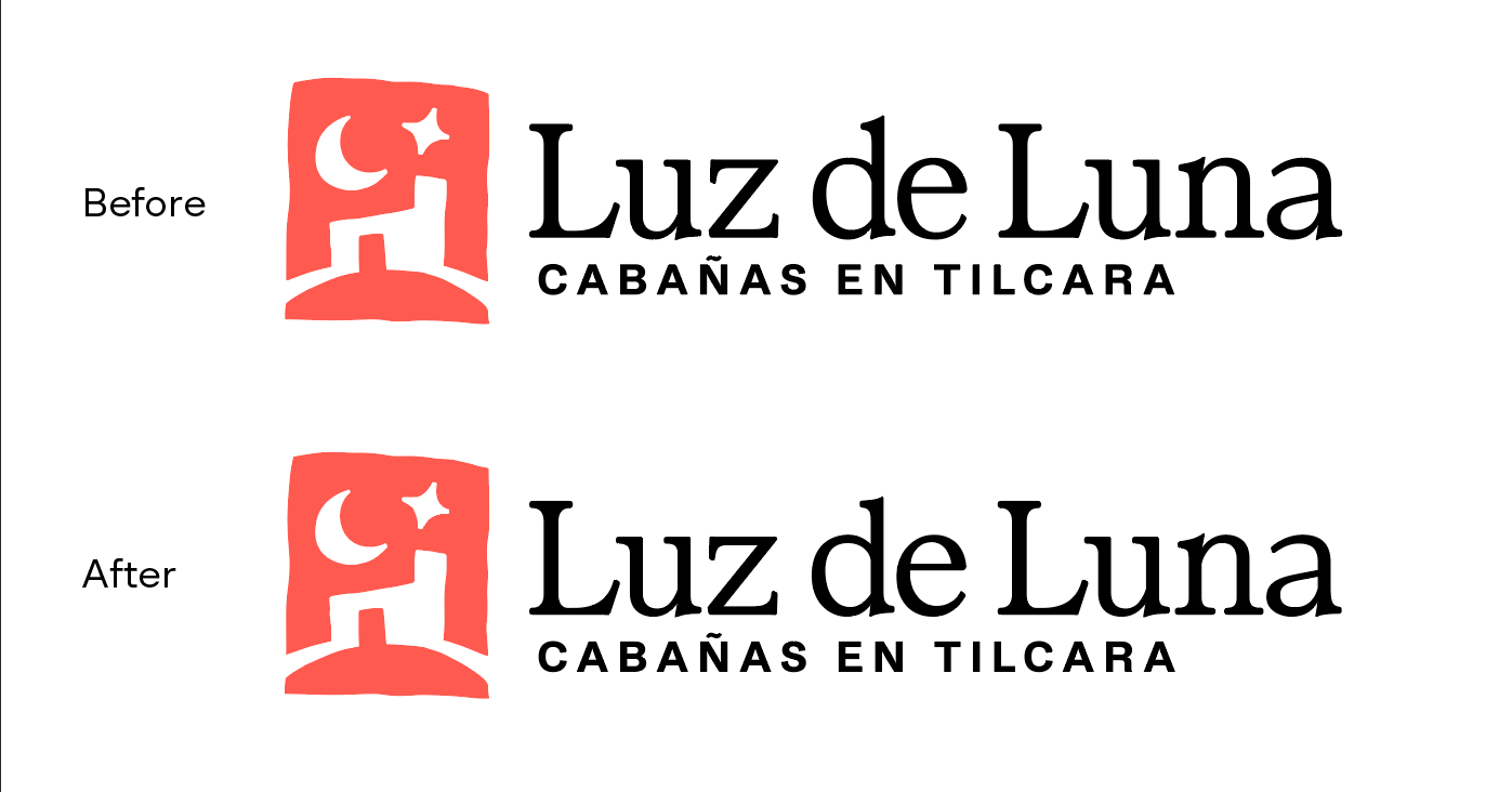
This is the logo
These are the adjustments I made. I know that type designers might jump at me but I did the unthinkable of also making the typeface thicker by just adding a thin stroke then expanding it. But hey, I'm running out of time and I'm not a type designer. This plus some kerning and word spacing.
Tagged:
0
Comments
-
Of the three words, the ‘de’ looks a little weaker than the others.I would add just a touch more weight to the lower terminal stroke of the e. Even though you have already made it heavier than in the source typeface, next to the word space it still creates an optical weak spot in the middle of the logotype. Similarly, you could also add a little more weight to the top of the bowl in the d, to balance better against the heavier bars of the nearby z.
2 -
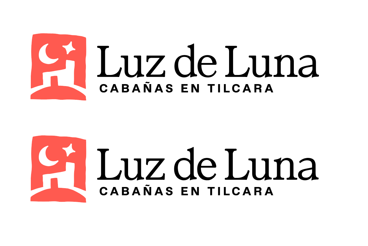
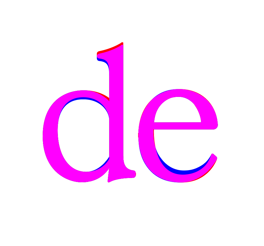
Changes done. Yeah the e looks much better now, although I'm not sure if I overdid it. I imitated somewhat what Times New Roman did to its e, balancing both the tail weight with the eye weight.
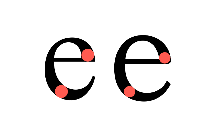 Here's a direct comparison between the two, (red=before, blue=after)
 0
0 -
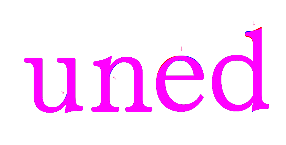
Made some additional changes, since thickening the upper d bowl joint with the stem letters u and n should also be thicker, I guess. Also changed the ascender d serif to match its lower serif, and leaned more to the right the angle of the top e stroke to look more like Times New Romans. Rounded a bit the edges of letters z and L leg serifs a tiny bit to match re roundness of all the other serifs.
 0
0 -
Off topic, but I'm trying to upload the PDF files in my comments multiple times but they don't seem to last long. They disappear after a few minutes.0

Categories
- All Categories
- 47 Introductions
- 4K Typeface Design
- 496 Type Design Critiques
- 580 Type Design Software
- 1.1K Type Design Technique & Theory
- 672 Type Business
- 889 Font Technology
- 29 Punchcutting
- 540 Typography
- 125 Type Education
- 333 Type History
- 82 Type Resources
- 113 Lettering and Calligraphy
- 33 Lettering Critiques
- 80 Lettering Technique & Theory
- 570 Announcements
- 100 Events
- 116 Job Postings
- 170 Type Releases
- 183 Miscellaneous News
- 270 About TypeDrawers
- 54 TypeDrawers Announcements
- 114 Suggestions and Bug Reports