New logo with a modified type: Luz de Luna. What are your thoughts?

Cristóbal Alarcón
Posts: 96
Hey Typedrawers! It's always nice to come back with a post. I might be back with logo design and for my very first comeback I did some adjustments to a typeface, so it could be appropriate for the client.
This time it's not really that much of a new typeface, but a modified one so it aligns more to the style I was looking for.
The client is called Luz de Luna (Moonlight), a cabin rental service. They were looking to be aligned with traditional, approachable and warm values. Traditional was the stronger one that could have a strong typeface direction.
After defining the strategy the logo should be mainly a symbol, and the typeface should be as standard as possible. So, what was the most traditional and standard typeface I could think of? Times New Roman. Problem is that typefaces alike have too much contrast in its strokes, which is problematic for logos and for the legibility needed for the client.
Still, I found an alternative that felt close to what I needed, but I would have to make some adjustments so it doesn't steals the spotlight from the symbol.
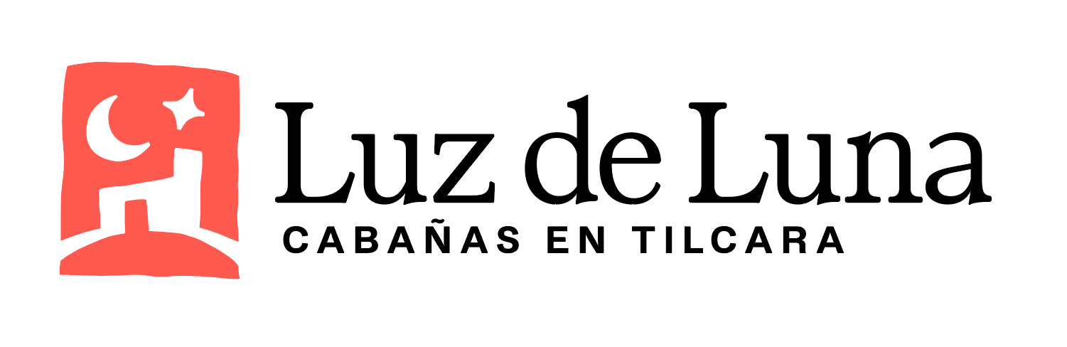
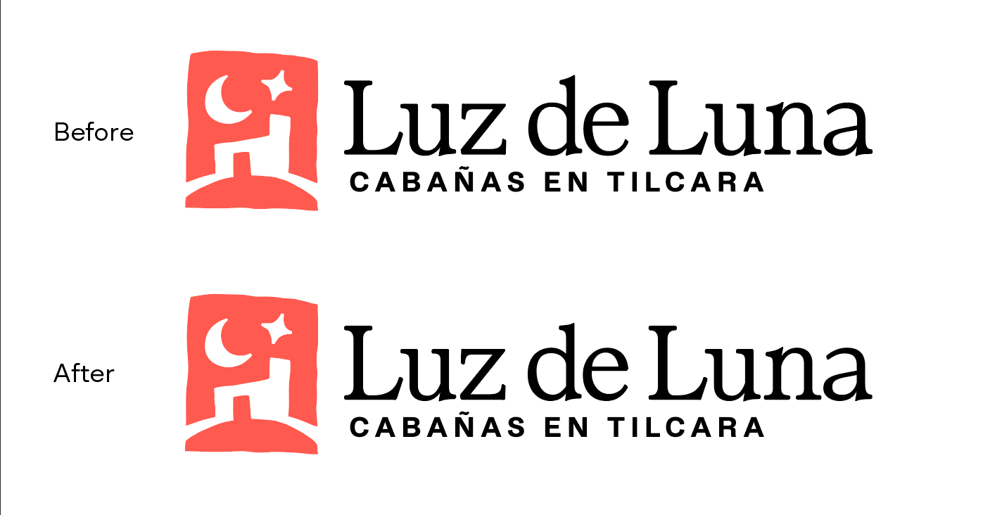
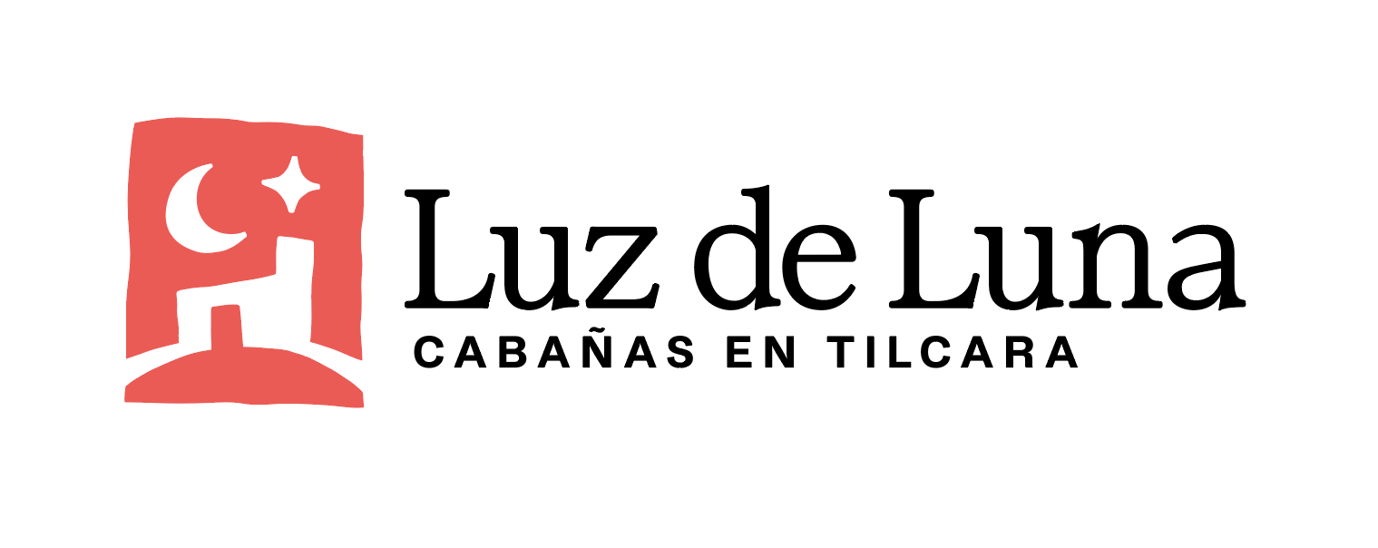
This is the logo
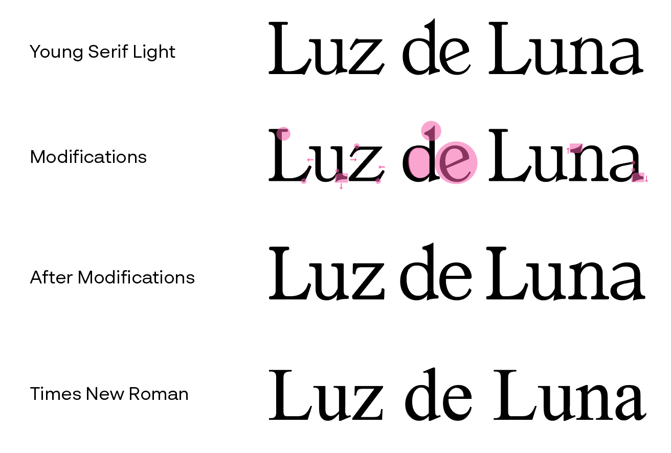
These are the adjustments I made. I know that type designers might jump at me but I did the unthinkable of also making the typeface thicker by just adding a thin stroke then expanding it. But hey, I'm running out of time and I'm not a type designer. This plus some kerning and word spacing.
Tagged:
0
Comments
-
Of the three words, the ‘de’ looks a little weaker than the others.I would add just a touch more weight to the lower terminal stroke of the e. Even though you have already made it heavier than in the source typeface, next to the word space it still creates an optical weak spot in the middle of the logotype. Similarly, you could also add a little more weight to the top of the bowl in the d, to balance better against the heavier bars of the nearby z.
2 -
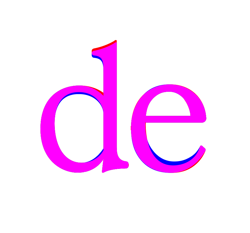
Changes done. Yeah the e looks much better now, although I'm not sure if I overdid it. I imitated somewhat what Times New Roman did to its e, balancing both the tail weight with the eye weight.
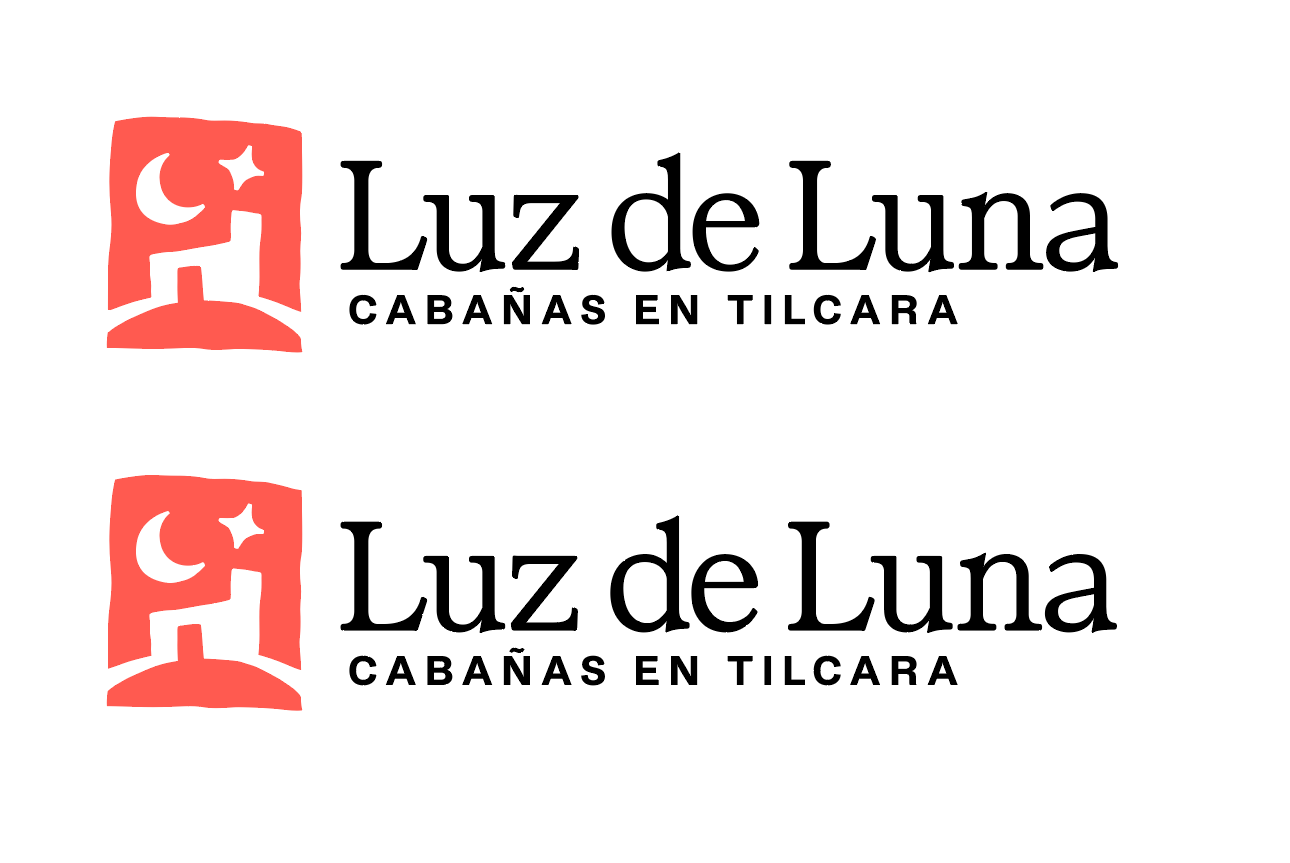
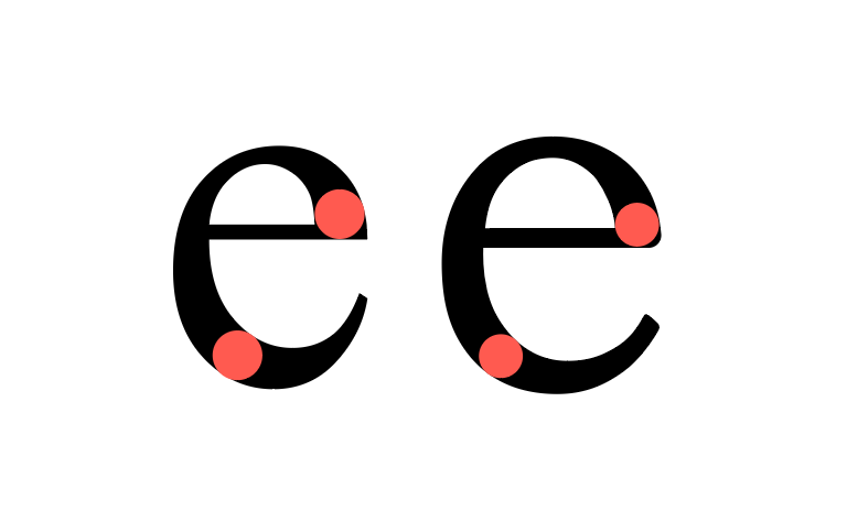 Here's a direct comparison between the two, (red=before, blue=after)
 0
0 -
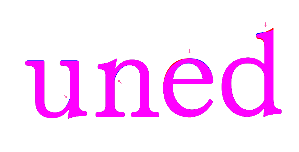
Made some additional changes, since thickening the upper d bowl joint with the stem letters u and n should also be thicker, I guess. Also changed the ascender d serif to match its lower serif, and leaned more to the right the angle of the top e stroke to look more like Times New Romans. Rounded a bit the edges of letters z and L leg serifs a tiny bit to match re roundness of all the other serifs.
 0
0 -
Off topic, but I'm trying to upload the PDF files in my comments multiple times but they don't seem to last long. They disappear after a few minutes.0
-
There is better balance across the whole word mark now, but I do think your revised e is a little less interesting or that you have, as you say, over done it. This is an awkward word mark, because the preposition ‘de’ is the least important word, but also where the eye sits when looking at the mark as a whole. The letter e in that position has a big impact on the look and feel of the whole, and I think your revised shape is a little too generically that of a text face like TNR. I would try keeping the original form and just strengthen the bottom terminal stroke along its length a bit.0
-
I should add that actually making it less interesting is the goal, since I want the all the attention to go towards the symbol. I do think it's kind of an awkward name since there are three words, I could stack "Luz de" on top of "Luna" to reduce how much "de" calls for attention, but that would go against the main context the client needs the logo to be used on (carved wood sign).What do you think? Should I keep these last changes now knowing this additional information?0
-
I would still be inclined to make the lower bowl of the e slightly less heavy than you have it in the lower left quadrant. It looks a bit too dominant relative to the same area in the a d and u (this is also the case in TNR, but that is a text face referencing particular historical forms, not a word mark where things benefit from balance).1
-
The symbol’s cute, at any rate!0
-
Oh yeah, I see what you mean now. Although I feel like thinning it makes looses a bit the flow it had before.
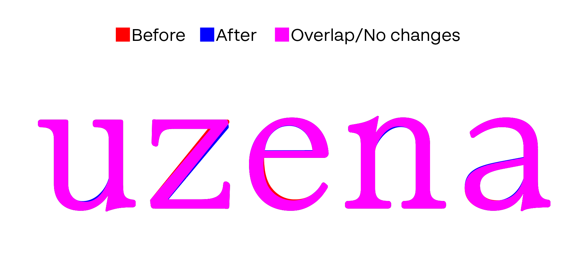
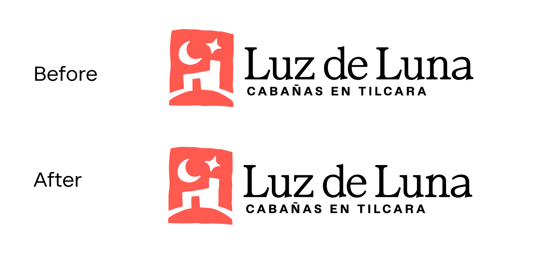 Taking into consideration about what you said about balance I also made an attempt that the other a and u bowls, the top curve of the e and the n shoulder are more consistent with d bowl. I retouched the top right part the z as well to be the same as it's lower left counterpart.
 0
0 -
Christian Thalmann said:The symbol’s cute, at any rate!Thank you! You know, although it's a compliment it's been something that people have been saying when looking at it. Which is amazing! But for this client in particular it's making me a bit un-easy that it could be perceived as cute. Cuteness is super approachable, but also I don't have to forget the other core value Traditional, and that's something I don't think is aligned with cuteness. Besides that, the typeface isn't meant to be that cute as well. I'm not trying to achieve the same formality as TMR, but it should be a good looking and readable wordmark.I might tone down a bit the quirkiness of the symbol, probably making the moon and the star less angled.0
-
Well, it does make me think of an adobe-built pueblo. Just in a cute way. I don't think that's a bad thing...And the font is certainly less formal than TNR, but that's also a good thing.1
-
Oh no I didn't meant it was a bad thing. It's more about how appropriate would be for the brand that their logo is perceived that way. Anyhow, I'll draw a bit less quirky alternative and let them choose.0
-
Try the bowl of the e somewhere between the two versions.The n is very slightly too narrow. The counter of the n should be a little wider than that of the u, because it has two internal serifs rather than one. The a is relatively generously proportioned, so the n looks narrow next to it.1
-
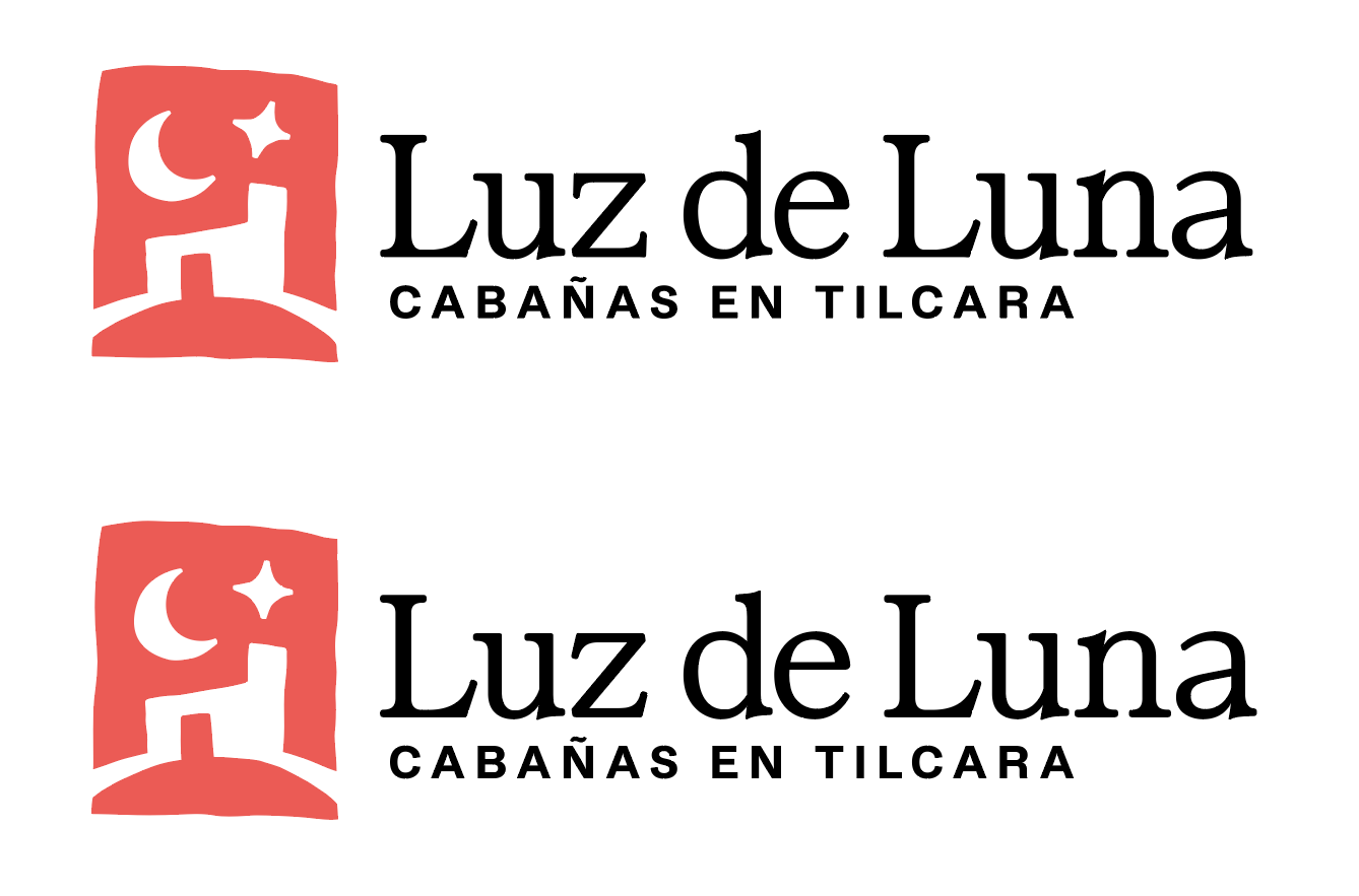
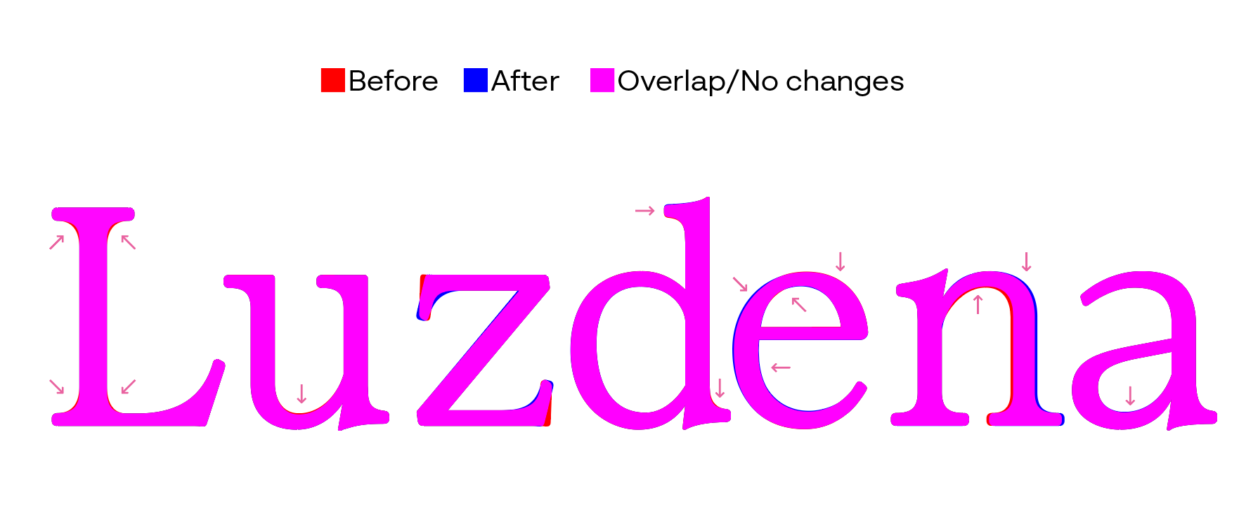
I think this might be the final version. Changes:- All serifs now should look more look alike- u counter thinned a tiny bit- z reverted to angled legs, so it looks more consistent with L leg. The straight alternatives started to generate tension to my eyes.- d redraw a bit ascender serif- e main stem redrawn to be ticker. I noticed it felt kinda thin compared to the rest of the letters stems. Attempted to find a middle point as suggested.- n letterform widened a bit (if I understood correctly)- a bottom part of the bowl thinned a tiny bit.- Symbol moon and star angles changed.
 0
0 -
Cristóbal Alarcón said:- z reverted to angled legs, so it looks more consistent with L leg. The straight alternatives started to generate tension to my eyes.
Another option would be to make the L leg serif more vertical—I don't think that angle pushing off the u's is particularly happy.0 -
The terminals on the z look good; you could adjust that of the L to be a similar angle, i.e. slightly steeper.I would make the ascender serif of the d a little longer, perhaps similar in length to those on the u. There is a lot of white space up there, so you can afford a less petit serif.0
-
Craig Eliason said:
Another option would be to make the L leg serif more vertical—I don't think that angle pushing off the u's is particularly happy.I did try with a more vertical serif, but to me it would feel "too office looking". Despite the angled serifs stealing some of the attention that should go to the symbol I felt that removing them would also diminish that legacy feel I was looking from Times New Roman. Here's how that L would look like with the latest changes, reverting also the z to the previous vertical serifs.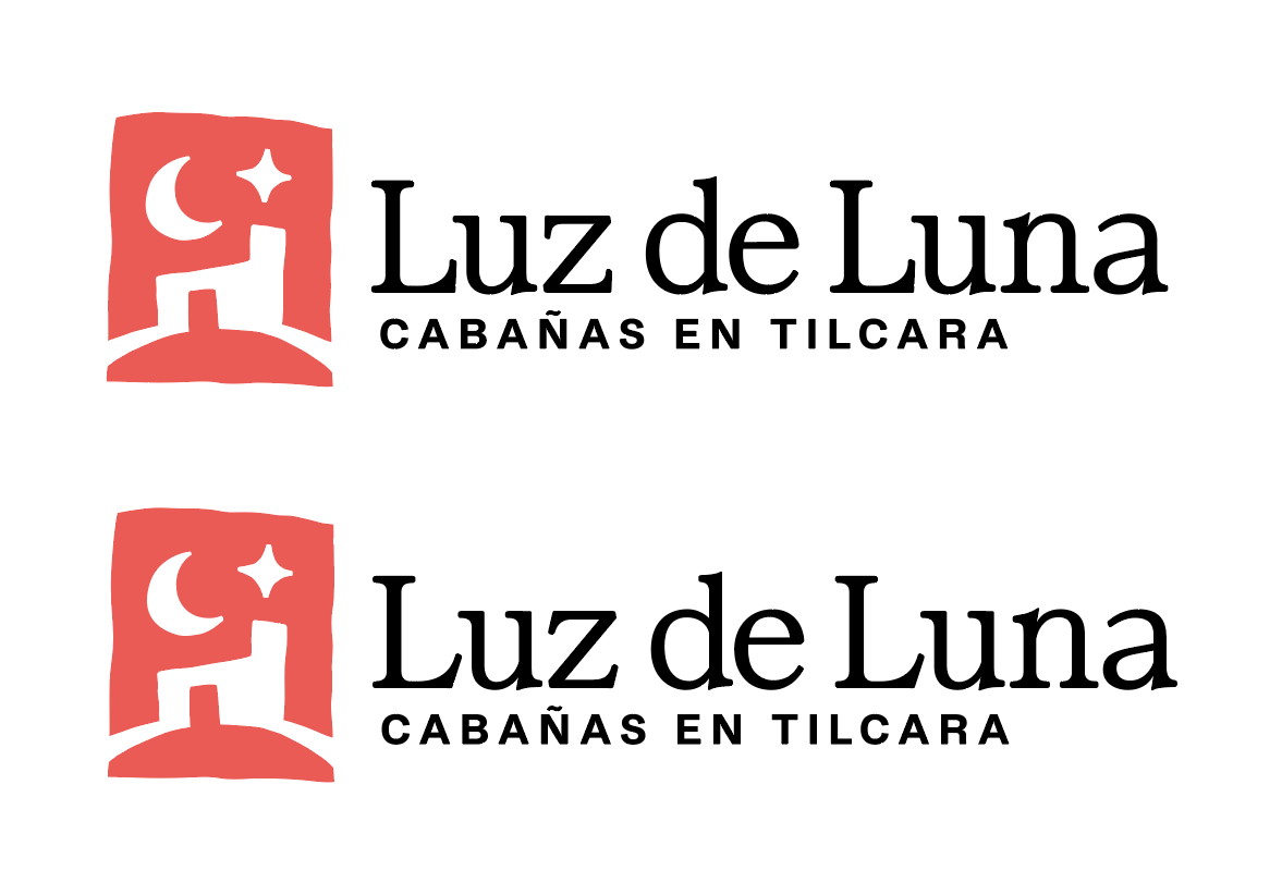 1
1 -
John Hudson said:I would make the ascender serif of the d a little longer, perhaps similar in length to those on the u. There is a lot of white space up there, so you can afford a less petit serif.Yeah, I was noticing that after uploading.
z serifs are in fact less steeper than L ones. I figured they looked balanced that way, do I really need to steepen it more?John Hudson said:The terminals on the z look good; you could adjust that of the L to be a similar angle, i.e. slightly steeper.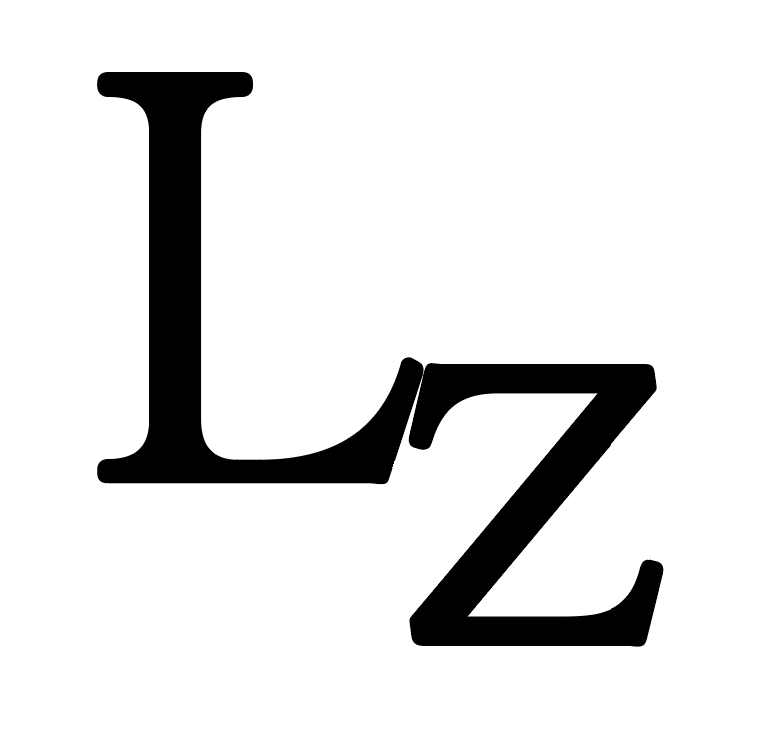 0
0 -
Think about it in terms of angle of thrust, which is not the outer straight edge of the terminal but a line through the dynamics of the terminal. In the L, this is affected by the longer, smoother inner curve.
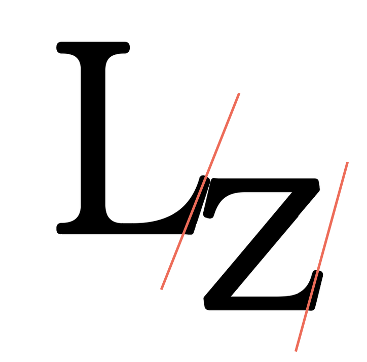 You could shift the tip of the L terminal just slightly to the left so that the angle of thrust is a little steeper, and closer to that of the z.That said, I also quite like your version with the vertical terminals: they bring something of the graphical quality of the image into the word mark.
1 -
I do like the versions with vertical serifs, but the versions with diagonal serifs it's more aligned with the brief.Here's the final exported version with L serifs a bit more steeper as suggested, already sent for the client to use. Thanks @John Hudson for all your guidance! And Craig and Christian for participating as well.
 2
2 -
Good stuff! I agree that the vertical leg serifs for L don’t work; it needs that bit of funk to match with the non-orthogonal design in the graphic.1


Categories
- All Categories
- 47 Introductions
- 4K Typeface Design
- 497 Type Design Critiques
- 591 Type Design Software
- 1.1K Type Design Technique & Theory
- 674 Type Business
- 907 Font Technology
- 29 Punchcutting
- 544 Typography
- 129 Type Education
- 333 Type History
- 82 Type Resources
- 114 Lettering and Calligraphy
- 33 Lettering Critiques
- 81 Lettering Technique & Theory
- 580 Announcements
- 101 Events
- 116 Job Postings
- 176 Type Releases
- 186 Miscellaneous News
- 270 About TypeDrawers
- 54 TypeDrawers Announcements
- 114 Suggestions and Bug Reports