img2bez: Raster-to-Vector Autotracing for Type Design

Eli Heuer
Posts: 11
https://elih.net/blog/img2bez/
I have a new blog post draft explaining the img2bez Rust crate I made for my Runebender forks and the open-source font AI solo startup/project I am working on. This is still a draft I am editing, and I will be running eval loops with AI agents all weekend improving the algorithms. I am posting it here looking for feedback before I publish the final version Monday, any substantial feedback will be credited at the end of the blog post.
I have a new blog post draft explaining the img2bez Rust crate I made for my Runebender forks and the open-source font AI solo startup/project I am working on. This is still a draft I am editing, and I will be running eval loops with AI agents all weekend improving the algorithms. I am posting it here looking for feedback before I publish the final version Monday, any substantial feedback will be credited at the end of the blog post.
I think it is a real breakthrough in this space and gets better results than any existing procedural autotracer, but I am looking for and open to criticism and feedback about why this is not better than existing solutions.
The blog post has an interactive demo of img2bez, compiled from Rust to WASM. So you can try it right in the blog post and even drag your own glyph images into the demo to trace them.
Tagged:
1
Comments
-
Hi Eli. Do you have any recommendations for input image to get best results. I did a quick test with this image:
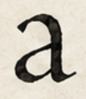 and the results are pretty bad: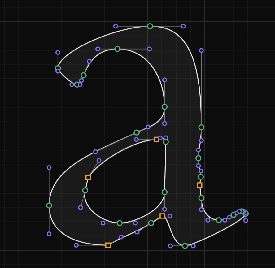
0 -
I've tried it on a few glyphs and I'm not sure I'm seeing it significantly improve results over the native potrace. is it trained to work on specific types of fonts? Here is a comparison of the native traced glyphs and then the img2bez traced glyph below:
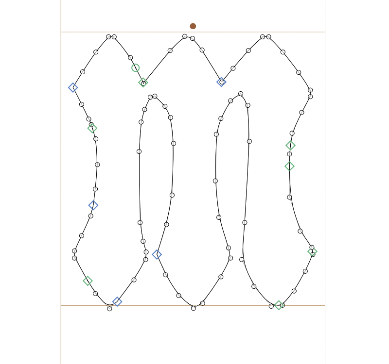
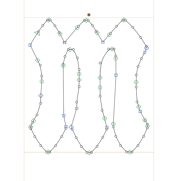
Here's also a comparison of the two fonts (first traced with potrace and some cleanup, second traced with img2bez)
1. https://static.mixfont.com/assets/20260626-184828-gothicgumdrop-regular-blz2sd9n.ttf
2. https://static.mixfont.com/assets/20260626-184825-gothicgumdrop-regular-img2bez-opl2uqy9.ttf
I'm personally very interested in this as my recent font submission to Google fonts was denied not due to AI generation policies or the design of the font but rather due to outline tracing quality. If there was a way to improve the tracing so that the submission could be improved, it would be very helpful.0 -
While neither outline is great, the one produced by Eli’s tool has done a better job placing on curve points at extrema, while the potrace example has long and inflected curves without any on curve points, e.g.
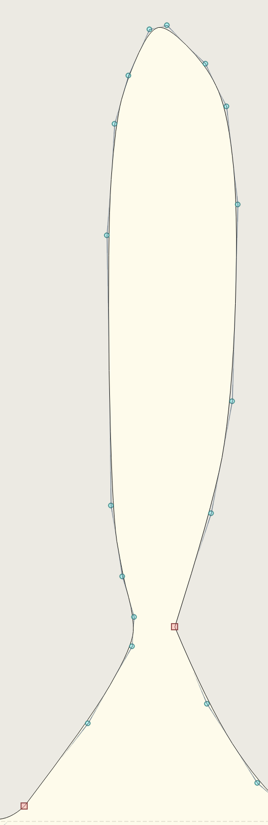 My impression is that Eli’s approach to structured outlines is heading in the right direction, but still suffering in the shape fidelity department as per my test.
0 -
Here's GlyphTracy's effort:
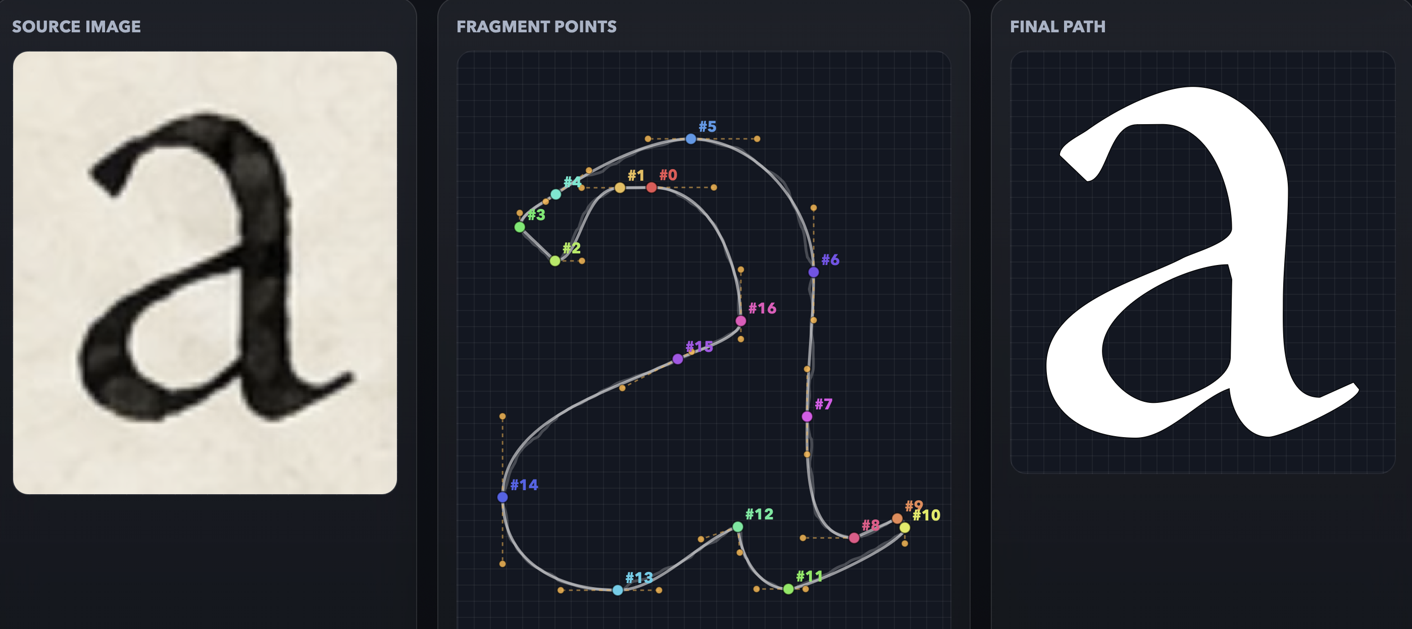
I think img2bez is pretty good - certainly better than potrace/autotrace. Working out what is image noise and what is desirable signal is a tricky problem. (We get a faithful reproduction of the pinch at the top left, but we don't get a faithful reproduction of the blobbyness of the outer curve on the top right. How does a computer know what is wanted and what is unwanted?) Doing so automatically, without having a human in the loop to manually tweak the settings, is extremely tricky.0 -
Instinctively, I think it must be necessary to average out wobbliness over the length of a curve, in order to capture the signal under the noise —, and this means being able to segment beginnings and ends of curves, which is where extrema identification and marking comes in useful at the trace stage and not just as a nicety of final font outlines. This suggests something iterative: first identifying where extrema or inflection points are, which may involve some averaging also to account for noise around those locations, and then averaging of the path between those locations to come up with curves or lines having the minimal number of points.It looks like GlyphTracy is doing something like this. Where it is running into difficulties seems to be at corners and flex locations, e.g. fragment points #16 and #15 in your image.0
-
These seem better than what a rank beginner can do, but far from what a typical person can do after a 5 day, 8h day, "introduction to type design" workshop can do...
 3
3 -
What I like is an autotracer that does the OTHER steps besides tracing: identification of letters, understand baseline, chops them into separate pieces, drops them into slots in my font editor…
…and then lets me do the tracing because it still sucks at tracing.
FontLab 8 does those other steps, and then I just delete its autotrace and do my own manual tracing. I used to do the same thing with ScanFont back in the day.8 -
My old Scanfont 3.13 still works in the current version of Windows. I still use it when I need to autotrace something. You have to export 1-bit bmp from Photoshop with the colors inverted.0





Categories
- All Categories
- 47 Introductions
- 4K Typeface Design
- 497 Type Design Critiques
- 591 Type Design Software
- 1.1K Type Design Technique & Theory
- 674 Type Business
- 906 Font Technology
- 29 Punchcutting
- 543 Typography
- 128 Type Education
- 333 Type History
- 82 Type Resources
- 114 Lettering and Calligraphy
- 33 Lettering Critiques
- 81 Lettering Technique & Theory
- 579 Announcements
- 101 Events
- 116 Job Postings
- 175 Type Releases
- 186 Miscellaneous News
- 270 About TypeDrawers
- 54 TypeDrawers Announcements
- 114 Suggestions and Bug Reports