Richard: A Dutch text face


Comments
-
I hate to be a killjoy, but this bears as much resemblance to Lexicon as did Roy Preston’s Prentis — for which Roy was publicly accused of plagiarism and widely vilified and which TEFF forced him into an agreement to never distribute.
So, you may want to proceed very carefully with this.3 -
I never noticed it when I saw this font one in bits and pieces, but Kent is right, this is too close to Lexicon. If I were you I would write this design off as a learning experience and leave it in a drawer. You aren’t going to make any friends by releasing this, especially if you release it as a Google font.1
-
Thank you both very much.
@Kentlew: You're not a killjoy, you're right. Lexicon went from being a source of inspiration, to being my only source of inspiration, which I'm sorry for. As a result, it has become somewhat of a revival, which was not my intention at the start, and would be a shameful thing to release. Wether or not TEFF would have a problem with this doesn't interest me. I just want to make original typedesigns, so I'll change direction. Just out of curiosity, do you have any sample material of Prentis, I can't find it anywhere...
@Dunwich: You didn't notice it at first, because it gradually shifted more and more towards Lexicon, but started as a relatively original typeface. I won't release it, as it is now, but I don't think I need to leave it in the 'drawer' entirely. I just have to make some major changes in the design direction and get Lexicon out of my head.
Thanks again. I'm aware of the fatc that this could have caused me a lot of trouble...0 -
Underneath are two options to move away from Lexicon. The top is a an adaptation of the latest version of Richard, being widened, softened and altered of shape, moving in a more classic (garamond, etc.) direction. The bottom is an older version of Richard, which has a lot more originality and has a more slab-like feel to it. I'm not sure as to what direction I'll take (perhaps both), but I just wanted to share this with you. Cheers! jasper
 0
0 -
do you have any sample material of Prentis, I can't find it anywhere...
Because of the fiasco, just about all traces have been excised. TEFF still has this up, but it is lo-res and difficult to see details (which may have been strategic on their part).
Roy also attempted to revisit the Prentis outlines and move them further from Lexicon. But it was hard to shake loose, and I don’t think he ever really succeeded in getting out from Lexicon’s shadow. If I were you, I’d set this aside for at least a year to get some distance and perspective. Then see if it still pulls at you.
0 -
That's quite nice actually. Better than Lexicon, from what I can see of it.0
-
The user and all related content has been deleted.0
-
They all look the same to me. Isn't this style beaten to death already?
Can’t that be said of most type styles?1 -
There were plenty of important differences to be seen, and many things to recommend Prentis (and the later versions) over Lexicon. But the similarities remained. And the dust-up with TEFF soured the whole thing.
Roy always maintained that there was no intent at plagiarism and that he started from scratch. I believe him. He was always forthcoming about his inspirations.
I hope he will forgive me for relating publicly as much as I have, since I know he has struggled to put the whole incident behind him. I bring the whole thing up mostly as a cautionary tale.
0 -
Seems a little harsh to dismiss Lexicon as another example of a style that's been beaten to death. I always considered Lexicon one of the seminal typefaces on which the style was based.0
-
The user and all related content has been deleted.0
-
The user and all related content has been deleted.0
-
What ever happened to Roy? He sort of disappeared after that incident.
Well, the whole affair was a bit disheartening, as you can imagine. Also, I think he had some health issues. We lost touch.
But I guess he’s still around. He published Prenton (which I’m pretty sure grew out of the sans component of Prentis) through some group called BluHead.
0 -
The user and all related content has been deleted.2
-
I think I solved the problem, but before I get all crazy and enthousiastic with my simple (obvious) solution, I'd like to know what you think of it. I had simply forgotten that the roots of Richard lie in Sensato. It started out as Sensato Serif, and quickly moved away. Could I bring them back together?0
-
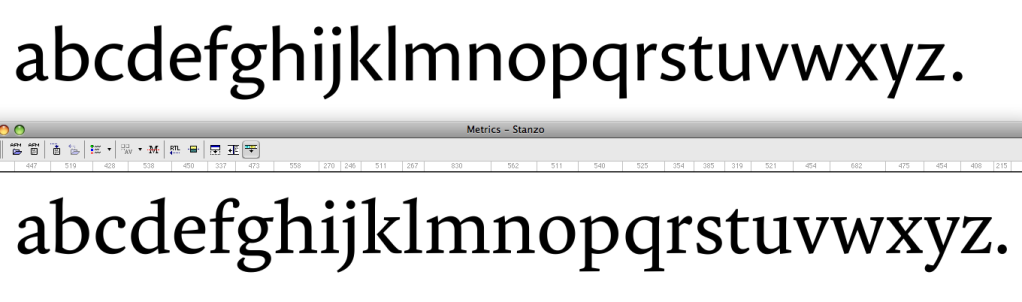
Ok, image didn't work. It's here: http://www.flickr.com/photos/designtown/6969991066/in/photostream/lightbox/
By the way, why won't typedrawers allow me to upload actual png/jpg files, instead of linking to another page? I used to link to the typophile.com page, but typophile won't let me upload pics anymore so this will have to do :-(0 -
Typedrawers doesn’t host images. It’s a limit of the hosting service.0
-
Put your images on iCloud, and link to them there.
You should change how you get inspiration.
Go for the idea, not the execution, and as James M says, don’t look at other people’s work! (Or if you do, only to make sure you walk down the opposite path).1 -
Here we go stereo.0 -
It’s bland and lacking in personality at the most fundamental level, that of shape and proportion.
You can fidlle with serif details for ever and not change that.
If the premise of being “Dutch” is the underlying broad-nibbed pen, why not base your style on your writing with such an implement? That way, it at least stands a chance of representing some of your own unique physical personality.
4 -
What can I say? I disagree. Being 'bland' is not a problem per sé. It's no longer Dutch, because it's no longer Richard, but Sensato Serif. I just didn't find a way to edit the first post. I believe it has enough character to work as display and text font, be it in its skeleton or in the details. It's not Lexicon, but that's a good thing.0
-
It is foolish to request a critique and then argue with the critic.8
-
When you started Sensato, what was it that made you want to make the typeface? What would you say defines it from others in the same genre?0
-


Sensato Sans, Cronos1 -
@Butterick: So I should just agree with all critique I'm given? I am grateful for all feedback I get, but I have my own mind too, you know.
@James Todd: Sensato started here as Garamond Sans: http://www.typophile.com/node/77210 With tons of similar revivivals of Garamond I didn't see any harm in loosely basing a sans-serif on it. As I started cleaning it up more and more, it moved towards its current state, away from Garamond. However, Garamond has remained my main source of inspiration. Sensato is Sensato because of: 1. Clearly visible stroke contrast 2. Humanist all the way, instead of a humanized modernist 3. increase in contrast in darker weights 5. Large Cap height 4. Legible in text, and elegant at display size.
@Stephen: Thanks for the comparison. I made it myself before, and decided there was enough distance between the two. What matters most is that I didn't look at Cronos any more than most other humanist sans' types, during the design of Sensato. You will also find that the italic, darker weights and uppercase letters of Cronos don't look like Sensato at all.
Sensato is my own design, with roots in Garamond. I worked long and hard on it, and I refuse to stop it's development because there are some similarities with other typefaces. If you're really upset about people copying each others fonts, compare Gotham and Proxima Nova and tell my why nobody seems to mind that.
0 -
I didn't suggest you stop its development. I'm just making a comparison that others will surely make if you choose to release this typeface. You decide what kind of designer you want to be. Your reputation will follow you.1
-
Gotham and Proxima Nova each have their own story despite coming to similar conclusions. Mark Simonson created Proxima first. Tobias Frere-Jones drew Gotham from very different sources.
You are not Tobias Frere-Jones. That's fine. You're young. Take it slow. Once you have proven yourself as an original type designer then you can get the benefit of the doubt when you create work that is this similar to existing designs. But don't expect that treatment right away.4 -
The user and all related content has been deleted.4
-
@1996type It is foolish to request a critique and then argue with the critic — who suggests you should not argue with the critic — about whether you should argue with the critic.2
-
0


![[Deleted User]](https://secure.gravatar.com/avatar/4a64fb71566d0b4e56fb2a244524664c/?default=https%3A%2F%2Fvanillicon.com%2F83f6992ca487b67bd3dd7df96e236fc1_200.png&rating=g&size=200)


Categories
- All Categories
- 47 Introductions
- 4K Typeface Design
- 493 Type Design Critiques
- 576 Type Design Software
- 1.1K Type Design Technique & Theory
- 669 Type Business
- 884 Font Technology
- 29 Punchcutting
- 537 Typography
- 124 Type Education
- 332 Type History
- 81 Type Resources
- 113 Lettering and Calligraphy
- 33 Lettering Critiques
- 80 Lettering Technique & Theory
- 569 Announcements
- 100 Events
- 116 Job Postings
- 170 Type Releases
- 182 Miscellaneous News
- 270 About TypeDrawers
- 54 TypeDrawers Announcements
- 114 Suggestions and Bug Reports