Three Imprints

konrad ritter
Posts: 204
in Type History
Not sure this belongs in history of typography, but I didn't know what the exact nature of it would be. Here goes.
Imprint, the 1913 face by Meynell and his associates, has been digitized in three versions. I personally like the URW cut. It's tight, more legible than the other two (MT and Bitstream), and it tones down the Caslonic look of its origin.
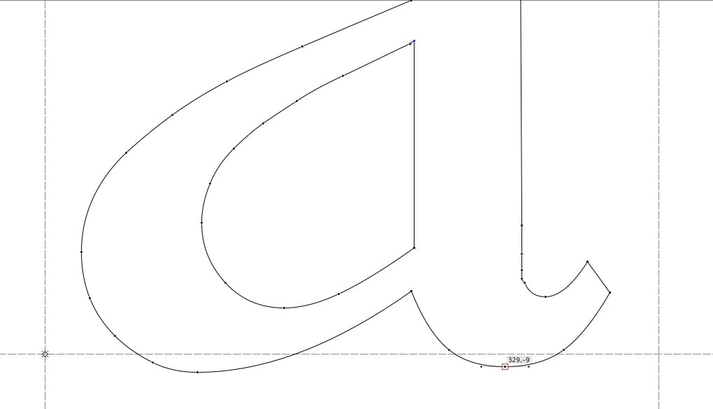
However, the URW digitization seems to me very peculiar. Most of the lowercase has unequal x-heights. Some of the 'flavor' glyphs come down below the baseline very unequally. Examples. Here's /a/.
Here's /s/

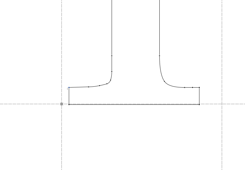
Two other glyphs, even stranger. The bottom halves of /i/ and /n/.

To make a long story short, I posted this to ask a question: is this an accident of sloppiness or haste by the folks at URW? Or was there some kind of typographic wisdom behind these slip-ups that I just don't get? Some kind of a secret idea that makes their cut better than MT's or BT's Imprint?
In particular, I'd like to ask: does this /v/ look right to you? Or was it supposed to go down lower beneath the baseline?

Imprint, the 1913 face by Meynell and his associates, has been digitized in three versions. I personally like the URW cut. It's tight, more legible than the other two (MT and Bitstream), and it tones down the Caslonic look of its origin.
However, the URW digitization seems to me very peculiar. Most of the lowercase has unequal x-heights. Some of the 'flavor' glyphs come down below the baseline very unequally. Examples. Here's /a/.
Here's /s/
Two other glyphs, even stranger. The bottom halves of /i/ and /n/.
To make a long story short, I posted this to ask a question: is this an accident of sloppiness or haste by the folks at URW? Or was there some kind of typographic wisdom behind these slip-ups that I just don't get? Some kind of a secret idea that makes their cut better than MT's or BT's Imprint?
In particular, I'd like to ask: does this /v/ look right to you? Or was it supposed to go down lower beneath the baseline?
0
Comments
-
Unexpected, but evaluating whether this is a mistake (and speculating on reasoning) should come after seeing the effect of set text (i.e. filled letters in sequence with no baseline drawn). Did you spot the misalignment just reading the text, or only in examining the file?
I can't say I've designed overshoots that follow these patterns, but I can say that overshoots are a signature instance of where designers have to trust their eyes rather than calculated strategies that seem like they'd produce consistency but don't.3 -
Regarding a and s, sometimes a doesn’t go as far below the baseline as other round shapes because with two areas going below the baseline it doesn’t need to descend as far.
As for the miscellaneous bad details it’s probably sloppy work cranked out quickly during the rush to digitize old type. You’ll find lots of slop if you inspect early digital fonts.4 -
Thank you, both. This is very helpful.
Honestly, in set text, it looks fine to me. Only on close inspection do you see those oddities. Anyway, I wasn't going to make a big deal out of them until I looked at the other two digitizations, which are very even across the alphabet. Then I thought that maybe the artist at URW had a better eye, so I thought I should ask the experts.
On a broader note, I used to think all the overshoots ought to be at the same height/depth, until I looked at DTL van den Keere, which is very uneven, and yet it works wonderfully. So, I discarded that dogma.0 -
Thank you, both. This is very helpful.
Honestly, in set text, it looks fine to me. Only on close inspection do you see those oddities. Anyway, I wasn't going to make a big deal out of them until I looked at the other two digitizations, which are very even across the alphabet. Then I thought that maybe the artist at URW had a better eye, so I thought I should ask the experts.
On a broader note, I used to think all the overshoots ought to be at the same height/depth, until I looked at DTL van den Keere, which is very uneven, and yet it works wonderfully. So, I discarded that dogma.
0 -
Regarding the sloppiness, one thing that may have been a factor is the primitive state of computers and output devices at the time. They were very slow and displays were not very high resolution. It may be that after weighing the costs and benefits of correcting small discrepancies, it wasn't worth the time and effort, that it wouldn't be visible in the final output.5
-
That’s right. And in this case it also seems some lines were generated by some kind of automatic tracing or the like (see the uneven and arbitrary number of points).Mark Simonson said:Regarding the sloppiness, one thing that may have been a factor is the primitive state of computers and output devices at the time. They were very slow and displays were not very high resolution. It may be that after weighing the costs and benefits of correcting small discrepancies, it wasn't worth the time and effort, that it wouldn't be visible in the final output.
But it can still happen to find professional fonts with, for example, (very slightly) inconsistent stem weights. Not when they are applied for some optical compensation, I mean.1 -
As a matter of fact most fonts overshoot the bottom of glyphs below the baseline. There is some good practice which characters overshoot how much. Normalised to EM 100 and round the lowest point the statistics show groups of little and large overshoot. A value of -0 (rounded) means 0 > bottom > -0.5.
stats for Helvetica
*** bottom (y1) frequency  min -22.0 max 46.5
bottom frq   chars
    -2  32   a b c d e o s t u C G J O S U ä ö ü Ö Ü ß 0 3 5 6 8 9 % / æ Œ œ
    -0  42   f h i k l m n r v w x z A B D E F H I K L M N P R T V W X Y Z Ä 1 2 4 7 ! ? . : ſ Æ

stats for Arial
*** bottom (y1) frequency  min -21.0 max 46.0
bottom frq   chars
    -1  31   a b c d e o s t u C G J O S U ä ö ü Ö Ü ß 0 3 5 6 8 9 / æ Œ œ
    -0  38   f h i k l m n r v w x z B D E H I K L M N P R T V W X Y Z 1 2 4 7 ! ? . : Æ
    +0   4   A F Ä ſ

stats for Geneva
*** bottom (y1) frequency  min -22.0 max 46.5
bottom frq   chars
    -2  32   a b c d e o s t u C G J O S U ä ö ü Ö Ü ß 0 3 5 6 8 9 % / æ Œ œ
    -1   3   + < >
    -0  42   f h i k l m n r v w x z A B D E F H I K L M N P R T V W X Y Z Ä 1 2 4 7 ! ? . : ſ Æ

stats for Verdana
*** bottom (y1) frequency  min -20.5 max 47.8
bottom frq   chars
    -2  17   a d o u O U ä ö ü Ö Ü 0 3 5 6 8 œ
    -1  13   b c e s t C G J S ß 9 % æ
    -0  40   f i m n r v w x z A B D E F H I K L M N P R T V W X Y Z Ä 1 2 4 7 ! ? . : ſ Æ Œ
    +0   3   h k l
Afterwards it's not possible to tell how the designer defined the amount of overshoot. Start with guides for small and large overshoot, or start exactly on the baseline and adapt later in all cases for visual impression. It leads to similar results: rounded glyphs have more overshoot.
The same is true for the top of glyphs relative to the x-height or H-height (the letter \H is more reliable to represent the height). Of course there are more differences between fonts, e. g. \H in comparison to \h.0 -
Thank you, Mr Wollmersdofer. I think we agree, in principle. I was quite prepared to accept some overshoot. I just thought it should be reasonable and uniform. For instance, in Times Roman (my reference for serif faces), the rounded glyphs overshoot by -12. As do /v/ and /w/. But, this cut of Imprint is very uneven. Some rounded glyphs overshoot by --11, other by -14, and a few by -17. /v/ and /w/ barely go -1 below the baseline. It's all very unusual (compared to your average serif), so that's why I was asking if people think there's some secret of design going on there.
0 -
While a version of Imprint that "tones down the Caslonic look" may well be a very useful text typeface, I'll have to say that I can't entirely approve, since the whole point of Imprint, as originally designed, was to be a reformed Caslon.So I would think it at least proper to give the resulting typeface a new name.0
-
Fair. I think so too.0
-
The user and all related content has been deleted.4
-
Now I recall that! That explains the extra points as well.James Montalbano said:URW used the IKARUS system to digitize art. It worked at a 10,000 unit workspace that was then translated to 1000 or 2048 final. Rounding errors of this kind were common.") 0
0 -
The user and all related content has been deleted.0


![[Deleted User]](https://secure.gravatar.com/avatar/4a64fb71566d0b4e56fb2a244524664c/?default=https%3A%2F%2Fvanillicon.com%2F83f6992ca487b67bd3dd7df96e236fc1_200.png&rating=g&size=200)
Categories
- All Categories
- 47 Introductions
- 4K Typeface Design
- 495 Type Design Critiques
- 577 Type Design Software
- 1.1K Type Design Technique & Theory
- 670 Type Business
- 885 Font Technology
- 29 Punchcutting
- 539 Typography
- 125 Type Education
- 333 Type History
- 81 Type Resources
- 113 Lettering and Calligraphy
- 33 Lettering Critiques
- 80 Lettering Technique & Theory
- 569 Announcements
- 100 Events
- 116 Job Postings
- 170 Type Releases
- 182 Miscellaneous News
- 270 About TypeDrawers
- 54 TypeDrawers Announcements
- 114 Suggestions and Bug Reports